Mixing Patterns in Interior Design: A Wall Art Cheat Sheet
The designer rules for combining pattern prints on a wall, without ending up with visual chaos.

Pattern mixing on walls scares people more than it should. Most guides tell you to mix scales and call it a day, which is why so many gallery walls end up looking like a flea market table. The real rules are simpler than designers let on, and they translate directly to choosing prints.
The 70/30 rule and why it works for pattern mixing on walls
Designers borrow the 70/30 rule from textile work, but it adapts beautifully to walls. The idea: 70% of your pattern story should come from one dominant style or mood, with 30% acting as an accent. On a wall of mixed pattern prints, that translates to picking a clear lead, then letting one or two contrasting prints play supporting roles.
Say you've decided your wall is mostly soft, organic patterns. Botanical line drawings, watercolour florals, abstract leaf shapes. That's your 70%. Your 30% might be a single bolder geometric print, a terrazzo composition, or a graphic checkerboard. The geometric piece is the one that makes the whole arrangement feel deliberate rather than themed.
This works because the eye needs a clear hierarchy. Without one, every print competes for attention and the wall reads as noise. With one, your accent feels like a punctuation mark.
A practical test: stand back from your reference images on a Pinterest board or laid out on the floor. If you can't tell within two seconds which prints are the "lead" and which are the "accent," your ratio is off. Adjust before you buy anything.
Scale is everything: large vs. small pattern pairings
Scale contrast is the single most underrated trick in mixing patterns in interior design. Three prints with similar pattern density will always look flat, even if the colours are perfect. The fix is to deliberately mix one large-scale pattern with smaller-scale ones.
Here's the formula we use: one print where the pattern motif is roughly the size of your hand, paired with two or three prints where the motif is the size of a coin. A 70x100cm abstract with bold sweeping shapes works brilliantly next to a pair of 30x40cm prints with tight, repeating detail. The eye moves between them naturally because there's somewhere for it to rest.
Avoid pairing prints where the motif size is roughly equal. Two medium florals at the same scale, hung together, will fight rather than complement. Even if you love both prints individually, on the wall they cancel each other out.
If you're building around an abstract anchor, let it be the largest piece in your arrangement. Abstracts handle scale well because their composition is already loose. Tighter, repeating pattern wall art works better at smaller sizes where the repetition becomes a texture rather than a focal point.

How colour anchoring stops pattern clashes before they start
Colour anchoring is the rule that saves pattern walls from looking accidental. The principle: pull two or three colours that appear across all your prints, even if the patterns themselves are completely different. Those shared colours become the invisible thread tying the wall together.
This is why a graphic black-and-white geometric can sit next to a soft botanical, as long as both contain a sliver of ochre or terracotta. The patterns clash on paper. The colour story makes them friends.
When shopping for prints, work backwards from a palette rather than picking prints you love individually and hoping. Three colours is the sweet spot. Two can feel restrictive, four starts to feel uncoordinated. A typical winning palette: a neutral (cream, off-white, warm grey), a saturated mid-tone (mustard, sage, dusty pink), and a deep accent (navy, charcoal, terracotta).
Look for prints that contain at least two of those three colours, even in small quantities. The colours don't need to dominate. A botanical print with sage leaves and the smallest hint of terracotta will sit happily next to a terrazzo print where terracotta is the lead colour.
The trap people fall into is matching too literally. If every print contains the same shade of mustard in equal quantity, the wall looks themed in the worst sense. You want the colour to whisper across the prints, not shout.
Building a pattern gallery wall in three steps
Step one: choose your anchor
Start with one print you're certain about. This is your largest piece, your statement, and the rest of the wall will be built around it. Pick something with a clear colour palette and a distinct style, because every other decision flows from here.
For most people, an abstract or large-scale geometric makes the easiest anchor. Botanical or figurative prints can also anchor, but they tend to dictate a more specific mood, which limits what you can pair around them.
Step two: build the supporting cast
With your anchor decided, choose two to four supporting prints that meet three criteria. They share at least two colours with the anchor. They sit at a smaller scale than the anchor. They offer some variety in pattern type, so a mix of geometric, organic, and textural rather than three of the same.
This is where wall art sets earn their keep. Sets are pre-coordinated, which removes the hardest decisions, and they often work as the supporting cast around an anchor you've chosen separately.
Step three: lay out before you commit
Don't hang anything until you've tested the layout. The cheapest method: cut paper templates to the exact dimensions of each print and tape them to the wall. Live with the arrangement for two days. Move things around. You'll catch awkward spacing and scale issues that aren't obvious in your head.
Spacing-wise, 5 to 8cm between frames is the sweet spot for a tight gallery feel. More than 10cm and the arrangement starts to feel disconnected. Less than 4cm and the frames visually merge into one blob.

Geometric plus organic: the easiest pattern pairing to try first
If you're new to pattern mixing and want a near-foolproof starting point, pair geometric with organic. It's the formula that interior designers reach for repeatedly because the contrast is built in. Geometric shapes are precise, structured, and cool. Organic shapes are loose, flowing, and warm. Together they balance each other.
Concrete examples: a terrazzo print with a botanical line drawing. A bold checkerboard with a soft watercolour floral. An angular abstract with an illustrated landscape. The geometric provides discipline. The organic provides breath.
The reason this pairing is so easy is that the eye reads the patterns as different categories rather than competing examples of the same thing. Two geometrics can clash because your brain compares them. A geometric and an organic don't trigger that comparison.
Browse geometric art prints for your structured pieces, then look for botanical, abstract, or figurative work to balance them. Aim for a 50/50 split or lean slightly towards whichever style suits the room. Bedrooms tend to want more organic. Studies and entryways can handle more geometric.
A note on contemporary pattern prints specifically: modern graphic styles like checkerboard, terrazzo, and bold linework all count as geometric for this rule, even when they feel softer than traditional grids. They still need an organic counterpoint to feel intentional rather than trend-led.
Frame consistency: the secret weapon for making mixed patterns feel cohesive
This is the rule almost nobody talks about, and it's the single most important thing you can do for a mixed-pattern wall. The frames must match. Not approximately. Match.
When patterns vary, frames must unify. If your prints are doing the visual work of contrast, your frames need to do the visual work of cohesion. Mixed patterns plus mixed frames equals chaos every time.
Three frame finishes work for almost any pattern wall: matte black, natural oak, and warm white. Pick one and commit across every piece. Black makes pattern colours feel sharper and more graphic. Oak softens everything and adds warmth, working especially well with botanical and earthy palettes. White disappears against pale walls and lets the prints speak loudest.
Frame width matters too. A consistent moulding width across the wall makes the arrangement feel curated. If you're mixing print sizes, the frame profile should still be the same depth and thickness, scaled proportionally.
A quick word on the practical side. The biggest issue with mixed-frame gallery walls is that frames bought separately rarely arrive perfectly matched, and prints rarely sit flush inside them. Frames bowing, prints buckling behind glass, glazing that catches glare from every angle. The whole reason we ship prints already framed and ready to hang is to avoid exactly this. Solid FSC wood frames, UV-protective acrylic glaze rather than glass, and the print fitted properly so the surface stays flat. On a busy pattern wall, any warping or bubbling reads instantly as cheap.
What about matting?
White mats are the unsung hero of pattern mixing. A generous mat creates visual rest between a busy print and the frame edge, which is exactly what a high-pattern wall needs. If your prints are dense, mat them. If they're already minimal, you can skip it.

Common mistakes that make pattern walls look accidental
Too many patterns at the same scale
The fastest way to make a wall look messy is to hang four or five prints where the pattern motifs are all roughly the same size. Even if every print is gorgeous, the wall reads as flat noise. Always include a clear large-scale piece.
No frame unity
Mixed frames on a mixed-pattern wall is the design equivalent of mixing checks, stripes, florals and polka dots in one outfit with no shared colour. Pick a frame finish and stick to it.
Colour chaos
If your prints don't share at least two colours, no clever layout will save them. Build the palette first, then shop for patterns that fit it.
Equal weighting
Treating every print as equally important kills hierarchy. One piece needs to lead. The 70/30 ratio exists precisely to prevent this.
Too many patterns full stop
Three to five pattern prints on a single wall is plenty. Six is the upper limit before things start to feel busy. More than seven and even perfect execution starts to feel like too much. Restraint is part of the craft.
Ignoring the room style
Maximalist and contemporary spaces can handle more pattern density. Traditional and minimalist rooms want fewer prints with more breathing room. Match the wall to the room, not to a Pinterest board from a different style category.
Hanging before testing
Painter's tape templates exist for a reason. Skipping the layout test is the single most common reason people end up with walls they don't love.

A final note on shopping order
Buy your anchor first. Live with it on the wall for a week before adding anything else. The single biggest reason pattern walls fail is that people buy everything at once, hoping it'll all work, rather than building deliberately. One print, then two, then four. Each new piece should answer a specific question your existing arrangement is asking.
Get the anchor right, match the frames, share two colours across everything, and mix scales aggressively. That's the whole cheat sheet.

Productos Fab destacados en este blog
-

Lámina Bauhaus moderna de motivos geométricos
Translation missing: es.products.product.sale_price Desde €16,95€23,95 -
Lienzo estudio de equilibrio moderno
Translation missing: es.products.product.sale_price Desde €64,95€92,95 -

Lámina abstracta moderna de equilibrio monocromo
Translation missing: es.products.product.sale_price Desde €16,95€23,95 -

Lienzo diseño geométrico Bauhaus
Translation missing: es.products.product.sale_price Desde €64,95€92,95 -

Lámina geometría moderna Bauhaus
Translation missing: es.products.product.sale_price Desde €16,95€23,95 -
Lienzo estudio de formas abstractas eclécticas
Translation missing: es.products.product.sale_price Desde €64,95€92,95 -

Lámina formas geométricas en equilibrio moderno
Translation missing: es.products.product.sale_price Desde €16,95€23,95 -

Lienzo patrón geométrico Bauhaus en verde
Translation missing: es.products.product.sale_price Desde €64,95€92,95 -

Lienzo patrón geométrico Bauhaus en negro y beige
Translation missing: es.products.product.sale_price Desde €64,95€92,95 -

Lámina Bauhaus de rayas modernas
Translation missing: es.products.product.sale_price Desde €16,95€23,95 -

Lámina equilibrio geométrico azul índigo
Translation missing: es.products.product.sale_price Desde €16,95€23,95 -

Lámina geométrica moderna en tonos neutros
Translation missing: es.products.product.sale_price Desde €16,95€23,95 -

Lámina damero en blanco y negro con flor surrealista
Translation missing: es.products.product.sale_price Desde €16,95€23,95 -

Lámina abstracta de formas apiladas
Translation missing: es.products.product.sale_price Desde €16,95€23,95 -

Lámina ángulos suaves en monocromo
Translation missing: es.products.product.sale_price Desde €16,95€23,95 -
Lámina geometría urbana en tonos neutros
Translation missing: es.products.product.sale_price Desde €16,95€23,95 -
Lámina armonía de formas abstractas
Translation missing: es.products.product.sale_price Desde €16,95€23,95 -
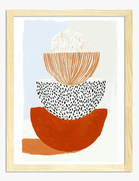
Lámina estudio de formas apiladas
Translation missing: es.products.product.sale_price Desde €16,95€23,95 -

Lienzo abstracto de formas orgánicas en terracota y azul
Translation missing: es.products.product.sale_price Desde €64,95€92,95 -

Lienzo abstracto moderno en tonos tierra
Translation missing: es.products.product.sale_price Desde €64,95€92,95


Más de The Frame

7 Ways to Style William Morris Tree Prints in Y...
Tree of Life. Woodpecker. The towering, tangled branches that made Morris famous. These prints have a vertical pull and a visual density that other Morris designs don't, which means hanging...

Why Art Prints Make the Most Meaningful Housewa...
Most housewarming gifts get consumed, regifted, or shoved in a cupboard within a month. Art does something different. It hangs on a wall in the new home for years, quietly...

Hosting at Christmas: Three Small Changes That ...
Most Christmas hosting advice asks you to do too much. You don't need a complete seasonal overhaul, you need your rooms to feel finished. The difference between a space that's...