Warm Scandi Style vs Cold Minimalism: Which Will You Choose?
How to layer warmth into Scandinavian style so your space feels lived-in, not like an empty showroom.

We've all walked into an "ultra-Scandi" room and felt vaguely cold. White walls, blonde wood, one spindly chair, and an unsettling echo. The problem isn't the style. It's the way it gets translated into "remove things until your home looks unlived in."
Why Scandi style isn't just 'put white everywhere'
Real Scandinavian interiors, the ones in Copenhagen flats and Stockholm townhouses, are not stark. They're soft. They're full of wool, sheepskin, linen, candlelight, well-loved books, and art that's been on the same wall for fifteen years. They look minimal because everything has been chosen carefully, not because everything has been removed.
The mistake most people make when learning how to decorate Scandinavian style is treating minimalism and warmth as opposites. They're not. Minimalism is the editing. Warmth is the layering you do within those edits. You need both, or you end up with a dental waiting room.
If you remember one thing: Scandi is about lagom, the Swedish idea of "just enough." Not too much, not too little. A room that feels lagom has space to breathe but also somewhere soft to sit, something warm to look at, and a sense that a real person lives there.

The Scandinavian colour palette: warm neutrals, not cold minimalism
This is where most rooms go wrong. People reach for the whitest white they can find, pair it with cool grey, and wonder why the space feels like a hospital corridor.
Scandinavian palettes work because they use warm neutrals. Think creamy off-whites with yellow or pink undertones, oat, putty, mushroom, sand, and soft greige. Cool whites with blue undertones make a room feel colder by several degrees, literally. Warm whites do the opposite.
A reliable approach: choose a warm white for the walls (something with a hint of yellow or red in the undertone, not blue), then layer in two or three deeper warm neutrals through textiles and furniture. Add one grounding darker tone, charcoal, deep forest, or terracotta, to give the eye somewhere to rest.
Wood tones matter just as much. Pure pale birch on its own can feel clinical. Mix at least two wood tones: a pale oak or ash with a warmer walnut or smoked oak. That contrast is what separates a real Scandi room from a flat-pack showroom.
The warm vs cold neutral test
Hold a paint swatch next to a sheet of printer paper. If your "white" or "grey" looks blue or green against the paper, it's a cold neutral and will read clinical on a wall. If it looks creamy or slightly pink, it's warm. This single test will save you from repainting later.
Choosing wall art that anchors a room without cluttering it
Wall art is the single most underused tool for fixing a cold Scandi room. Empty walls are the loudest signal that nobody lives somewhere. They make rooms echo, both literally and visually.
The trick is choosing pieces that anchor a space without filling it. One large print will almost always feel calmer and more intentional than three small ones scattered above a sofa. As a rough rule, your main piece of art should be roughly two-thirds the width of the furniture beneath it. Above a 200cm sofa, that means art in the region of 100x140cm or 70x100cm. Smaller than that and it floats awkwardly, looking lost.
Height matters too. Centre your art around 145-150cm from the floor (gallery hang height), or about 20-25cm above the back of the sofa. Hanging things too high is the classic mistake that makes rooms feel cold. Art should feel like it's in conversation with the furniture, not stranded near the ceiling.
For style, Scandi rooms come alive with abstract art prints in muted earth tones, soft landscapes, line drawings, and botanical studies. Avoid anything too high contrast or busy. You want pieces that add depth and quietness, not pieces that shout.
A good starting point is our Scandinavian art prints collection, where the palette and mood are already aligned to the look. Pair one large statement piece with a smaller complementary print elsewhere in the room and you've solved the empty wall problem without tipping into clutter.
One practical note on framing: cheap framing is what makes Scandi-style prints look flimsy. A solid wood frame in white oak or natural ash, properly fitted to the print, transforms an inexpensive piece into something that looks considered. Frames that ship warped, or arrive separately from the print and need fiddly assembly, undo all the work you've done elsewhere in the room.
Texture is everything: pairing prints with natural materials
If colour sets the temperature of a Scandi room, texture sets the mood. A flat, smooth, all-matte room feels cold no matter how warm the palette is. You need things to touch.
The warmth equation we like: aim for at least five distinct textures in any main room. Smooth (leather, ceramic, glass), soft (wool, linen, bouclé), rough (jute, rattan, raw wood), reflective (brass, brushed metal), and organic (plants, dried grasses, sheepskin). Miss one of these categories and the room reads incomplete.
The textures don't all need to be loud. A linen cushion, a chunky knit throw, a jute rug, a brass lamp base, and a trailing plant will quietly do most of the work. The art on the walls then becomes the visual texture, the matte paper of a high-quality print catching light differently to a glossy frame or a smooth ceramic vase.
This is why we like matte giclée prints in Scandi spaces. The paper has a softness to it that glossy or glass-fronted alternatives don't. Acrylic glazing also helps because it doesn't throw the harsh reflections that glass does, particularly important if you have big windows (and you should, this is Scandinavia we're channelling).

Room-by-room breakdown
Living room
The living room is where Scandi rooms most often turn cold, because it's the room people minimise most aggressively. Non-negotiables for warmth: a soft rug (wool or jute, large enough that the front legs of all your seating sit on it), at least two layered throws and three cushions on the sofa in mixed textures, and one large piece of art above the main seating area.
Add a coffee table with something on it (a book stack, a ceramic bowl, a small plant). An empty coffee table is the single loudest "nobody lives here" signal in a living room. Floor lamps with warm bulbs in the 2700K range, never higher, make the difference between hygge and interrogation room.
Bedroom
Layered bedding is the heart of a Scandi bedroom. Linen sheets, a wool or cotton blanket folded at the foot, two pillow heights, and a quilt or throw add depth without fuss. Keep the palette tight (two or three warm neutrals) but vary the texture wildly.
Art above the bed should be calming. Botanicals, abstract landscapes, or single-subject line drawings all work. Browse botanical art prints for soft, organic options that bring nature in without feeling literal. One large piece (70x100cm or larger above a double bed) usually beats a gallery wall here, which can feel too busy for a sleeping space.
Hallway
Hallways are where Scandi style nearly always goes wrong, treated as transitional spaces and left bare. A blank hallway is the first thing guests see and sets the temperature for the rest of the home.
Hang one or two prints at eye height, add a small bench or stool with a sheepskin draped over it, and put a runner down. A wall hook in blackened steel or brass for coats, a basket for shoes, and a small ceramic bowl on a console for keys. That's it. That's the whole hallway.
The most common Scandi decorating mistakes (and how to fix them)
You can see more wall than furniture. Your art is too small or there isn't enough of it. Size up, or add a second piece to balance the wall.
Everything is the same tone of beige. You've gone too matchy. Add one darker grounding element: a charcoal cushion, a black-framed print, a dark wood side table.
The room echoes. Not enough soft surfaces. Add a rug, curtains, or upholstered seating. Hard floors plus hard walls plus minimal textiles equals an echo chamber.
It looks like a showroom, not a home. Nothing personal in sight. Add books you've actually read, a piece of art that means something, a plant you've kept alive, a photograph. Lagom doesn't mean impersonal.
The lighting is harsh. One ceiling light on full blast is the enemy of hygge. You need at least three light sources per room at different heights, all in warm white (2700K). Table lamps, floor lamps, candles, wall sconces. Never a single overhead.
Everything is brand new. A bit of vintage or secondhand prevents the catalogue look. One older piece (a worn leather chair, an inherited rug, a vintage ceramic) gives a room soul.

How to mix Scandinavian prints with other styles without losing the look
Pure Scandi can tip into monotony if you're not careful. Mixing in other styles is what gives a room personality, the trick is balance.
A rough formula we keep coming back to: keep around 70% of the room Scandi (the palette, the wood tones, the clean lines), and let 30% be something else. That something else might be Japandi (add darker woods, ceramics, more sculptural pieces), bohemian (rattan, vintage rugs, more pattern in textiles), or rustic (rougher textures, more aged finishes, exposed wood beams if you're lucky).
Wall art is the easiest way to introduce a second style without disrupting the base. A more graphic abstract piece, a moody landscape, or a striking monochrome line drawing can bring an entirely different energy to a Scandi room without you needing to change the furniture. Our minimalist art prints collection is a good place to start if you want pieces that work in cross-style rooms.
Avoid mixing more than two styles in one room. Scandi plus one other is sophisticated. Scandi plus three others is a jumble sale.

The final test
Stand in the middle of your room and ask three questions. Can I see somewhere soft to sit? Is there something on the walls that I actually like looking at? Does it look like a person, specifically me, lives here?
If the answer to any of those is no, the room is too cold. Add a throw, hang the art lower and larger, and put something personal where the eye lands first. That's the whole secret. Scandi style isn't about subtraction. It's about subtraction followed by the right kind of addition, and most people stop halfway.

Productos Fab destacados en este blog
-

Lámina escandinava de líneas orgánicas en tonos neutros
Translation missing: es.products.product.sale_price Desde €16,95€23,95 -

Lámina estilo nórdico de líneas orgánicas en tonos tierra
Translation missing: es.products.product.sale_price Desde €16,95€23,95 -

Lienzo nórdico de formas orgánicas en beige cálido
Translation missing: es.products.product.sale_price Desde €64,95€92,95 -

Lámina floral escandinava
Translation missing: es.products.product.sale_price Desde €16,95€23,95 -

Lienzo botánico y floral nórdico
Translation missing: es.products.product.sale_price Desde €64,95€92,95 -

Lámina flores gráficas estilo nórdico
Translation missing: es.products.product.sale_price Desde €16,95€23,95 -

Lienzo flores nórdicas atrevidas
Translation missing: es.products.product.sale_price Desde €64,95€92,95 -

Lienzo floral fluido de estilo nórdico
Translation missing: es.products.product.sale_price Desde €64,95€92,95 -

Lámina escandinava de formas orgánicas
Translation missing: es.products.product.sale_price Desde €16,95€23,95 -

Lienzo de flores escandinavas retro
Translation missing: es.products.product.sale_price Desde €64,95€92,95 -

Lienzo mujer con gato negro, estilo nórdico
Translation missing: es.products.product.sale_price Desde €64,95€92,95 -

Lienzo botánico nórdico en tonos suaves
Translation missing: es.products.product.sale_price Desde €64,95€92,95 -

Lámina cama a rayas con fondo azul y cojín naranja
Translation missing: es.products.product.sale_price Desde €16,95€23,95 -

Lámina salón modernista soleado
Translation missing: es.products.product.sale_price Desde €16,95€23,95 -

Lienzo gato nórdico en tonos suaves
Translation missing: es.products.product.sale_price Desde €64,95€92,95 -

Lámina de amapolas rojas estilo escandinavo
Translation missing: es.products.product.sale_price Desde €16,95€23,95 -

Lienzo amapolas rojas estilo escandinavo
Translation missing: es.products.product.sale_price Desde €64,95€92,95 -

Lámina sala moderna iluminada por el sol
Translation missing: es.products.product.sale_price Desde €16,95€23,95 -
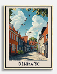
Lienzo escena urbana de Dinamarca
Translation missing: es.products.product.sale_price Desde €64,95€92,95 -

Lienzo botánico de estilo nórdico moderno
Translation missing: es.products.product.sale_price Desde €64,95€92,95


Más de The Frame

Why William Morris Prints Look Brilliant in Mod...
William Morris has been quietly miscategorised for decades. His patterns get filed under "country cottage" or "Arts and Crafts revival" and rarely escape, which is a shame because his tree...

Why Arts and Crafts Nature Prints Are the Antid...
The minimalism hangover: why bare walls stopped feeling calming For about a decade, the aspirational interior was a white box with one boucle chair in it. That look has officially...

Botanical Petal Art: Why Close-Up Prints Feel M...
Full florals have had a long run, and they're not going anywhere. But if you've noticed that the botanical art appearing in design magazines, boutique hotel lobbies, and the better-styled...