How to Build a Gallery Wall with Watercolor Cityscape Prints (Without It Looking Like a Mess)
The cohesion trick that turns Paris, Tokyo and New York into one wall, not three competing holiday souvenirs.

You love watercolour cityscapes, but you've seen the gallery walls where Paris, Tokyo and New York fight each other for attention like postcards on a fridge. The problem isn't the prints. It's that nobody tells you how to make different cities feel like one collection. This guide fixes that with exact layouts, measurements, and the one rule that matters more than any other.
Why watercolour cityscapes make surprisingly great gallery walls
Photographic cityscapes can be tricky in groups. Sharp lines, hard contrast and saturated skies start competing the moment you hang more than two together. Watercolours behave differently. The soft edges, washed pigments and visible paper texture give your eye somewhere to rest, which means you can hang five or seven of them on one wall without it feeling like a magazine rack.
There's also a forgiving quality to the medium itself. Watercolour flattens unfamiliar skylines into shapes and colour, so a city you've never visited reads as atmosphere rather than information. That's why a Lisbon scene next to a Kyoto scene next to an Edinburgh scene can feel like one mood rather than three holidays.
Done right, a watercolour cityscape wall feels collected. Done wrong, it feels like the gift shop at an airport. The difference comes down to four decisions: how many prints, what palette, what sizes, and what frames. We'll work through each.

How many prints you actually need (spoiler: fewer than you think)
The instinct is to fill the wall. Resist it. Most gallery walls look cluttered because they have nine pieces doing the work of five.
For a standard wall behind a sofa or bed (around 200cm wide), three to five prints is the sweet spot. For a taller, narrower wall (a hallway, a stairwell, the side of a chimney breast), three vertical prints stacked or staggered works beautifully. Seven is the upper limit before things tip into "vibey hostel" territory, and seven only works if your wall is genuinely wide (think 250cm and up) and your palette is tightly controlled.
Our rule: pick a number, then remove one. Three confident prints will always beat five hesitant ones. If you're unsure, start with three and add later. You can always grow a gallery wall. You can't easily shrink one without leaving holes in the plaster.
A useful starting point if you want a curated set rather than building from scratch is browsing pre-paired wall art sets, which take the matching guesswork out of the equation.
Choosing a cohesive palette across multiple city scenes
This is the section nobody writes, and it's the single most important part of getting a themed gallery wall right.
When you're mixing different cities, the cities themselves stop being the unifying element. The palette has to do that job instead. Before you buy anything, decide whether your wall is going to be warm, cool, or muted neutral. Then filter every print you consider through that decision.
Warm palette
Sunset Florence, golden-hour Marrakech, autumnal Boston. Ochres, terracottas, dusty pinks, warm greys. These walls feel cosy and work brilliantly in north-facing rooms or above a sofa in a lounge.Cool palette
Rainy London, foggy Reykjavik, blue-hour Stockholm. Slate, navy, sage, soft teal. These walls feel calm and modern. They suit bedrooms and bathrooms where you want a hushed atmosphere.Muted neutral palette
Misty Edinburgh, overcast Tokyo, hazy Lisbon. Greys, off-whites, soft browns, the occasional muted accent. The most flexible option and the easiest to live with long-term.The mistake to avoid: combining a sunset Paris (warm orange and pink) with a rainy Seattle (cool blue and grey) and assuming "they're both cities, they'll work." They won't. Your eye reads colour temperature before it reads subject matter, so two different temperatures on one wall will always feel like two different walls pretending to be one.
When you're browsing watercolor cityscape art prints, squint at the thumbnails. If your eyes blur the details and the prints still feel like they belong together, you're on the right track. If one suddenly jumps out as "the warm one" or "the bright one," it's the wrong piece for this wall.
The size mix that works: our recommended layout for 3, 5, and 7 prints
Symmetry is safe. Asymmetry is interesting. Both work for watercolour cityscapes, but the size mix matters more than the layout shape.
Three prints (best for walls 150-200cm wide)
Option A: Equal trio. Three prints at the same size, hung in a row. We recommend 50x70cm portrait orientation, spaced 5cm apart. Total wall coverage roughly 160cm wide. Clean, calm, very gallery-like.
Option B: Anchor plus two. One larger horizontal print (70x100cm) with two smaller portraits (40x50cm) stacked vertically to one side. The large piece is your anchor. Everything else supports it.
Five prints (best for walls 200-250cm wide)
Option A: The classic grid. Five prints in a 3-over-2 or 2-3-2 arrangement at 40x50cm each, with 5cm spacing throughout. Tidy, almost architectural.
Option B: The anchor layout. One 70x100cm horizontal cityscape in the centre, with four 30x40cm prints positioned two on each side, stacked. This creates a clear focal point and feels more curated than a grid.
We'd nudge you toward Option B nine times out of ten. Grids are foolproof but they can feel a bit corporate. The anchor layout has personality.
Seven prints (best for walls 250cm+ wide)
Seven is where you need to be most disciplined. Use one large anchor (70x100cm), two medium pieces (50x70cm) flanking it, and four small pieces (30x40cm or 21x30cm) filling the corners. Keep spacing at 5cm minimum or the wall starts to feel like wallpaper.
Avoid an even number of small pieces unless you're going fully symmetrical. The eye prefers groups of three or five small prints around an anchor.

Frame consistency: why matching your frames matters more than matching your cities
If you take one thing from this article: match your frames, not your cities.
Mixed frames work for eclectic gallery walls where every piece is wildly different anyway. They do not work for themed collections. When your subject is already varied (different skylines, different countries, different seasons), the frame is what tells the eye "these belong together."
Our recommendation: pick one frame colour and one frame profile across all your prints. Black for a graphic, modern feel. Natural oak for warmth and a softer, Scandi-leaning look. White for airy, light-filled rooms. Avoid mixing wood tones with painted finishes. Avoid thin frames next to chunky ones.
This is also where build quality starts to matter. Cheaply framed prints warp, especially in humid rooms or near radiators. Frames that arrive separately from the print and need self-assembly often end up slightly out of square, which you'll notice when you hang five of them in a row. Our art prints ship pre-fitted in solid FSC-certified wood frames with UV-protective acrylic glaze, so the print, frame and fixtures all arrive ready to hang in one box. It also means the prints won't fade in direct sunlight, which matters for a gallery wall opposite a window.
Mat or no mat?
For watercolours, we lean toward a mat. The white border around a watercolour gives the soft pigments room to breathe, and matching mats across all your prints adds another layer of cohesion. Cream mats can work with warm palettes, but stick to white if you're mixing warm and cool tones in a muted neutral scheme. Avoid coloured mats. They date quickly and fight with the watercolour itself.
If you go without a mat, make sure every print in your collection follows the same rule. Half-matted, half-unmatted is the look of a wall built over time without a plan.
Step-by-step hanging guide with spacing measurements
You've chosen your prints, your palette and your frames. Now the wall.
Step 1: Find the centre line
The centre of your gallery wall (the visual centre, not necessarily the geometric one) should sit at **145cm to 150cm from the floor**. This is the museum standard and it works because it lines up with average eye level. Above a sofa or console, drop the bottom of the lowest frame to roughly 20-25cm above the furniture. Closer than that and it looks crowded. Further and the art "floats."Step 2: Lay it out on the floor first
Always. Lay every print on the floor in the exact configuration you plan to hang. Take a photo from directly above. Look at the photo. If something feels off, swap pieces around now, not after you've drilled holes.Step 3: Spacing
For watercolour cityscapes specifically, we recommend **5cm between frames**. The standard advice is 4-6 inches (around 10-15cm), but watercolours have soft edges that visually "spread" beyond the frame. Tighter spacing (5cm) keeps the wall feeling like one composition rather than scattered individual pieces. Any closer than 4cm and the frames start crowding each other.Step 4: Paper templates
Cut paper templates the size of each frame. Tape them to the wall with low-tack masking tape. Step back. Live with them for a day if you can. Adjust until the proportions feel right, then mark hanging points through the paper directly into the wall.Step 5: Hang the anchor first
Start with your largest piece. Get it level. Get it centred. Then build outward. If you start with the small pieces, the anchor never quite lands where it should.
Common gallery wall mistakes and how to avoid them
Mixing colour temperatures
Already covered, but it bears repeating. Warm and cool watercolours on the same wall create visual static. Pick a temperature and stick to it.Too many orientations
A wall of all-portrait prints reads calm. A wall of all-landscape prints reads cinematic. A wall of mixed orientations needs a clear logic (the anchor is horizontal, everything else is vertical, for example). Random mixing without a system is what makes a gallery wall look thrown-together.Hanging too high
The most common mistake we see. People hang gallery walls at standing eye-level, forgetting that most of the time you're sitting in the room. 145cm centre line. Trust it.Buying the prints all at once from different sources
This is the source of most cohesion failures. If you buy three prints from one shop, two from another and one from a market stall in Lisbon, the paper weights, print qualities and colour profiles won't match. Even watercolours that look similar on screen can print very differently. Buying a coordinated set from a single source where the printing process is consistent (the same paper, the same inks, the same calibration) eliminates this problem entirely. Browsing [watercolor art prints](/collections/watercolor-art-prints) as a single collection helps you see how pieces sit together before committing.Forgetting the room around the wall
Your gallery wall doesn't exist in isolation. If your sofa is rust-coloured velvet and your rug is sage green, your gallery wall palette needs to acknowledge them. Pull one or two colours from the room into your prints. Ignore this and the wall will always feel like it's been imported from somewhere else.Treating it as finished too soon
Live with the wall for a week before declaring it done. Watercolour cityscapes reward attention. You'll start to notice which prints you love and which feel like filler. Swap the filler. A great gallery wall is edited, not assembled.Where to land
Pick your palette before you pick your cities. Match your frames, not your skylines. Use one anchor piece and let everything else support it. Hang at 145cm centre, space at 5cm, lay it out on the floor first. If you do those five things, your wall will look curated by someone who knew exactly what they were doing, which, by then, you will.


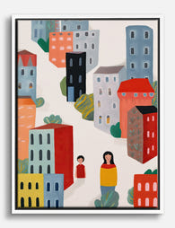
Productos Fab destacados en este blog
-

Lienzo paisaje urbano colorido
Translation missing: es.products.product.sale_price Desde €64,95€92,95 -

Lámina de casas victorianas de San Francisco en acuarela
Translation missing: es.products.product.sale_price Desde €16,95€23,95 -

Lienzo paisaje urbano minimalista color coral
Translation missing: es.products.product.sale_price Desde €64,95€92,95 -
Lienzo paseo urbano colorido
Translation missing: es.products.product.sale_price Desde €64,95€92,95 -
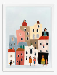
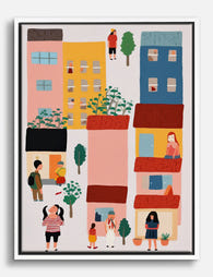
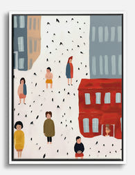
Lámina paisaje urbano colorido con gente
Translation missing: es.products.product.sale_price Desde €16,95€23,95 -

Lienzo oasis urbano colorido
Translation missing: es.products.product.sale_price Desde €64,95€92,95 -

Lienzo paisaje urbano en tonos pastel rosa y verde menta
Translation missing: es.products.product.sale_price Desde €64,95€92,95 -
Lienzo vida urbana en color
Translation missing: es.products.product.sale_price Desde €64,95€92,95 -

Lámina paisaje urbano de Londres en acuarela
Translation missing: es.products.product.sale_price Desde €16,95€23,95 -
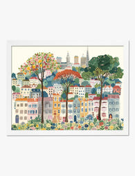
Lámina de San Francisco en acuarela colorida
Translation missing: es.products.product.sale_price Desde €16,95€23,95 -
Lienzo escena urbana y pequeños momentos
Translation missing: es.products.product.sale_price Desde €64,95€92,95 -

Lienzo paisaje urbano de Londres en acuarela
Translation missing: es.products.product.sale_price Desde €64,95€92,95 -

Lienzo cascada tropical luminosa
Translation missing: es.products.product.sale_price Desde €64,95€92,95 -

Lienzo paseo urbano en tonos pastel
Translation missing: es.products.product.sale_price Desde €64,95€92,95 -

Lámina paisaje urbano en tonos pastel
Translation missing: es.products.product.sale_price Desde €16,95€23,95 -

Lienzo paseo urbano en color
Translation missing: es.products.product.sale_price Desde €64,95€92,95 -

Lienzo paisaje urbano vibrante
Translation missing: es.products.product.sale_price Desde €64,95€92,95 -
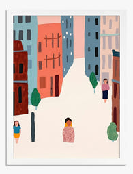
Lámina paseos urbanos en tonos pastel
Translation missing: es.products.product.sale_price Desde €16,95€23,95 -

Lámina paseos por la ciudad en color
Translation missing: es.products.product.sale_price Desde €16,95€23,95 -

Lienzo paseos urbanos en San Francisco
Translation missing: es.products.product.sale_price Desde €64,95€92,95


Más de The Frame

How to Display Art Prints at Home: Hanging, Gro...
Most art prints don't look bad because of the print. They look bad because they've been hung 15cm too high, spaced like strangers at a bus stop, or floated above...

How to Build a Folk Art Gallery Wall (With Layo...
You've collected the prints. You've got a tape measure, a pencil, and a wall that's been blank for months. This guide takes you from indecision to nails in the plaster,...

How to Build a Face Art Gallery Wall That Actua...
Face art is having a moment, but most gallery walls built around it look chaotic, creepy, or both. The difference between a wall that feels curated and one that feels...