Botanical vs Tropical Prints: A Straightforward Guide to Choosing Plant Art
One is a 19th century science lesson, the other is a holiday in print form. Here's how to choose.

Plant prints get lumped together online, but botanical and tropical are two genuinely different things. One is rooted in 18th century scientific illustration, the other is a modern celebration of lush, saturated colour. Choose wrong for the room and the print either disappears into the wall or shouts over everything else in it.
Botanical prints: what the term actually means
A botanical print, properly speaking, is an illustration made for scientific documentation. Picture a single fern, an iris stem, or a sprig of rosemary rendered with surgical precision against a pale background, often with the Latin name handwritten underneath. The tradition comes from the great European plant hunters of the 18th and 19th centuries, when artists like Pierre-Joseph Redouté were commissioned to record every species being shipped back from the colonies and the New World.
That heritage explains how botanical prints look today. The palette is restrained: muted greens, faded ochres, sepia, cream paper. The composition is usually a single specimen, centred, with plenty of negative space around it. Detail is the whole point. You're meant to be able to count the veins on a leaf.
Modern botanical prints either reproduce these historical plates directly or use the same visual language: precise linework, soft watercolour washes, careful labelling. They feel quiet, considered, almost academic. That's their charm, and it's also the reason they need the right setting to work.
If this is the direction you're leaning, the botanical art prints collection is the place to start browsing.

Tropical prints: the bolder, more decorative cousin
Tropical prints share some DNA with botanicals (they're both plant art on a wall) but the goal is completely different. Tropical prints exist to evoke a feeling: heat, abundance, a slightly louche holiday somewhere with a pool. Think oversized monstera leaves filling the whole frame, banana fronds in saturated emerald, palm silhouettes against terracotta skies.
Where botanicals isolate a single specimen, tropicals layer them. Where botanicals whisper, tropicals project. The colours are deliberately punchy: deep jungle green, hot coral, mustard, ink black. The compositions are decorative rather than educational, often cropping leaves so aggressively that they become near-abstract shapes.
Almost all tropical prints are modern. There's no centuries-old folio tradition behind them. They emerged as a decorative style in the mid 20th century alongside the Palm Beach and tiki aesthetics, and they had a major resurgence in the 2010s when houseplants became the defining interior obsession. Today's tropical art prints range from minimalist single-leaf studies to maximalist jungle scenes.
The practical difference matters for shopping. A botanical print is asking you to look closely. A tropical print is asking the room to feel different.
Side by side: how the same leaf looks in both styles
Take a monstera deliciosa, since it's the plant equivalent of a celebrity.
Rendered botanically, you'd see a single leaf laid flat against cream paper, every fenestration drawn precisely, the stem and a section of root system included for completeness, and "Monstera deliciosa Liebm." printed in a small italic font at the bottom. The greens would be muted, almost olive. It looks like something out of a Victorian explorer's notebook.
Rendered tropically, the same leaf might fill the entire frame edge to edge, cropped at the petiole, drawn in two flat tones of deep green with no shading, set against a dusty pink background. No label. No stem. Just shape and colour.
Same plant, completely different brief. The botanical version is documenting it. The tropical version is using it.
This is the clearest way to test which direction you actually want. If you're drawn to the small precise version, you're a botanical shopper. If you want the big graphic one, you're a tropical shopper. The fact that retailers tag both as "leaf prints for framing" is what causes most of the confusion.
Which rooms suit botanical prints
Botanicals belong in rooms where you want focus or calm. The reasons are practical, not just vibes.
Studies and home offices. The small scale, detailed linework, and academic feel of botanical prints rewards close looking, which suits a space where you're already sitting still. A set of four 30x40cm framed prints above a desk creates a quiet, considered backdrop without competing for your attention.
Bedrooms. Muted palettes and uncluttered compositions help bedrooms feel restful. Botanical prints in sage, faded green, and cream sit beautifully against linen bedding and neutral walls. Avoid hanging them directly above the headboard if you want to sleep well; either side of the bed in pairs works better.
Hallways and stair walls. Long narrow walls are perfect for botanical sets, where the repetition of similar specimens at consistent scale creates rhythm. A run of six small framed prints down a hallway looks far more considered than a single large piece.
Bathrooms. Botanicals suit the slightly utilitarian, apothecary-adjacent feel of a good bathroom. Stick to framed prints with UV-protective acrylic glaze rather than glass; the acrylic handles humidity better and won't shatter if a bottle falls off a shelf.
Where botanicals fail: large open-plan living rooms, kitchens with strong existing colour, and any wall over about two metres wide if you're using a single small print. They get lost. Either go bigger, hang them as a multi-print set, or pick a different style.

Which rooms suit tropical prints
Tropicals belong in social, energetic, conversational rooms. The saturated colours and bold compositions are doing work that calm rooms don't need.
Living rooms. A single 70x100cm framed tropical print above a sofa, or an XL 100x150cm canvas on a feature wall, anchors a room and gives the eye somewhere to land. The boldness justifies the scale. This is where tropicals genuinely shine.
Kitchens and dining rooms. Kitchens are usually visually busy already (appliances, tiles, utensils, food) so a confident piece of art holds its own where a delicate botanical would vanish. Tropical prints in greens and corals also flatter the warm light of pendant fixtures over dining tables.
Conservatories and garden rooms. The connection is obvious but it works. A jungle-toned tropical print extends the outside-in feel. Use canvas here rather than framed prints; the matte canvas finish handles fluctuating light better and the lack of glazing means no glare from the windows.
Hallway statement walls. If you have a single wall opposite the front door, this is the place for a large tropical print. It sets the tone for the whole house in the first three seconds someone walks in.
Where tropicals fail: minimalist Scandi interiors (too busy against the restraint), already-bold maximalist rooms (everything fights), and small box bedrooms (overwhelming at close range). Tropicals need either visual space around them or a confident, considered backdrop.
For more general plant-themed options that sit somewhere between the two, the broader plants art prints collection is worth a look.
Can you mix both styles in the same home? Yes, but here's how
You can absolutely have botanicals in your study and tropicals in your living room. What's harder is mixing them on the same wall or in the same sightline, and that's where most people come unstuck.
Three rules make it work.
One: pick a connecting element. If your botanicals are in thin black frames, your tropicals should be in thin black frames too. Or match the mount colour. Or stick to a shared colour family (deep greens and warm neutrals work for both). Without a connector, the styles read as accidental.
Two: give each style its own zone. A gallery wall with two botanicals and two tropicals mashed together rarely works. Cluster the botanicals on one section, the tropicals on another, with breathing room between them. The eye should be able to register each group as intentional.
Three: respect the scale logic. Botanicals look right small, in sets. Tropicals look right large, often singly. Don't blow up a botanical to 100x150cm to match a tropical; the detail isn't designed for that scale and it looks stretched. And don't shrink a tropical to 30x40cm; the boldness disappears.
The cleanest mixed approach is botanicals on connecting walls (hallways, transitions, stairwells) and tropicals as the big statement piece in the main social room. The botanicals do quiet work between the loud moments.

Framing choices that complement each style
This is where a lot of plant prints get let down. The print itself is fine; the frame is fighting it.
For botanical prints
Botanicals look best in frames that honour their historical origins or get out of the way entirely.
Thin black frames. The default for a reason. They reference modern gallery hanging, contain the print neatly, and let the detail do the talking. Best for sets of three or more, where consistency matters.
Natural oak or pale wood. Suits softer, watercolour-style botanicals. Warmer and less stark than black, particularly good in bedrooms.
A generous white mount. Whatever frame colour you pick, a wide mount (5cm minimum) makes a botanical look properly archival. It mimics the way museums display historical illustrations and gives the eye somewhere to rest before reaching the artwork.
Avoid: chunky modern frames, oversized statement frames, anything in a finish that competes for attention. The frame is a setting, not a feature.
For tropical prints
Tropicals can take a stronger frame, or none at all.
Canvas, unframed. Often the best choice. The matte canvas surface, mirrored-edge wrapping, and minimalist profile suit the modern, decorative spirit of tropical art. No glare, no fuss, and at XL sizes (up to 100x150cm) the impact is real.
Black framed canvas. If you want a more polished finish without losing the canvas texture, a slim black float frame around a canvas hits both notes.
Natural wood frames on paper prints. A medium-width oak or walnut frame brings warmth and references the natural subject matter. Works particularly well for prints with terracotta or warm pink backgrounds.
Avoid: ornate gold frames (clash with the modernity), white frames against pale walls (the print appears to float oddly), and anything that adds visual clutter to an already busy composition.
One general note that applies to both styles: framed prints from Fab ship with the frame and print already fitted in one box, with fixtures attached, so you're not assembling anything or trying to align a print inside a frame you bought separately. The biggest failure in this category historically has been frames arriving warped, prints bubbling under glass, or having to source a frame to fit later. None of that here. UV-protective acrylic glaze on the framed prints also means the colour holds even in a sunny room, which matters when you've picked a botanical specifically for its delicate palette.

A quick decision framework
If you've read this far and still aren't sure, two questions get you most of the way there.
What's the room for? Focus, rest, or quiet conversation points to botanical. Energy, entertaining, or making a first impression points to tropical.
What's your wall size? Under a metre wide, or you want a set, botanical. Over a metre wide and you want a single piece, tropical.
Get those right and you can browse nature art prints without second-guessing every option. The styles aren't interchangeable and the marketing language that treats them as the same thing does shoppers no favours. Pick the one that suits the room you're actually decorating, not the one that looked good on someone else's wall.

Produits Fab présentés dans cet article
-
Affiche botanique tropicale en collage
Translation missing: fr.products.product.sale_price À partir de €19,95€33,25 -

Affiche botanique tropicale
Translation missing: fr.products.product.sale_price À partir de €19,95€33,25 -

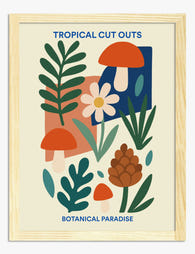
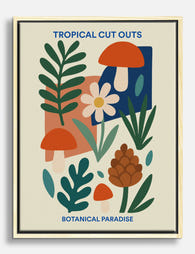
Affiche paradis botanique en papier découpé
Translation missing: fr.products.product.sale_price À partir de €19,95€33,25 -

Affiche formes botaniques tropicales
Translation missing: fr.products.product.sale_price À partir de €19,95€33,25 -

Affiche paradis botanique en papier découpé
Translation missing: fr.products.product.sale_price À partir de €19,95€33,25 -

Affiche botanique, plantes sur étagère, fond jaune
Translation missing: fr.products.product.sale_price À partir de €19,95€33,25 -

Affiche élégance botanique des palmiers
Translation missing: fr.products.product.sale_price À partir de €19,95€33,25 -

Affiche jardin aux formes botaniques découpées
Translation missing: fr.products.product.sale_price À partir de €19,95€33,25 -

Affiche paradis tropical en découpages botaniques
Translation missing: fr.products.product.sale_price À partir de €19,95€33,25 -

Toile collage botanique tropical
Translation missing: fr.products.product.sale_price À partir de €64,95€91,95 -

Affiche oasis botanique
Translation missing: fr.products.product.sale_price À partir de €19,95€33,25 -

Affiche guide des pains
Translation missing: fr.products.product.sale_price À partir de €19,95€33,25 -

Affiche plantes vertes sur fond jaune lumineux
Translation missing: fr.products.product.sale_price À partir de €19,95€33,25 -

Affiche serre tropicale paisible
Translation missing: fr.products.product.sale_price À partir de €19,95€33,25 -
Toile collage botanique tropical
Translation missing: fr.products.product.sale_price À partir de €64,95€91,95 -

Affiche collage tropical et botanique
Translation missing: fr.products.product.sale_price À partir de €19,95€33,25 -

Affiche jardin en découpage végétal
Translation missing: fr.products.product.sale_price À partir de €19,95€33,25 -

Toile jungle d'intérieur éclectique
Translation missing: fr.products.product.sale_price À partir de €64,95€91,95 -

Affiche formes botaniques paradisiaques
Translation missing: fr.products.product.sale_price À partir de €19,95€33,25 -

Affiche botanique sombre, inspiration héritage
Translation missing: fr.products.product.sale_price À partir de €19,95€33,25


Plus de The Frame

Our Favourite Bathroom Wall Art Picks for Every...
Why bathrooms are the most neglected room for art (and the easiest to fix) Most people will spend months agonising over the perfect print for above the sofa and leave...

7 Tree Art Styling Ideas for Every Room in Your...
Tree art is one of the most flexible categories of wall decor you can buy, which is exactly why people get it wrong. A misty pine forest that looks soothing...

Why Does Vibrant Art for Your Living Room Feel ...
You found a print you love. It's loud, joyful, possibly a bit unhinged, and you've now spent four evenings wondering if your living room can actually handle it. That hesitation...