Why Most Monet Prints Look Terrible (And How to Find One That Doesn't)
A buyer's guide to spotting the difference between museum-grade reproductions and the flat, lifeless posters flooding the internet.

Monet is the most reproduced artist on the internet, and most of those reproductions are bad. The brushwork goes flat, the colours turn muddy, and the frame arrives looking like it cost £4. Here's what's actually going wrong, and what to look for instead.
The problem with cheap Monet prints
Impressionism is genuinely hard to reproduce. Monet didn't paint smooth, flat surfaces. He built his canvases up in dense, textured layers of broken colour, with visible brushstrokes that catch light differently depending on where you stand. A water lily isn't a single shade of pink. It's twenty shades of pink, lavender, ochre and pale green, dabbed in tiny strokes that your eye blends into a flower.
That layered, textural approach is exactly what cheap printing destroys. Mass-market posters are usually printed on glossy or semi-glossy paper using offset presses calibrated for photographs and graphic design, not paintings. The result is a flattened image that looks more like a screenshot of a Monet than a painting by one. The brushwork disappears. The colour relationships collapse. You end up with something that reads as "blue and green pond" rather than the shimmering, atmospheric thing Monet actually painted.
This matters more for Monet than for, say, a clean line drawing or a flat poster design. Reproducing a Rothko badly is a problem. Reproducing a Monet badly is a different problem, because so much of what makes the work work is the surface itself.

Giclée vs offset printing: why the technology matters
Giclée (pronounced "zhee-clay") is a French word for "spray," and it describes a high-resolution inkjet process that sprays microscopic droplets of pigment ink onto paper or canvas. Offset printing, the standard for commercial posters, uses four fixed ink plates (cyan, magenta, yellow, black) pressed onto paper at speed.
For a film poster or a magazine, offset is fine. For a Monet, it's a disaster. Offset printing works in dot patterns, and those dots are visible if you look closely. More importantly, the four-colour CMYK process struggles to render the subtle tonal range Monet used: those shifts from violet to grey-blue to almost-white in the surface of a pond. Colours get clipped to whatever the press can manage.
Giclée printing uses up to 12 ink channels, with pigments that can reproduce a far wider colour gamut. The droplets are small enough that they're invisible to the naked eye, which means the texture you see is the brushwork in the original painting, not the texture of the printing process. This is why every serious museum reproduction service uses giclée. It's also why our Monet collection is printed this way as standard. Anything less and the layered Impressionist palette flattens out.
When you're shopping, "giclée" alone isn't enough. Ask about ink type (pigment-based archival inks, not dye-based) and resolution. 300 DPI is the baseline. Anything lower and you'll see softness in the fine brushwork.
Glossy vs matte paper: which is right for Monet?
This is the question almost no retailer answers honestly. Some shops actively recommend glossy or satin finishes for Monet's water paintings, which is genuinely baffling.
Monet painted on canvas. Canvas is matte. The original Water Lilies series at the Musée de l'Orangerie has zero shine. Putting a glossy finish on a Monet reproduction is like adding a laugh track to a Bergman film. It changes the whole emotional register.
Glossy paper does two things, both bad for Impressionism. First, it adds reflections that bounce off any nearby light source, meaning you can't actually see the painting from half the angles in your room. Second, it visually flattens texture. The shine creates a uniform surface plane that overrides the implied three-dimensionality of the brushwork. You lose the very thing you're paying for.
Matte paper, especially thick matte cotton-rag paper, absorbs light rather than reflecting it. The surface stays quiet so the image can do the work. You see brushstrokes as brushstrokes, not as glints. Our art prints use a heavy matte stock specifically because it preserves the depth and tonal range of paintings like the Water Lilies series.
Paper weight matters too. Anything under 200gsm feels like a magazine page and tends to ripple in a frame. 250gsm and above gives you the substantial, museum-card feel that holds the print flat and lets the colour sit properly. If a seller doesn't tell you the GSM, that's a flag.
Frame quality: the number one reason wall art disappoints
Read enough customer reviews of online art prints and a pattern emerges immediately. People love the print, then complain bitterly about the frame. "Flimsy." "Warped." "Arrived bent." "Plastic that looked like wood in the photo."
This is the single biggest failure point in the entire category, and it's worth understanding why. Most online art print companies don't make their own frames. They print the artwork in one place, source frames from a separate supplier (often the cheapest available), and ship them in two boxes. The frame arrives separately, you assemble it yourself, and the print never quite sits right because the moulding wasn't designed for that exact paper stock.
Worse, the frames themselves are often MDF wrapped in printed vinyl made to look like wood. They warp in humid rooms, the corners separate over time, and the "wood grain" is just a photograph of wood grain.
The fix is simple but rare: solid wood frames, FSC-certified, fitted to the print before shipping, sent in a single protective box. That's what we do, and it's the boring infrastructure decision that determines whether your print actually looks good on a wall five years from now. When you're comparing options, ask whether the frame is solid wood or composite, whether it ships pre-fitted, and what the frame depth is. Anything thinner than about 2cm tends to look insubstantial around a serious painting.

What UV-protective glazing actually protects against
UV light fades pigments. This isn't controversial; it's basic chemistry. Even indirect daylight, over years, will gradually wash out a print hung on a wall opposite a window. Reds and yellows go first, blues last, which is particularly cruel for a Monet because it skews the whole palette towards the cool end and erases the warm undertones he layered in deliberately.
Traditional glass framing offers minimal UV protection unless you pay extra for museum glass. Acrylic glazing with a built-in UV filter does the job at a fraction of the weight, and crucially, it doesn't shatter if the frame falls off the wall.
We use UV-protective acrylic on framed prints as standard, paired with archival pigment inks rated to last hundreds of years even in direct sunlight. That combination is what "museum quality" actually means in practice. Without it, "archival" is just a marketing word.
If you're hanging a Monet water lily print anywhere near a window, UV glazing isn't optional. It's the difference between owning the print for a decade and owning a sad, faded version of it.
Colour accuracy: how a good print captures Monet's layered palette
Monet's late water paintings are particularly demanding because of how he built colour. He'd lay down a base, let it dry, then dab another colour on top, then another, often leaving the underlayers visible in the gaps. The eye reads the result as a single luminous surface, but technically it's a stack.
Reproducing this requires two things: a printer with enough colour channels to render the subtle tonal jumps, and a profiling process that accounts for how the chosen paper absorbs ink. A good print shop will calibrate every batch against a known reference. A bad one prints whatever the file says and ships it.
There's also a historical wrinkle worth knowing. In his last decade, Monet had cataracts, which shifted his perception towards yellows and reds. The late water lily paintings have a distinctive warm cast that some restorers and reproducers "correct" by cooling the palette back towards what they assume the "true" colour was. This is a mistake. The warm tones are the painting. A faithful reproduction preserves them.
When you're buying online, look at the product photography carefully. If every Monet on the site has the same cool, slightly bluish tone, the seller is colour-correcting to a house style rather than reproducing each painting on its own terms. You want sellers who treat each work as its own colour problem.
What to look for when buying Monet water paintings prints online
A short checklist for anyone trying to buy Monet water paintings prints without ending up disappointed:
Printing method. Giclée, pigment inks, minimum 300 DPI. If the listing doesn't specify, assume the worst.
Paper. Matte. 250gsm or heavier. Cotton or cotton-blend if specified.
Frame. Solid wood, FSC-certified ideally, pre-fitted before shipping. Avoid anything described only as "wood-effect" or "composite."
Glazing. UV-protective. Acrylic is fine and often preferable to glass.
Sizing. Monet's water lily compositions are usually horizontal. A horizontal print at 70x50cm or 100x70cm sits well above a sofa or sideboard. Vertical formats can work for cropped sections but lose the panoramic feel of the originals.
Returns. A serious returns policy (we offer 99 days) tells you the seller is confident in the product. A 14-day window with restocking fees tells you the opposite.
Embellished prints. Beware listings that claim "hand-finished texture" or "artist-applied brushstrokes." This is usually a cheap print with a clear gel medium dragged across the surface to fake texture. It looks crude in person and adds nothing. A real giclée on quality matte paper has all the visual depth you need.

Why ready-to-hang framing saves your walls (and your sanity)
The final mile of buying art is the part nobody talks about, and it's where a surprising amount of the experience falls apart. You order a print. It arrives in two boxes. You assemble the frame. You realise the print is slightly larger than the frame opening. You bend it slightly to make it fit. You attach the hanging hardware yourself, badly. The whole thing sits crooked on the wall.
Or, alternatively, the frame and print arrive in a single box, the print is properly mounted, the hanging fixtures are already attached, and you put a nail in the wall and hang it. Ten minutes, done.
That second version sounds obvious, but it's rare in this industry because it requires the seller to control framing in-house rather than outsourcing it. We ship framed prints fully fitted and ready to hang because the alternative produces the exact disappointed customers you can read about in any review section online. If you're investing in a serious reproduction, the last thing you want is to spend an hour wrestling with a flat-pack frame and a sheet of plastic that scratches if you breathe on it.

A final word
The real test of a Monet print isn't how it looks in the product photo. It's how it looks at 7am, in flat winter light, when you walk past it on the way to the kitchen. A cheap print looks like a poster. A good one looks like a painting that happens to live on your wall.
If you're starting a search, the broader Impressionism collection is a good place to see the full range, and our wider art prints catalogue shows the same printing and framing standards applied across other periods. Buy the right print once and you'll stop thinking about it. That's the goal.

Produits Fab présentés dans cet article
-

Affiche nymphéas inspirée de Monet
Translation missing: fr.products.product.sale_price À partir de €16,95€23,95 -

Toile pont aux nymphéas de Claude Monet
Translation missing: fr.products.product.sale_price À partir de €64,95€92,95 -

Toile nymphéas, inspiration Monet
Translation missing: fr.products.product.sale_price À partir de €64,95€92,95 -

Toile nymphéas de Monet
Translation missing: fr.products.product.sale_price À partir de €64,95€92,95 -

Toile nymphéas de Monet
Translation missing: fr.products.product.sale_price À partir de €64,95€92,95 -

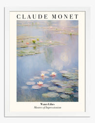
Affiche Nymphéas de Monet
Translation missing: fr.products.product.sale_price À partir de €19,95€33,25 -
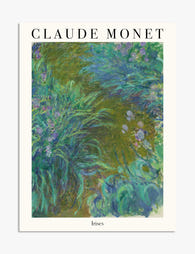
Affiche jardin d’iris de Monet
Translation missing: fr.products.product.sale_price À partir de €19,95€33,25 -
Affiche nymphéas de Monet, sérénité
Translation missing: fr.products.product.sale_price À partir de €19,95€33,25


Plus de The Frame

Why William Morris Prints Look Brilliant in Mod...
William Morris has been quietly miscategorised for decades. His patterns get filed under "country cottage" or "Arts and Crafts revival" and rarely escape, which is a shame because his tree...

Why Arts and Crafts Nature Prints Are the Antid...
The minimalism hangover: why bare walls stopped feeling calming For about a decade, the aspirational interior was a white box with one boucle chair in it. That look has officially...

Botanical Petal Art: Why Close-Up Prints Feel M...
Full florals have had a long run, and they're not going anywhere. But if you've noticed that the botanical art appearing in design magazines, boutique hotel lobbies, and the better-styled...