How to Create a Coastal Gallery Wall That Doesn't Look Like a Holiday Rental
A formula for coastal gallery walls so specific you couldn't accidentally make it look like a beach Airbnb if you tried.

You love the look on Pinterest. You've saved forty seascape prints. Then you stand in front of your wall holding a tape measure and a hammer, and your brain goes blank. This guide replaces the vague advice with actual numbers, ratios, and rules so you can stop deliberating and start hanging.
Why a coastal gallery wall works (and when a single large print is better)
Coastal imagery has range. A foggy Cornish headland, a graphic abstract in indigo and bone, a black and white photograph of breaking surf. They share a visual language (horizon lines, water, sky) but offer enough variety to fill multiple frames without becoming repetitive. That's the whole reason gallery walls exist as a format: they need internal variety to justify the multiplication.
A single large print is the better choice when your wall is under 120cm wide, when the wall has a strong architectural feature already (a fireplace, panelling, a deep alcove), or when the room is busy with pattern elsewhere. A 100x150cm canvas of a moody seascape above a sofa often does more work than six smaller prints fighting for attention.
If your wall is wider than 150cm, sits behind a sofa, bed, or sideboard, and the surrounding space is relatively calm, a gallery wall earns its place. Anything in between is a judgment call, and you should default to the single large print if you're unsure. One confident piece beats six tentative ones.
Choosing a layout: grid, salon hang, or asymmetric cluster
There are three layouts worth your time. Pick one based on the room, not on what looks prettiest in isolation.
The grid is two, three, or four prints across in even rows. Same size frames, same spacing, perfect alignment. It reads as deliberate and architectural, and it suits modern interiors, hallways, and rooms with clean lines. The grid is the most forgiving layout for nervous decorators because the maths does the work for you.
The salon hang is a dense, edge-aligned arrangement of mixed sizes, often anchored along a top or bottom line. It's the layout most people picture when they hear "gallery wall." It works in period homes, eclectic interiors, and rooms with high ceilings. It's also the layout most likely to go wrong, because there's no built-in grid to keep you honest.
The asymmetric cluster is three to five prints arranged off-centre, usually with one larger anchor piece and smaller satellites. It's the most contemporary of the three and the easiest to extend later. If you can't decide, choose this one.

How many prints you actually need for a 150cm, 200cm, and 250cm wall
Here's where most guides bail out and tell you to "trust your eye." Your eye is the problem. Use these numbers instead.
150cm wide wall (typical behind a small sofa or single bed): Three to four prints. Either three 40x50cm prints in a horizontal row, or one 50x70cm anchor with three 30x40cm satellites in an asymmetric cluster. Total artwork width should sit between 100cm and 130cm, leaving roughly 10-15cm of breathing room on each side.
200cm wide wall (standard three-seater sofa or king bed): Five to six prints. A 2x3 grid of 40x50cm prints works beautifully. For a salon hang, try one 60x80cm centrepiece, two 40x50cm prints, and three 30x40cm prints. Total artwork width between 140cm and 170cm.
250cm wide wall (large lounge wall, bed with bedside tables): Six to eight prints. A 3x2 grid of 50x70cm prints, or a salon hang with one 70x100cm anchor and five to seven supporting prints in mixed sizes. Total artwork width between 180cm and 220cm.
The general rule: your gallery wall should occupy roughly two thirds to three quarters of the wall's width. Less than that and it floats apologetically. More than that and it feels crammed. Pre-curated wall art sets take the sizing maths out entirely if you'd rather skip the calculator stage.
Mixing seascape styles: abstract, photographic, and illustrative together
The single biggest reason coastal gallery walls fail is style monotony. Six photographs of beaches read as a holiday slideshow. Six abstract blue washes read as a paint chart. You need a deliberate mix.
Use a 60/30/10 ratio. Sixty percent of your prints should be your dominant style, thirty percent a secondary style, and ten percent an accent that creates contrast. For a six-print wall, that translates to roughly four photographic, two abstract, and one illustrative or typographic piece (the maths rounds up).
If photography is your dominant style, lean into varied subjects: one wide horizon, one close-up texture (water surface, rock detail), one moody weather scene, one with a horizon-altering element like a lone figure or boat. Same family, different conversations. Browse ocean wall art prints with this in mind rather than picking six versions of the same shot.
The accent piece is what stops the wall feeling like a stock photo collection. A graphic line drawing of a wave, a vintage nautical chart, a single piece of typography ("the sea, once it casts its spell..."). One accent. Not three. Three accents and it becomes a theme park.
Colour cohesion: the trick to making mixed prints look intentional
Limit your palette to three colour families maximum, and make sure every print contains at least one of them. This is the single most important rule in this article.
For a classic coastal palette, that might be: deep navy, warm sand, and bone white. Every print on your wall should feature at least one of those tones prominently. A photograph of a stormy North Sea (navy + bone). An abstract in cream and ochre (sand + bone). A line drawing on off-white (bone + navy ink). They look like they belong together because they share a vocabulary.
The room's orientation should shift your palette. North-facing rooms get cool, flat light, and pure cool palettes (icy blues, greys, white) will feel clinical. Warm your selection up with sand, terracotta, ochre, or warm whites. South-facing rooms can handle cooler, moodier palettes because the light brings its own warmth.
Avoid the holiday rental palette: turquoise, coral, and bright white together. It's not that those colours can't work, it's that the specific combination has been so over-used in seaside lets that it now reads as a costume rather than a colour scheme. Swap turquoise for ink blue or slate, coral for terracotta or rust, and bright white for chalk or bone.

Frame consistency vs mixing frames: our strong opinion
Match your frames. We'll defend this position.
Mixed frames work in maximalist, layered, deeply personal collections built up over years. They almost never work for a coastal gallery wall installed in a single afternoon. The reason is that coastal art already has high internal variety (different mediums, different subjects, different colour temperatures), and mixing frames adds another variable. Too many variables and the wall reads as chaos rather than curation.
Pick one frame finish and commit. Natural oak is our default recommendation: it's warm without being yellow, it complements both cool and warm coastal palettes, and it doesn't compete with the artwork. Black is a strong second choice for graphic, photography-led walls. White frames can disappear into white walls (sometimes a feature, sometimes a bug) and tend to yellow over time on cheaper materials.
Avoid distressed "driftwood" frames. We know. They sound like they should work for coastal art. They don't. They double down on the theme so hard that the wall tips into pastiche, and you've achieved exactly the holiday rental look you were trying to avoid.
A note on finish: matte prints almost always look more expensive than glossy. Glossy reflects ceiling lights, creates glare from windows, and reads as commercial reproduction. Matte paper, particularly thick giclée stock, has depth and dimension up close, and it photographs better too. The Fab framed prints use UV-protective acrylic glaze rather than glass, which means no reflections and no fading even in a sunny south-facing lounge.
Step-by-step hanging guide with exact spacing measurements
You've chosen your prints, your layout, and your frames. Now hang them properly.
Step 1: Lay it out on the floor first
Clear a floor area roughly the size of your wall. Arrange your prints exactly as you intend to hang them. Take a photo from directly above. Look at the photo, not the arrangement. Distance reveals problems your eye misses up close.
Step 2: Set your spacing
Frames should sit 5 to 7cm apart (roughly 2 to 3 inches). Less than 5cm and they read as one chaotic mass. More than 8cm and the wall fragments into separate pieces rather than reading as a collection. This is the number that makes the difference between curated and chaotic. Use the same spacing horizontally and vertically.
Step 3: Find your centre line
Gallery walls hung above sofas, beds, or sideboards should have their visual centre roughly 145-152cm from the floor (standard gallery height) OR 15-25cm above the top of the furniture, whichever is lower. Above a sofa, the bottom of the lowest frame should sit no more than 25cm above the back cushion. Float it any higher and the wall feels disconnected from the room.
Step 4: Anchor first, build outward
Hang your largest print first. For grids, that's the top-left or centre piece. For asymmetric clusters, the anchor goes slightly off-centre (about a third of the way in from one side) rather than dead centre. This is the placement rule that changes everything: off-centre anchors create movement, dead-centre anchors create stiffness.
Step 5: Use paper templates
Cut newspaper or brown paper to the exact size of each frame. Mark the hanging point on each template. Tape the templates to the wall, adjust until you're happy, then drill through the marked points. This is the single most useful trick for nervous hangers and it costs nothing.
Fab framed prints arrive ready to hang with fixtures already attached, which removes one of the more annoying steps in this process. The frame, print, and acrylic glaze ship together properly fitted in one box, so you're not assembling anything or worrying about the print sitting unevenly behind the glass.

Our favourite seascape combinations for gallery walls
Five tested combinations that work. Steal them directly.
The Cornish coast (six prints, 200cm wall): Three moody photographic seascapes in greys and slate, two abstract prints in muted blue and bone, one line illustration of a lighthouse or fishing boat. Oak frames. Best in a south-facing lounge.
The Mediterranean restraint (five prints, asymmetric, 180cm wall): One large anchor photograph of a calm horizon at golden hour, two smaller abstract prints in cream and ochre, one architectural detail (a whitewashed wall, a stone arch), one botanical print of an olive branch. This combination works because the warmth balances the coastal coolness.
The graphic monochrome (six prints, 2x3 grid, 200cm wall): All black and white photography. Mix scale within the subjects: one wide horizon, one wave detail, one rocky coastline, one sky study, one figure on a beach, one architectural pier or harbour shot. Black frames. The most modern of the options.
The Nordic calm (four prints, asymmetric, 150cm wall): One large abstract in pale blue and bone, two smaller monochrome photographs of foggy water, one minimalist line drawing of a wave. Oak or pale ash frames. Ideal for north-facing bedrooms where you want softness without sweetness.
The painterly classic (seven prints, salon hang, 250cm wall): Mix of painted seascapes in oils-style prints, one anchor in deeper tones, supporting prints in cream and soft blues. Add one piece of nautical typography. Oak frames in slightly warmer tone. This one rewards a richer, more traditional room.
If you're starting from a blank wall, the coastal art prints and beach art prints collections are the most efficient places to build a palette from, because the curation is already pulling in the same direction.

Before you start
Take a photo of your empty wall. Mark out the rough footprint of your gallery (use painter's tape on the wall) before you order anything. Order one size up if you're between sizes; under-scaled gallery walls are the most common mistake by a wide margin. And resist the urge to add a seventh print "just in case." If your formula says six, hang six.

Produits Fab présentés dans cet article
-

Toile vagues apaisantes bord de mer
Translation missing: fr.products.product.sale_price À partir de €64,95€92,95 -

Toile vagues de mer avec citation inspirante
Translation missing: fr.products.product.sale_price À partir de €64,95€92,95 -

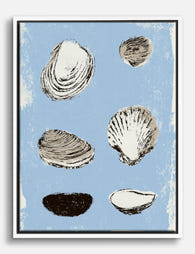
Affiche coquillages sur fond bleu
Translation missing: fr.products.product.sale_price À partir de €19,95€33,25 -

Affiche étude de coquillage côtier
Translation missing: fr.products.product.sale_price À partir de €19,95€33,25 -

Affiche vagues apaisantes du bord de mer
Translation missing: fr.products.product.sale_price À partir de €19,95€33,25 -

Toile vagues marines apaisantes
Translation missing: fr.products.product.sale_price À partir de €64,95€92,95 -

Toile coquillage abstrait en spirale esprit bord de mer
Translation missing: fr.products.product.sale_price À partir de €64,95€92,95 -

Toile vagues côtières apaisantes
Translation missing: fr.products.product.sale_price À partir de €64,95€92,95 -

Affiche coquillage bord de mer
Translation missing: fr.products.product.sale_price À partir de €19,95€33,25 -

Toile rêve de bord de mer
Translation missing: fr.products.product.sale_price À partir de €64,95€92,95 -
Toile étude de coquillages marins
Translation missing: fr.products.product.sale_price À partir de €64,95€92,95 -

Toile vagues côtières apaisantes
Translation missing: fr.products.product.sale_price À partir de €64,95€92,95 -

Affiche vagues côtières au clair de lune
Translation missing: fr.products.product.sale_price À partir de €19,95€33,25 -

Toile fenêtre sur la mer
Translation missing: fr.products.product.sale_price À partir de €64,95€92,95 -

Affiche ruelle du littoral méditerranéen
Translation missing: fr.products.product.sale_price À partir de €16,95€23,95 -

Affiche coquillages sur fond bleu
Translation missing: fr.products.product.sale_price À partir de €19,95€33,25 -

Affiche paysage côtier apaisant
Translation missing: fr.products.product.sale_price À partir de €19,95€33,25 -

Affiche village en bord de mer coloré
Translation missing: fr.products.product.sale_price À partir de €19,95€33,25


Plus de The Frame

Best Dog Wall Art for Every Room (Not Just the ...
Dog art has an image problem. For decades it's been treated as something you tolerate in a downstairs loo or tuck behind a coat rack, as if loving your dog...

Small Bathroom Gallery Wall Ideas: How to Make ...
Small bathrooms are the most overlooked walls in your home. They're also the easiest to get right, because the constraints make most of the decisions for you. This guide gives...

Photography or Painting? How to Pick the Right ...
Most advice on this question stops at "it's personal preference." That's a cop-out. The choice between a photographic landscape and a painted one is driven by architecture, colour temperature, and...