
 Commandez aujourd'hui, livré le
 Living Room Art Trends Worth Paying Attention To (And Ones to Skip)
An honest look at what's actually shaping living room walls in 2026, and what you should leave on the trend rail.


Living room art has changed more in the last two years than in the previous ten. The gallery wall is fading, single oversized pieces are taking over, and the warm, textured palette of 2026 is rewriting what feels current. Here's what's worth your money, and what to skip.
The shift from gallery walls to single bold statements
The salon-style gallery wall had a long run. Twelve mismatched frames, a leaning ladder, a small cactus print to fill the gap. It defined living room walls from roughly 2018 to 2023, and it's now the clearest sign that a space hasn't been updated in a while.
The shift is towards one large piece doing the heavy lifting. Designers specifying art for 2026 projects are consistently choosing single statement works at scale, often 80x120cm or larger. The reasoning is simple: a busy gallery wall competes with everything else in a room. A single piece anchors it.
There's a practical advantage too. One large print is easier to live with. You don't have to rebalance the arrangement when you move a lamp, and you don't have to commit to a dozen aesthetic decisions at once. You commit to one.
If your sofa is 220cm wide, you want art that spans roughly two-thirds of it, so 140-150cm across. Above a 180cm sofa, an 80x120cm piece hung in landscape works beautifully. Hang it so the centre sits 145-150cm from the floor (around 57-60 inches), with 15-20cm of breathing room above the sofa back.

Gallery walls aren't dead, exactly. They still work in narrow hallways and stairwell turns. But above the sofa, in the room where you actually spend your evenings, the pendulum has swung and it isn't swinging back soon.
Warm abstracts and organic shapes: why they're everywhere right now
Walk through any well-designed living room shoot from the last six months and you'll see a pattern. Warm-toned abstracts. Loose, hand-drawn shapes. Caramel, sand, terracotta, ochre, oatmeal, sage. The cool-grey minimalism of 2019 has been replaced with something that feels considerably more human.
This isn't a passing colour story. It's connected to a much broader shift in interiors away from builder-beige and grey-everything towards what designers are calling warm neutrals, those slightly off-white, dusty, slightly-clay tones that read as soft rather than sterile. Art is the fastest way to bring this palette into a room.
The shapes matter as much as the colours. The trend is for irregular, organic forms. Soft curves. Asymmetric brushwork. Things that look made by a person, not generated by software. This connects to the larger anti-disposable movement happening across furniture and homeware, where handmade and slightly imperfect is winning over machine-precise.
Texture is doing a lot of work here too. Flat, glossy prints suddenly feel dated next to art that has visible brush marks, paper grain, or layered surfaces. Our abstract art prints lean into this, printed on thick matte paper that holds texture and depth rather than reflecting it away with gloss. If you're choosing one trend from this article to actually invest in, it's this one. Warm organic abstracts will age well because they're rooted in a much larger return to natural materials and handcraft, not just a colour fad.
A few palette specifics, because "warm" is too vague to shop with. Look for caramels with a hint of red rather than yellow (yellow-caramel reads dated). Sage greens that lean grey rather than mint. Terracotta that's dusty rather than orange. Oatmeal rather than pure cream. These are the tones that will still feel right in 2029.
Vintage and botanical prints: nostalgia done right
Botanical prints had a rough patch. The 2018-2020 wave gave us tropical leaves in cheap black frames in every rental flat in Europe. For a while, the whole category felt overcooked.
It's come back, but the new version looks almost nothing like the old one. The current botanical trend is rooted in proper antique illustration: Redouté roses, vintage mushroom studies, Victorian seaweed prints, hand-coloured ferns. These pieces have historical weight, fine detail, and a slightly faded quality that reads as collected rather than purchased.

The difference between dated botanical and current botanical comes down to specificity. Generic "tropical leaf in monstera silhouette" looks like 2019. A single, carefully observed botanical study, ideally with the original Latin name visible somewhere on the print, looks like something you found at an estate sale.
If you want this look, single specimens beat busy compositions. One large pressed-fern print at 70x100cm above a sideboard does more work than four medium prints clustered together. Pair them with warm wood and brass rather than the matte black frames they used to come in. Our botanical art prints collection focuses on this contemporary take, with proper archival paper that doesn't yellow.
The same principle applies to vintage more broadly. Old travel posters, antique maps, mid-century exhibition posters and reproductions of historical artworks are all having a moment. The unifying factor: they look like they have a story. Mass-produced "vintage style" prints with artificial distress filters do not.
Modern minimalist living room art: less really is more
Minimalism in living room art has matured. The early-2020s version was line drawings of faces, single black squiggles, and abstract figures that all started to look identical. The 2026 version is more interesting, and more confident.
Modern minimalist art now tends towards larger scale (a single shape filling most of the canvas), warmer palettes (no more stark black on white), and more intentional composition. Think Helen Frankenthaler-influenced colour fields. A single arch in burnt sienna. A horizon line in two earth tones. Quietly architectural rather than aggressively bare.
This works particularly well in living rooms with a lot of going on already, busy textiles, lots of plants, full bookshelves. A minimalist piece gives the eye somewhere to rest. It's also remarkably forgiving across different decorating styles. You can put a minimalist colour-field print in a Scandi flat, a Victorian terrace, or a converted warehouse and it reads correctly in all three.
A note on placement, because minimalist art is often the most poorly hung. The temptation with a single small piece is to centre it on the wall, which usually means it floats awkwardly above the furniture. Don't. Anchor it to the furniture below: centre it on the sofa or sideboard, regardless of where that puts it on the wall. The room reads as composed rather than gappy.
Our modern art prints edit is worth a look if this is your direction. The trick with minimalism is making sure the materials carry the weight, because there's nothing for poor printing to hide behind. Thick matte paper, deep ink saturation, and a frame with actual presence make the difference between minimalist and just empty.
Trends we'd skip (and why they won't last)
Now for the honest part. Some of what's being heavily marketed right now is going to look extremely 2024 by the end of next year. A few specific things we'd avoid.
Inspirational typography prints. "Good vibes only", "But first, coffee", and their endless variations. These have never aged well and the current version isn't going to break the trend. They look immediately dated and they tell visitors very little about your taste except that you bought something quickly.
Generic AI-generated abstract art. This category is exploding because it's cheap to produce, and you can spot it within a second. The colours are too clean, the compositions are too symmetrical, and there's a strange hollow quality where the brushwork should be. Hand-made or properly photographed art has imperfections, variation, and depth. AI prints look like screensavers. They will be the macramé wall hangings of 2027.

Mass-produced "boho" line art faces. The continuous-line drawings of women's profiles, often with a single leaf or flower coming out of the head. They were everywhere in 2021 and they're now the visual shorthand for "I furnished my flat from one Instagram ad."
Oversaturated travel photography. That specific style of HDR-heavy landscape shot, hyper-blue sky, glowing waterfall, impossibly green trees. It reads as stock photography rather than art.
Aggressive gallery walls of mismatched thrift finds. As mentioned above, this look has fully tipped from charming to dated. If you love the maximalist energy, channel it into one large, busy piece rather than fifteen small ones.
The unifying problem with all of these is that they were made to be bought quickly. They're optimised for thumbnail appeal, not for living with. Anything optimised for the scroll tends to look tired once it's actually on your wall.
How to buy art that outlasts the trend cycle
If you only take one thing from this article, take this: trend-proof art isn't trend-free art. It's art chosen for reasons that will still apply in five years.
Buy for the room, not the wishlist. Stand in your living room. Note the dominant colour temperature, the scale of your largest piece of furniture, the natural light direction. Choose art that responds to those specific things. Art bought in the abstract, "I love this print, I'll find somewhere for it", rarely settles properly into a home.
Invest in size before quantity. One properly sized 80x120cm piece will do more for your living room than four 30x40cm prints. The rule of thumb most designers use: art should span roughly two-thirds of the furniture below it. Smaller and it floats, larger and it overwhelms.
Choose materials that age well. This is where fast art and lasting art diverge sharply. Cheap prints fade, warp, and yellow within a couple of years, especially in rooms with direct sunlight. Look for archival paper, proper giclée printing, and UV-protective glazing if the piece is framed. Acrylic glazing is lighter than glass, doesn't shatter, and protects against fading. Solid wood frames hold their shape; MDF and veneer frames don't.
Check how the print and frame ship. The biggest disappointment in this category is opening a box to find a beautifully chosen print bent at the corners or a frame separated from the artwork. The pieces we make ship fully assembled, with print fitted into frame, ready to hang straight from the box. It sounds basic but it solves the single most common complaint with framed art.
Trust pieces that have a point of view. Generic decor art is forgettable by design. Art with a clear perspective, whether that's a specific botanical study, an abstract by a named artist, or a vintage print with provenance, tends to stay interesting because there's actually something to look at. You'll notice new details a year in.

Frame choice matters more than people think. Thick, slightly chunky frames in natural oak or warm walnut are having a strong moment and pair beautifully with both vintage and contemporary art. Thin black metal frames, the default of the last decade, are starting to read as cold. If you're investing in a single statement piece, the frame is part of the artwork, not a wrapper for it.
If you want a starting point, our living room art prints edit is curated specifically for the scale and tone of living spaces.
The most useful question to ask before buying anything: would this piece still make sense in this room if I rearranged the furniture? If yes, it's probably trend-proof. If the answer depends on the exact current setup, it's probably trend-bait.
Buy fewer things, buy them larger, and buy them for reasons you can articulate. Trends will keep moving. A piece chosen with intention won't notice.

Produits Fab présentés dans cet article
-

Affiche moderne colorée pour salon
Translation missing: fr.products.product.sale_price À partir de €19,95€33,25 -

Affiche salon moderne et coloré
Translation missing: fr.products.product.sale_price À partir de €19,95€33,25 -

Affiche salon vert chaleureux
Translation missing: fr.products.product.sale_price À partir de €19,95€33,25 -

Affiche salon pop aux couleurs vives
Translation missing: fr.products.product.sale_price À partir de €19,95€33,25 -

Toile ambiance lounge chic
Translation missing: fr.products.product.sale_price À partir de €64,95€92,95 -

Affiche abstraite formes douces esprit moderne
Translation missing: fr.products.product.sale_price À partir de €16,95€23,95 -

Affiche nuances de terracotta chaleureuses
Translation missing: fr.products.product.sale_price À partir de €19,95€33,25 -

Affiche oasis de luxe moderne au bord de la piscine
Translation missing: fr.products.product.sale_price À partir de €19,95€33,25 -

Affiche intérieur moderne baigné de soleil
Translation missing: fr.products.product.sale_price À partir de €19,95€33,25 -

Affiche portrait moderne et joyeux
Translation missing: fr.products.product.sale_price À partir de €16,95€23,95 -

Affiche oasis moderne
Translation missing: fr.products.product.sale_price À partir de €19,95€33,25 -
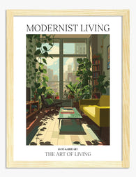
Affiche oasis urbaine verdoyante
Translation missing: fr.products.product.sale_price À partir de €19,95€33,25 -

Affiche portrait bleu audacieux
Translation missing: fr.products.product.sale_price À partir de €16,95€23,95 -

Affiche fleur minimaliste dans un vase moderne
Translation missing: fr.products.product.sale_price À partir de €16,95€23,95 -

Affiche intérieur moderniste aux couleurs pop
Translation missing: fr.products.product.sale_price À partir de €19,95€33,25 -

Affiche nature morte botanique moderne
Translation missing: fr.products.product.sale_price À partir de €16,95€23,95 -

Toile intérieur moderne baigné de soleil
Translation missing: fr.products.product.sale_price À partir de €64,95€92,95 -

Affiche équilibre bohème moderne
Translation missing: fr.products.product.sale_price À partir de €19,95€33,25 -

Affiche salon chaleureux avec bibliothèque et canapé jaune
Translation missing: fr.products.product.sale_price À partir de €19,95€33,25


Plus de The Frame

William Morris Bird Prints: Which Ones to Choos...
If you've started searching for Morris birds, you've probably already hit the wall: there are at least five distinct designs, they look nothing like each other, and most shops sell...

The Best William Morris Prints for Your Bedroom...
Morris designs have a reputation for being busy, which makes a lot of people nervous about putting them in a bedroom. That nervousness is fair, because some of his patterns...

Strawberry Thief, Acanthus, and Beyond: The Wil...
If you've ever searched for William Morris prints, you've met Strawberry Thief within about ten seconds. It's the pattern everyone knows, the one museums put on tote bags, the one...