Whimsical vs Traditional Landscape Art: What's the Difference and How to Mix Them
A practical guide to two very different ways of painting the natural world, and how to make them live together on your walls.

Landscape art splits cleanly into two camps once you start looking properly: the kind that tries to show you the world as it is, and the kind that bends the world into something more interesting. Both belong on your walls. The trick is knowing what each one does to a room, and how to make them work together when you want a bit of both.
Defining the two styles: what actually makes a landscape 'whimsical'
Traditional landscape art aims for fidelity. Think Constable's cloud studies, Turner's atmospheric seas, the Hudson River School's reverent American vistas. The goal is to capture a real place at a real moment, with accurate light, scale, perspective, and colour. Even when traditional landscapes lean dramatic or romantic, they obey the rules of the visible world.
Whimsical landscape art does the opposite. It treats the natural world as a starting point and then takes liberties: hills become rolling pastel waves, trees grow in impossible colours, houses tilt at angles that gravity wouldn't allow. So when people ask what is whimsical landscape art, the short answer is a landscape that prioritises feeling and imagination over realism.
The confusion happens because "whimsical" gets used loosely. It overlaps with folk art (those colourful village scenes with naive perspective), with fantasy landscape art prints (dragons, floating islands, dreamlike skies), and with contemporary illustration. What unites them all is a refusal to take realism seriously.

Key elements of whimsical art: colour, light, and bending reality
If you're trying to spot whimsical work in the wild, four things tend to give it away.
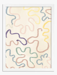
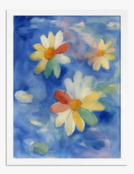
Colour that ignores nature. Pink mountains. Lavender fields under a turquoise sky. Whimsical landscapes use colour for emotional effect, not accuracy. Colourful whimsical landscape art often skews toward saturated, candy-bright palettes, though some artists work in soft pastels or moody jewel tones.
Exaggerated or simplified shapes. Trees become lollipops. Hills become symmetrical curves. Clouds get personality. The brushwork is often deliberately flat or graphic rather than blended and atmospheric.
Playful perspective. A whimsical landscape might show a village from three angles at once, or shrink a mountain so a fox in the foreground feels enormous. Traditional rules of vanishing points and proportion get cheerfully ignored.
Emotional warmth. There's almost always a sense of joy, curiosity, or quiet magic. Even moody whimsical pieces feel inviting rather than imposing.
Traditional landscapes, by contrast, lean on naturalistic colour (sage, ochre, slate, the muted greens of actual British countryside), atmospheric perspective (things further away get hazier and bluer), and careful composition that draws your eye through the scene the way it would travel through a real view.
The four main types of landscape art and where whimsical fits in
Most landscape art falls into one of four broad categories, and understanding the spectrum helps you mix styles confidently.
Representational
Photorealistic or near-photorealistic. The most "traditional" of the traditional. Calm, formal, often used in offices and grown-up living rooms because it reads as sophisticated and serious.
Impressionist
Looser brushwork, focus on light and mood over detail. Still based on real places but with the artist's hand visible. This is your bridge category. Impressionist landscapes mix beautifully with both traditional and whimsical work because they share realism's subject matter and whimsy's expressiveness.
Abstract
Landscape stripped down to colour blocks, gestural marks, or pure shape. Often reads as contemporary and minimalist. Works as a transitional piece in either direction.
Whimsical and folk
Imaginative, stylised, often narrative. Sub-categories include folk landscape (those naive village scenes with crooked houses), fantasy landscape (mythical, dreamlike, sometimes magical), and contemporary illustrative landscape (graphic, modern, often kid-friendly without being childish).
You can browse the full range across our landscape art prints collection if you want to see how these categories play out side by side.
How each style changes the feeling of a room
This is the part most guides skip. The style of landscape you choose changes the emotional temperature of a room far more than its colour palette does.
Traditional landscapes feel calm, considered, and timeless. They're the visual equivalent of a deep armchair. They suit rooms where you want gravitas: a study, a formal dining room, a bedroom that feels like a hotel suite. They also age well, which matters if you're investing in larger pieces.
Whimsical landscapes feel joyful, energetic, and personal. They make a room feel lived-in and a bit eccentric. They suit kitchens, kids' rooms, hallways, snug reading corners, and anywhere you want to inject warmth without resorting to cushions and throws. They also tend to start conversations.
The trade-off is straightforward. Go all-traditional and your home reads as sophisticated but can tip into stuffy. Go all-whimsical and your home reads as fun but can tip into chaotic. Most well-decorated homes mix the two, weighted toward whichever style suits the owner's personality.

Mixing whimsical and traditional: frame matching and spacing tips
Mixing styles works. Mixing styles badly looks like a charity shop window. The difference comes down to a few principles.
Match the frames, not the art
The single most useful rule for mixing landscape styles on one wall: keep frames consistent. If your whimsical print sits in a natural oak frame and your traditional print sits in the same natural oak frame, your eye reads them as a set even though the art is wildly different.
Black frames work for both styles and create the most dramatic contrast. Natural wood frames soften the difference and feel more collected. White frames lean modern and let the art do the talking. Pick one frame finish for a gallery wall and stick with it.
Use a consistent margin
Frame to frame, aim for spacing of around 5 to 8cm. Closer than that and the wall feels cramped. Wider and the pieces stop reading as a group. The same applies whether your art is whimsical, traditional, or mixed.
Anchor with a larger piece
A gallery wall mixing styles needs an anchor. Pick one piece, ideally 60x80cm or larger, and build around it. The anchor can be either style. If your anchor is traditional, surround it with whimsical pieces and the whole arrangement reads as "traditional home with personality." Reverse it and you get "playful home with depth."
Repeat one element across pieces
Even when subject matter differs, repeating a colour, a shape, or a tonal range across whimsical and traditional pieces makes them speak to each other. A traditional moorland scene with purple heather and a whimsical print with lavender hills will live happily together because the colour conversation is already happening.
Size ratios for mixed gallery walls
A reliable formula for a six-piece mixed gallery wall: one large anchor (60x80cm or 70x100cm), two medium pieces (40x50cm or 50x70cm), and three smaller pieces (30x40cm). Mix the styles across the sizes, not within them. So your anchor might be traditional, two of your mediums whimsical, one medium traditional, and so on. This stops the eye from sorting the wall into "the whimsical bit" and "the traditional bit."
For pre-coordinated arrangements that take the guesswork out, our wall art sets are designed to work as a group from the start.
When to go all-whimsical vs when to blend
Sometimes mixing isn't the answer. Some rooms benefit from going fully in one direction.
Go all-whimsical when: the room is for a child or shared family space, your overall decor is eclectic or maximalist, you have a small space (a hallway, downstairs loo, reading nook) that benefits from a strong personality, or you want a single room to feel like an escape from the rest of the house.
A bathroom done entirely in colourful whimsical landscape art prints, for instance, feels like stepping into a different world for ten minutes a day. That's worth doing.
Go all-traditional when: the room is formal (dining, study, primary bedroom in a period property), your architecture is doing the heavy lifting (high ceilings, original fireplaces, panelling), or you're decorating for longevity and don't want to refresh the art every few years.
Blend when: you have a large open-plan space that needs visual variety, you're decorating a hallway or staircase that connects different rooms with different moods, or you want your home to feel collected rather than themed. Blending is also the right answer for most living rooms in modern homes, where the architecture is neutral and the art is doing most of the personality work.
The continuum matters here. You don't have to jump from a Constable reproduction to a candy-coloured fantasy print. Impressionist landscapes, contemporary semi-realist work, and muted folk art all sit comfortably in the middle and act as bridges. If you're nervous about mixing, start there. Browse nature art prints for pieces that span the spectrum.

Our favourite pairings from the Fab collection
A few combinations we keep coming back to.
The countryside contrast
A traditional misty moorland or coastal scene paired with a whimsical illustrated forest. The realism of the first piece grounds the room. The stylised second piece adds warmth. Hang them on adjacent walls rather than side by side so each gets to breathe. Both look exceptional printed on thick matte paper, where the lack of glare lets the muted colours of the traditional piece and the saturated colours of the whimsical piece both read true.
The folk and fine pairing
A naive folk landscape (think rolling hills, tiny houses, patchwork fields) hung above a sideboard, with a more traditional botanical or pastoral piece nearby. Match the frames in natural oak and the whole arrangement feels like something you'd find in a country house that's been collected over decades, not bought in a weekend.
The fantasy and atmospheric
A dreamlike fantasy landscape art print (floating islands, impossible skies, magical light) paired with a moody atmospheric traditional piece. This works particularly well in bedrooms and reading corners. The fantasy piece provides the escapism, the traditional piece provides the depth. Both styles benefit from being printed at scale, so go larger than you think, ideally 70x100cm or up to canvas at 100x150cm if the wall allows.
The gallery wall mix
Six pieces, all in matching black frames, mixing one traditional anchor, two impressionist transitional pieces, two whimsical illustrated landscapes, and one abstract landscape. Hung in a loose grid above a sofa or sideboard. This is the most flexible arrangement and the one most homes benefit from. It reads as collected, considered, and personal without committing the room to a single mood.
For pieces specifically chosen to work across both styles, our whimsical landscape art prints collection sits comfortably alongside more traditional work thanks to consistent framing options.

A few practical things worth knowing
Frames matter more than people think. A whimsical print in a cheap frame looks like a kid's poster. The same print in a solid wood frame with proper fixtures looks like art. Whichever style you go for, pay attention to what's holding it on the wall.
Print quality matters too, particularly for traditional landscapes where subtle tonal shifts in skies and foliage carry the piece. Giclée printing on thick matte paper preserves those gradations in a way cheaper printing methods don't. Whimsical work is more forgiving of print quality because the colours are bolder, but the paper texture still affects how the piece feels in the room.
If you're hanging in a kitchen, bathroom, or anywhere with humidity and temperature swings, canvas tends to handle the conditions better than framed paper. Canvas also reads as slightly more casual, which can suit whimsical work particularly well.
The takeaway
Pick the style that matches how you want a room to feel, not the style you think you're supposed to like. If you can't choose, mix them with matched frames and consistent spacing. Anchor with one larger piece, repeat a colour or tone across the others, and don't be precious about it. The best-looking homes always look like someone made decisions, not like someone followed rules.

Produits Fab présentés dans cet article
-

Affiche scène féerique en forêt
Prix promotionnel À partir de €19,95€33,25 -
Affiche fantaisie pastel
Prix promotionnel À partir de €19,95€33,25 -

Affiche balade poétique à flanc de colline
Prix promotionnel À partir de €19,95€33,25 -

Affiche paysage de forêt et de collines, verts terreux et ocres chauds
Prix promotionnel À partir de €19,95€33,25 -

Affiche botanique pastel
Prix promotionnel À partir de €19,95€33,25 -

Toile balade sur des collines stylisées
Prix promotionnel À partir de €65,95€93,95 -

Toile abstraite aux tons verts et pastels doux
Prix promotionnel À partir de €65,95€93,95 -

Affiche jardin fleuri au clair de lune
Prix promotionnel À partir de €19,95€33,25 -

Toile fantôme dans une prairie de fleurs sauvages
Prix promotionnel À partir de €65,95€93,95 -

Affiche lignes fluides noir et blanc
Prix promotionnel À partir de €19,95€33,25 -

Affiche fantôme dans prairie fleurie vintage
Prix promotionnel À partir de €19,95€33,25 -

Affiche balade poétique en forêt
Prix promotionnel À partir de €19,95€33,25 -

Toile fantôme espiègle dans une prairie fleurie
Prix promotionnel À partir de €65,95€93,95 -

Affiche élégance fantaisiste de Cezanne
Prix promotionnel À partir de €19,95€33,25 -
Affiche marguerites à l'aquarelle poétiques
Prix promotionnel À partir de €19,95€33,25 -

Affiche paysage de prairie aux fleurs sauvages
Prix promotionnel À partir de €19,95€33,25 -

Toile balade fantaisiste en forêt
Prix promotionnel À partir de €65,95€93,95 -

Affiche botanique verte abstraite
Prix promotionnel À partir de €19,95€33,25 -

Affiche jardin enchanté
Prix promotionnel À partir de €19,95€33,25 -

Toile fantaisie botanique
Prix promotionnel À partir de €65,95€93,95


Plus de The Frame

Vintage Rose Prints: From Botanical Illustratio...
Vintage rose prints are having a proper moment. Not the dusty, chintzy kind your nan had over the settee, but the considered, well-framed kind that anchor a modern room and...

Why Rose Print Decor Works Better Without the C...
Why Roses Are the One Floral That Never Truly Goes Out of Style Roses have been painted, printed and photographed for centuries, and they still turn up in the work...

Beyond the Fruit Bowl: Kitchen Wall Art Ideas T...
The kitchen is the most photographed, most lived-in room in your home, and yet it's usually decorated like an afterthought. A print of lemons here, a chalkboard-style coffee poster there,...