How to Build a Beach-Themed Gallery Wall That Looks Intentional, Not Random
The exact spacing, sizing and colour rules to turn your two beach prints into a wall that looks curated, not cluttered.

You own two beach prints. You want a gallery wall. The gap between those two facts is where most people get stuck, hammer in too many nails, and end up with something that looks like a holiday scrapbook exploded. This guide gives you the layout templates, spacing measurements and aesthetic rules to build out properly from what you already own.
Why gallery walls work so well with beach and ocean subjects
Coastal imagery has a built-in advantage: the colour palette is already coherent. Sand, sea, sky and foam repeat across almost every beach photograph, painted seascape and abstract wave study you'll ever find. That shared palette of blues, sandy beiges, foam whites and the occasional warm sunset coral means even wildly different pieces tend to play nicely together.
The other reason it works is scale variety. Beach subjects range from sweeping wide horizons to tight macro shots of shells, ripples and rope. That natural variation in zoom level gives you the visual rhythm a gallery wall needs without you having to manufacture it.

The golden rule: unify by colour, not by subject
Here's where most beach themed wall art ideas fall apart. People assume the way to make a coastal gallery wall feel cohesive is to pick prints with the same subject. Five beach huts. Six surfboards. Endless lighthouses. The result looks like a gift shop.
The better approach is to unify by colour and let the subjects vary. A blue-toned ocean photograph, a navy and white abstract seascape, and a warm beige beach landscape with a pale sky will read as a set even though one is photography, one is abstract, and one is figurative. They share a palette. That's enough.
Pick two or three colours that already appear in the prints you own and use those as your filter for everything you add. If your existing pair leans blue and sandy beige, your next print needs to live in that family. A bright tropical palm print in saturated turquoise will fight everything around it, however lovely it looks on its own.
What if your two existing prints don't match at all?
If your starting pair already clashes, you have three options. First, demote one of them to another room and rebuild around the stronger piece. Second, find a third print that bridges them, something containing colours from both. Third, unify them through identical framing in a neutral tone, which can paper over a surprising amount of palette disagreement.
Layout templates that work for 3, 5, and 7 prints
You don't need to invent a layout. These three templates cover almost every gallery wall you'll ever want to build.
Three prints: the horizontal row
Three prints of equal size in a single horizontal row, hung above a sofa, console or bed. Use 30x40cm or 50x70cm depending on the wall. Space them 5cm apart. The row should be roughly two-thirds the width of the furniture below it.
This is the easiest possible gallery wall and looks intentional immediately. A coastal wall art set of 2 plus one more piece in the same family gets you here without any guesswork.
Five prints: the anchor and satellites
One large anchor print (50x70cm or 60x80cm) with four smaller prints (30x40cm) arranged around it. The classic version puts the anchor on the left and stacks two pairs of smaller prints in a 2x2 grid to the right. The whole arrangement should read as a rectangle.
Keep 5cm spacing between every frame. The outer edges of the 2x2 grid should align with the top and bottom of the anchor print.
Seven prints: the salon hang
A salon hang is asymmetrical but contained. You build it inside an imaginary rectangle, usually with one large piece (60x80cm) as the visual centre of gravity, two medium pieces (40x50cm), and four smaller pieces (21x30cm or 30x40cm) filling in around them.
The trick: the outer edges of the whole arrangement should form a clean rectangle, even if the internal layout is irregular. Spacing stays at 5cm throughout. Mix vertical and horizontal orientations, but balance them, if you have a horizontal piece on the upper left, put another on the lower right.

Mixing styles: pairing beach photography with painted seascapes
This is where coastal gallery walls become genuinely interesting. A wall of seven photographs looks like a calendar. A wall of seven paintings looks like a hotel lobby. The mix is the point.
The pairing that almost always works: high-contrast black and white beach photography alongside softer painted or illustrated seascapes. The photography brings sharpness and graphic structure. The paintings bring atmosphere and texture. Together they feel curated rather than themed.
When you mix media, lean harder on colour discipline. If you're introducing an abstract piece, pull it from the same palette as your photography. A moody abstract art print in deep blues and sea greens will sit beautifully next to a black and white shoreline shot, because the abstract piece reads as an atmospheric extension of the photograph rather than a competing subject.
A useful ratio for a five-print wall: roughly 60% photography or figurative work, 40% abstract or illustrated. Tip too far either way and the wall loses tension.
Mixing orientation
Vertical and horizontal prints in the same gallery wall is good. Random vertical and horizontal prints in the same gallery wall is bad. The rule is balance: if you place a horizontal print in one quadrant, place another horizontal in the opposite quadrant. The same goes for vertical pieces. Your eye should travel around the wall evenly, not get stuck in one corner.
Frame consistency vs. eclectic framing
For coastal themes specifically, we think frame consistency wins almost every time. The subject matter already has natural variety baked in (different blues, different scenes, different styles). Adding frame variety on top tips the wall from "collected" to "chaotic."
The three frame finishes that work best for coastal art:
- Natural oak or light wood. The most flattering for beach palettes. Picks up the sand and warm tones. Slightly relaxed, slightly Scandinavian.
- White. Clean, gallery-style, makes blues pop. Best for bright rooms and minimalist interiors.
- Black. Sharper and more graphic. Excellent if your gallery wall leans heavily on photography or has a lot of darker, moodier ocean shots.
Pick one and use it across every piece. Mixing white and natural wood occasionally works. Mixing all three rarely does.
Eclectic framing (different finishes, widths, even gold and brass mixed in) can work for coastal walls but only when the prints themselves are visually quiet, mostly muted tones, similar compositions. The moment your subjects start varying, eclectic frames push the whole thing into yard sale territory.
A quick word on frame quality. The fastest way to make a gallery wall look cheap is shipping issues: warped mounts, prints that bubble inside the frame, fixtures that arrive separately and have to be fiddled with. If you're framing through us, the frame and print arrive together in one box, properly fitted, with hanging fixtures already attached. The frames themselves are solid FSC wood, not MDF or veneer, which matters because veneer frames warp visibly within a year or two on most walls.
Sizing and spacing: the numbers that actually matter
Vague advice ruins gallery walls. Here are the actual measurements.
Centre line: 145cm from the floor. This is the standard gallery hanging height, calibrated to average eye level for a standing adult. The centre point of your entire arrangement (not the centre of any individual print) sits at 145cm.
Above furniture: 15-25cm gap. Measure from the top of the sofa, console or headboard to the bottom edge of your lowest frame. Closer than 15cm looks cramped. More than 25cm and the art floats untethered from the furniture.
Between frames: 5cm. This is the single most important number in this article. Five centimetres of breathing room between every frame, every time. Tighter spacing (2-3cm) can work for very small grids of identical prints, but for any mixed gallery wall, 5cm is the sweet spot. Inconsistent spacing is what makes a wall look "random" more than any other single factor.
Total wall coverage: 60-75% of the furniture width. A gallery wall above a 200cm sofa should span roughly 120-150cm wide. Narrower and the wall looks underdressed. Wider and it overwhelms the furniture.
Room-specific adjustments
Above a sofa, the centre line drops slightly to about 140cm because you want the arrangement weighted toward the seated eye line. In a bedroom above the bed, you can go a touch lower still, around 135cm, since most of the time you're viewing it from a lower angle. In bathrooms or hallways where there's no seating, stick to 145cm.

How to plan it on the floor before committing to the wall
Do not skip this step. Hammering test holes into a wall to find a layout is how you end up with eleven nails for a five-print arrangement.
Step 1. Clear a section of floor roughly the size of your eventual wall space. Lay the prints out in your intended layout with the actual 5cm spacing.
Step 2. Stand on a chair and look down at the arrangement. You'll immediately see imbalances that aren't visible at floor level. A vertical clustered too far left, a colour weighted too heavily on one side. Adjust until your eye travels evenly across the whole rectangle.
Step 3. Photograph it from directly above with your phone. Hold the phone parallel to the floor, frame the entire arrangement, and shoot. Then look at the photo. Photographs flatten composition the way your eye does on the wall, so problems jump out immediately.
Step 4. Once you're happy, cut paper templates the exact size of each frame (newspaper or brown paper works fine). Tape them to the wall using low-tack masking tape, replicating the layout. Live with it for a day. Walk past it. See it from across the room.
Step 5. Mark the hanging hook position on each paper template, hammer through the paper, then tear the template away. Your nails are placed perfectly.
This whole process takes an hour. Skipping it costs you a weekend of patching holes.
Our recommended beach print combinations to get you started
If you're building out from two existing prints, these are the combinations we'd actually recommend, working from the most common starting points.
If you own two blue-toned ocean photographs: Add a soft abstract seascape in the same blues, then a quieter sandy beach landscape with a pale sky. The abstract bridges the literal photography with the looser landscape and gives the wall texture variety. Browse ocean art prints for the abstract piece.
If you own a beach landscape and a black and white shoreline shot: You're already mixing well. Add a third high-contrast black and white piece (rocks, a single figure on sand, a pier) to anchor the photography side, then a muted abstract in soft blues to balance the landscape side. That gets you to a strong four-print arrangement.
If you own two figurative beach scenes (huts, deckchairs, swimmers): This is the hardest starting point because figurative beach work tips toward kitsch quickly. Pull the wall back toward sophistication with two abstract pieces in matching tones. The abstracts dilute the literal beachiness and let the figurative pieces feel like character rather than cliché. Look at beach scene art prints for considered figurative options that won't push you over the edge.
If you want unique coastal wall art rather than the obvious choices: Look for macro shots (rope detail, shell texture, foam patterns), unusual angles (overhead drone shots, underwater perspectives), or atmospheric work that suggests the coast without showing it directly (a single sail on the horizon, an empty deckchair, light on water).

Common mistakes that make gallery walls look random
Four things, in order of frequency:
Inconsistent spacing. 5cm here, 8cm there, 3cm in another spot. The eye reads this instantly even if you can't articulate why the wall looks off.
No colour thread. Six prints with no shared palette. Even if every individual piece is beautiful, the wall has nothing holding it together.
Frames fighting each other. Three different woods, two different widths, a black frame thrown in for contrast. Pick one finish.
Pieces too small for the wall. A gallery of 21x30cm prints on a large living room wall looks like postage stamps. Scale up your anchor piece, or add more prints, or both.
A final note on building slowly
You don't need to finish the wall this weekend. Some of the best gallery walls are built over a year, with prints added as you find them. Hang your existing two using the centre line and spacing rules above, leave the surrounding wall empty, and add as you go. A half-built gallery wall planned properly looks better than a finished one thrown together.
Get the spacing right, pick one frame finish, unify by colour, and trust that variety in subject and style is a feature, not a problem to solve.

Produits Fab présentés dans cet article
-

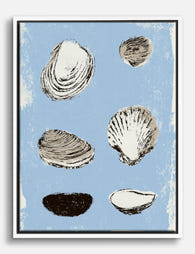
Affiche étude de coquillage côtier
Translation missing: fr.products.product.sale_price À partir de CHF 16.00CHF 22.00 -

Affiche coquillage bord de mer
Translation missing: fr.products.product.sale_price À partir de CHF 16.00CHF 22.00 -

Toile coquillage abstrait en spirale esprit bord de mer
Translation missing: fr.products.product.sale_price À partir de CHF 62.00CHF 88.00 -

Toile collection de coquillages marins
Translation missing: fr.products.product.sale_price À partir de CHF 62.00CHF 88.00 -

Affiche coquillages sur fond bleu
Translation missing: fr.products.product.sale_price À partir de CHF 16.00CHF 22.00 -

Affiche coquillages sur fond bleu
Translation missing: fr.products.product.sale_price À partir de CHF 16.00CHF 22.00 -

Toile vagues de mer avec citation inspirante
Translation missing: fr.products.product.sale_price À partir de CHF 62.00CHF 88.00 -
Toile étude de coquillages marins
Translation missing: fr.products.product.sale_price À partir de CHF 62.00CHF 88.00 -

Toile rangée de planches de surf, esprit bord de mer
Translation missing: fr.products.product.sale_price À partir de CHF 62.00CHF 88.00 -

Affiche vagues apaisantes du bord de mer
Translation missing: fr.products.product.sale_price À partir de CHF 16.00CHF 22.00 -

Toile vagues apaisantes bord de mer
Translation missing: fr.products.product.sale_price À partir de CHF 62.00CHF 88.00 -

Affiche rayures marines et vagues bleues
Translation missing: fr.products.product.sale_price À partir de CHF 16.00CHF 22.00 -
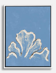
Toile coquillages bleus bord de mer
Translation missing: fr.products.product.sale_price À partir de CHF 62.00CHF 88.00 -

Toile fenêtre sur la mer
Translation missing: fr.products.product.sale_price À partir de CHF 62.00CHF 88.00 -

Toile rêve de bord de mer
Translation missing: fr.products.product.sale_price À partir de CHF 62.00CHF 88.00 -

Affiche swing de golf en bord de mer à rayures
Translation missing: fr.products.product.sale_price À partir de CHF 16.00CHF 22.00 -

Toile vagues marines apaisantes
Translation missing: fr.products.product.sale_price À partir de CHF 62.00CHF 88.00


Plus de The Frame

Thrushes, Hares, and Peacocks: The Animals in W...
Why Morris put animals at the centre of his designs William Morris wasn't decorating walls with cute creatures. He was making a quiet argument. While Victorian factories churned out cheap,...

From Dutch Masters to Modern Minimalism: The Ke...
Search "types of flower bouquet art" and you'll get wedding centrepieces, posy guides, and cascading bridal arrangements. Useful if you're getting married. Useless if you're trying to choose what goes...

Every Flower in William Morris's World: A Guide...
William Morris designed roughly 50 wallpapers and around 30 chintzes across his career, and almost every single one features a plant. If you've ever stood in front of a Morris...