How to Build a Gallery Wall Around Empowering Art Prints
How to expand one or two statement prints into a curated wall arrangement that keeps the message loud and the styling sharp.

You bought one empowering print, maybe two. They mean something to you, and now you want to build a proper gallery wall around them without diluting their impact or ending up with something that reads as a Pinterest quote board. This guide gives you exact templates, spacing measurements, and pairing rules to do it properly.
Start with an anchor: choosing your central empowering print
Every successful gallery wall has a hierarchy. With empowering art, that hierarchy matters more than usual because these prints tend to be visually loud (bold typography, strong colour, declarative messaging), and if you give two pieces equal weight, your eye won't know where to land.
Your anchor is the single print you want people to read first. Choose it on three criteria: which message means the most to you, which print has the strongest visual presence, and which one you want to physically centre the arrangement around. The other prints will support it, not compete with it.
For an anchor, go bigger than feels comfortable. A 50x70cm or 70x100cm print works far better as a focal piece than a 30x40cm. If you're working with one of your existing prints and it's smaller, that's fine, just plan to add a larger anchor and let the smaller piece become a supporting member of the cast.
A few practical tips for choosing well. Avoid an anchor with such busy typography that nothing else can sit near it. Avoid pure quote prints in script fonts as anchors, they tend to look better as accents. Anchors with a clear shape (a portrait, a strong silhouette, a single bold word) hold a wall together more reliably than anchors made of dense text.

The 3-print starter layout
Before you commit to a 7-piece wall, build a 3-print arrangement. It's the easiest layout to get right, it teaches you how your prints relate to each other, and it gives you a base you can grow from later.
The horizontal triptych (best above a sofa or sideboard)
Three prints in a row, all the same size. Use 50x70cm prints, portrait orientation, with 6cm of space between each frame. Total width comes in around 162cm, which sits beautifully above a standard 3-seater sofa (200-220cm wide).
Place your empowering anchor in the centre. Flank it with two complementary prints (more on what to choose below). Hang the centre of the middle print at 145cm from the floor when the wall stands alone, or roughly 20-25cm above the top of your sofa back if you're hanging above furniture.
The asymmetric trio (best for narrow walls or hallway entrances)
One large print (70x100cm) on the left, two smaller prints (40x50cm) stacked vertically on the right. Leave 5cm between the two stacked prints, and 6cm of vertical air between the large print and the stacked pair. The right edges of the smaller stack should align with the right edge of the large print, creating a clean visual rectangle.
Your anchor goes large on the left. The two stacked prints should be calmer pieces, abstract shapes or botanical line work, anything that gives the eye somewhere to rest.
The 57-inch rule, briefly
Galleries hang artwork so the centre of the piece sits at roughly 145cm (57 inches) from the floor, which is average human eye level. For gallery walls, treat the centre of the entire arrangement as the centre point, not any individual print. This is the single most useful rule for getting hanging height right on the first try.
Mixing empowering prints with other subjects
Here's where most gallery walls go wrong. People pair their empowering print with three more empowering prints, the typography stacks up, the messages compete, and the wall starts to feel like a slogan generator. The fix is straightforward: one statement piece, then quieter companions.
The subjects that pair well:
Abstract art. Soft shapes, muted colour fields, or gestural brushwork give the eye a place to rest after reading your bold anchor. Abstract prints work especially well because they introduce visual texture without competing language. Look for pieces that pick up one or two colours from your empowering print.
Botanical line drawings or pressed leaves. Calm, organic, traditionally feminine in a way that compliments rather than undermines a feminist statement. Botanical art prints in monochrome (black ink on cream paper) are particularly versatile because they go with everything.
Black and white photography. Portraits, architectural details, or landscape shots in black and white add depth and a documentary quality. They feel grown up. They keep your gallery wall from reading as decorative only.
Single-word typographic prints in restrained fonts. If you do want more text on the wall, keep it to one or two short words in a clean serif or sans-serif. Pair a long-message anchor with a one-word supporter, never two long messages side by side.
What to avoid: multiple script-font quote prints, anything with conflicting messaging, prints that share your anchor's colour palette so closely that they blend into one shape, and anything cute or twee that undercuts the seriousness of your statement piece.
The principle underneath all of this is what stylists call "rest for the eye." Bold pieces need calm neighbours. If you're shopping more empowering work to expand the collection, browse empowering art prints with this rule in mind: pick one more loud one, maximum, and let everything else support.
Frame colour and material: why consistency is the cheat code
If you take one thing from this guide, take this. Matching frames is the single biggest factor in whether a mixed-subject gallery wall looks curated or chaotic.
When your subjects vary (a bold typographic anchor, a botanical line drawing, an abstract, a black and white photograph), the frames become the connective tissue. Identical frames signal to the eye that these pieces belong together, even when the imagery is wildly different. Mismatched frames do the opposite, they fragment the wall and make every print feel like an orphan.
Pick one frame colour and stick to it across the entire arrangement. Black is the strongest choice for empowering art because it reinforces the seriousness of the message and frames bold typography crisply. Natural oak works beautifully with botanical and softer pairings. White frames can work but tend to disappear against pale walls, which weakens the structure of the gallery.
Material matters too. Solid wood frames hold their shape, sit flush against the wall, and don't warp the way cheaper engineered materials can. UV-protective acrylic glaze (rather than glass) is worth seeking out, it's lighter, it doesn't shatter, and it stops your prints from fading in sunlight. Direct sun is the enemy of bold colour, and an empowering print that fades to pastel within two years has lost most of its punch.

One more thing on framing. If you're commissioning your prints framed, make sure the frame and print ship together, properly fitted in one box. Prints and frames shipped separately almost always result in misalignment, bubbling, or warped mat boards once you try to assemble them yourself. It's the most common failure point in the whole category.
Scaling up to a 5-7 print gallery wall
Once your 3-print starter is working, you can grow it without rebuilding from scratch. The trick is to add prints in pairs or matched units, not one at a time. Single additions tend to look like afterthoughts.
The 5-print rectangle
Take your horizontal triptych and add one print above each of the two flanking pieces. The new prints should be smaller (30x40cm if your trio is 50x70cm), and they should sit with their bottom edges aligned with each other, 5cm above the tops of the prints below. The result is a clean rectangle with your anchor still firmly in the centre.
The 7-print salon
Seven prints arranged loosely around a strong central anchor. This is the most flexible layout but also the easiest to get wrong. Use a mix of sizes: one 70x100cm anchor, two 50x70cm supporters at roughly 10 and 2 o'clock positions, two 40x50cm at 8 and 4 o'clock, and two 30x40cm filling gaps. Keep 5-7cm of consistent spacing between every neighbouring frame.
Lay it out on the floor first. Always. Spend an hour rearranging on the floor before a single nail goes in the wall. Then trace each frame onto kraft paper, tape the templates to the wall, and live with them for a day or two before committing.
A pre-curated wall art set can shortcut a lot of this work, particularly if you want a 3 or 5-piece arrangement where the proportions and palette are designed to sit together from the start.
The cohesion check
Before you commit, stand back six metres and squint. If any single piece jumps out as the wrong size, wrong colour, or wrong tone, pull it. A 6-print wall that hangs together is always better than a 7-print wall with one piece fighting the rest.
Common gallery wall mistakes and how to avoid them
Hanging too high. The single most common error. Gallery centre at 145cm, not "wherever it looks right when I'm standing." Eye level when you're seated on the sofa is what matters in a lounge, not eye level when you're standing.
Inconsistent spacing. Some prints 4cm apart, others 9cm. The eye reads this as carelessness. Pick one spacing (5, 6, or 7cm depending on print size) and apply it everywhere.
Too many statement pieces. Three quote prints, two empowering portraits, and a typographic feminist manifesto all in one arrangement. Pick one anchor. The rest support.
Mixing print qualities. A museum-grade giclée print next to a thin poster from an old gig hits the eye like a spelling mistake. Keep your print quality consistent, ideally matte, ideally on heavy paper. Glossy and matte don't sit well together.
Forgetting the wall colour. Bold empowering prints on a stark white wall can feel clinical. A soft chalky white, warm off-white, or even a deeper colour like sage or terracotta gives the prints something to push against.
Ignoring lighting. Bold typography needs to be readable. A picture light or a directional ceiling spot transforms a gallery wall, particularly in the evening. If your wall is opposite a window, factor in glare. Acrylic glaze helps because it doesn't reflect like traditional glass.

Layouts for specific walls
Above a sofa
Your gallery wall should be roughly two-thirds the width of your sofa, no wider. For a 220cm sofa, aim for 145-165cm of total wall art width. Hang the bottom edge of your lowest print 20-25cm above the sofa back. Closer than 20cm feels cramped, further than 30cm and the art floats free of the furniture below it.
The 3-print horizontal triptych (50x70cm prints, 6cm spacing) is purpose-built for this position. If you want more, build the 5-print rectangle and let it grow upward, not outward.
Along a hallway
Hallways are where you can be more daring. People walk past them, they don't sit and stare, so a denser arrangement with more variety works. Run a horizontal line of prints with their centres aligned at 145cm, spaced 6-8cm apart. Mix orientations (portrait and landscape) but keep frame style identical.
For a long hallway, plan for a "rhythm." A bold empowering anchor every two metres, with calmer pieces filling between them. The eye gets pulled forward by the strong pieces, which makes the hallway feel longer and more considered.
Staircase walls
The hardest wall in any house. The rule: follow the slope of the staircase, not the ceiling. Imagine an invisible diagonal line running parallel to the stair handrail, roughly 145cm above the centre of each step. The middle of each print sits on that line.
Start with your anchor at the visual focal point (usually the largest landing or the middle of the rise). Work outwards in pairs, and let frame size taper smaller as you climb. Spacing stays consistent at 6cm between frames. Resist the temptation to add more pieces just because the wall is big. A staircase looks better with five well-placed prints than fifteen scattered ones.

A final word on building it slowly
The best gallery walls aren't built in an afternoon. They're built over months, as you find pieces that mean something and let them earn their place. Start with your anchor. Add the trio. Live with it. Add two more when you find the right ones. The wall that took you a year to assemble will always look better than the wall you finished in a weekend.

Produits Fab présentés dans cet article
-

Toile cœur audacieux et inspirant
Translation missing: fr.products.product.sale_price À partir de CHF 62.00CHF 88.00 -
Affiche citation girl power
Translation missing: fr.products.product.sale_price À partir de CHF 16.00CHF 22.00 -

Toile typographique inspirante
Translation missing: fr.products.product.sale_price À partir de CHF 62.00CHF 88.00 -

Affiche cœur rouge et affirmation de soi
Translation missing: fr.products.product.sale_price À partir de CHF 16.00CHF 22.00 -

Toile typographie inspirante rose poudré
Translation missing: fr.products.product.sale_price À partir de CHF 62.00CHF 88.00 -

Affiche énergie de femme riche
Translation missing: fr.products.product.sale_price À partir de CHF 16.00CHF 22.00 -
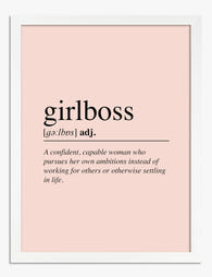
Affiche définition Girlboss
Translation missing: fr.products.product.sale_price À partir de CHF 16.00CHF 22.00 -

Affiche son histoire, ses règles à elle
Translation missing: fr.products.product.sale_price À partir de CHF 16.00CHF 22.00 -

Affiche sois fier de toi
Translation missing: fr.products.product.sale_price À partir de CHF 16.00CHF 22.00 -
Toile citation fille rebelle minimaliste noir et blanc
Translation missing: fr.products.product.sale_price À partir de CHF 62.00CHF 88.00 -

Affiche portrait géométrique de Frida Kahlo
Translation missing: fr.products.product.sale_price À partir de CHF 16.00CHF 22.00 -

Toile aux frontières du style
Translation missing: fr.products.product.sale_price À partir de CHF 62.00CHF 88.00 -

Affiche Frida Kahlo, portrait géométrique
Translation missing: fr.products.product.sale_price À partir de CHF 16.00CHF 22.00 -

Affiche portrait de muse moderne
Translation missing: fr.products.product.sale_price À partir de CHF 16.00CHF 22.00 -

Toile bustes féminins minimalistes
Translation missing: fr.products.product.sale_price À partir de CHF 62.00CHF 88.00 -

Affiche Frida Kahlo portrait géométrique
Translation missing: fr.products.product.sale_price À partir de CHF 16.00CHF 22.00 -

Affiche Frida Kahlo portrait géométrique
Translation missing: fr.products.product.sale_price À partir de CHF 16.00CHF 22.00 -

Toile portrait géométrique de Frida Kahlo
Translation missing: fr.products.product.sale_price À partir de CHF 62.00CHF 88.00 -

Toile Frida Kahlo muse géométrique
Translation missing: fr.products.product.sale_price À partir de CHF 62.00CHF 88.00


Plus de The Frame

From Dutch Masters to Modern Minimalism: The Ke...
Search "types of flower bouquet art" and you'll get wedding centrepieces, posy guides, and cascading bridal arrangements. Useful if you're getting married. Useless if you're trying to choose what goes...

Every Flower in William Morris's World: A Guide...
William Morris designed roughly 50 wallpapers and around 30 chintzes across his career, and almost every single one features a plant. If you've ever stood in front of a Morris...

What Colours Go With Bouquet Prints? Pairings I...
You've found a bouquet print you love. Now you need to know if it will actually work above your sofa, opposite that mustard armchair, next to the curtains you spent...