Gold Cat Art Prints and the Warm, Maximalist Interiors They Were Made For
How a niche art trend tapped into the biggest interiors movement of the moment, and where to put it.

Cold minimalism is over. Warm maximalism, the design world's slow rebellion against beige rooms and beige feelings, has brought back gold, ornament, pattern and personality. Right at the centre of this shift, oddly enough, sits a cat covered in gold leaf.
The warm maximalism trend: why gold and ornamental art are back
Warm maximalism is the headline trend across most 2026 forecasts. Dezeen has covered designers pulling away from "disciplined minimalism" toward layered, textured rooms with real material warmth. Domus Academy and StyleBlueprint have both flagged "refined maximalism" as the dominant mood: rich colour, ornament, craft, and storytelling, but edited rather than chaotic.
The point is not to fill every surface. It is to bring back the things minimalism quietly banished: pattern, glow, sentiment, and decorative art that actually says something about you. Gold reads as warmth before it reads as luxury, which is why it is everywhere again — in lighting, in textiles, in framing, and especially in art.
Cats, meanwhile, have always been a personality shortcut. Put the two together and you get gold cat art prints that feel completely of the moment: ornamental, warm, slightly maximalist, and very much about character over restraint.

How Klimt's aesthetic predicted the current love for layered, textured interiors
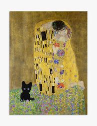
Gustav Klimt was painting warm maximalism more than a hundred years before anyone called it that. His gold period — The Kiss, Adele Bloch-Bauer I, Judith — layered metallic leaf with geometric pattern, organic ornament, dense colour, and a flatness that made decoration the point rather than a side dish.
Look at what 2026 trend reports are asking for: rich palettes, ornament, geometric repeats, mixed textures, a sense of craft. That is essentially a description of Klimt's Stoclet Frieze. His work flattened the line between fine art and decorative art at a time when that distinction felt important, and the current interiors mood is doing exactly the same thing on a domestic scale.
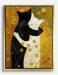
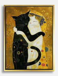
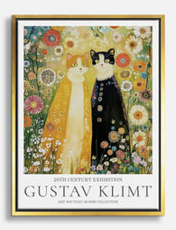
Which brings us to the cats. Klimt famously kept eight to ten studio cats and was obsessed with them, but he never actually painted one. Today's Klimt inspired cat art is an artist interpretation of a "what if": Klimt's gold, his patterning, his ornamental density, applied to the animal he actually lived with. It is decorative art doing what decorative art has always done best, which is taking something personal and making it ceremonial.
What counts as art nouveau cat art
Strictly speaking, Klimt sat at the Vienna Secession, adjacent to but distinct from Art Nouveau. In practice, the visual language overlaps: flowing line, ornament, gold, organic forms, decorative flatness. So when people search for art nouveau cat prints, they usually mean this whole family of ornamental, gold-leaf-style imagery. Same mood, slightly different art historical postcode.
Gold cat art prints as a statement piece vs. part of a collection
There are two ways to use these prints, and they ask for very different rooms.
As a statement piece. One large print, alone on a wall, doing the heavy lifting. This works best at 60x80cm or larger, hung above a sofa, bed, console or fireplace. The gold provides the warmth, the cat provides the personality, and you let the rest of the room stay relatively quiet around it. We think this is the easier route if you are nervous about maximalism tipping into clutter.
As part of a collection. Three or more smaller prints, typically 30x40cm or 40x50cm, clustered as a gallery wall or run along a hallway. This is where Klimt cat art earns its keep, because the ornamental density rewards repetition. Mix one or two gold cat prints with botanical line drawings, a moody portrait, or an abstract in a complementary palette. The trick is consistency in framing: pick one frame colour and stick to it across the whole group.
A quick scale rule we keep coming back to: a single statement piece should be roughly two-thirds the width of the furniture beneath it. Above a 200cm sofa, that is a print around 130cm wide, or two prints sitting side by side. Hang the centre of the artwork at roughly 145cm from the floor, gallery standard.
Room palettes that make gold tones sing
Gold is a colour that lives or dies by what surrounds it. Against cool grey or stark white it can look brassy and lonely. Against the right warm tones it reads as candlelight.
These are the palettes we think work best:
Burnt amber and clay. Walls in something like Farrow & Ball's Red Earth, or a softer terracotta, with the gold of the print picking up the warm undertone. Pair with cream linen, oak, and one deeper accent like aubergine or chocolate.
Deep teal and forest green. A dark green wall (think Studio Green, Hicks' Blue, or Inchyra Blue tipping toward teal) makes gold sing the way emeralds sing in a jewellery box. This is the most theatrical option and probably the most photogenic.
Warm off-white with wood. If you do not want to paint, lean into texture: oak floors, rattan, jute, unbleached linen, a clay-coloured throw. The gold print becomes the warmest point in the room and pulls everything together.
Aubergine and oxblood. For the dark academia readers. Deep, dim, slightly moody, with brass lamps and leather. Klimt cat prints in a black frame against an oxblood wall is a very specific look, and it works.
Avoid pure cool greys, icy blues, and bright cold whites. They flatten gold and make the whole thing feel like a hotel lobby that lost its nerve.

Mixing gold art with modern furniture without it feeling like a palace
The fear with ornamental, gold-heavy art is that the room will end up looking like a Viennese opera foyer. The fix is contrast, not matching.
Put ornamental art against plain furniture. A Klimt-style gold cat print looks best above something with clean lines: a low-slung modern sofa in oatmeal bouclé, a flat-fronted oak sideboard, a simple plaster-pink wall. The art carries the ornament so the furniture does not need to.
Keep metals consistent, not matching. If your print has warm gold tones, lean into brass, antique gold, or unlacquered brass for lighting and hardware. Avoid chrome and polished nickel in the same sightline. You do not need every metal to be identical, just from the same temperature family.
Limit ornament to two or three "voices" per room. The art is one voice. A patterned rug might be another. A textured cushion or a carved side table is a third. Beyond that, let surfaces stay quiet. Refined maximalism, as Dezeen put it, borrows warmth from maximalism but strips out the excess.
Finally, give the art room to breathe. A large gold print needs negative space around it more than a small abstract does, because the eye needs somewhere to rest after all that ornament. Resist the urge to surround it immediately with shelves of objects.
Why matte giclée printing is the right format for gold-toned art
This is the bit most articles skip, and it is the bit that decides whether your print looks like art or like a poster.
Giclée is a high-resolution inkjet printing process using archival pigment inks, typically on heavyweight matte paper. Done properly, on the right paper, it reproduces fine detail and subtle tonal shifts that cheaper printing methods flatten out. Our art prints are printed this way on thick matte paper, with inks rated to last hundreds of years even in direct sunlight.
For gold-toned art specifically, matte is the only sensible choice. Here is why.
Gloss creates glare exactly where you do not want it. Gold tones rely on subtle gradients to read as metallic rather than flat yellow. A glossy finish bounces light off the surface, which kills those gradients and turns the gold into a hot spot. Matte absorbs light evenly, so the gold reads as depth rather than reflection.
Matte paper holds detail at close range. Klimt-inspired work has dense ornament: tiny geometric repeats, fine line, layered pattern. On matte giclée you can stand 30cm away and still see the detail. On gloss, the reflection wins.
Matte ages better in real rooms. Glossy surfaces show every fingerprint, every dust mark, every angle of light from a nearby window. Matte just sits there, looking like a painting.
If you are framing, glass is also a problem: it adds another reflective layer on top of the print. Our framed prints use a UV-protective acrylic glaze instead, which prevents fading from sunlight without the heavy mirror-like glare of standard glass. For gold art in particular, that matters.
One more practical note. The biggest failure mode in art prints is poor framing: warped mounts, separately shipped frames, prints that arrive bubbled or misaligned. We print and frame in-house, fit everything before it leaves, and ship it as one piece with fixtures attached. It arrives ready to hang on the wall.

Five real room setups with Klimt cat prints at the centre
To make this concrete, here are five room scenarios we think genuinely work.
1. The warm minimalist living room
Oatmeal sofa, oak floor, off-white walls with a slight pink undertone, one large 70x100cm gold cat print in a black frame above the sofa. Brass floor lamp, one terracotta cushion, one cream throw. The print does all the decorative work, the room stays calm.
2. The dark academia study
Oxblood or deep aubergine walls, a vintage leather chair, brass desk lamp, walls of books. Two 40x50cm Klimt cat prints in black frames flanking a window or doorway. Moody, scholarly, slightly theatrical. This is where decorative cat wall art earns its name.
3. The maximalist hallway gallery
Narrow hallway painted in something like Inchyra Blue. A cluster of six to eight prints in matching slim brass frames: two Klimt cats, two botanical studies, a moody still life, an abstract in ochre and teal. Hung close together, salon-style, lit by a small picture light.
4. The bedroom focal wall
Deep green wall behind the bed, rust-coloured headboard, white linen bedding, two matching 50x70cm gold cat prints hung side by side above the headboard in slim black frames. Brass wall sconces either side. Symmetrical, warm, slightly cinematic.
5. The plaster-pink dining room
Round oak dining table, four mismatched dining chairs, woven pendant light, plaster-pink walls. One enormous 100x150cm canvas of a Klimt-style gold cat as a single statement piece on the longest wall. Canvas works particularly well here because it sits flat to the wall without glare, and the mirrored edge wrapping means none of the image gets lost around the sides.

A note on gallery walls and curated layering
If you go the collection route, the rule is intentional layering, not random clutter. Pick a unifying thread: one shared colour (gold), one shared frame finish (black, or natural oak, or brass), or one shared subject (animals, botanicals, portraits). Vary scale within the group so the eye has movement, but keep one variable locked. That is what designers mean by curated maximalism, and it is the difference between "considered" and "I bought a lot of things."
The takeaway
Gold cat art is not a novelty. It sits at the intersection of two things people genuinely want right now: warmth, in rooms that have spent a decade being cold, and personality, in homes that have spent a decade being neutral. Klimt's aesthetic happens to be a near-perfect template for both.
Pick one large piece and let it carry a quiet room, or build a small collection with one locked variable. Hang it against a warm wall colour, keep your metals in the same temperature family, and choose matte over gloss every time. That is the whole brief.

Produits Fab présentés dans cet article
-

Affiche chat doré style Klimt
Translation missing: fr.products.product.sale_price À partir de CHF 15.00CHF 22.00 -
 Feuille d'or
Affiche chats enlacés à la feuille d'or, style Klimt
Translation missing: fr.products.product.sale_price À partir de CHF 22.00CHF 36.00 -

Affiche chats enlacés inspiration Klimt
Translation missing: fr.products.product.sale_price À partir de CHF 15.00CHF 22.00 -

Affiche muse féline, esprit Klimt
Translation missing: fr.products.product.sale_price À partir de CHF 15.00CHF 22.00 -

Affiche jardin aux chats façon Klimt
Translation missing: fr.products.product.sale_price À partir de CHF 15.00CHF 22.00 -

Toile le baiser doré de Gustav Klimt avec chat
Translation missing: fr.products.product.sale_price À partir de CHF 60.00CHF 86.00 -

Affiche le baiser de Klimt avec un chat
Translation missing: fr.products.product.sale_price À partir de CHF 15.00CHF 22.00 -

Toile le baiser de Klimt avec chat
Translation missing: fr.products.product.sale_price À partir de CHF 60.00CHF 86.00 -
Toile chats enlacés dorée inspirée de Klimt
Translation missing: fr.products.product.sale_price À partir de CHF 60.00CHF 86.00 -
Toile chats enlacés inspiration Klimt
Translation missing: fr.products.product.sale_price À partir de CHF 60.00CHF 86.00 -
Affiche le baiser de Klimt au chat noir
Translation missing: fr.products.product.sale_price À partir de CHF 15.00CHF 22.00 -

Affiche chat blanc au jardin, inspirée de Gustav Klimt
Translation missing: fr.products.product.sale_price À partir de CHF 15.00CHF 22.00 -

Affiche jardin enchanté de Klimt
Translation missing: fr.products.product.sale_price À partir de CHF 15.00CHF 22.00 -

Toile chat blanc au jardin, style Gustav Klimt
Translation missing: fr.products.product.sale_price À partir de CHF 60.00CHF 86.00 -

Affiche chat noir au jardin, style Klimt
Translation missing: fr.products.product.sale_price À partir de CHF 15.00CHF 22.00 -

Affiche chat à la fenêtre, jardin façon Klimt
Translation missing: fr.products.product.sale_price À partir de CHF 15.00CHF 22.00 -

Affiche chat noir et fleurs orange style Klimt vintage
Translation missing: fr.products.product.sale_price À partir de CHF 15.00CHF 22.00 -

Affiche chat noir dans un jardin inspiré de Klimt
Translation missing: fr.products.product.sale_price À partir de CHF 15.00CHF 22.00 -
Toile chats espiègles de Klimt
Translation missing: fr.products.product.sale_price À partir de CHF 60.00CHF 86.00


Plus de The Frame

Who Did Klimt Actually Paint? The Real People i...
Gustav Klimt painted some of the most recognisable women in art, but most people couldn't name a single one of them. The faces draped in gold and pattern were real...

Klimt's Beech Forest and Birch Forest Paintings...
Klimt's forests are having a moment, and the search results are a mess. People type in "beech forest poster" and end up looking at three different paintings with overlapping German...

The Story Behind Klimt's Woman in Gold: Adele B...
She has been called the Mona Lisa of Austria, looted by Nazis, fought over in court for decades, and sold for $135 million. The painting is dazzling, but the woman...