Monet's Water Lilies: Why One Man Painted the Same Pond 250 Times
The 30-year obsession behind the most reproduced paintings in art history, and how to live with one at home.

Claude Monet spent the last three decades of his life painting one pond. He made roughly 250 canvases of the same patch of water in his garden at Giverny, working through cataracts, bereavement, and a world war, until he was painting almost by memory. The story behind these paintings is stranger and more obsessive than most prints on living room walls let on.
The Garden Monet Built: How Giverny Became His Greatest Subject
In 1883 Monet moved his family to a pink stucco farmhouse in Giverny, a village about 75km northwest of Paris. The flower garden came first, but the water garden, the one that ate the rest of his life, didn't exist yet. He had to build it.
In 1893 he bought a marshy plot across the railway line from his property and applied to the local council to divert a tributary of the Epte to feed a pond. The neighbours objected. They worried his "exotic plants" would poison the water their cows drank. Monet won the permit, dug the pond, and within a few years had expanded it to roughly four times its original size.
He ordered hybrid water lilies from the Latour-Marliac nursery in southern France, which had recently figured out how to cross hardy European lilies with tropical varieties from Egypt and South America. By 1900 Monet was employing six to eight gardeners. One of them had the daily job of rowing a flat-bottomed boat across the pond to dust the lily pads clean before Monet started painting.
"My finest masterpiece," he reportedly told a visitor, "is my garden."

Early Water Lilies: The Japanese Bridge Period
The first proper series came in 1897 to 1899, when Monet painted his green Japanese-style footbridge arching over the pond. These early canvases are the most "readable" of the lot. You can see the bridge, the bank, the weeping willows, the lilies floating in clear horizontal bands.
Monet had been collecting Japanese woodblock prints since the 1870s. By the time he died he owned 231 of them, including major works by Hokusai and Hiroshige, and they still hang in the dining room and corridors of the Giverny house today. The bridge, the asymmetry of the compositions, the flattened sense of depth, all of it borrowed from ukiyo-e. If you're drawn to that cross-cultural lineage, the traditional Japanese art prints Monet learned from are worth seeing on their own terms.
These bridge paintings tend to be the most popular as prints for a simple reason. They give the eye something to land on. The arched green bridge anchors the composition, which makes them easier to live with in a busy room.
The Obsessive Middle Years: Painting Light on Water
By 1903 the bridge had largely disappeared from his canvases. Monet zoomed in. He cropped out the banks, the sky, the willows. What remained was pure water surface, lily pads, and reflections of clouds and trees that existed somewhere above the frame.
This is the period most people picture when they think "Monet water lily painting." Roughly 1903 to 1908, dozens of canvases, all squarish or roundish, all focused on a small piece of the pond at different hours, different weather, different seasons. He was painting light, not lilies. The flowers were just the excuse.
In 1908, days before a major exhibition in Paris, Monet took a palette knife to fifteen of these finished canvases and destroyed them. He wrote to his dealer that they weren't good enough. He delayed the show by a year.
Then in 1910 the Seine flooded. The water garden was submerged. The exotic lilies froze and rotted. Monet had to rebuild the entire pond, replant everything, and start again. His wife Alice died the following year. His eldest son Jean died in 1914. He was 73, half blind, and in mourning. This is when he decided to start his most ambitious project.
Monet's Cataracts and the Shift to Abstraction
Monet first noticed his vision changing around 1908. By 1914 he was officially diagnosed with cataracts in both eyes. Reds turned muddy. Blues drained of intensity. Fine detail disappeared. He described his world as looking increasingly yellow and brown, "as if seen through a fog."
He resisted surgery for nearly a decade, terrified it would ruin his colour perception further. He finally agreed to operate on his right eye in 1923, at the age of 82. The recovery was difficult and the results uneven. He had to repaint several canvases afterwards because, with his sight partially restored, he realised he had been working in colours that didn't match what he intended.

Art historians still argue about the late paintings. Were the murky greens and unexpected violets a deliberate move toward abstraction, or were they what Monet honestly saw through clouded lenses? The truthful answer is probably both. He was a meticulous craftsman who knew what he was doing, and he was also working with deteriorating equipment. The looseness in the late work feels intentional. The colour shifts feel medical.
Whichever way you read them, the post-1914 canvases are the ones that influenced the next half-century of painting. Abstract expressionists like Joan Mitchell and Mark Rothko looked at late Monet and saw a way forward that had nothing to do with lilies.
The Grandes Décorations: Room-Sized Canvases at the Orangerie
In November 1918, the day after the Armistice, Monet wrote to his friend Georges Clemenceau, the French prime minister, offering two large decorative panels to the nation as a celebration of peace. Clemenceau, who had been pushing him to finish his big project for years, took the offer and ran with it. Two panels became eight. Eight became a custom installation in two oval rooms at the Musée de l'Orangerie in Paris.
To paint them, Monet had a new studio built at Giverny in 1915. It was vast, naturally lit through a glass roof, and equipped with mobile easels on castors so he could wheel the enormous canvases around and step back to see them at distance. Some panels were two metres tall and six metres wide.
He worked on the Grandes Décorations for the rest of his life. He kept reworking, repainting, refusing to release them. He died in December 1926, age 86. The panels were installed at the Orangerie the following year, exactly as he had specified, and they remain there today. Standing in the middle of those two oval rooms is the closest you can get to climbing inside a painting.
After his death, the rest of his work fell out of fashion for nearly thirty years. Giverny itself was abandoned and overgrown. It wasn't until MoMA bought a large Water Lilies panel in 1955 (one that was tragically destroyed in a 1958 fire at the museum) that the late work was rediscovered and reframed as the foundation of modern abstraction. The garden was restored in the 1970s and now receives over half a million visitors a year.
Which Water Lilies Print to Choose: Cool Blues vs Warm Sunset Tones
So you want one for your wall. The first decision is period, which really means palette and mood. Here's how we'd think about it.
Cool blue and green palette (mostly middle period, 1903 to 1908). These are the most serene and the easiest to live with. Soft cloud reflections, pale pink and white lilies, a lot of blue-green water. They work in north-facing rooms because they lift the cool light rather than fighting it. They suit bedrooms, bathrooms, calm sitting rooms.
Warm violet, gold, and rust palette (late period, 1914 to 1926, and some sunset studies). Richer, more dramatic, often more abstract. The colour temperature warms a room rather than cooling it. These work in south or west-facing rooms where evening light is already warm, and in spaces with darker walls (deep green, navy, plum) where the warmer tones can hold their own.
Bridge compositions (early period, 1897 to 1899). More representational, more architectural, easier for guests to immediately "read." Good for hallways, dining rooms, anywhere people stand and look rather than sit and absorb.
If you want to see the breadth of his output in one place, our Claude Monet landscape art prints collection covers the full arc from Argenteuil and Étretat through to the late Giverny pieces. For the wider movement he belonged to, our Impressionism prints collection puts him in context with Pissarro, Sisley, and the rest.

Hanging a Water Lilies Print: Best Rooms, Sizes, and Frame Options
Size first. Monet painted these as immersive objects. The Orangerie panels are six metres wide for a reason. A small print of a Water Lilies canvas fights its own nature. We'd suggest going as large as the wall sensibly allows. For a sofa wall, you want the print to span at least two thirds of the sofa's width. Above a console or sideboard, the same rule applies. In practice that usually means 70x100cm for a framed print or up to 100x150cm if you go for canvas.
Format. The middle-period close-ups (water surface only, no horizon) tend to be roughly square. They sit beautifully above a square or round table, a bath, or a bed. The bridge paintings and some late panels are more horizontal. Horizontal works above sofas and sideboards. Vertical Water Lilies are rare in Monet's output, but a vertical crop of a larger painting can work well in a narrow space between two doors.
Framed or canvas? A framed print on matte paper, behind a UV-protective acrylic glaze, looks closest to how the painting hangs in a museum. The matte surface kills glare, which matters because Monet's brushwork has so much surface detail to read. You'll see his palette knife marks and the dry-brush scumbling that gives the lily pads their texture. We'd usually go this route for the early and middle periods, where the detail rewards close looking.
Canvas suits the late, more abstract panels. The poly-cotton weave gives the image a painterly presence on the wall and the mirrored edge wrap means you don't lose any of the composition. It also works better in humid rooms (bathrooms, kitchens) where paper can be more sensitive. Hand-stretched over solid FSC wood means no warping six months in, which is the most common complaint we hear about cheap canvas prints from elsewhere.
Frame colour. For cool blue palettes, natural oak or a soft off-white frame keeps the calm. Avoid black, which fights the softness. For warm sunset palettes, walnut, dark oak, or a black frame all work, depending on the wall colour. White walls plus warm Monet plus black frame is a classic combination for a reason.
Room by room. Living rooms can take the largest sizes and the most dramatic late-period palettes. Bedrooms suit the middle-period blues and greens. Bathrooms work surprisingly well with a smaller framed bridge print, partly because the green and water motifs feel at home there. Hallways are good for the bridge compositions because passing traffic doesn't need to absorb anything subtle.
If you like the botanical dimension of Monet's late work specifically (the lilies, the irises, the wisteria, the willows), it's worth browsing our broader botanical art prints collection alongside the Monet pieces. They sit together well in a gallery wall or across adjacent rooms.
One last thought. Monet painted the same pond 250 times because each canvas was a record of a particular hour, a particular light, a particular state of mind. When you hang one at home, you're not hanging a "Monet." You're hanging one specific morning in 1906, or one specific autumn afternoon in 1919. Pick the one that matches the light in your room, and it will look right every time you walk past it.


Produits Fab présentés dans cet article
-

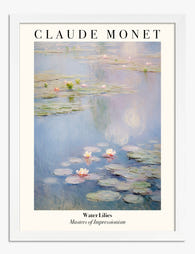
Toile nymphéas de Monet
Prix promotionnel À partir de CHF 63.00CHF 89.00 -

Toile pont aux nymphéas de Claude Monet
Prix promotionnel À partir de CHF 63.00CHF 89.00 -

Toile nymphéas de Monet
Prix promotionnel À partir de CHF 63.00CHF 89.00 -

Toile nymphéas, inspiration Monet
Prix promotionnel À partir de CHF 63.00CHF 89.00 -

Affiche nymphéas inspirée de Monet
Prix promotionnel À partir de CHF 16.00CHF 23.00 -

Affiche pont aux nymphéas de Monet
Prix promotionnel À partir de CHF 16.00CHF 23.00 -

Affiche nymphéas de Claude Monet, sérénité
Prix promotionnel À partir de CHF 16.00CHF 23.00 -
Affiche nymphéas de Monet, sérénité
Prix promotionnel À partir de CHF 16.00CHF 23.00 -

Affiche Nymphéas de Monet
Prix promotionnel À partir de CHF 16.00CHF 23.00


Plus de The Frame

The Best Wall Art for Plant Lovers (That Doesn'...
You already have too many plants. You know it, your partner knows it, the fiddle leaf fig blocking the window knows it. But your walls are still bare, and there's...

Are Botanical Prints Still in Style? The Trend ...
Botanical prints have been declared "over" roughly every three years since 2015, and yet they keep hanging on more walls than ever. The truth is they're not a trend at...

Room-by-Room or Whole-Home? Styling Botanical P...
Most botanical prints are hung wrong. They're too small for the wall, glossy in rooms that need calm, and floating at eye level above sofas they should be anchoring. This...