Beyond the Band Poster: Music-Inspired Wall Decor That Actually Looks Good
How to put your music taste on the wall without your living room reading like a sixth-form common room.

Loving music and decorating like an adult are not mutually exclusive, but most music wall decor would have you believe otherwise. The problem is one of literalism: tour posters, album covers blown up to A1, glossy headshots of musicians staring down at your dinner table. There is a more sophisticated way to put your taste on the wall, and it starts with treating music as a design element rather than a souvenir.
The problem with most music wall decor (and how to avoid it)
Band posters and album art have a specific aesthetic vocabulary, and it belongs to a specific stage of life. They are loud, photographic, and unambiguous. Hung in a grown-up living room, they fight with everything around them: the linen sofa, the considered lamp, the rug you actually saved up for.
The issue is not music itself. It is that literal imagery (a band's face, a tour date list, a glossy promo shot) acts like a poster on a bedroom wall whether you frame it or not. Your eye reads it as memorabilia, not art.
The fix is abstraction. Trade the literal for the suggestive. Lyrics, typography, abstract artwork inspired by a song or genre, photography that evokes the mood of a record rather than depicting the artist. These read as design choices, not fan declarations, and they sit comfortably alongside the rest of your interior.

Lyrics prints as the sophisticated alternative to band posters
Lyrics prints work because they do two things at once. They communicate your taste to anyone who recognises the words, and they function as typographic art to anyone who does not. A guest who has never heard the song still sees a well-set piece of text on beautiful paper. That is the difference between decor and memorabilia.
Typography choice carries most of the weight here. A clean serif (think Garamond or Caslon) reads as literary and considered. A modern sans-serif feels architectural and calm. Hand-lettered script can work, but it tips into sentimental territory quickly, so use it sparingly and only with lyrics that earn the romance.
Avoid anything that looks like a wedding invitation unless it actually is one. The fonts that scream "first dance keepsake" (swirling script, gold foil effects, hearts) are exactly what makes music quote wall art feel naff. Keep it restrained.
On choosing the lyrics themselves: a single line almost always beats a full verse. Negative space is doing real work in a good lyrics print, and the more text you cram in, the less each word matters. Pick a line that holds up out of context. "Hold on to that feeling" reads beautifully on a wall. A complete chorus does not.
Mixing lyrics art with abstract and photography prints
Lyrics prints get more sophisticated when they stop being the only musical element in the room. The trick is pairing them with non-literal pieces that share a mood.
A few combinations that work:
- Lyrics + abstract. A typographic print next to a piece of muted abstract art (soft shapes, washy colours) reads as gallery, not fan zone. The abstract piece carries the emotional register of the song without spelling it out.
- Lyrics + black-and-white photography. Architectural shots, moody landscapes, or a single performer photographed from behind on stage. The photograph supplies atmosphere; the lyrics supply the meaning.
- Lyrics + texture studies. Close-up prints of natural textures (bark, water, fabric) ground the typography in something tactile.
The rule of thumb: if every piece in a grouping is musical, the wall starts to feel like a theme. If only one or two pieces are explicitly music-related and the rest are simply beautiful, the music elements feel like part of a curated collection.
Creating a music-themed gallery wall that feels curated, not cluttered
Gallery walls fail when they read as a collection of unrelated decisions. They succeed when there is a visible logic, even if the viewer cannot articulate what it is. For music-inspired walls, give yourself one anchor and build outwards.
The three-piece vertical
A simple, forgiving layout for narrow walls (next to a doorway, in a hallway, beside a tall bookshelf). Stack three prints in a column, each 30x40cm or 40x50cm, with 5 to 7cm of space between them. Use one lyrics print, one abstract piece, and one photograph. Frame all three identically. Done.
The asymmetric cluster of five
Better for a sofa wall or above a console. Start with one larger anchor piece (around 60x80cm) positioned slightly off-centre. Arrange four smaller prints (30x40cm and 40x50cm) around it, leaving a consistent 6 to 8cm gap between every frame. The anchor can be the lyrics print, or it can be an abstract piece with a smaller lyrics print as a satellite. Both work.
The grid
A 2x2 or 3x2 grid of identically sized prints in matching frames is the most formal option. It suits dining rooms and home offices. Mix lyrics, abstract, and photography across the grid, but keep tonal values close so the wall reads as one composition rather than four or six.
Whatever the layout, hang the centre of the arrangement at roughly 145 to 150cm from the floor (gallery standard). And keep frame styles consistent. Mixing thick oak frames with thin black metal in the same grouping rarely looks intentional. Browse wall art sets if you want pieces designed to hang together from the start.

Colour palettes that let lyrics prints shine
Lyrics prints are typographic, which means they are read before they are looked at. Anything around them that is too saturated or busy will fight for attention and lose, leaving you with a wall that feels chaotic.
Three palette formulas that consistently work:
1. Neutral envelope. Walls in off-white, soft chalk, or a warm putty. Lyrics prints in black on white paper. Surrounding pieces in greys, taupes, and creams. One small accent colour repeated across the room (a sage green cushion, an ochre throw) but never inside the frames themselves. This is the safest and most timeless option.
2. Monochrome moody. Walls in a deep charcoal, ink blue, or forest green. Lyrics prints in white text on dark grounds, or black text on cream. The drama comes from contrast, not colour variety. This works exceptionally well in snugs, studies, and dining rooms.
3. Single accent. Pick one colour (terracotta, mustard, deep teal) and let it appear in two or three of the prints across the wall. Keep everything else neutral. The accent ties the gallery together without making any single piece compete with the lyrics.
When in doubt, go black and white. The most sophisticated lyrics prints are usually monochrome, because colour is one more thing the typography has to compete with. A line of song set in black ink on thick matte paper, framed simply, will outclass a colourful version almost every time.
Best rooms for music-inspired decor (and rooms to skip)
Not every room benefits from music wall art, and choosing the wrong space is half of why music decor gets a bad reputation.
Rooms that work
The living room. The most flexible option, especially if you keep the music elements to one or two pieces within a wider gallery wall. Lyrics prints work above a sofa, beside a fireplace, or as part of a console arrangement.
The dining room. Surprisingly good. Lyrics prints set a tone for conversation without dominating the room, and dining walls are usually under-decorated. A single large lyrics print, well-framed, can carry a whole wall.
The home office or study. Personal, but seen by you constantly. This is where you can be more specific with lyrics that mean something to you, because the audience is mostly yourself.
The hallway and stairwell. Vertical lyrics arrangements suit narrow walls beautifully. Hallways are also where guests pause, so a striking typographic print can be the first impression of your taste.
The bedroom. Above the bed or on a facing wall. Choose lyrics that feel calm rather than energetic. Save the loud songs for the lounge.
Rooms to skip
The kitchen. Steam, splashes, and cooking smells are not friends to paper-based prints. If you want music decor here, keep it small and well away from the hob.
The bathroom. Humidity will warp paper and degrade frames over time. Even with UV-protective acrylic glaze, the moisture is the enemy. Skip it.
The nursery or child's bedroom. This is where the band poster aesthetic actually belongs, but in its own space and on its own terms. Don't overthink it for kids' rooms.
Formal entryways in rentals or shared spaces. If you are not sure how long you will be in a space, do not commit a major wall to deeply personal lyrics. Save those for spaces you control.

Framing quality matters: why cheap frames ruin the effect
The single biggest reason music decor looks juvenile is bad framing. A great print in a poor frame reads as a poster. A modest print in a beautifully made frame reads as art. The frame is doing more work than most people realise.
Specifically, this is what cheap framing gets wrong:
Material. MDF and veneer frames have a dead, plasticky surface that catches light unflatteringly. Solid wood frames have grain, depth, and a quality of light reflection that simply looks more expensive because it is. FSC-certified solid wood is the standard worth holding to.
Glazing. Glass frames are heavy, shatter-prone, and create harsh glare under spotlights and lamps. UV-protective acrylic glaze is lighter, safer, and crucially, prevents the print from fading even in direct sunlight. Glare is the enemy of readability for lyrics prints, so this matters more here than for most artwork.
Fit and finish. Prints that arrive separately from frames almost always end up slightly misaligned, with bubbling, warping, or visible gaps at the edges. Prints that are properly fitted into the frame at the point of manufacture sit flat, sit straight, and stay that way. This is the single biggest difference between a wall that looks considered and one that looks improvised.
Mounting. Cheap frames arrive with flimsy hooks or no fixtures at all, which leads to crooked hanging and damaged walls. Frames that ship with proper fixtures attached and are ready to hang out of the box save you the hassle and look better for it.
The print itself matters too. Museum-grade giclée printing on thick matte paper has a depth and tonal range that thin glossy posters cannot match, and matte finishes eliminate the reflective surface that makes cheap prints look cheap from across the room.
If you are torn between buying song lyrics home decor framed or unframed, framed almost always wins for typographic work. The frame creates the negative space and visual containment that lyrics need to feel finished. Unframed canvas works beautifully for abstract and photographic pieces, less so for text.

A few last things worth getting right
Scale is the easiest thing to get wrong. A 30x40cm lyrics print floating alone above a three-seater sofa will look like a postage stamp. A general guide: artwork above furniture should fill roughly two-thirds of the furniture's width. For a 220cm sofa, that means an arrangement around 150cm wide, whether that is one large piece or a cluster.
Light your lyrics prints from the side or from above with a downward angle, never head-on. Front lighting flattens the typography and creates glare even with acrylic glaze. A wall light or directional spot at 30 degrees off-axis will pick out the print without bouncing back into your eyes.
And rotate. Music taste evolves, and there is no rule that says the lyrics on your wall in your thirties have to be the lyrics on your wall in your forties. Treat your wall as a curated, changing collection rather than a permanent installation, and the decor will keep feeling alive instead of dated.

Produits Fab présentés dans cet article
-

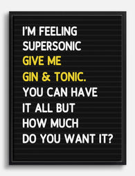
Toile typographique Wonderwall aux paroles iconiques
Translation missing: fr.products.product.sale_price À partir de CHF 62.00CHF 88.00 -

Toile la musique est la réponse noir et blanc
Translation missing: fr.products.product.sale_price À partir de CHF 62.00CHF 88.00 -

Affiche typographique la musique est ma muse
Translation missing: fr.products.product.sale_price À partir de CHF 16.00CHF 22.00 -

Affiche paroles de Wonderwall noir et blanc
Translation missing: fr.products.product.sale_price À partir de CHF 16.00CHF 22.00 -
Toile platine vinyle rétro
Translation missing: fr.products.product.sale_price À partir de CHF 62.00CHF 88.00 -
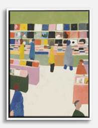
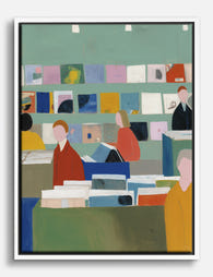
Toile scène vinyle chez le disquaire
Translation missing: fr.products.product.sale_price À partir de CHF 62.00CHF 88.00 -

Toile vinyles rétro roses et noirs
Translation missing: fr.products.product.sale_price À partir de CHF 62.00CHF 88.00 -

Affiche ambiance disquaire moderne
Translation missing: fr.products.product.sale_price À partir de CHF 16.00CHF 22.00 -

Affiche vinyles rétro
Translation missing: fr.products.product.sale_price À partir de CHF 16.00CHF 22.00 -

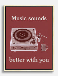
Toile typographique Sounds Better With You
Translation missing: fr.products.product.sale_price À partir de CHF 62.00CHF 88.00 -
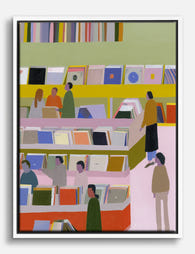
Toile scène colorée d’un magasin de disques
Translation missing: fr.products.product.sale_price À partir de CHF 62.00CHF 88.00 -

Toile disque vinyle en mouvement noir et blanc
Translation missing: fr.products.product.sale_price À partir de CHF 62.00CHF 88.00 -
Affiche boutique de disques rétro et colorée
Translation missing: fr.products.product.sale_price À partir de CHF 16.00CHF 22.00 -
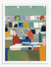
Toile ambiance disquaire moderne
Translation missing: fr.products.product.sale_price À partir de CHF 62.00CHF 88.00 -

Toile disques vinyles rétro
Translation missing: fr.products.product.sale_price À partir de CHF 62.00CHF 88.00 -
Toile typographique musicale noir et blanc, touche de jaune
Translation missing: fr.products.product.sale_price À partir de CHF 62.00CHF 88.00 -

Toile ambiance vinyle chez le disquaire
Translation missing: fr.products.product.sale_price À partir de CHF 62.00CHF 88.00 -

Affiche/Toile Ziggy Stardust, David Bowie
Translation missing: fr.products.product.sale_price À partir de CHF 62.00CHF 88.00 -

Affiche vinyle rétro aux couleurs vives
Translation missing: fr.products.product.sale_price À partir de CHF 16.00CHF 22.00 -

Affiche typographique la musique est plus lumineuse ensemble
Translation missing: fr.products.product.sale_price À partir de CHF 16.00CHF 22.00


Plus de The Frame

Every Flower in William Morris's World: A Guide...
William Morris designed roughly 50 wallpapers and around 30 chintzes across his career, and almost every single one features a plant. If you've ever stood in front of a Morris...

What Colours Go With Bouquet Prints? Pairings I...
You've found a bouquet print you love. Now you need to know if it will actually work above your sofa, opposite that mustard armchair, next to the curtains you spent...

Boho Sun Wall Art: How to Nail the Look Without...
Boho sun art has a reputation problem. Done badly, it screams student halls and macramé overload. Done well, it's one of the warmest, most grounding aesthetics you can put on...