One Statement Piece Is All Your Living Room Needs
Stop filling walls and start finishing rooms. The case for one brilliant piece over five hesitant ones.

Most blank walls stay blank because the brief feels enormous. You don't actually need a gallery, a grid, or a curated grouping you'll second-guess for six months. You need one piece, in the right place, at the right size, and the room is finished.
Why one piece beats five
There's a tidy bit of design logic behind this. A room needs a focal point: somewhere the eye lands first, somewhere it rests. When you scatter four or five smaller pieces around the walls, you don't get five focal points. You get none. The eye bounces, the room feels busy, and nothing earns its place.
One large piece does the opposite. It pulls the room together, sets the tone, and tells the eye where to go. Everything else (the sofa, the rug, the lamp you've owned for a decade) becomes a supporting cast member instead of competing for attention.
There's also the confidence angle. Choosing one piece you genuinely love is easier than choosing five that work together. You make one decision well, instead of five decisions adequately. That's why minimalist rooms often feel more considered than maximalist ones, even when they cost less to put together.
If you've been staring at a blank wall for months, this is probably the permission you needed. You're not under-decorating. You're editing.

Find your focal wall first
Before you think about what to buy, work out where it goes. Most living rooms have one wall that's quietly begging for the job, and a few obvious distractions.
The three candidates
Above the sofa. The default, and usually the right answer. The sofa is the largest piece of furniture in the room and creates a natural base for art to sit on. If your sofa floats against a long, empty wall, this is your focal wall.
Above the fireplace. If you have a fireplace, it's already a focal point. Art above it amplifies that, but only if the mantel and surround don't dominate. A heavy stone fireplace with an ornate mantel doesn't need help. A clean, modern fire surround often does.
The wall opposite the entry. Sometimes the first thing you see when you walk into the room isn't the sofa, it's the wall across from the doorway. If that wall is currently doing nothing, it's wasting an entrance moment.
How to choose between them
Stand in the doorway. Where does your eye go first? Whatever it lands on is either already a focal point or wants to be one. If it lands on a blank wall, that's your answer. If it lands on the sofa, work above it. If it lands on the fireplace and that fireplace feels under-dressed, put your piece there.
Don't try to do two. Two focal points cancel each other out. Pick the wall that has the most uninterrupted space and the clearest sightline, and commit.
Sizing: the rule everyone quotes, and how to actually use it
The two-thirds rule has been doing the rounds in design columns for years, and it's quoted constantly because it works. Your art should be roughly 60 to 75 percent of the width of the furniture it sits above.
A 220cm sofa wants art that's between 130cm and 165cm wide. A 180cm sofa wants something around 110cm to 135cm. Go smaller than this and the piece looks timid, marooned in the middle of the wall like it wandered in by accident. Go wider than the sofa and it tips into awkward.
For a living room with a standard three-seater, that usually points you towards something in the 100x150cm or 70x100cm range, depending on orientation. Portrait works above narrower sofas or in tall rooms. Landscape works above wider sofas and in rooms with lower ceilings. A landscape canvas print at 100x150cm tends to be the sweet spot for most British living rooms.
Height: the bit people get wrong
Hang the centre of the piece at roughly 145 to 150cm from the floor (this is the gallery standard, eye level for an average adult). Above a sofa, that usually puts the bottom edge of the frame around 15 to 20cm above the sofa back. Any higher and the piece floats, disconnected from the furniture it's meant to anchor. Any lower and it looks like it's resting on the cushions.
If your ceilings are high (over 2.7m), nudge everything up by 5 to 10cm. If your ceilings are low, don't. The relationship to the sofa matters more than the relationship to the ceiling.
Choosing the actual piece
Now the hard part. You've got the wall, you've got the dimensions, and you're staring at a thousand options. Here's how to narrow it down without losing a weekend.
Start with mood, not subject
Don't begin by asking "do I want a landscape or an abstract?" Begin by asking what you want the room to feel like. Calm and quiet? Warm and rich? Energetic and confident? Slightly strange and interesting?
The mood you want determines the palette and the style, and the palette and style determine the piece. A muted, washed-out landscape and a high-contrast graphic print do completely different jobs in a room, even if they're the same size.
If your living room is where you decompress at the end of the day, you probably want something quiet. If it's where you host, you might want something with more presence. Be honest about how you actually use the space.

Let the art lead, not the cushions
Here's where most people go wrong. They buy the sofa, the rug, the cushions, the throws, and the lamp, then try to find art that "matches." By the time you reach the art, the room is so locked-in that nothing feels right.
If you can, choose the art early and let it set the palette. Pull two or three colours from the piece and use those for cushions, throws, and accessories. The room will feel cohesive in a way that's almost impossible to achieve by working backwards.
If you've already bought everything else, don't try to match exactly. Find a piece that picks up one or two existing tones and introduces one new colour. That new colour gives the room somewhere to go. Without it, everything sits at the same note.
The personal connection test
The piece has to do design work, but it also has to do emotional work. You're going to look at it every day for years. If you can't articulate why you like it (beyond "it goes with the sofa"), keep looking.
A good test: imagine you've moved house and you're unpacking. Would you put this piece up in the new place, or would you quietly leave it in the box? If it's the box, it was never the right piece.
Browse abstract art prints if you want something that reads as mood rather than image, or landscape prints if you want a sense of place and depth. Both can carry a room, they just do it differently.
The mistakes that make one-piece living rooms fail
A single statement piece works brilliantly when it's the right size, in the right place, with enough presence. It falls apart when any of those three are off.
Too small. The most common mistake by a long way. A 40x50cm print above a three-seater sofa looks lost. If you're hesitating between two sizes, almost always go bigger.
Floating. Hung too high, the piece detaches from the sofa and looks like it's drifting. The sofa needs to feel like the base, the art needs to feel like it's sitting on that base. 15 to 20cm of breathing room is enough.
Wrong palette. A piece in colours that fight the room (cool greys in a warm terracotta scheme, for example) will always feel like an intruder, no matter how beautiful it is on its own.
Choosing safe. A timid piece is worse than no piece. If you're going to commit to one image carrying a whole room, it needs presence. Beige-on-beige minimalism can work, but only if there's something interesting happening in texture, scale, or composition. "Inoffensive" is not a design strategy.
When one piece isn't enough
Honest disclosure: this approach doesn't work in every room.
If you've got a very long wall (over 4 metres) with no furniture beneath it, a single piece will look stranded. You either need a much larger format, a diptych, or a considered grouping.
If your living room already has multiple architectural focal points (a fireplace, a bay window, exposed brick, built-in shelving), adding a single statement piece can create a fifth focal point that overcrowds the room. Sometimes the right answer is smaller, quieter art that supports what's already there.
And if your taste is genuinely maximalist (you love layered, full, more-is-more interiors), one piece will feel undercooked. That's fine. The single statement approach is one strategy, not the only strategy.

Test before you commit
You don't have to guess. Two simple tests save a lot of regret.
The tape method. Cut painter's tape to the exact dimensions of the piece you're considering. Stick it on the wall where you'd hang the art. Live with it for a day or two. You'll know almost immediately if the size is right.
Digital mock-ups. Take a photo of your wall straight-on, then drop the product image into a photo editor at the correct proportions. Crude, but effective for checking palette.
Beyond that, lean on the returns policy. A 99-day return window means you can hang the piece, live with it through different light at different times of day, and only commit properly once you know. Art looks different at 9am than it does at 9pm, and you want to see both.
Format and finish: a quick word
For a statement piece, the format affects the feel of the room as much as the image does.
A framed art print with a clean wooden frame and a thick matte paper feels considered and gallery-like. It's the right call for a more polished living room, and acrylic glazing means no glare from your lamps and no fading from sunlight pouring in through south-facing windows.
A canvas print feels softer, warmer, and more relaxed. It works beautifully in lounges that lean lived-in rather than formal, and the lack of glazing means you can hang it across from a window without thinking about reflections. Canvas is also lighter, which matters at larger sizes.
Both arrive ready to hang with the fixtures attached. The frame and print ship together, properly fitted in one box, which sounds obvious but is the single biggest failure point in the category. A warped frame or a print that's bubbled away from its mount will ruin even the most beautiful image.

The short version
Pick the wall. Measure the furniture beneath it. Aim for art that's 60 to 75 percent of that width. Hang the centre at around 145 to 150cm from the floor. Choose a piece you actually love, in a palette that gives your room somewhere to go. Use tape to test, and trust your eye.
One piece, chosen well, finishes the room. Five pieces, chosen tentatively, never quite do.

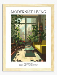
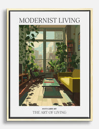
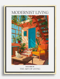
Produits Fab présentés dans cet article
-
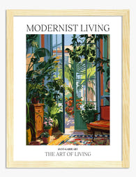
Affiche oasis botanique moderne
Translation missing: fr.products.product.sale_price À partir de CHF 16.00CHF 22.00 -

Toile havre moderniste baigné de soleil
Translation missing: fr.products.product.sale_price À partir de CHF 61.00CHF 87.00 -
Affiche oasis urbaine verdoyante
Translation missing: fr.products.product.sale_price À partir de CHF 16.00CHF 22.00 -
Toile oasis urbaine végétale
Translation missing: fr.products.product.sale_price À partir de CHF 61.00CHF 87.00 -
Toile havre moderniste ensoleillé
Translation missing: fr.products.product.sale_price À partir de CHF 61.00CHF 87.00 -

Affiche liens qui comptent
Translation missing: fr.products.product.sale_price À partir de CHF 16.00CHF 22.00 -

Affiche typographique linéaire noir et blanc
Translation missing: fr.products.product.sale_price À partir de CHF 16.00CHF 22.00 -

Affiche intérieur moderniste baigné de soleil
Translation missing: fr.products.product.sale_price À partir de CHF 16.00CHF 22.00 -

Affiche portrait expressif en aplats de couleur
Translation missing: fr.products.product.sale_price À partir de CHF 16.00CHF 22.00 -

Affiche typographique citation Best Seat
Translation missing: fr.products.product.sale_price À partir de CHF 16.00CHF 22.00 -

Affiche havre moderniste baigné de soleil
Translation missing: fr.products.product.sale_price À partir de CHF 16.00CHF 22.00 -

Affiche coin lecture douillet
Translation missing: fr.products.product.sale_price À partir de CHF 16.00CHF 22.00 -

Toile typographique moderne et audacieuse, tons bruns
Translation missing: fr.products.product.sale_price À partir de CHF 61.00CHF 87.00 -

Toile zéro minimaliste
Translation missing: fr.products.product.sale_price À partir de CHF 61.00CHF 87.00 -

Toile ce qui compte le plus, ce sont les gens
Translation missing: fr.products.product.sale_price À partir de CHF 61.00CHF 87.00 -

Toile refuge moderniste baigné de soleil
Translation missing: fr.products.product.sale_price À partir de CHF 61.00CHF 87.00 -

Toile coin lecture douillet au bouquet de fleurs
Translation missing: fr.products.product.sale_price À partir de CHF 61.00CHF 87.00 -

Toile typographique audacieuse noir et blanc
Translation missing: fr.products.product.sale_price À partir de CHF 61.00CHF 87.00 -
Affiche coin lecture chaleureux
Translation missing: fr.products.product.sale_price À partir de CHF 16.00CHF 22.00 -

Toile typographique noir et blanc au message audacieux
Translation missing: fr.products.product.sale_price À partir de CHF 61.00CHF 87.00


Plus de The Frame

Kitchen Art: What Works, What Fades
Kitchens are the worst room in your home for art. Heat cycles, steam plumes, airborne grease, and direct overhead lighting will quietly destroy anything you hang without thinking. This guide...

The Bedroom Finishing Guide: Art, Scale, and Light
Most bedrooms get decorated, but very few get finished. The difference is not how much you put on the walls, it is whether the art, the scale of your furniture,...

Art That Works with Patterned Wallpaper
Patterned wallpaper is having a proper moment, and the question that comes next is always the same: what on earth do you hang on it? The honest answer is that...