How to Build a Space Art Gallery Wall That Feels Curated, Not Cluttered
Specific layouts, exact spacing, and the balancing trick that stops dark nebulas turning your wall into a black hole.

Space art is stunning but tricky. Dark nebulas, bright planets, and busy constellation charts need intentional arrangement or your wall ends up looking chaotic instead of cosmic. This guide walks you through the layouts, sizes, and spacing rules that make a space gallery wall look right from day one.
Why space art is uniquely suited to gallery walls
Most gallery walls struggle because the prints don't share a visual language. Botanical etchings beside abstract portraits beside film stills, all fighting for attention. Space art doesn't have this problem.
Almost every astronomy print, whether it's a Hubble nebula photograph, a vintage constellation chart, or a minimalist moon phase diagram, pulls from the same palette: deep blues, charcoal blacks, dusty purples, with hits of orange, gold, or white. This shared colour story means you can mix wildly different subjects (a 1700s star map next to a NASA Voyager image) and they still feel like they belong together.
The varied subject matter is the second advantage. Planets are graphic and circular. Nebulas are painterly and chaotic. Constellation diagrams are linear and technical. Putting them side by side creates rhythm without effort. You get visual variety inside a tight thematic box, which is exactly what a gallery wall needs.

Choosing your anchor piece
Every good gallery wall has an anchor: the largest print that the rest of the arrangement orbits around. Get this one right and the rest is straightforward.
Size. For a wall above a sofa, sideboard, or bed, your anchor should be 50x70cm at minimum. For a feature wall in a hallway or above a console, 70x100cm gives proper presence. Anything smaller and the gallery loses its centre of gravity.
Subject. The anchor should be your most visually arresting piece, not necessarily your favourite. A high-contrast nebula image (think the Pillars of Creation or the Carina Nebula) works brilliantly because the deep blacks and bright gas clouds give the eye somewhere to land. Planetary close-ups (Jupiter, Saturn, Earth from orbit) work too, especially if you want a calmer focal point.
Position. Place the anchor slightly off-centre in the arrangement, not dead middle. Roughly one third in from the left or right edge. This stops the layout feeling symmetrical in a stiff way and gives you flexibility to build outwards.
If you're decorating above furniture, the anchor's centre should sit around 15-20cm above the top of the sofa or sideboard. The full arrangement then grows up and out from there.
Three gallery wall layouts that work
Skip the freestyle approach. These three layouts cover almost every wall and every taste.
The grid (4 or 6 prints)
The grid is the most forgiving layout and the easiest to get right. Four prints in a 2x2, or six prints in a 3x2. All identical sizes, all identical frames, evenly spaced.
For a 2x2 above a 2-seater sofa, use four 40x50cm prints with 5cm gaps between them. Total wall coverage: roughly 85x105cm. For a 3x2 above a larger sofa or bed, use six 30x40cm prints with 5cm gaps for a coverage of around 100x85cm.
Grids suit spaces where everything else is busy: patterned rugs, layered cushions, lots of plants. The order calms the room.
The salon hang (5-7 prints)
The salon style is a curated cluster of mixed sizes around an anchor. More personality, more work to plan.
A reliable five-print formula: one anchor at 50x70cm, two medium prints at 30x40cm, two small prints at 21x30cm. Hang the anchor first, then place the mediums diagonally opposite each other (top-right of the anchor, bottom-left, or similar), then tuck the smalls into the remaining gaps. Maintain 5-7cm spacing throughout.
Salon arrangements work best on tall walls and in rooms with simpler furniture, where the gallery itself becomes the focal point.
The linear run (3-5 prints)
A horizontal row of equally sized prints, hung at the same height. Clean, architectural, very modern.
Three 40x50cm prints in a row above a console table, with 6cm gaps, gives you a 132cm-wide arrangement. For a longer wall, five 30x40cm prints with the same spacing stretch to around 174cm.
Linear runs are perfect for narrow hallways, above a bed headboard, or along a stairwell.

Mixing print types
The strongest space gallery walls combine several different categories of astronomy prints. Pick at least three for visual variety. The main types worth knowing:
Nebula photography. Deep-space images of gas clouds and star nurseries. Rich, colourful, painterly. These usually become your anchor pieces. Think Orion, Carina, the Eagle Nebula.
Constellation diagrams and vintage star maps. Antique charts from the 17th-19th centuries, often featuring zodiac figures hand-drawn over the star fields. These bring warmth and historical weight to balance the cold drama of space photography.
Planetary imagery. Close-ups of individual planets, moons, or Earth from orbit. Graphic, often circular, with clean compositions. Excellent for breaking up busier prints.
Mission and spacecraft photography. Astronauts, lunar landers, the Space Shuttle, satellites. Adds a human story to an otherwise abstract theme.
Abstract cosmic art. Modern interpretations: minimalist moon phases, geometric solar systems, painterly galaxy washes. Useful when you want the colour palette without the literal documentary feel.
A good mix for a five-print wall: one nebula (anchor), one vintage star chart, one planetary close-up, one mission photograph, one abstract piece. You'll find most of these in our stars and space art prints collection.
The trick is balancing dark and light. Nebula photography and deep-space images read as visually heavy. Vintage charts on cream backgrounds and planetary close-ups against black space read lighter. Aim for roughly 60% darker prints, 40% lighter. Too many dark prints clustered together and you create a "black hole" where the eye stops registering individual images.
The one rule that ties it all together: consistent framing
If you take one thing from this guide, take this. Use the same frame, in the same finish, for every print on your gallery wall.
Space art is varied by nature. Different subjects, different photographic styles, different eras. The frames are what tell the eye these prints belong together. Mismatched frames (one oak, one black, one white, one gold) break that visual contract instantly, no matter how cohesive the artwork is.
For space prints specifically, black or deep charcoal frames work best. Here's why: most astronomy art has a dark background that bleeds to the edge of the print. A black frame creates a continuous dark border that lets the imagery feel like it's floating in space, rather than being interrupted by a contrasting frame edge. White frames make space prints look like specimens pinned to a wall. Natural wood softens them in a way that fights the drama.
Our framed prints come in solid FSC-certified wood (no MDF, no veneers) with UV-protective acrylic glaze instead of glass, which matters for two reasons. First, no glare across the dark surfaces, which is the single most common complaint with framed astronomy prints. Second, no fading even in direct sunlight, so the deep blacks stay deep over years. They also arrive ready to hang with fixtures already attached, so you're not assembling anything on the floor at 9pm.
If you'd rather skip the curation entirely, our pre-built wall art sets come pre-matched in size and frame finish.
Spacing, hanging heights, and the paper template trick
The professional standard for gallery wall spacing is 5-7cm (roughly 2-3 inches) between frames. Tighter than 5cm and the prints visually merge into one chaotic block. Wider than 7cm and the arrangement falls apart into separate pieces.
For the overall hanging height, the centre of your arrangement should sit at 145-150cm from the floor. This is the gallery standard, calibrated to average eye level. If you're hanging above furniture, override this slightly: the bottom of the lowest print should sit 15-20cm above the top of the sofa, sideboard, or headboard.
Now the paper template trick, which is genuinely the difference between a clean install and twelve unnecessary holes in your wall.
- Trace each frame onto kraft paper or newspaper. Cut out templates the exact size of each frame.
- Mark the position of the hanging fixture on the back of each frame, then transfer that mark to the corresponding paper template. This is where your nail or screw needs to go.
- Stick the templates to the wall with low-tack masking tape. Start with the anchor, then build outwards, maintaining your 5-7cm spacing.
- Step back. Photograph the wall on your phone (the camera shows you imbalances your eye misses). Adjust until it feels right.
- Hammer the nail through the marked spot on each paper template. Tear the paper away. Hang the print.
The whole process takes 30 minutes and saves you the misery of repositioning heavy framed prints by trial and error.

Common gallery wall mistakes with dark prints
Dark prints behave differently from light ones, and most generic gallery wall advice ignores this completely.
The black hole effect. Cluster too many high-contrast nebula or deep-space prints together and the eye reads them as a single dark mass with no individual definition. Fix: alternate dark prints with lighter ones (vintage charts, planetary images on lighter backgrounds, abstract minimalist pieces). Never place two of your darkest prints directly adjacent.
Spacing that looks wrong. With dark prints, the gap between frames reads as a bright stripe rather than a neutral pause. If your wall is white, 5cm gaps can suddenly feel like glaring lines. Solution: either tighten spacing to 4cm for very dark arrangements, or paint the wall behind the gallery a deeper colour (charcoal, dark teal, or even black). A dark wall makes a space gallery sing.
Glossy finishes. Glass-fronted frames bounce light off dark prints and obscure the imagery from most angles. This is why we use UV-protective acrylic glaze, which has far less reflectivity. If you're framing your own prints, look for anti-glare or matte glazing.
Skipping the matte paper. Cheap astronomy prints on glossy paper look like posters. Museum-grade matte paper holds the deep blacks properly and shows the fine detail in nebula photography, which is where these images earn their place on your wall. Worth checking before you buy.
Wrong wall colour. Stark white walls fight dark prints. Off-white, warm grey, sage, navy, or terracotta all let space art breathe. If repainting is off the table, a black and white art print or two woven into the gallery can act as a transitional buffer between the dark imagery and the bright wall.
A ready-made 5-print space gallery wall
If you want a starting point, here's a five-print salon arrangement that works above a standard 3-seater sofa or king-size bed. All in matching black frames.
- Anchor: A nebula photograph at 50x70cm. Position slightly left of centre.
- Top right of anchor: A vintage constellation chart at 30x40cm.
- Bottom right of anchor: A planetary close-up (Jupiter or Saturn works beautifully) at 30x40cm.
- Far right, mid-height: A minimalist moon phase print at 21x30cm.
- Far right, lower: An astronaut or mission photograph at 21x30cm.
Maintain 6cm spacing throughout. Total wall coverage: roughly 145cm wide by 95cm tall. The anchor's centre sits 145cm from the floor, with the bottom of the lowest print 18cm above your sofa.

Final thought
A space gallery wall fails when it's treated as a collection of nice-looking individual prints. It works when you treat it as a single composition: one anchor, balanced light and dark, consistent framing, deliberate spacing. Plan it on paper, photograph it before you hammer, and trust the rules above 5-7cm spacing. Get those right and the wall takes care of itself.

Produits Fab présentés dans cet article
-

Affiche lueur d'étoiles
Translation missing: fr.products.product.sale_price À partir de CHF 16.00CHF 22.00 -

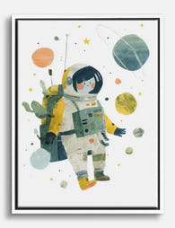
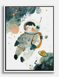
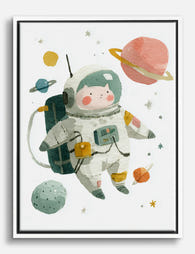
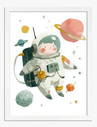
Affiche petit astronaute dans l’espace
Translation missing: fr.products.product.sale_price À partir de CHF 16.00CHF 22.00 -

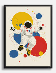
Toile astronaute pop aux couleurs primaires
Translation missing: fr.products.product.sale_price À partir de CHF 61.00CHF 87.00 -

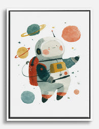
Affiche petit astronaute en aquarelle pour chambre enfant
Translation missing: fr.products.product.sale_price À partir de CHF 16.00CHF 22.00 -
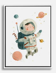
Toile astronaute et planètes pour chambre d’enfant
Translation missing: fr.products.product.sale_price À partir de CHF 61.00CHF 87.00 -
Toile petit astronaute aquarelle
Translation missing: fr.products.product.sale_price À partir de CHF 61.00CHF 87.00 -

Toile astronaute dans un flot de couleurs
Translation missing: fr.products.product.sale_price À partir de CHF 61.00CHF 87.00 -
Toile astronaute pop aux couleurs vives
Translation missing: fr.products.product.sale_price À partir de CHF 61.00CHF 87.00 -

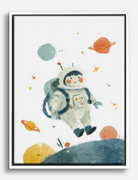
Affiche astronaute en aquarelle pour chambre d'enfant
Translation missing: fr.products.product.sale_price À partir de CHF 16.00CHF 22.00 -
Toile aquarelle petit astronaute et planètes
Translation missing: fr.products.product.sale_price À partir de CHF 61.00CHF 87.00 -
Toile aquarelle petit astronaute
Translation missing: fr.products.product.sale_price À partir de CHF 61.00CHF 87.00 -

Affiche portrait regard vers les étoiles
Translation missing: fr.products.product.sale_price À partir de CHF 16.00CHF 22.00 -
Toile petit astronaute dans l’espace
Translation missing: fr.products.product.sale_price À partir de CHF 61.00CHF 87.00 -

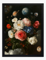
Toile fleurs cosmiques
Translation missing: fr.products.product.sale_price À partir de CHF 61.00CHF 87.00 -
Affiche fleurs célestes
Translation missing: fr.products.product.sale_price À partir de CHF 16.00CHF 22.00 -
Toile astronaute et planètes à l'aquarelle
Translation missing: fr.products.product.sale_price À partir de CHF 61.00CHF 87.00 -

Affiche astronaute en pleine aventure pour chambre d'enfant
Translation missing: fr.products.product.sale_price À partir de CHF 16.00CHF 22.00 -
Toile aquarelle jeune astronaute et planètes colorées
Translation missing: fr.products.product.sale_price À partir de CHF 61.00CHF 87.00 -
Affiche aventure spatiale du petit astronaute
Translation missing: fr.products.product.sale_price À partir de CHF 16.00CHF 22.00 -

Affiche bouquet du jardin cosmique
Translation missing: fr.products.product.sale_price À partir de CHF 16.00CHF 22.00


Plus de The Frame

How to Build a Blossom Gallery Wall That Actual...
Most blossom gallery walls fail for the same reason: they're a collection of pretty things rather than a composition. The fix is planning, not taste. This guide gives you the...

How to Build a Winter Sports Gallery Wall That ...
Most winter sports gallery walls fail for the same reason: people buy four prints they like, hang them roughly equidistant, and call it done. A gallery wall that looks intentional...

How to Style Matisse Portrait Prints in Every R...
You've fallen for a Matisse face. Now you're staring at a wall, second-guessing the size, the frame, the room, the lot. This is the practical guide that takes you from...