The Real Plants Behind William Morris's Most Famous Patterns
A botanical field guide to the actual English plants hiding inside Morris's most beloved leaf patterns.

Most people know William Morris loved nature. Almost no one knows which specific plants are in which patterns, or how to recognise them once you do. This is the field guide we wish existed when we first started hanging his work on our walls.
Morris the naturalist: why he spent hours sketching in his garden
Morris was a designer who happened to draw plants, but he was also a plantsman who happened to design. From childhood he carried a copy of John Gerard's Herball (1597), the great Elizabethan botanical encyclopaedia, and he kept returning to it throughout his career. The Herball taught him to look at plants the way a 16th-century apothecary would: leaf shape, stem habit, the way a tendril curls, the geometry of a flower head.
He sketched constantly. Not quick decorative doodles, but slow studies of how a single acanthus leaf folds back on itself, or how willow leaves layer along a branch. His daughter May later described him standing in front of a plant for half an hour without drawing a line, just looking.
This patience is the reason his patterns still feel alive 150 years later. They aren't decorative leaves. They're specific leaves, observed by someone who knew them by name.

Red House and Kelmscott Manor: the two gardens that shaped everything
Almost every famous Morris pattern can be traced back to one of two gardens. Understanding which garden produced which design is the single most useful thing you can know about his work.
Red House, Bexleyheath (1860 to 1865)
Morris's first home, built for him by Philip Webb, came with a deliberately old-fashioned garden of apple trees, roses trained on wooden trellises, and a kitchen garden of native English herbs and vegetables. It was here, watching a climbing rose tangle through a wooden trellis outside his bedroom window, that he designed Trellis (1862), his very first wallpaper. The lattice is the actual trellis. The roses are the actual roses. The birds (drawn by Webb) are the actual birds that nested in them.
Red House also gave us Daisy (1864), inspired by the spring meadow flowers in the orchard, and Fruit (also called Pomegranate, 1866), which grew out of the kitchen garden's autumn abundance.
Kelmscott Manor, Oxfordshire (1871 to 1896)
When Morris took the lease on Kelmscott, a Tudor farmhouse beside the upper Thames, his patterns changed completely. The garden was wilder, the surrounding meadows boggier, and the riverbank thick with willow, sedge and meadowsweet. The patterns from this period are looser, more flowing, more aware of water and weather.
Willow Boughs, Strawberry Thief, Kennet, Wandle, Lodden (all named after Thames tributaries) and the great Acanthus itself came from this Kelmscott period. If you own a Morris print with a sinuous, river-like flow, it almost certainly began here.
Acanthus: from ancient Greek columns to your living room wall
Acanthus (1875) is Morris's most ambitious leaf pattern and arguably the most demanding piece of woodblock printing ever attempted in Victorian England. It required 30 separate printing blocks and 15 colours to produce a single repeat. He knew it would be expensive. He did it anyway.
The actual plant
The acanthus in the pattern is Acanthus mollis, sometimes called bear's breeches, a Mediterranean perennial with enormous deeply lobed dark-green leaves that can reach 60cm long. It grew (and still grows) in the Kelmscott garden. Morris would have known it from two sources: the living plant outside his door, and the stylised acanthus carved into the capitals of Corinthian columns since the 5th century BC.
This double inheritance, botanical and architectural, is the whole point. Morris wasn't drawing a leaf. He was drawing 2,000 years of leaf-drawing.
What he changed
Look at a real acanthus leaf and you'll see it's asymmetrical, slightly messy, varying wildly from plant to plant. Morris kept the deep lobes and the curling tips but flattened the whole thing, gave it a strict mirror symmetry, and made the leaves overlap in a way they never quite do in nature. He learned this layering trick from studying medieval manuscript borders at the British Museum, where scribes had been stylising acanthus the same way for 500 years.
The result sits exactly between observation and ornament. You can see the real plant in it. You can also see that it's been put through centuries of artistic translation. That tension is what makes Morris's leaf designs work so well as wall art: they're decorative without ever feeling decorative.
Willow Boughs: the most calming leaf pattern Morris ever drew
If Acanthus is Morris showing off, Willow Boughs (1887) is Morris at his most restful. It's a single colour, a single plant, and a single mood. We think it's the best Morris pattern for a bedroom or a quiet hallway, and one of the easiest of his designs to live with at scale.
The actual plant
The willows are Salix alba, the white willow, and Salix fragilis, the crack willow, both native species that line the Thames around Kelmscott. Morris would have walked past them every day on his way to the river. The leaves are long, narrow, slightly silvery on the underside, and they layer themselves along thin flexible branches in a way that produces natural diagonal rhythms.
What he changed
Almost nothing, which is the genius of it. Morris removed the trunk, removed the ground, removed the sky, and just kept the boughs. He also subtly aligned the leaves so they form an undulating diagonal flow across the wall, something the real plant only suggests. The repeat is so well-disguised that most people never notice it tiles at all.
It's worth pausing on what this pattern doesn't have: no flowers, no fruit, no birds, no contrast colour. Just leaves. In a Victorian context, where pattern usually meant maximalist exotica, this was almost shockingly restrained.

Vine and Fruit: when leaves meet abundance
Vine (1873) and Fruit (1866) are the patterns where Morris's leaf-drawing meets his love of the kitchen garden. Both are denser than Willow Boughs and more colourful than Acanthus, and both reward close inspection.
Vine
The vine is Vitis vinifera, the common grape vine, which Morris grew at Kelmscott against a south-facing wall. The leaves are the star: five-lobed, deeply veined, drawn from multiple angles so you see them face-on, in profile, and curling at the edges as if drying in late summer. Tiny bunches of grapes peek through the leaves but are deliberately understated. The leaves do the work.
This pattern shows Morris's woodcut influence most clearly. The leaf edges are crisp, almost cut. He'd been studying Albrecht Dürer's botanical engravings and you can see Dürer's confident outlining in every leaf.
Fruit (Pomegranate)
Fruit is the Red House pattern par excellence, drawn when Morris was still figuring out what his style would be. You'll find pomegranates, lemons, oranges and peaches, none of which actually grew in the Red House garden. He took the fruit from medieval tapestries and grafted them onto an English-orchard structure of apple branches. The leaves, though, are real: drawn from the apple, pear and quince trees that Webb had planted around the house.
It's the most honest pattern in his catalogue about how he actually worked: real English foliage as the structure, decorative borrowed motifs as the ornament. If you've ever wondered why Morris feels both familiar and slightly foreign, Fruit is the pattern that explains it.
Why Morris rejected industrial pattern-making for hand-observed nature
In the 1870s, Victorian wallpaper was dominated by chemically printed, machine-produced imitations of French damasks and exotic chinoiserie. Patterns were drawn by anonymous staff designers working from pattern books, copying motifs that had been copied from earlier copies. Nobody was looking at plants anymore.
Morris found this both ugly and dishonest. His objection wasn't only aesthetic. He believed that a pattern made without observation, by a designer who'd never grown a willow or split open a pomegranate, would never feel right on a wall. It would be decoration about decoration, with no original source.
So he did the slow thing. He grew the plants, sketched the plants, studied Gerard's Herball to confirm what he was seeing, hand-cut woodblocks rather than using rollers, and insisted on natural dyes (indigo, madder, weld) over the cheap aniline colours flooding the market. This is why his prints still look correct under modern light: the colour relationships were calibrated against actual plant pigments, not chemical approximations.
It's also a useful thing to know when you're buying a Morris print today. The reason giclée reproduction works so well for his designs is that the colour palette was never garish to begin with. Printed on thick matte paper with archival inks, the patterns sit on a wall the way Morris intended: rich but never loud, present but never shouting. You can browse the full range of William Morris art prints and see how the natural palette holds up across very different patterns.

How to spot the real plants in Morris's leaf prints
Once you know what to look for, every Morris pattern becomes a small puzzle. Here's a field guide for the patterns you're most likely to own or want to own.
Acanthus leaves
Look for: deep lobes with curling tips, mirror symmetry, leaves layered in three or more colours of green. Always large-scale. If the leaves are huge and architectural, it's acanthus.
Willow leaves
Look for: long narrow leaves (three to four times longer than wide), arranged along thin curving branches, usually monochrome or two-tone. If the pattern feels calm and diagonal, it's willow.
Vine leaves
Look for: five-lobed leaves with sharp points, often drawn from multiple angles in the same pattern. Small fruit is a giveaway, but the leaf shape alone is distinctive.
Strawberry leaves
In Strawberry Thief (1883), look for the trifoliate leaf, three small leaflets joined at a single stem, with serrated edges. The strawberry is the wild English variety, Fragaria vesca, smaller and more pointed than supermarket strawberries.
Apple, pear and quince leaves
These appear across Fruit, Trellis and several lesser-known patterns. Apple leaves are oval with finely serrated edges. Pear leaves are glossier and more pointed. Quince leaves have a soft downy underside that Morris hinted at with a paler colour layer.
Meadow flowers
In Daisy and the various meadow patterns, you'll find ox-eye daisy (Leucanthemum vulgare), red campion, fritillary and harebell. All native English wildflowers that Morris would have seen growing wild in the Kelmscott meadows in May and June.
Riverbank plants
The patterns named after Thames tributaries (Kennet, Wandle, Lodden) contain water-loving plants: meadowsweet, water lily, sedge, flag iris. If a pattern flows in long vertical waves, it's almost certainly a river pattern.

A small pilgrimage worth making
Both gardens are still open to visitors. Kelmscott Manor, run by the Society of Antiquaries, has been partially replanted to match the species Morris would have known, and you can still see willows along the same stretch of the Thames he walked. Red House, now owned by the National Trust, has restored sections of the original garden including the trellis that inspired his first wallpaper.
If you own a Morris print and have the chance to visit either, do it. There's something quietly powerful about standing in front of the actual acanthus plant that became the pattern on your wall. It collapses 150 years in a way that no museum label ever can.
Until then, the best thing you can do is look more carefully at the print you already have. Find the lobes. Trace the stems. Identify the leaf. The pattern was made by a man who spent his life learning to see plants. The least we can do is spend ten minutes learning to see them back. For more in this vein, our botanical art prints collection and our wider selection of vintage art prints sit naturally alongside Morris on a wall.

Produits Fab présentés dans cet article
-

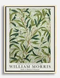
Affiche motif botanique style William Morris
Translation missing: fr.products.product.sale_price À partir de CHF 16.00CHF 22.00 -

Poster Willow Pattern von William Morris
Translation missing: fr.products.product.sale_price À partir de CHF 16.00CHF 22.00 -

Affiche motif saule de William Morris
Translation missing: fr.products.product.sale_price À partir de CHF 16.00CHF 22.00 -

Toile motif floral inspiré par William Morris
Translation missing: fr.products.product.sale_price À partir de CHF 61.00CHF 87.00 -

Affiche botanique inspiration William Morris
Translation missing: fr.products.product.sale_price À partir de CHF 16.00CHF 22.00 -

Affiche motif Fruit de William Morris
Translation missing: fr.products.product.sale_price À partir de CHF 16.00CHF 22.00 -

Affiche botanique inspirée de William Morris
Translation missing: fr.products.product.sale_price À partir de CHF 16.00CHF 22.00 -

Affiche botanique Vine de William Morris
Translation missing: fr.products.product.sale_price À partir de CHF 16.00CHF 22.00 -

Affiche botanique d'automne style William Morris
Translation missing: fr.products.product.sale_price À partir de CHF 16.00CHF 22.00 -

Affiche arbre de vie inspirée par William Morris
Translation missing: fr.products.product.sale_price À partir de CHF 16.00CHF 22.00 -
Toile feuilles botaniques de William Morris
Translation missing: fr.products.product.sale_price À partir de CHF 61.00CHF 87.00 -

Toile William Morris motif floral vert olive
Translation missing: fr.products.product.sale_price À partir de CHF 61.00CHF 87.00 -

Affiche feuillage botanique inspirée par William Morris
Translation missing: fr.products.product.sale_price À partir de CHF 16.00CHF 22.00 -

Affiche prairie fleurie de William Morris
Translation missing: fr.products.product.sale_price À partir de CHF 16.00CHF 22.00 -

Affiche William Morris feuilles d’acanthe
Translation missing: fr.products.product.sale_price À partir de CHF 16.00CHF 22.00 -

Affiche Willow de William Morris
Translation missing: fr.products.product.sale_price À partir de CHF 16.00CHF 22.00 -

Affiche vase botanique William Morris
Translation missing: fr.products.product.sale_price À partir de CHF 16.00CHF 22.00 -

Toile florale d'automne inspirée de William Morris
Translation missing: fr.products.product.sale_price À partir de CHF 61.00CHF 87.00 -

Affiche arbre de vie de William Morris
Translation missing: fr.products.product.sale_price À partir de CHF 16.00CHF 22.00 -

Affiche feuilles de saule de William Morris
Translation missing: fr.products.product.sale_price À partir de CHF 16.00CHF 22.00


Plus de The Frame

Traditional or Contemporary? Styling William Mo...
William Morris designs have a reputation problem. They're either dismissed as dusty Victoriana or treated so reverently that people end up with rooms that look like National Trust tearooms. The...

House Print Decorating Ideas That Work in Every...
You bought a beautiful print of a Georgian townhouse, or maybe a row of pastel Lisbon facades, because you genuinely love architecture. Six months later you've added two more, and...

William Morris Tree Designs: Why They Still Cap...
William Morris is remembered for his florals, but his trees tell a different story. They are slower, more architectural, and rooted in a tradition older than the wallpapers that made...