Art for Above a Console Table
A style-first guide to choosing, sizing, and hanging art that makes your console table look intentional, not accidental.

A console table without art on the wall above it always looks unfinished. Get the art right and the whole vignette clicks into place. Get it wrong (too small, too high, wrong vibe) and the table itself starts to look awkward, like it's apologising for being there.
This guide covers what to choose, how to size it, and how to hang it without putting unnecessary holes in your wall.
Start with the room, not the rules
Before you measure anything, work out what your console table is actually doing. A console in a formal entryway sets the tone for the entire house. One in a narrow hallway needs to add interest without crowding the walkway. A console behind a sofa acts as a visual bridge between two zones. A dining room console is part of a tablescape you look at while eating.
Each of these wants different art.
Entryway consoles deserve something with presence. This is the first thing guests see, and it sets a mood. Think bold landscapes, architectural photography, abstract pieces with strong composition, or a confident single portrait. Avoid anything fussy or quiet here; an entryway eats subtle art for breakfast.
Hallway consoles work better with calmer pieces. The viewer is usually moving past, so a busy gallery wall can feel chaotic. A single horizontal print or a clean diptych tends to read better.
Behind-sofa consoles should harmonise with whatever is happening on the opposite wall (often a TV or fireplace). Match the visual weight roughly. If your TV wall is dark and dense, the console art needs enough presence to hold its own.
Dining room consoles can take more atmospheric, mood-driven art. You're seated, you have time to look, and the lighting is usually softer. Botanicals, still lifes, and moodier abstracts all work well here.

Choose the art before you choose the size
Most guides skip straight to measurements. That's backwards. The size that works depends on the type of art you've chosen, because visual weight is not the same as physical dimensions.
A dense, dark, high-contrast print at 60x80cm feels bigger than an airy watercolour at the same size. A minimalist line drawing needs more breathing room to read properly. A photograph with deep blacks anchors a wall more aggressively than a pastel abstract.
Style matching, briefly
If your room is warm and layered (vintage rugs, wood tones, brass), look for art with similar warmth: oil-painting reproductions, earthy abstracts, botanical studies, soft photography. Cold, graphic art will fight the room.
If your room is sharp and modern (clean lines, neutral palette, metal finishes), the art can either reinforce that with bold graphic work, black and white photography, or architectural prints, or deliberately contrast with something painterly and organic to soften the space.
Browse abstract art prints if you want pieces that work across multiple style directions, or black and white prints if you need something that will sit calmly with almost any palette.
Subject matter that works above consoles
Landscapes (especially horizontal ones) sit beautifully above consoles because they echo the horizontal line of the table. Architectural prints feel formal and intentional. Botanical studies in a set of two or three add quiet rhythm. Abstract pieces with a clear focal point anchor a vignette without competing with lamps and objects on the surface.
What to avoid: tiny detailed prints that disappear from a few metres away, anything with a busy pattern that clashes with a patterned rug or wallpaper, and family photos (save those for hallways and bedrooms; entryways feel cold with portraits of people you don't know).
The measurements that actually matter
Now the rules. They're useful checkpoints, not laws.
Width: Your art should be roughly two-thirds the width of the console table. A 120cm console wants art around 80cm wide. Going slightly wider (up to three-quarters) looks confident; going much smaller looks like the art is floating, lost.
For a triptych or gallery wall, treat the entire arrangement as one piece and apply the same two-thirds rule to the total width including the gaps.
Height above the table: 15 to 20cm (roughly 6 to 8 inches) between the top of the console and the bottom of the frame. Less than this and the art feels squashed onto the table. More than this and the art floats, disconnected.
Eye level checkpoint: The centre of the artwork should land around 145 to 152cm from the floor (the standard 57 to 60 inch gallery rule). If your 20cm gap pushes the centre much above that, the art is probably too tall for the spot, or your ceilings are unusually high and you need to compensate.
Adjust for tall lamps: If you have lamps that reach 50 to 60cm above the table, you've got two choices. Either hang the art so the top of the frame sits roughly level with the top of the lamps (giving you a clean horizontal line across the vignette), or commit to art that's tall enough to clearly dominate, with the lamps reading as flanking elements. The middle option (art that's slightly shorter than the lamps) always looks indecisive.

Arrangement options and when to use each
Single statement piece
The cleanest, most confident option. Choose this when your console sits in a featured position (formal entry, behind a key sofa) and you want the art to do the talking. Works especially well at larger sizes; a single 70x100cm framed print above a console looks expensive even when the rest of the room is modest.
A framed print suits formal entries best, where the polish matters. A large canvas print suits relaxed living spaces where you want the art to feel painterly and less precious.
Diptych or triptych
Two or three pieces hung in a row. Excellent for wide consoles (140cm+) where a single piece would need to be enormous to fit the two-thirds rule. Also great when you want visual rhythm without the complexity of a full gallery wall.
Keep the spacing tight: 5 to 8cm between frames. Treat the set as one unit when you measure for centring.
Gallery wall
The most personal option, the hardest to get right. Choose this when your console is in a casual, lived-in space and you want a collected, layered feel. Avoid in formal entries (it usually reads as cluttered) and narrow hallways (the viewer can't step back to take it in).
Spacing between frames: 5 to 10cm, kept consistent throughout. Treat the entire arrangement as a single rectangle when applying the two-thirds rule and the 15 to 20cm gap above the table.
Mock it up first. Cut paper templates to the size of each frame, tape them to the wall, and live with the layout for a day or two before drilling anything. Photograph the wall on your phone; mistakes are easier to spot in a photo than in person.
Stacked vertical
Two pieces hung one above the other. Brilliant for narrow consoles or spaces between doorways where horizontal space is limited but you have vertical room to work with. Choose pieces that share a palette or theme so the stack reads as one composition.
Layered leaning
Lean one or two large pieces directly on the console rather than hanging them. Works beautifully for renters, indecisive types, and anyone with picture rails or awkward walls. Layer a larger piece behind a smaller one for depth, and let a lamp or vase overlap the front edge slightly.
The trade-off: leaning eats console surface space, so it doesn't work if you actually use the console for keys, post, or storage.
How to hang it without regret
You need: a tape measure, a pencil, a spirit level (or the level on your phone), and the right fixtures for your wall (picture hooks for plaster, wall plugs for masonry, command strips for rentals).
- Measure the centre point of your console along its width. Mark it lightly on the wall above.
- Decide whether to centre on the console or the wall (more on this below).
- Measure 15 to 20cm up from the console top. This is where the bottom of the frame will sit.
- Mark where the hanging hardware on the back of the frame will meet the wall. For framed prints with D-rings or a wire, this is usually 5 to 8cm down from the top of the frame. Measure the actual frame, don't guess.
- Drill, hammer, or stick. Hang. Step back. Adjust.
Framed prints from Fab arrive with fixtures already attached and the print properly fitted inside the frame, so you're hanging one finished object, not assembling anything on your wall.
Centre on the console or the wall?
If the console is centred on the wall, this question doesn't exist. If it's off-centre (next to a doorway, beside a radiator, pushed to one side of an alcove), centre the art on the console, not the wall. The eye reads the console and art as one vignette. Centring on the wall just makes the offset look like a mistake.

Troubleshooting the awkward stuff
Low ceilings (under 2.4m): Go horizontal. Tall vertical art compresses a low ceiling further. A wide horizontal piece, or a horizontal diptych, makes the wall feel broader and ceilings feel higher.
High ceilings (over 3m): Resist the urge to centre at the standard 145cm eye level; the art will look stranded. Either go larger (a 70x100cm portrait orientation print held higher works well) or use a stacked vertical arrangement to fill the vertical space.
Off-centre console: Centre the art on the console. Then add a tall plant or floor lamp to the empty side of the wall to balance the composition.
Renters: Adhesive strips rated for the weight of your frame work well on flat painted walls (always test on an inconspicuous spot first). Leaning art on the console itself avoids holes entirely. Picture rails, if you have them, are a gift.
Art that doesn't quite fit the two-thirds rule: If you've fallen in love with a piece that's slightly small, layer it. Lean a smaller piece on the console in front, or hang a second piece beside it. If it's slightly large, hang it anyway; oversized art above a console is a known design move and usually looks better than too small.
Styling the surface so the art doesn't work alone
The art and the table styling are one composition. Vary the heights on the console (a tall lamp, a medium vase, a low stack of books) so the eye travels up to the art naturally rather than hitting a flat row of objects. Echo a colour from the art in one styled object on the table; it ties everything together without being matchy.
Don't fill every inch of the console. Negative space on the surface lets the art breathe.
When to use a mirror instead
A mirror above a console is the right call when the hallway is dark, narrow, or both. Mirrors bounce light and visually widen tight spaces in a way art can't. They're also the easier choice for genuinely formal entries where you want elegance without committing to a specific subject matter.
Art wins when you want personality, mood, or a clear style statement. Mirrors win when you want light and space. There's no rule against using both: a mirror leaning on the console with smaller framed prints flanking it on the wall is a very good look.
For more on choosing pieces that suit smaller entry spaces, the hallway art collection is a useful place to start.

A quick checklist before you drill
- Art width is two-thirds to three-quarters of the console width
- Bottom of frame sits 15 to 20cm above the console top
- Centre of art lands around 145 to 152cm from the floor
- Art is centred on the console, not the wall (if those differ)
- You've mocked the arrangement up in paper or photographed it first
- The style and palette actually suit the room you're standing in
Get those six right and the rest is just hammering.

Produits Fab présentés dans cet article
-

Affiche Above Me Now
Translation missing: fr.products.product.sale_price À partir de €16,95€23,95 -
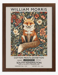
Affiche renard de William Morris
Translation missing: fr.products.product.sale_price À partir de €16,95€23,95 -

Affiche rêverie à table
Translation missing: fr.products.product.sale_price À partir de €16,95€23,95 -
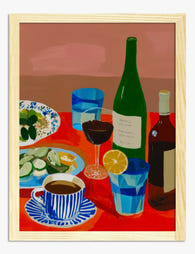
Affiche table rouge et conviviale
Translation missing: fr.products.product.sale_price À partir de €16,95€23,95 -

Affiche collines de Toscane
Translation missing: fr.products.product.sale_price À partir de €16,95€23,95 -

Affiche chevaux élégants année du cheval
Translation missing: fr.products.product.sale_price À partir de €16,95€23,95 -

Affiche table conviviale aux couleurs vives
Translation missing: fr.products.product.sale_price À partir de €16,95€23,95 -

Toile renard aux motifs floraux par William Morris
Translation missing: fr.products.product.sale_price À partir de €64,95€92,95 -

Affiche table conviviale
Translation missing: fr.products.product.sale_price À partir de €16,95€23,95 -

Affiche match de football vu d'en haut
Translation missing: fr.products.product.sale_price À partir de €16,95€23,95 -

Affiche géométrique Bauhaus
Translation missing: fr.products.product.sale_price À partir de €16,95€23,95 -

Affiche table conviviale en pastels
Translation missing: fr.products.product.sale_price À partir de €16,95€23,95 -

Affiche botanique pivoine, inspiration William Morris
Translation missing: fr.products.product.sale_price À partir de €16,95€23,95 -

Affiche table conviviale aux tons pastels
Translation missing: fr.products.product.sale_price À partir de €16,95€23,95 -

Affiche table élégante et conviviale
Translation missing: fr.products.product.sale_price À partir de €16,95€23,95 -

Toile étude de pivoines, inspiration William Morris
Translation missing: fr.products.product.sale_price À partir de €64,95€92,95 -

Toile collines toscanes vintage
Translation missing: fr.products.product.sale_price À partir de €64,95€92,95 -

Toile règles de danse sur la table noir et blanc
Translation missing: fr.products.product.sale_price À partir de €64,95€92,95 -

Affiche collines de Toscane au coucher du soleil
Translation missing: fr.products.product.sale_price À partir de €16,95€23,95


Plus de The Frame

What to Hang in Awkward Corners
Corners are the dead zones of most homes. Your eye skims past them, furniture refuses to sit flush against them, and you end up with a triangular patch of wall...

Art for Narrow Walls and Hallways
Narrow walls are the most under-decorated surfaces in most homes. Not because they're hard to style, but because most advice treats every awkward space as the same problem when really...

What to Put on a Big Blank Wall
Big blank walls feel impossible because they multiply your options instead of narrowing them. Every idea seems plausible, nothing feels right, and the wall stays empty for another six months....