Creative Studio: Colour and Personality, on Purpose
How to build a creative studio where every colour, frame and print actively fuels the work you make.

Most maximalism advice treats colour like a costume. Pile it on, mix the patterns, call it personality. But a creative studio is not a stage set. It is the room where you actually have to think, make, and care about what you produce, which means the art on your walls needs to do real work.
This guide is about intentional maximalism. Not chaos dressed up as confidence, but a considered approach to colour, scale and subject that reflects how you create and what you need from your space to do it well.
What "purposeful maximalism" actually means
Maximalism gets a bad reputation because people confuse it with clutter. They are not the same. Clutter is unedited accumulation. Maximalism is curated abundance, every piece earning its place because it adds something specific to the room.
In a creative studio, that distinction matters more than anywhere else. You are not styling a guest bedroom. You are building an environment that has to support hours of focused work, decision-making, and the occasional creative crisis at 11pm.
Purposeful maximalism asks a different question than "does this look good together." It asks "does this make me work better." Sometimes the answer is jewel tones and oversized florals. Sometimes it is a wall of high-contrast graphic prints. The colours are not arbitrary. They are tools.

Find your colour personality
Before you buy a single print, you need to know which kind of maximalist you actually are. These four categories are a starting point, not a cage. Most creatives sit between two.
The jewel tone maximalist
You are drawn to depth. Emerald, sapphire, garnet, amethyst, ink black. Your work probably involves craft, detail, or a sense of luxury. Tactile makers, jewellery designers, calligraphers, illustrators with a romantic streak. This palette signals abundance and slows the eye down, which is useful when your work demands precision.
Pair jewel-toned colourful art prints with warm wood frames and brass hardware. Avoid cool greys. You want the room to feel like a velvet-lined box, not a hospital.
The primary pop maximalist
You think in big, declarative gestures. Red, yellow, cobalt, sometimes a punchy green thrown in. Graphic designers, illustrators, anyone whose work needs energy and confidence. This palette is loud on purpose, which suits people whose creative process involves bold first drafts and quick decisions.
Watch out for the playroom trap. Primary colours plus white walls can read as nursery if you are not careful. Ground it with black framing, a dark floor, or one large piece of bold wall art in a dominant colour so the rest can riff around it.
The earthy bohemian maximalist
Terracotta, ochre, sage, rust, cream, faded indigo. Writers, ceramicists, textile artists, photographers who shoot natural light. This palette is quiet but layered, which works for slower, more contemplative creative practices. The room should feel like it has been built up over years, even if you assembled it last weekend.
The risk here is everything blending into mush. You need contrast. One almost-black print, one piece of strong botanical illustration, something with a hard graphic edge to keep it from going full Pinterest cliché.
The high-contrast maximalist
Black, white, one or two saturated accents, lots of pattern. Photographers, art directors, anyone whose work is image-led and needs the studio to feel curated rather than cosy. This palette is maximalist in pattern and density, minimalist in colour count, which is a sophisticated balance to pull off.
It also ages well. If you suspect your taste might shift in two years, this is the safest entry point to maximalism that still feels like maximalism.
Match your art to your creative discipline
Different work demands different walls. The studio that helps a novelist write a third act will actively interfere with an illustrator trying to colour-match a brief.
Writers and strategists need walls that hold attention without competing for it. Larger pieces, slower subjects, fewer focal points. Landscape and abstract work tends to suit better than figurative or text-heavy art. The eye needs somewhere to rest when sentences are stuck.
Designers and illustrators benefit from variety and reference. Gallery walls work well here because they mimic the mood-board way you already think. Mix print styles, eras and palettes. The room should feel like a Pinterest board you can walk inside.
Photographers usually want fewer, larger pieces with strong tonal control. Your eye is already trained to read light and composition, so busy walls will exhaust it. One or two oversized canvas prints can carry an entire room.
Makers and ceramicists need rooms that survive mess. Canvas prints handle humidity, dust and the occasional splash better than glazed frames, which matters if your studio has a kiln, a wheel, or a sink. A large canvas print sized around 100x150cm above your workbench gives presence without the worry.

How to start if you are coming from minimalism
If your current studio is white walls and one peace lily, going full maximalist overnight will give you whiplash and buyer's remorse. Build in stages.
Stage one: pick a wall. One. Usually the wall you face when you work, because that is the one doing the heaviest lifting on your mood. Leave the others alone for now.
Stage two: choose a single statement piece. Go larger than feels comfortable. A 70x100cm framed print or a 100x150cm canvas. Small art on a big wall looks apologetic, and apologetic is the opposite of what you want.
Stage three: live with it for two weeks. Notice how it changes the room at different times of day. Notice whether you actually like working under it. This is information.
Stage four: build around it. Add two or three supporting pieces in related but not identical tones. A gallery wall, a stacked pair, a piece on an adjacent wall to pull the eye through the room.
The mistake people make is buying ten prints at once because they saw a beautiful image on Instagram. That image had a stylist. You have a deadline. Build slowly.
Sizing for studios specifically
Studios tend to have more vertical clutter than other rooms. Shelves, racks, tools, surfaces piled with the project you are mid-way through. Your walls need to compete with that, which usually means bigger art than you would hang in a lounge.
A rough rule for studios: whatever size you think will work, go one size up. A 50x70cm print that would look generous above a sofa often looks lost above a desk piled with reference books and a monitor.
For canvas, the extra large canvas prints at 100x150cm hold a wall on their own and pair well with the visual noise of a working studio. For framed prints, 70x100cm is the upper limit and the right limit for most studio feature walls.
Gallery walls follow a different logic. Aim for the cluster to occupy roughly two thirds of the wall width, with the centre of the arrangement at eye level when you are seated, not standing. You will spend most of your studio hours sitting.
Common studio mistakes worth avoiding
Buying art that matches your work too literally. A graphic designer with a wall full of typography prints. A photographer surrounded by photographs. It feels obvious in your head and oppressive in the room. Contrast is more useful than echo. Your walls should give your eye somewhere to go that is not the screen.
Choosing trends over instinct. If you have to convince yourself you like a piece, you do not. Studios are long-term spaces. The art that survives the longest is the art you chose because you could not stop looking at it.
Cheap framing on good prints. This is the one that quietly ruins more studios than anything else. Warped MDF frames, glass that picks up every fluorescent reflection, prints shipped loose and badly fitted. If you are investing in maximalism, the framing has to hold up. Solid wood frames, UV-protective acrylic glaze that kills glare, and prints fitted properly in the box rather than shipped as a flatpack project. This sounds like a small detail. It is not.
Forgetting the ceiling and corners. Maximalist studios benefit from art that draws the eye up and around. A single tall print in a corner, a small piece above a doorway. These spots cost almost nothing to fill and transform how the room reads.

Gallery walls that actually work
Gallery walls are the maximalist's signature move, and also where most attempts fall apart. The fix is structure, not spontaneity.
Start with a horizontal line or a vertical line that runs through the arrangement. The top edge of one row, the centre line of all pieces, the right edge of a column. Pick a line and commit to it. The eye needs an anchor.
Vary the sizes more than you think. Three medium prints next to each other looks like a catalogue page. One large piece, one medium, two small, in mixed orientations, looks like a considered collection.
Keep the spacing tight. Five to seven centimetres between frames reads as deliberate. Fifteen centimetres reads as accidental.
Mix the subjects but unify something. A common colour that appears in every piece. A consistent frame finish. A shared tonal range. One thread that ties the wall together so it reads as a collection rather than a junk drawer. Browsing a curated set of framed art prints is easier when you already know what your thread is.
Letting the studio evolve
Your work will change. The studio that suits you now will not suit you in three years, and that is fine. Build for adaptability.
Hang one or two anchor pieces that you genuinely love and expect to keep. Around those, plan for rotation. Smaller prints can move from wall to wall as your projects shift. A piece that fuelled a particular client brief can come down once the brief is delivered, replaced by something that fits the next thing.
This is the quiet argument for buying real, lasting prints rather than poster-grade ones. Museum-grade giclée printing on thick matte paper with archival inks does not fade in direct sunlight, which means the art outlasts the project. You can move it, restyle it, lend it to a friend, and it still looks the way it did the day it arrived.

A practical starting point
If you are reading this and feel paralysed, here is the shortest version.
Identify your colour personality. Pick one wall, the one you face when you work. Buy one large piece, larger than feels safe, in a palette that matches your colour personality and contrasts with your daily work. Live with it for two weeks. Then add two or three supporting pieces that share one common thread with the first.
That is the entire framework. Everything else is refinement.
Your studio is not a magazine spread. It is the room where you have to show up every day and make something. Choose the art that helps you do that, in colours that feel like you when you are working at your best. The rest will follow.

Produits Fab présentés dans cet article
-

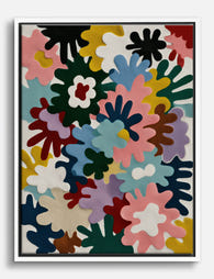
Toile maximaliste à aplats de couleur
Translation missing: fr.products.product.sale_price À partir de €64,95€92,95 -

Toile explosion de couleurs
Translation missing: fr.products.product.sale_price À partir de €64,95€92,95 -

Toile ambiance d'atelier chaleureuse et colorée
Translation missing: fr.products.product.sale_price À partir de €64,95€92,95 -

Affiche portrait expressif en aplats de couleur
Translation missing: fr.products.product.sale_price À partir de €16,95€23,95 -

Toile traits audacieux, esprit unique
Translation missing: fr.products.product.sale_price À partir de €64,95€92,95 -

Affiche abstraite coups de pinceau multicolores
Translation missing: fr.products.product.sale_price À partir de €16,95€23,95 -

Affiche abstraite blocs de couleur
Translation missing: fr.products.product.sale_price À partir de €16,95€23,95 -

Affiche jardin coloré et maisonnette bleue
Translation missing: fr.products.product.sale_price À partir de €16,95€23,95 -
Toile explosion de couleurs arc-en-ciel
Translation missing: fr.products.product.sale_price À partir de €64,95€92,95 -

Affiche abstraite aux couleurs vives
Translation missing: fr.products.product.sale_price À partir de €16,95€23,95 -

Toile explosion de couleurs au pinceau
Translation missing: fr.products.product.sale_price À partir de €64,95€92,95 -

Affiche botanique colorée
Translation missing: fr.products.product.sale_price À partir de €16,95€23,95 -

Affiche tigre multicolore, style maximaliste
Translation missing: fr.products.product.sale_price À partir de €16,95€23,95 -

Affiche typographique chaos chromatique
Translation missing: fr.products.product.sale_price À partir de €16,95€23,95 -

Toile muse moderne en collage aux couleurs vives
Translation missing: fr.products.product.sale_price À partir de €64,95€92,95 -

Affiche visage abstrait en aplats de couleur
Translation missing: fr.products.product.sale_price À partir de €16,95€23,95 -

Toile tigre multicolore maximaliste
Translation missing: fr.products.product.sale_price À partir de €64,95€92,95


Plus de The Frame

The Boutique Hotel Feel at Home: What to Copy, ...
There's a specific feeling you get walking into a good boutique hotel. The lobby art makes you stop. The bedroom print feels like it was chosen for that exact room....

Mediterranean Escape: Terracotta, Sage, and the...
There's a reason the same three colours keep showing up in every Mediterranean room you've pinned. Terracotta, sage green, and warm white aren't just pretty together. They're a coded language...

Warm Minimalism: Restraint Without Coldness
Warm minimalism is what happens when minimalism remembers it's meant for humans. It keeps the discipline, the breathing room, the refusal to clutter, but swaps out the gallery-white sterility for...