How to Build a Love Themed Gallery Wall That Actually Looks Cohesive
A theme-first approach to gallery walls, with print pairing formulas, layout templates, and the frame rules that actually work.

Most love themed gallery walls fail for the same reason: they read as a pile of romantic prints rather than a considered collection. The fix is not buying better art. It is choosing pieces that talk to each other through colour, scale, and frame, then hanging them with discipline.
This guide gives you the formulas, measurements, and decisions that turn a wall of separate prints into one curated arrangement.
Start with a hero piece: choosing your anchor print
Every good gallery wall has a hero. This is the largest print, the one your eye lands on first, and the piece that sets the colour palette and emotional tone for everything else. Without it, you get a democracy of prints all competing for attention, which is exactly what makes gallery walls look random.
For a love themed wall, your hero should be the most expressive piece in the group. A bold abstract heart in muted terracotta. A large figurative couple in line drawing. A typographic love quote in painterly script. Pick one strong idea and let everything else support it.
Size matters here. If your wall is above a sofa or bed (the usual spots), your hero should be at least 50x70cm, ideally 60x80cm or 70x100cm. Anything smaller and it will not hold the wall. The rest of your prints can then be smaller (30x40cm or 40x50cm) because they are playing supporting roles.
Splurge on this piece. The hero is what people will actually look at, so it is worth choosing something printed properly on thick matte paper with real depth, rather than a thin poster that buckles in the frame within a year.

The three-print formula for a love themed gallery wall
The simplest, most reliable formula for a love themed gallery wall uses three categories of art, one piece from each:
- One abstract or symbolic piece (an abstract heart, a colour-field piece in romantic tones, a minimalist line drawing)
- One typographic or quote piece (a love quote, a single word, lyrics in considered typography)
- One figurative piece (a couple, hands, a romantic figure study, a vintage-feeling photograph)
This works because each category does a different job. The abstract gives you colour and emotion. The typography gives the wall a clear theme without being literal. The figurative piece gives the eye a human reference point.
You can scale this formula up to six or nine prints by repeating the categories: two abstracts, two quotes, two figuratives. The ratio matters more than the count. If you have five quote prints and one abstract, the wall reads as a typography wall, not a love wall.
For larger arrangements, browse love art prints and quote art prints side by side so you can see the categories pair before you commit.
Mixing styles without chaos: quotes, abstracts, and figurative art together
The reason most mixed-style walls look chaotic is colour, not style. You can hang an abstract painting next to a vintage photograph next to a hand-lettered quote and it will look intentional, as long as the colours connect.
Pick a palette of two or three colours and make sure every print contains at least one of them. For love themes, a reliable palette is:
- A soft warm neutral (cream, oat, blush)
- One accent (terracotta, dusty rose, burgundy, deep red)
- One grounding tone (charcoal, ink black, deep olive)
Avoid pure bright reds and saturated pinks unless you want the wall to read as Valentine's Day decoration. Muted, dusty, earthy versions of the same colours feel grown up and last all year.
Style mixing then becomes safer. An abstract in terracotta and cream sits next to a black-ink line drawing of a couple, sits next to a quote print in charcoal serif on oat paper. Three different visual languages, one shared palette, and the wall reads as one piece.
Frame consistency vs. eclectic mix (and which we recommend)
The eclectic frame mix (different colours, different widths, different finishes) works in maybe one in twenty homes. It requires a confident maximalist eye, a wall full of prints with strong visual differences, and usually a vintage-leaning interior to absorb the variety.
For a love themed wall in a modern home, we recommend matching frames. Always.
Matching frames are the single biggest factor in whether your gallery wall looks curated or chaotic. They create a visual rhythm that lets you mix wildly different art styles without the eye reading the wall as messy. The frame becomes the consistent grammar, the art becomes the vocabulary.
For love themes specifically, three frame finishes work best:
- Natural oak: warm, modern, pairs beautifully with terracotta and dusty pink palettes
- Black: graphic, confident, best when your prints lean typographic or high-contrast
- White: light, soft, works in bright rooms with pastel-leaning art
Pick one and commit across every frame. If your prints are unframed canvas, the same logic applies: same canvas depth, same edge treatment.
A note on quality. Cheap frames are the fastest way to ruin a gallery wall. Warped MDF, prints shipped loose with the frame, glass that catches every light in the room. If you are buying framed prints, look for solid wood frames with UV-protective acrylic glaze (it does not glare like glass and protects from fading), with the print properly fitted in the frame at the workshop, not by you on your kitchen floor.

Layout templates: grid, salon, and asymmetric options with dimensions
Three layouts work reliably for love themed gallery walls. Pick based on your space and how formal you want the wall to feel.
The grid (formal, symmetrical)
Six prints in a 3x2 arrangement, all the same size (40x50cm works well), all identical frames, with even spacing. Total wall coverage roughly 150cm wide by 120cm tall.
This is the most polished, most architectural option. It suits modern interiors, above beds, and behind sofas. It is also the least forgiving: any wonky frame or uneven gap is immediately visible.
The salon hang (relaxed, layered)
A loose cluster of seven to nine prints in mixed sizes, arranged organically with a strong centre. Hero piece at 60x80cm in the middle, surrounded by 30x40cm and 40x50cm pieces.
The trick: keep the outer edges of the cluster following an imaginary rectangle. The inside can feel loose, but the perimeter should be roughly straight. This is what stops salon walls looking like an explosion.
Asymmetric (modern, gallery feel)
Three or five prints in different sizes, hung off-centre with deliberate imbalance. One large hero (70x100cm) on the left, two medium prints (40x50cm) stacked on the right. Or one large in the middle with one small floating off to one side.
This works best on wider walls where you want negative space to be part of the composition. It feels more like a curated gallery and less like a decorating project.
For pre-paired sets that take the guesswork out of pairing, browse wall art sets where the colour and style relationships are already worked out.
Spacing, height, and alignment rules that actually work
These rules are not negotiable. They are the difference between a wall that looks designed and one that looks improvised.
Spacing between frames: 5 to 7cm. Closer than 5cm and the wall feels cramped. More than 7cm and the prints stop reading as a group.
Centre height: the visual centre of your gallery wall should sit at 145 to 152cm from the floor. This is gallery standard, and it works because it aligns with average eye level. Most people hang art too high.
Above furniture: leave 15 to 20cm between the top of the sofa, bed, or console and the bottom of your lowest frame. Closer and the art feels stuck to the furniture. Further and it floats away from it.
Alignment: pick one alignment line and follow it. Either the tops of all frames align, the bottoms align, or the horizontal centre line of the arrangement runs through the middle of every print. Mixing alignments is what makes walls look chaotic.
The floor layout method (do this every time)
Before you put a single nail in the wall, lay every print on the floor in front of the wall. Move them around. Photograph the arrangement. Move them again.
Better still: cut paper templates the exact size of each frame, label them, and tape them to the wall with masking tape. Live with it for 24 hours. Adjust. Then mark the nail positions through the paper before pulling it down.
This single step prevents 90% of gallery wall mistakes. Skipping it is how you end up with twelve unnecessary holes in your plaster.

Common gallery wall mistakes and how to avoid them
Too matchy. Six prints all in the same style, same colours, same energy. The wall looks like wallpaper, not a collection. Fix: introduce one piece that breaks the pattern. A black and white photograph among colour abstracts. A bold typographic piece among soft figuratives.
Competing focal points. Two equally large, equally bold prints fighting for attention. Fix: demote one. Either swap it for something smaller, or move it to a different wall. There is one hero per arrangement.
Wrong colour balance. Three pink prints and one charcoal piece will always look unbalanced because the charcoal will read as a hole. Fix: repeat every colour at least twice across the wall. If you have one charcoal piece, add a second print that contains charcoal even as a small accent.
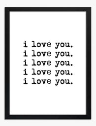
Too literal. Six pink hearts and a "LOVE" sign reads as a card shop window. Fix: dilute literal love imagery with abstract pieces, landscapes in romantic tones, or figurative art that suggests connection without spelling it out.
Frames hung too high. The most common mistake by far. Drop everything by 10 to 15cm and watch the room transform.
Random sizes with no relationship. Five prints at five completely unrelated dimensions. Fix: stick to two or three sizes maximum across the whole arrangement. 30x40cm, 40x50cm, and one 60x80cm hero is plenty.
Recommended love prints that pair well together
A few combinations that work, as starting points rather than rules.
The warm minimalist set (three prints):
- Hero: large abstract heart in terracotta and cream (60x80cm)
- A black-ink line drawing of two figures (40x50cm)
- A typographic quote in charcoal serif on oat background (40x50cm)
All in natural oak frames. Palette: terracotta, cream, charcoal.
The soft romantic set (five prints):
- Hero: dusty pink figurative painting of a couple (70x100cm)
- Two small abstract heart studies in blush and burgundy (30x40cm each)
- One quote print in burgundy script (40x50cm)
- One botanical or rose study in muted pink (40x50cm)
All in white frames. Palette: blush, burgundy, cream.
The graphic modern set (six prints, grid):
- Six prints, all 40x50cm, all in black frames
- Two abstract hearts in red and black
- Two typographic love quotes in black on cream
- Two line-drawn figurative pieces
Palette: red, black, cream. The grid does the heavy lifting.
For more options as you build out your set, heart art prints is a good place to find pieces that lean abstract and symbolic rather than literal.

A final note on seasonal flexibility
A well built love themed gallery wall should not need dismantling for the rest of the year. The reason it works in February is the same reason it works in October: muted palette, mixed styles, considered framing.
If you find yourself wanting to swap pieces for different seasons, the issue is usually that your palette is too literal (too much pink, too much red). Pull saturation down and the same wall reads as warm and considered all year. That is the whole point. Build it once, build it properly, and let it stay up.

Produits Fab présentés dans cet article
-

Toile crée la vie que tu aimes
Translation missing: fr.products.product.sale_price À partir de €64,95€92,95 -

Toile cœur joyeux et aplats de bleu
Translation missing: fr.products.product.sale_price À partir de €64,95€92,95 -

Affiche typographique amour rouge
Translation missing: fr.products.product.sale_price À partir de €16,95€23,95 -

Toile amour en typographie arc-en-ciel
Translation missing: fr.products.product.sale_price À partir de €64,95€92,95 -

Toile all you need is love, rose et rouge
Translation missing: fr.products.product.sale_price À partir de €64,95€92,95 -
Affiche typographique affirmation d'amour
Translation missing: fr.products.product.sale_price À partir de €16,95€23,95 -

Affiche plus d’amour noir et blanc
Translation missing: fr.products.product.sale_price À partir de €16,95€23,95 -

Toile l'amour est partout
Translation missing: fr.products.product.sale_price À partir de €64,95€92,95 -
Affiche citation l'amour est partout (noir et blanc)
Translation missing: fr.products.product.sale_price À partir de €16,95€23,95 -
Toile cœur minimaliste
Translation missing: fr.products.product.sale_price À partir de €64,95€92,95 -

Toile l'amour dans chaque geste
Translation missing: fr.products.product.sale_price À partir de €64,95€92,95 -

Toile typographique l'amour est partout
Translation missing: fr.products.product.sale_price À partir de €64,95€92,95 -

Toile typographique rétro All You Need Is Love
Translation missing: fr.products.product.sale_price À partir de €64,95€92,95 -

Affiche typographique amour, cœur noir sur fond blanc
Translation missing: fr.products.product.sale_price À partir de €16,95€23,95 -

Affiche cœur rouge amour, inspiration Matisse
Translation missing: fr.products.product.sale_price À partir de €16,95€23,95 -
Affiche l’amour suffit
Translation missing: fr.products.product.sale_price À partir de €16,95€23,95 -

Affiche bouquet de ballons en forme de cœur
Translation missing: fr.products.product.sale_price À partir de €16,95€23,95 -

Affiche cœur et racines
Translation missing: fr.products.product.sale_price À partir de €16,95€23,95 -

Toile plus d'amour s'il vous plaît noir et blanc
Translation missing: fr.products.product.sale_price À partir de €64,95€92,95 -

Affiche bouquet de ballons en forme de cœur à l’aquarelle
Translation missing: fr.products.product.sale_price À partir de €16,95€23,95


Plus de The Frame

Arts and Crafts Animal Prints: The Victorian De...
The Arts and Crafts revival: why Victorian animal prints are trending again Scroll through any interior design hashtag right now and you'll see them everywhere: hares peering through curling foliage,...

You're Overthinking Your Arts and Crafts Galler...
Most gallery wall advice assumes you're working with clean, simple imagery. Photographs. Line drawings. Quiet little prints with breathing room baked in. Arts and Crafts prints are the opposite of...

Watercolor Painting Styles Explained: From Bota...
A quick primer on why watercolour looks the way it does Watercolour behaves unlike any other medium. Pigment suspended in water, applied to absorbent paper, with the artist controlling roughly...