Matisse Cut-Outs vs Traditional Botanical Art: Which Suits Your Space?
One style whispers botanical accuracy, the other shouts joyful colour. Here's how to pick the right one for your walls.

Both styles put nature on your wall, but they do completely different things to a room. One is quiet, studied, and architectural. The other is loud, joyful, and unapologetically modern. This guide helps you work out which one belongs in your space, and what happens if you want both.
Two ways to put nature on your wall
Traditional botanical illustration came out of science. Artists like Georg Dionysius Ehret in the 18th century and Pierre-Joseph Redouté in the early 19th century painted plants for botanists, herbalists, and royal collections. Every vein, stamen and leaf curl was rendered with near-photographic accuracy on cream or off-white grounds. The intent was documentary.
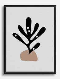
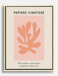
Matisse arrived at botanicals from the opposite end. In the late 1940s, confined to a wheelchair after surgery, he began cutting shapes from gouache-painted paper with scissors. The cut-outs, including works like La Gerbe, Les Velours, and the Blue Nudes series, reduced leaves, algae, coral and flowers to flat, abstract silhouettes in saturated colour. The intent was emotional.
That difference, scientific record versus emotional shorthand, is the root of every other decision you'll make.

Detail vs simplicity: what each style brings to a room
A traditional botanical print rewards close looking. You'll find yourself standing in front of it, tracing the structure of a fern frond or counting petals on a peony. It adds layers, texture and a sense of craft. In a room, it acts like a quiet book on a shelf: present, but not demanding.
Matisse's botanical work does the opposite. A single cut-out shape, a leaf reduced to three curves and a flat block of vermilion, hits you from across the room. It's about gesture and rhythm, not information. You don't study a Matisse cut-out. You feel it.
This matters practically. If your room already has a lot going on, busy textiles, layered rugs, full bookshelves, a detailed botanical illustration can disappear into the visual noise. A Matisse-style piece will cut through it. The reverse is also true. In a pared-back, low-furniture room, a Matisse cut-out can feel too aggressive, while a delicate botanical illustration provides exactly the right amount of detail.
The psychology of each style
Traditional botanicals create calm through order. There's something inherently soothing about scientific precision, the same reason people find old maps and anatomical drawings restful. Matisse's floral art creates energy through movement. The shapes feel like they're still being cut, mid-gesture, full of life.
Choose accordingly based on what your room is for. Bedrooms and reading nooks tend to want calm. Kitchens, hallways and home offices often benefit from energy.
Colour palettes compared: muted realism vs Matisse's bold blocks
Traditional botanical illustration sits in a narrow colour range. Sage, olive, dusty rose, ochre, sepia, soft terracotta, all on cream or ivory backgrounds. The palette is naturalistic because the originals were observational. This makes them remarkably easy to live with. They slot into almost any existing scheme without fighting it.
Matisse's plant paintings are the opposite. Think cobalt blue, vermilion, lemon yellow, emerald, fuchsia, often pushed up against each other with no transitional tones. The backgrounds are usually flat white or another saturated colour. There's no shading, no gradient, no compromise.
This is the single biggest practical difference when shopping. A traditional botanical print will quietly cooperate with your existing sofa, curtains and rug. A Matisse cut-out makes demands. If your room's palette is taupe, beige, soft grey and oak, a vermilion-and-cobalt Matisse piece will either become the entire focal point of the room or look like it wandered in from somewhere else.
That's not a reason to avoid it. It's a reason to commit. If you're choosing matisse botanical art prints, accept that the artwork is now the loudest thing in the room and edit the rest accordingly.
Room styles that suit traditional botanical prints
Traditional botanicals work best in rooms that already have some age, weight or texture to them. Specifically:
Older homes with original features. Victorian terraces, Georgian flats, period cottages. The detail in the illustration echoes the detail in the architecture: cornicing, picture rails, panelled doors. A grouping of three 30x40cm framed botanical prints above a console table in a hallway with original tiles is a particular kind of perfect.
Rooms with warm, layered palettes. If your space leans toward sage greens, terracottas, ochres, deep navys, and natural woods like walnut or oak, traditional botanicals feel native. They share the same DNA.
Studies, libraries and reading corners. The scholarly origins of botanical illustration suit rooms with books in them. A Redouté-style rose print above a leather armchair is a cliché for a reason.
Bedrooms and bathrooms that want calm. Soft, detailed, low-contrast art is restful. Browse botanical art prints for a sense of the muted register that suits these rooms.
Country-style kitchens. Hand-painted-looking fruit and herb illustrations above the range or near a dresser have been a kitchen staple for two hundred years. They still work because the visual logic, plants belong near food, makes immediate sense.
If you're drawn to traditional botanicals, you're probably also drawn to vintage art prints more broadly, antique maps, old engravings, anything with a sense of having existed before you. That's worth knowing because these all pair together easily.

Room styles that suit Matisse's cut-out botanicals
Matisse-style cut-outs need clean architecture and confident styling. They thrive in:
Modern, minimalist interiors. White walls, low slung furniture, oak floors, a single statement light. The simplicity of the room gives the artwork room to do its thing. A single 70x100cm framed Matisse cut-out can carry an entire wall.
Mid-century influenced rooms. Teak sideboards, tapered legs, mustard or olive upholstery. The cut-outs were made in the same period as much classic mid-century design, and the aesthetic vocabularies match.
Family homes with kids. The bold colours and friendly shapes appeal to children without being childish. A Matisse leaf cut-out in a playroom or above a kitchen breakfast bar reads as joyful rather than precious.
Small rentals. If you can only hang one or two pieces, and you can't drill into every wall, a single large Matisse print does more work per square metre than almost any other style. You don't need a gallery wall to make an impact. You need one bold piece.
Mediterranean-inflected spaces. Whitewashed walls, terracotta floors, linen, ceramics. The cut-outs were made on the French Riviera and they look like they remember the light there.
Who chooses each style
You probably already know which camp you're in. People who love traditional botanicals tend to be collectors, comfortable with detail, drawn to history, often nostalgic. People who love Matisse botanical drawings tend to be confident with colour, less concerned with literal representation, drawn to design as much as art.
Neither is better. They're just different temperaments.
Can you mix them? Yes, but here's how to do it well
This is where most advice falls apart. People say "mix and match" without explaining how. Here's a useful rule of thumb: you can absolutely combine traditional botanical illustration with Matisse-style cut-outs in the same room, but they need to share at least one of three things, colour, scale, or framing.
Share a colour. If your traditional botanicals have ochre and sage tones, choose a Matisse piece that picks up one of those colours, even in a saturated form. A vermilion-heavy cut-out will fight a muted Redouté rose. A Matisse with mustard, olive or warm pink will harmonise.
Share a scale. Don't put a small 30x40cm botanical illustration next to a 100x70cm Matisse on the same wall. The size mismatch reads as accidental. Either keep them roughly the same size, or commit to a clear hierarchy where the Matisse is obviously the hero and the botanicals are clearly supporting.
Share a framing approach. If your Matisse is in a wide white frame, frame the botanicals in white too. If the botanicals are unframed and floating in oak, the Matisse should be unframed in oak. Consistent framing makes wildly different artworks feel like a deliberate collection rather than a jumble.
A simple decision tree
- If your furniture is mostly antique, warm woods, layered textiles: lean traditional, with one Matisse as a surprise.
- If your furniture is mostly modern, clean lines, neutral upholstery: lean Matisse, with one traditional botanical as a counterweight.
- If your furniture is somewhere in between (most people): pick the style that matches the mood you want the room to have, not the furniture you already own.
The mood test matters more than the furniture test. Furniture changes. The feeling you want a room to give you is more permanent.

Size and framing considerations for each style
These two styles want different things from a frame.
Traditional botanicals look best with a generous mount and a thin frame. A wide white or off-white mount gives the detailed illustration breathing room, and a thin black, oak or walnut frame keeps the focus on the artwork. Without the mount, traditional botanicals can feel cramped. With it, they look like museum pieces.
A common mistake is going too small. A single 21x30cm botanical print on a large wall looks like a postage stamp. If you only want one piece, go for at least 50x70cm. If you want multiples, hang three or more in a tight grid, with consistent spacing of about 5cm between frames.
Matisse cut-outs need either no frame or a very minimal one. The whole point of the work is the flat, immediate impact of the shape. A heavy ornate frame fights the simplicity. Options that work: a thin black frame with no mount, a thin white frame with no mount, or a canvas print with the image wrapped around the edges for a frameless modern look.
Scale up more aggressively with Matisse. Because the shapes are simple, they hold up at large sizes in a way that detailed illustrations don't. A 100x70cm Matisse on the wall above a sofa is a confident, finished look. The same wall would need three or four traditional botanicals to feel resolved.
A note on what you're actually buying
This is worth being honest about. Almost all Matisse floral art available today is reproduction or Matisse-inspired work, since the originals live in museums. Traditional botanicals are different. There are genuine 19th-century chromolithograph prints still in circulation, alongside modern reproductions. If authenticity matters to you, traditional botanicals offer a route to owning something genuinely old. If you just want the visual impact, a well-made giclée reproduction on thick matte paper will look identical from any viewing distance.
The thing that actually affects how the artwork looks in your home is print quality and framing, not provenance. A beautifully printed reproduction in a properly fitted frame will outperform a poorly printed original every time. Warped paper, bowed frames, prints shipped separately from frames and fitted at home with hardware-store clips, these are the things that make art look cheap, not the source of the image.

Making the choice
Walk around your home and ask yourself one question: do you want your art to add detail to the room, or to simplify it? Traditional botanicals add. They give your eye more to do. Matisse botanicals subtract. They give your eye one bold thing to land on.
There's no universal right answer. There's only the answer that matches the room you want to live in. If you're still unsure, start with the style that feels furthest from your existing decor. Most rooms are over-furnished and under-arted, and the contrast usually does more work than the match.

Produits Fab présentés dans cet article
-

Affiche botanique bleue inspiration Matisse
Translation missing: fr.products.product.sale_price À partir de €16,95€23,95 -
Toile motif botanique découpé, inspiration Matisse
Translation missing: fr.products.product.sale_price À partir de €64,95€92,95 -

Affiche botanique rose inspirée des papiers découpés de Matisse
Translation missing: fr.products.product.sale_price À partir de €16,95€23,95 -

Toile botanique bleue façon papiers découpés, esprit Matisse
Translation missing: fr.products.product.sale_price À partir de €64,95€92,95 -

Affiche découpes inspirées de Matisse
Translation missing: fr.products.product.sale_price À partir de €16,95€23,95 -

Affiche botanique esprit Matisse
Translation missing: fr.products.product.sale_price À partir de €16,95€23,95 -
Toile botanique en découpage inspirée de Matisse
Translation missing: fr.products.product.sale_price À partir de €64,95€92,95 -

Affiche formes découpées, inspiration Matisse
Translation missing: fr.products.product.sale_price À partir de €16,95€23,95 -

Affiche botanique bleue Matisse
Translation missing: fr.products.product.sale_price À partir de €16,95€23,95 -

Affiche découpages colorés façon Matisse
Translation missing: fr.products.product.sale_price À partir de €16,95€23,95 -

Toile formes découpées inspirées de Matisse
Translation missing: fr.products.product.sale_price À partir de €64,95€92,95 -

Affiche papier découpé inspiré de Matisse
Translation missing: fr.products.product.sale_price À partir de €16,95€23,95 -

Toile jardin en papiers découpés esprit Matisse
Translation missing: fr.products.product.sale_price À partir de €64,95€92,95 -

Affiche intérieur botanique ensoleillé de Matisse
Translation missing: fr.products.product.sale_price À partir de €16,95€23,95 -

Affiche découpages joyeux inspirée par Matisse
Translation missing: fr.products.product.sale_price À partir de €16,95€23,95 -

Affiche papier découpé feuille rouge de Matisse
Translation missing: fr.products.product.sale_price À partir de €16,95€23,95 -

Affiche papiers découpés colorés façon Matisse
Translation missing: fr.products.product.sale_price À partir de €16,95€23,95 -

Affiche feuillage d'Henri Matisse
Translation missing: fr.products.product.sale_price À partir de €16,95€23,95 -

Affiche forme découpée bleue inspirée de Matisse
Translation missing: fr.products.product.sale_price À partir de €16,95€23,95 -

Affiche papiers découpés rouges inspiration Matisse
Translation missing: fr.products.product.sale_price À partir de €16,95€23,95


Plus de The Frame

Why William Morris Prints Look Brilliant in Mod...
William Morris has been quietly miscategorised for decades. His patterns get filed under "country cottage" or "Arts and Crafts revival" and rarely escape, which is a shame because his tree...

Why Arts and Crafts Nature Prints Are the Antid...
The minimalism hangover: why bare walls stopped feeling calming For about a decade, the aspirational interior was a white box with one boucle chair in it. That look has officially...

Botanical Petal Art: Why Close-Up Prints Feel M...
Full florals have had a long run, and they're not going anywhere. But if you've noticed that the botanical art appearing in design magazines, boutique hotel lobbies, and the better-styled...