Stop Spacing Botanical Prints Randomly: A Gallery Wall Formula
The exact measurements, layouts, and frame rules that separate a curated botanical gallery wall from a chaotic one.

Most botanical gallery walls fail for the same reason: they're arranged by instinct. You hold a print up, eyeball the spacing, hammer in a nail, and hope. This guide gives you the templates, measurements, and frame rules to get it right the first time.
Why botanical prints make the best gallery walls
Botanicals have a built-in advantage over almost any other subject matter. They share a visual language: green and earth tones, organic line work, white or cream backgrounds, and a similar sense of scale. That means even a wildly mixed set tends to read as cohesive, where photography or abstract prints often clash.
They also age well. A fern illustration from 1840 sits comfortably next to a modern line drawing of a monstera, which is not something you can say about most genres. This makes botanicals forgiving for beginners and rewarding for anyone willing to think about composition properly.
The catch is that "forgiving" is not the same as "foolproof." Hang six leafy prints at random heights with mismatched frames and the wall still looks like a charity shop window. The structure has to come from you.

Choosing a layout: grid, salon hang, or linear row
There are three layouts that work reliably for botanicals. Pick one before you buy a single print.
The grid
A grid is two to four rows of evenly sized prints in identical frames. It's the most formal option and the easiest to execute. Best for: dining rooms, hallways, anywhere you want quiet symmetry. Six prints in a 3x2 grid is the classic, and it almost never fails.
The salon hang
A salon hang mixes sizes around a central anchor print, with smaller prints orbiting it. This is the layout most people get wrong because they treat "asymmetrical" as "random." It still needs a clear shape, usually a rectangle or square that contains the whole arrangement.
The linear row
A single horizontal row of three to five prints at the same height. Underrated, modern, and ideal above a sofa, console, or bed. We think this is the best starting point if you're nervous about gallery walls, because there's only one variable to get right: the spacing between frames.
How many prints you actually need (and the sizes that work together)
Print quantity should be dictated by wall width, not enthusiasm. As a rule, your gallery wall should occupy roughly two-thirds of the wall's width or two-thirds of the furniture beneath it.
For walls 120 to 160cm wide (small alcove, narrow hallway): 3 prints. Either three 30x40cm in a row, or a single 50x70cm flanked by two 30x40cm.
For walls 160 to 200cm wide (above a 2-seater sofa, double bed headboard): 5 to 6 prints. A 3x2 grid of 30x40cm works beautifully here. Alternatively, one 50x70cm anchor with four 21x30cm surrounding it.
For walls 200 to 250cm wide (above a 3-seater sofa, large sideboard): 6 to 9 prints. Either a 3x2 grid of 40x50cm, or a salon hang built around a 60x80cm centrepiece.
For walls over 250cm wide: 9 prints minimum, or scale up the frame sizes. A 3x3 grid of 40x50cm reads better than nine smaller frames floating in space.
The sizes that combine best are the standard pairings: 30x40 with 50x70, or 40x50 with 60x80. Stick to two sizes within one arrangement. Three sizes is achievable but harder. Four sizes is chaos.
Mixing vintage botanical prints with modern styles without clashing
The all-vintage botanical wall is a familiar look, but it can feel like a dentist's waiting room. Mixing vintage illustrations with modern line drawings or contemporary paintings gives the wall personality, and it's the single biggest upgrade you can make. The trick is doing it intentionally.
Three rules make mixed styles work:
Match the colour palette, not the era. If your vintage prints have cream backgrounds with muted sage and ochre, your modern prints should sit in the same range. A bright cobalt blue monstera print will fight every chromolithograph in the room.
Match the line weight. Vintage botanical illustrations tend to have fine, detailed line work. Pair them with modern prints that have similar precision, not chunky marker-pen graphics. If you want something looser, commit to looser across the whole wall.
Use the mat as the unifier. A consistent off-white mat around every print, vintage or modern, ties the arrangement together more than any other single decision. It also gives the eye somewhere to rest between frames.
If you want a starting point, browse our vintage art prints for the classical botanical illustrations and pair two or three of them with simpler modern leaf studies from our botanical art prints collection. Three vintage to two modern is a good ratio.

Frame colour and consistency: why matching matters here
For an eclectic gallery wall of family photos, travel mementoes, and abstract art, mismatched frames can work. For botanicals, they cannot. Here's why: the prints themselves are already varied (different species, different illustrators, different eras), so the frames have to provide the discipline. Without that, the wall has no structure.
Pick one frame finish and use it for every print. The three that work for botanicals:
Black frames. Sharp, graphic, and modern. They make vintage botanicals feel intentional rather than dusty. Best in rooms with strong contrast: white walls, dark furniture, monochrome interiors.
Natural wood frames. Oak or ash, ideally with a visible grain. Warm, contemporary, and the most forgiving choice. Works in almost any room.
Gold or brass frames. Elegant but harder to pull off. They suit traditional interiors and rooms with warm undertones. Avoid in cool, minimalist spaces where they'll feel out of place.
A note on materials: cheap MDF frames warp, especially in humid rooms like kitchens and bathrooms where botanicals often end up. Solid wood holds its shape and ages well. Our framed prints use FSC-certified solid wood with UV-protective acrylic glaze, which matters if any part of your wall gets direct sunlight, because botanical pigments fade fastest.
Mat or no mat
Mats add visual breathing room and make smaller prints feel more substantial. For a 30x40cm print, a 5cm mat is standard. For a 50x70cm print, 7cm. Matless framing works for modern minimalism and tight grid layouts where you want maximum image and minimum white space.
Pick one approach for the whole wall. Mixing matted and matless frames in the same arrangement looks like an accident.
Step-by-step hanging guide with spacing measurements
This is where most guides go vague. Here are the actual numbers.
1. Measure your wall and mark the centre. Find the horizontal midpoint of the wall (or the furniture beneath, if there is any) and mark it lightly in pencil.
2. Set your eye-level reference. The centre of your gallery wall (not the top, the centre) should sit at 145 to 150cm from the floor. This is gallery standard. Above furniture, leave 15 to 20cm between the top of the furniture and the bottom of the lowest frame.
3. Decide your spacing.
- Grid layout: 5cm between frames, equal horizontal and vertical
- Salon hang: 6 to 8cm between frames, varied but consistent in feel
- Linear row: 5 to 7cm between frames
4. Mock it up on the floor first. Lay every frame out on the floor in front of the wall. Photograph it. Adjust until you're happy.
5. Cut paper templates. Trace each frame onto kraft paper or newspaper, cut them out, and mark where the hanging fixture sits on the back. Tape the templates to the wall with masking tape using your spacing measurements. Live with it for 24 hours.
6. Hang from the centre outward. Start with the central print (or the anchor print in a salon hang) and work outward. This prevents the arrangement from drifting off-centre.
7. Use a spirit level on every frame. Eyeballing level on a gallery wall is the fastest way to ruin it. Five minutes with a level saves you from rehanging everything.
Frames that arrive ready to hang with fixtures already attached make this dramatically easier. If you're piecing together vintage frames and unframed prints, allow extra time for fitting and hardware.
Three botanical gallery wall layouts you can copy exactly
These are tested arrangements with exact dimensions. You can replicate any of them at home.
Layout 1: The classic grid (suits walls 180 to 220cm wide)
Six 30x40cm prints in a 3x2 grid. Frame spacing 5cm. Total arrangement: approximately 130cm wide by 90cm tall. Use one consistent species family (ferns, palms, or wildflowers) for maximum cohesion. Black frames with cream mats.
Layout 2: The anchored salon hang (suits walls 220 to 280cm wide)
One 60x80cm anchor print, centred. Two 40x50cm prints, one upper left, one lower right of the anchor. Three 30x40cm prints filling the remaining corners and one gap. Frame spacing 7cm. The whole arrangement should fit within an imaginary rectangle roughly 200cm wide by 130cm tall. Natural oak frames, matless for the modern prints, matted for the vintage ones.
Layout 3: The horizontal linear row (suits above a sofa or bed)
Five 30x40cm prints in a single row. Frame spacing 6cm. Total width: approximately 170cm. Hang the centre of the row at 150cm from the floor, or 18cm above the back of your sofa. Black frames, no mat, all portrait orientation. Mix three vintage botanical illustrations with two modern leaf line drawings, alternating.
If you want to skip the curation entirely, our pre-curated wall art sets are designed to work together at standard sizes, which removes most of the guesswork.

Common mistakes that make gallery walls look unfinished
These are the errors we see most often, and how to avoid them.
Hanging too high. The most common mistake. If your gallery wall feels like it's floating, drop it 10cm and recheck. The centre should be at 145 to 150cm, not the top.
Spacing too generous. When in doubt, tighten the spacing. 5 to 7cm reads as intentional. 12cm reads as "I ran out of frames."
Mixing too many sizes. Two sizes maximum within a single arrangement, unless you're doing a deliberate salon hang with a clear anchor.
Floating off-centre above furniture. The gallery wall must centre on the furniture below it, not on the wall itself. If your sofa sits left of centre on the wall, the gallery wall goes above the sofa, not above the wall's midpoint.
Inconsistent colour temperature. Warm-toned vintage prints next to cool, blue-green modern illustrations will fight. Pick a temperature and stick to it. Most botanicals lean warm, so it's usually the modern prints that need vetting.
Frames that don't match the print quality. Hanging museum-quality prints in flimsy frames undermines the whole thing. Conversely, expensive frames around low-resolution downloads make the prints look worse, not better.
Forgetting the wall colour. White walls suit any frame. Deep green or navy walls demand either natural wood or gold frames. Black frames on a dark wall disappear, which is occasionally intentional but usually a mistake. If you're working with a coloured wall, consider browsing green art prints for tones that complement rather than fight your paint.
Skipping the paper template step. Twenty minutes of taping kraft paper to the wall saves you from forty unnecessary nail holes. Always do it.
A final word
Botanical gallery walls reward planning and punish improvisation. Pick your layout before you pick your prints, commit to a single frame finish, and measure twice before you hammer once. The wall you imagine in your head is achievable, but only if you treat it as a composition rather than a collection.


Produits Fab présentés dans cet article
-

Affiche botanique, plantes sur étagère, fond jaune
Translation missing: fr.products.product.sale_price À partir de €16,95€23,95 -

Affiche escalier botanique
Translation missing: fr.products.product.sale_price À partir de €16,95€23,95 -

Toile escalier végétal
Translation missing: fr.products.product.sale_price À partir de €65,95€92,95 -

Toile botanique rose aux courbes fluides
Translation missing: fr.products.product.sale_price À partir de €65,95€92,95 -

Toile escalier végétal
Translation missing: fr.products.product.sale_price À partir de €65,95€92,95 -

Affiche botanique jardin d'herbes sauvages
Translation missing: fr.products.product.sale_price À partir de €16,95€23,95 -

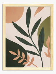
Affiche botanique moderne aux formes fluides
Translation missing: fr.products.product.sale_price À partir de €16,95€23,95 -

Toile harmonie botanique
Translation missing: fr.products.product.sale_price À partir de €65,95€92,95 -

Affiche botanique moderne tons neutres
Translation missing: fr.products.product.sale_price À partir de €16,95€23,95 -

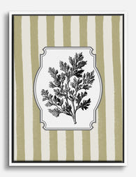
Affiche planche botanique vintage
Translation missing: fr.products.product.sale_price À partir de €16,95€23,95 -
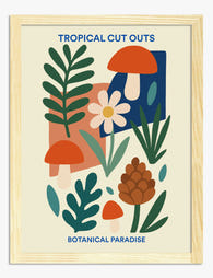
Affiche botanique tropicale en collage
Translation missing: fr.products.product.sale_price À partir de €16,95€23,95 -

Affiche botanique bohème plantes vertes et pots
Translation missing: fr.products.product.sale_price À partir de €16,95€23,95 -

Affiche jardin en découpage végétal
Translation missing: fr.products.product.sale_price À partir de €16,95€23,95 -
Toile botanique vintage noir et blanc, brin d’herbe
Translation missing: fr.products.product.sale_price À partir de €65,95€92,95 -

Toile botanique vintage
Translation missing: fr.products.product.sale_price À partir de €65,95€92,95 -
Affiche botanique bohème moderne
Translation missing: fr.products.product.sale_price À partir de €16,95€23,95 -

Toile botanique vibrante
Translation missing: fr.products.product.sale_price À partir de €65,95€92,95 -

Toile vases bohèmes à motifs botaniques
Translation missing: fr.products.product.sale_price À partir de €65,95€92,95 -

Affiche collection botanique minimaliste au trait
Translation missing: fr.products.product.sale_price À partir de €16,95€23,95


Plus de The Frame

Thrushes, Hares, and Peacocks: The Animals in W...
Why Morris put animals at the centre of his designs William Morris wasn't decorating walls with cute creatures. He was making a quiet argument. While Victorian factories churned out cheap,...

From Dutch Masters to Modern Minimalism: The Ke...
Search "types of flower bouquet art" and you'll get wedding centrepieces, posy guides, and cascading bridal arrangements. Useful if you're getting married. Useless if you're trying to choose what goes...

Every Flower in William Morris's World: A Guide...
William Morris designed roughly 50 wallpapers and around 30 chintzes across his career, and almost every single one features a plant. If you've ever stood in front of a Morris...