What to Put in a Stairwell: The Hardest Wall in the House
A decision-making guide for the most awkward, most visible, most commitment-heavy wall you own.

Stairwells are the wall everyone postpones. The ceiling is too high, the angle is wrong, the lighting is bad, and every nail hole feels like a permanent mistake on a wall you stare at twice a day. This guide will help you figure out what actually belongs there, starting with the question most articles skip: should you hang anything at all?
Why stairwells defeat people
The stairwell breaks every rule that makes other walls easy. You view it from below, from the side, from halfway up while carrying laundry, and from the landing looking down. There is no single "right" viewing distance, which means there is no single right scale of art.
The angle is the obvious problem, but it's not the worst one. The worst one is commitment. A stairwell gallery wall often involves eight or twelve nail holes in a wall that is awkward to access, expensive to repaint, and visible from every public room on the ground floor. Getting it wrong is costly. Getting it right feels like a coin flip.
Then there's the lighting. Most stairwells are lit by a single overhead pendant or a small window halfway up, which creates uneven shadows and dull patches. Art that looked vivid in your living room can flatten out completely on the stairs.

Diagnose your stairwell first
Before you choose art, name your stairwell. Most fall into one of four types, and each wants a different answer.
Enclosed narrow stairwell
Walls on both sides, often painted white or magnolia, with a single bulb overhead. The wall space is fragmented by doorways and landings. You're working with short vertical runs rather than one big canvas.
These spaces reward small, considered groupings or a vertical run of two to three pieces. A single large statement piece rarely fits because you can't step back far enough to see it.
Open two-story stairwell
The feature wall of the house. One side of the staircase is open to a hallway or lounge below, and the wall above rises three or four metres. This is where a single oversized piece almost always beats a gallery wall.
L-shaped stairwell with landing
The most common configuration in UK terraces and semis. You get a diagonal run, a square landing wall, and often a return. This is the format gallery walls were designed for, but only if you have the patience.
Tall narrow vertical stairwell
Common in townhouses and converted flats. The wall climbs three storeys with almost no horizontal breathing room. Gallery walls collapse in these spaces because there is no width to play with. You want a vertical series, a runner, or nothing at all.
When the answer is "leave it blank"
Some stairwells look best empty. If your wall is painted a strong colour, panelled, or covered in a textured plaster, the wall itself is the feature. Hanging art on it almost always makes the space busier without making it better.
Blank stairwells look intentional when the rest of the house feels considered. They look unfinished when surrounding rooms are heavily decorated and the stairs feel like a forgotten zone. The test: do the adjacent walls have art? If yes, the stairwell probably should too. If your hallway and lounge are deliberately minimal, leave the stairs alone.
The single statement piece approach
For tall, open stairwells, one large piece almost always outperforms a gallery wall. You only have one good viewing position (from the bottom looking up), and a single image rewards that view in a way a cluster of small frames can't.
Scale matters more than you think. On a wall that climbs four metres, a 70x100cm print is the practical maximum for framed prints, and on a two-story wall it can still read as undersized. If you want real presence, canvas prints go up to 100x150cm and the lighter weight makes them easier to hang at height without heavy-duty fixtures.
What to choose: high-contrast images with a clear focal point. Landscapes with strong horizons, bold abstracts, or single-subject photography all work. Avoid anything detailed enough that you'd want to study it up close, because you can't.
The gallery wall approach (when it's right)
Gallery walls suit L-shaped stairwells and standard residential stairs with a clear diagonal run. They don't suit narrow vertical stairwells, and they often overcomplicate open two-story walls.
How to plan one without losing your mind
The professional consensus on eye level is around 145-150cm from the floor to the centre of the artwork. On stairs, you apply this to a diagonal centreline that follows the angle of the staircase itself, so each piece sits at roughly the same "eye level" relative to the step beneath it.
Spacing between frames should be 5-7cm. Tighter feels cramped, wider feels disconnected. Keep the spacing consistent even if the frame sizes vary.
The paper template trick is non-negotiable. Cut sheets of newspaper or brown paper to the exact size of each frame, mark where the hanging hook would land on each, and tape them to the wall with masking tape. Live with the layout for at least 48 hours. Walk up and down the stairs at different times of day. Only then commit to nails.

Choosing the pieces
The hardest part of a staircase gallery wall is cohesion. Random art that worked when you collected it over a decade rarely holds together when you cluster it. You need a unifying thread: consistent frame colour, a shared palette across the prints, or a single subject matter (botanical, architectural, black and white photography).
Our advice: pick the thread first, then the pieces. If you want a black-and-white photographic gallery wall, every piece needs to be black and white. Don't smuggle in a colour print because you love it. It will fight the rest.
The runner approach (for tall narrow stairwells)
If you have a tall narrow stairwell, forget the gallery wall. The wall doesn't have the width for it, and the result almost always looks crowded.
A runner is a vertical series of three to five pieces, all the same size, stacked at consistent intervals up the wall. It reads as one composition rather than a cluster, which suits the verticality of the space. Botanical prints, architectural studies, or abstract panels all work well in this format.
Sizing: 40x50cm or 50x70cm pieces work for most narrow stairwells. Spacing of 10-15cm between frames is generous enough to let each piece breathe.
Stair-stepped individual frames
A middle path between gallery wall and runner. You hang individual pieces, each one stepped down to follow the staircase angle, with the same spacing between each. It's less dense than a gallery wall and more rhythmic than a runner.
This works best with three to five medium-sized pieces (40x50cm or 50x70cm) in matching frames. The repetition does the heavy lifting; you don't need the images themselves to be tightly related.
Lighting: the problem nobody mentions
Stairwell lighting is almost always wrong for art. A single overhead bulb creates top shadows and dead patches. A small window halfway up creates uneven daylight that shifts throughout the day.
Two practical fixes. First, swap your overhead bulb for a warmer colour temperature (2700K) and higher CRI rating. The colour rendering matters more than the brightness. Second, consider battery-powered picture lights for individual pieces. They've become genuinely good in the last few years and require no wiring.
If your stairwell gets direct sunlight from a south-facing window, fading is a real concern. Standard prints behind glass will fade over years of exposure. Pieces with UV-protective acrylic glazing handle this much better, which is worth checking before you commit to anything you care about.

If you're renting
The instinct is to default to adhesive strips and small frames, but there's a better approach: a picture ledge along the lower wall of the staircase. One narrow shelf, two screws, and you can lean prints against the wall in any arrangement you like. Change them whenever. No commitment.
Leaning works particularly well on the landing wall where there's a flat surface to anchor it. Combine a ledge with one or two adhesive-hung pieces higher up and you've got a layered look without 12 nail holes.
For tenants who want gallery-wall density, hang a single large piece instead. One hole, maximum impact. Save the gallery wall for when you own the walls.
The grow-over-time strategy
The single best piece of advice for stairwell decoration: don't try to finish it in one weekend. Start with two or three pieces you genuinely love, hang them with deliberate spacing that leaves room for additions, and live with it for six months before adding more.
This solves three problems at once. It reduces the commitment anxiety (you're not buying eight prints at once). It gives you time to see what the wall actually needs. And it produces a more interesting result, because pieces collected over time tend to feel more personal than a matched set bought in one go.
The risk is that "growing over time" becomes "never finished." Set yourself a soft deadline of a year, and decide that whatever you have on the wall by then is the final arrangement.
Practical safety and clearance notes
Two things to actually measure. Headroom: anything that protrudes more than 5cm from the wall needs to be above head height for someone walking down the stairs. Box frames and canvases on chunky stretcher bars count. This is rarely a problem on a flat landing but matters on the diagonal run.
Handrail clearance: leave at least 10cm between the top of your handrail and the bottom of any artwork. Less than that and the rail visually crowds the frame, and you'll knock the corners with your knuckles.
Bridging two different design schemes
Stairs often connect a formal downstairs to a more relaxed upstairs, or a Victorian hallway to a modern bedroom. The stairwell wall is where you reconcile them.
The trick is to pick art that borrows from both. If downstairs is dark and traditional and upstairs is light and contemporary, the stairwell wants something in between: muted modern landscapes, soft abstracts, or black-and-white photography. Avoid art that commits hard to either end. The stairwell is a transitional space and it should look like one.

A simple decision rule
If your stairwell is tall and open, hang one large piece. If it's narrow and vertical, hang a runner. If it's L-shaped with a landing, you can do a proper gallery wall but plan it on paper first. If you rent or you're not sure, install a picture ledge and lean things on it until you are.
The worst thing you can do is nothing for years, then panic-buy a matched set on a Sunday afternoon. Start with one piece you love, hang it well, and let the rest of the wall reveal itself.

Produits Fab présentés dans cet article
-

Toile escalier aux couleurs vives
Translation missing: fr.products.product.sale_price À partir de €64,95€92,95 -

Affiche tournesols apaisants
Translation missing: fr.products.product.sale_price À partir de €16,95€23,95 -

Toile escalier moderne aux couleurs vives
Translation missing: fr.products.product.sale_price À partir de €64,95€92,95 -

Toile escalier végétal
Translation missing: fr.products.product.sale_price À partir de €64,95€92,95 -

Toile escalier végétal
Translation missing: fr.products.product.sale_price À partir de €64,95€92,95 -

Affiche escalier oasis verdoyante
Translation missing: fr.products.product.sale_price À partir de €16,95€23,95 -

Toile escalier botanique luxuriant
Translation missing: fr.products.product.sale_price À partir de €64,95€92,95 -

Affiche plantes sur escalier
Translation missing: fr.products.product.sale_price À partir de €16,95€23,95 -

Affiche escalier botanique
Translation missing: fr.products.product.sale_price À partir de €16,95€23,95 -

Toile escalier bohème et plantes luxuriantes
Translation missing: fr.products.product.sale_price À partir de €64,95€92,95 -

Toile plantes sur escalier coloré
Translation missing: fr.products.product.sale_price À partir de €64,95€92,95 -
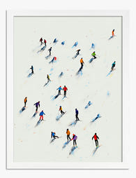
Affiche skieurs colorés sur neige blanche
Translation missing: fr.products.product.sale_price À partir de €16,95€23,95 -

Affiche promenade sur le green de golf
Translation missing: fr.products.product.sale_price À partir de €16,95€23,95 -

Toile marches carrelées à motifs et plantes en pot
Translation missing: fr.products.product.sale_price À partir de €64,95€92,95 -

Affiche botanique bohème sur marches carrelées
Translation missing: fr.products.product.sale_price À partir de €16,95€23,95 -

Affiche plantes sur le palier
Translation missing: fr.products.product.sale_price À partir de €16,95€23,95 -

Affiche liens qui comptent
Translation missing: fr.products.product.sale_price À partir de €16,95€23,95 -

Affiche serre des jardins botaniques de Kew
Translation missing: fr.products.product.sale_price À partir de €16,95€23,95 -

Toile patineurs d'hiver rassemblés
Translation missing: fr.products.product.sale_price À partir de €64,95€92,95 -

Toile escaliers à motifs et plantes vertes
Translation missing: fr.products.product.sale_price À partir de €64,95€92,95


Plus de The Frame

Art for Green Walls: What Works, What Fights
You painted the walls green. Maybe sage, maybe forest, maybe something in between. Now the room feels half-finished and the art you owned before suddenly looks wrong against it. Green...

Art at the Top and Bottom of a Staircase
Staircases are the most overlooked walls in the house. They are also the trickiest, because the top of the stairs, the bottom of the stairs, and the landing in between...

Above the Toilet, Above the Bath: Bathroom Art ...
Bathrooms are the most overlooked walls in the house, and the trickiest to get right. Steam, splash, awkward sightlines and tiled surfaces all conspire against the kind of art advice...