
 Commandez aujourd'hui, livré le
 William Morris Peony Wallpaper vs Art Print: Which One Actually Works?
An honest decision-making guide for anyone who loves the design but isn't sure wallpaper is realistic.


You love the Morris peony. You've spent three evenings deep in Google image results, you've saved twelve different pins, and you still can't decide whether to commit to wallpaper or go the print route. This article is the one you wish had existed when you started searching.
The appeal of Morris peony wallpaper (and why people hesitate)
Morris's peony design, first drawn in the late 1800s, is one of those rare patterns that reads as both maximalist and oddly restful. The blooms are large and confident, the foliage tangles in a way that feels alive, and the colourways (deep teal, soft pink, cream, sage) flatter almost any room they touch. It's no surprise the william morris peony wallpaper design keeps resurfacing every few years.
The hesitation is just as predictable. Wallpaper is a commitment in money, time, and reversibility. You need to size walls, hire a hanger or attempt it yourself, and accept that if you ever fall out of love with peonies, you're in for a long weekend with a steamer. For renters, it's often not even an option. For homeowners, there's the quiet worry about resale value when a future buyer walks in and sees floral maximalism on every surface.
This is the gap most people get stuck in. They love the pattern, they don't love what installing it actually involves, and nobody online is genuinely helping them weigh the alternatives.
Cost comparison: a roll of Morris wallpaper vs a statement art print
Let's put real numbers on the table. Authentic Morris & Co. peony wallpaper currently retails at around £92 to £130 per roll in the UK. A standard roll covers roughly 5.2 square metres, which sounds like a lot until you remember pattern repeats waste material.
For a typical accent wall behind a sofa (around 3 metres wide by 2.4 metres tall, so 7.2 square metres), you'll need two rolls minimum, three if the pattern repeat is generous or the wall isn't perfectly rectangular. That's £200 to £390 in wallpaper alone, before paste, lining paper, and labour. Professional hangers in most UK cities charge £150 to £300 for a single accent wall. Realistic all-in cost: £350 to £700.

A large framed william morris peony print at 70x100cm sits in a very different bracket. You're looking at the price of one print, framed, delivered, and ready to hang. No paste, no professional, no weekend lost to wrestling with bubbles. For most people, the print route comes in at roughly a third of the wallpaper cost, sometimes less.
That cost difference matters. Not because cheaper is automatically better, but because it changes what kind of decision you're making. A print is a "yes, let's try it" purchase. Wallpaper is a "we need to discuss this" purchase.
Renters and commitment-phobes: why a print wins
If you rent, the maths is usually decided for you. Most tenancy agreements either ban wallpaper outright or require you to return walls to their original state, which means stripping, re-skimming, and repainting at your own cost when you leave. Even peel-and-stick "removable" alternatives, which do exist as a third option worth knowing about, often pull paint off older walls and rarely look as crisp as the real thing up close.
A framed print sidesteps all of this. One picture hook, one screw, one wall plug. When you move, it comes with you. When you redecorate, it relocates to a different room. When you fall out of love with peonies in three years (it happens), you swap it for something else without involving a steamer or a deposit dispute.
The commitment-phobe argument applies to homeowners too. A print lets you live with the pattern for six months and see how you actually feel about it. Wallpaper asks you to be sure before you start. For a design as bold as peony, that trial period genuinely matters.
There's also the resale question for owners. Estate agents will quietly tell you that strong-pattern wallpaper polarises buyers. Some adore it, many mentally add the cost of stripping it to their offer. Art comes off the wall when you list the property. Wallpaper doesn't.
Visual impact: can a single print match a wallpapered wall?
Here's the honest answer: not exactly, and that's not necessarily a bad thing.
A wallpapered wall delivers immersion. The pattern wraps the room's edges, repeats behind your sofa, climbs to the ceiling. It's a total commitment to the design. A single print, even a very large one, creates a focal point rather than an environment. Your eye lands on it, rests there, then moves on.
For some rooms, immersion is exactly what you want. A small downstairs cloakroom or a reading nook can carry full wallpaper beautifully because the space is contained and the pattern feels enveloping. For larger rooms, particularly open-plan spaces, full wallpaper can tip from "atmospheric" to "overwhelming" surprisingly quickly.
A well-sized print does something different but equally powerful. It anchors a wall, signals the room's design intent, and leaves breathing space for everything else. Sofas read more clearly. Light bounces around. The pattern becomes a guest star rather than the entire cast.

If you're worried a print can't compete, the issue is usually size, not the concept. Which brings us to the next point.
The hybrid approach: one statement print plus painted walls
This is the answer most people don't realise they're looking for. Paint your walls in a colour drawn from the Morris palette (a muted sage, a chalky pink, a deep ink-blue), then hang one substantial peony print as the anchor. You get the colour story of the wallpaper without the wall-to-wall commitment.
The trick is letting the paint do quiet work while the print does loud work. If your peony print features a teal background, a soft cream or warm white on the surrounding walls lets the print breathe. If you want a moodier room, pull a secondary colour from the print itself (the sage of the leaves, the dusty rose of the petals) and paint three walls in that tone, leaving the wall with the print slightly lighter.
This approach also solves the colourway question. Morris peony exists in pink-led, blue-led, and cream-led versions, and rooms read very differently depending on which you choose. Pink-led works beautifully in bedrooms and softer living rooms. Blue-led suits dining rooms, studies, and north-facing spaces that can carry the depth. Cream-led is the safest in rentals or open-plan areas where you want pattern without drama.
Painted walls give you full control over how loud the room reads. Wallpaper takes that decision out of your hands.
Choosing the right print size to make a wallpaper-level impact
This is where most people undershoot, and it's why so many "I tried a print instead" stories end in disappointment. A 30x40cm print above a three-seater sofa will look apologetic, not impactful. Morris peony is a busy, large-scale pattern that was designed to be seen at architectural scale. Shrink it too far and the design loses its punch.
Some working rules:
Above a sofa or bed: aim for a print that's roughly two-thirds the width of the furniture below it. For a standard three-seater (around 200cm wide), that's a print at least 130cm wide. In practice, this means going for 70x100cm framed at the very minimum, ideally larger if you have the wall space.
Above a console or sideboard: 50x70cm framed works for narrower pieces, 70x100cm for wider ones. Hang it so the bottom edge sits around 20-25cm above the surface.
On a blank wall as a solo statement: go big or don't bother. A single print on an empty wall needs scale to justify the surrounding emptiness. We'd suggest looking at large wall art options at 70x100cm or above, or considering canvas at sizes up to 100x150cm if you want maximum presence without the weight of a frame.
Gallery wall of multiple Morris prints: three to five prints, varied sizes, hung tight (5-8cm gaps). This can work beautifully but requires more planning than a single statement piece, and you lose some of the immersive effect that makes a single large print so satisfying.
The single biggest mistake is buying a print you think is "quite big" when it arrives. Measure the wall, mark the outline with masking tape before you order, and live with the rectangle for a day. You'll almost always go bigger than your instinct suggests.
Why print quality matters more with Morris (detail, colour, paper weight)
Morris's peony works because of detail. The veining on the leaves, the layered petals, the deliberate imperfections in the hand-drawn line. Cheap printing flattens all of this. The blooms turn into blobs, the colours go muddy, and what should be a centrepiece becomes a sad approximation of one.
This is why printing method matters more with Morris than with, say, a minimal abstract. Giclée printing on heavy matte paper holds the fine linework that makes the design sing. Standard inkjet on thin paper doesn't. Paper weight (we'd suggest looking for 200gsm or above) affects how the print sits inside its frame, whether it warps in humid rooms, and how the colours read in different lights.

Colour accuracy is the other thing to scrutinise. Morris's palette is famously specific. The teals lean grey-green, not bright. The pinks are dusty, not candy. The creams have warmth, not yellow. Prints that get this wrong end up looking like generic florals rather than recognisably Morris.
A few practical pointers when comparing options across william morris art prints:
- Matte paper, not glossy. Morris designs were never meant to shine.
- UV-protective glazing if the print is going anywhere near a sunny window, otherwise colours fade within a few years.
- Solid wood frames rather than MDF or veneer. Morris is heritage design, and the frame should match that quality.
- Look for prints made with archival inks rated for hundreds of years, not budget pigments that shift colour within a decade.
The same care applies whether you're choosing peony specifically or browsing wider floral art prints. The pattern is only as good as the printing.
One last note on the authenticity question. Some prints are licensed reproductions of original Morris & Co. archive designs. Others are "Morris-inspired" pieces drawn in his style. For wallpaper, authentic Morris & Co. matters because you're buying into the heritage as much as the pattern. For wall art, it matters less than you'd think. What matters is whether the design is genuinely beautiful and printed well. A poorly printed authentic reproduction will look worse than a well-printed homage.
So which one should you choose?
If you own your home, love commitment, and want a small or contained space (a cloakroom, a reading corner, a snug) to feel completely transformed, wallpaper still has its place. The immersion is real and a print can't quite replicate it.
For everyone else (renters, commitment-phobes, anyone with a larger room, anyone who wants to test the pattern before going all-in, anyone working with a tighter budget), one substantial framed peony print on a thoughtfully painted wall delivers most of the visual reward at a fraction of the cost and risk.
Measure your wall, go one size bigger than your instinct, pay attention to print quality, and pull a complementary paint colour from the design itself. That's the whole formula.


Produits Fab présentés dans cet article
-

Affiche pivoines élégantes de William Morris
Translation missing: fr.products.product.sale_price À partir de €16,95€23,95 -

Affiche pivoines épanouies de William Morris
Translation missing: fr.products.product.sale_price À partir de €16,95€23,95 -

Affiche pivoines en fleurs de William Morris
Translation missing: fr.products.product.sale_price À partir de €16,95€23,95 -

Affiche botanique pivoine, inspiration William Morris
Translation missing: fr.products.product.sale_price À partir de €16,95€23,95 -

Affiche pivoines élégantes, style William Morris
Translation missing: fr.products.product.sale_price À partir de €16,95€23,95 -

Affiche élégance des pivoines inspirée par William Morris
Translation missing: fr.products.product.sale_price À partir de €16,95€23,95 -

Affiche botanique de pivoine style William Morris
Translation missing: fr.products.product.sale_price À partir de €16,95€23,95 -

Affiche pivoine violette, inspirée de William Morris
Translation missing: fr.products.product.sale_price À partir de €16,95€23,95 -

Affiche pivoines de William Morris
Translation missing: fr.products.product.sale_price À partir de €16,95€23,95 -

Toile pivoines style William Morris
Translation missing: fr.products.product.sale_price À partir de €64,95€92,95 -
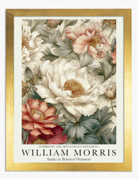
Affiche pivoine élégante inspirée par William Morris
Translation missing: fr.products.product.sale_price À partir de €16,95€23,95 -

Affiche pivoine style William Morris
Translation missing: fr.products.product.sale_price À partir de €16,95€23,95 -

Affiche pivoines style William Morris
Translation missing: fr.products.product.sale_price À partir de €16,95€23,95 -
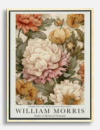
Toile pivoines épanouies style William Morris
Translation missing: fr.products.product.sale_price À partir de €64,95€92,95 -

Toile jardin de pivoines inspirée par William Morris
Translation missing: fr.products.product.sale_price À partir de €64,95€92,95 -

Toile William Morris pivoine élégante
Translation missing: fr.products.product.sale_price À partir de €64,95€92,95 -

Toile étude de pivoines, inspiration William Morris
Translation missing: fr.products.product.sale_price À partir de €64,95€92,95 -
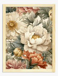
Affiche rêverie de pivoine par William Morris
Translation missing: fr.products.product.sale_price À partir de €16,95€23,95 -

Affiche pivoines en fleurs de Morris
Translation missing: fr.products.product.sale_price À partir de €16,95€23,95 -

Toile pivoine de William Morris
Translation missing: fr.products.product.sale_price À partir de €64,95€92,95


Plus de The Frame

Why William Morris Prints Look Brilliant in Mod...
William Morris has been quietly miscategorised for decades. His patterns get filed under "country cottage" or "Arts and Crafts revival" and rarely escape, which is a shame because his tree...

Why Arts and Crafts Nature Prints Are the Antid...
The minimalism hangover: why bare walls stopped feeling calming For about a decade, the aspirational interior was a white box with one boucle chair in it. That look has officially...

Botanical Petal Art: Why Close-Up Prints Feel M...
Full florals have had a long run, and they're not going anywhere. But if you've noticed that the botanical art appearing in design magazines, boutique hotel lobbies, and the better-styled...