Best Labrador Wall Art: Styles, Ideas, and What Actually Looks Good on a Wall
An honest, opinionated guide to choosing labrador art that suits your home, your dog, and your taste.

You love your labrador. That doesn't mean your hallway should look like a tribute to him. This is a style-first guide to choosing labrador wall art that earns its place on the wall, with honest takes on what actually works in real homes.
Not all labrador art is created equal
Labrador wall art falls into roughly four buckets: realistic portraits, illustrative or modern prints, minimalist line art, and vintage poster styles. Each has a completely different feel, and each suits a different kind of home.
The mistake most people make is buying based on the dog rather than the style. You see a yellow lab that looks like yours, you click buy, and three weeks later it's hanging above the sofa looking weirdly out of place. The fix is to start with your decor and work backwards. A modern flat in Hackney needs different art than a Cotswolds cottage, even if the dog is the same.
Before we get into specifics, one general rule: pick art you'd hang even if it wasn't a labrador. If the only thing it has going for it is the breed, it'll feel like merch. If it's a strong piece of art that happens to feature a lab, it'll feel like a deliberate decorating choice.

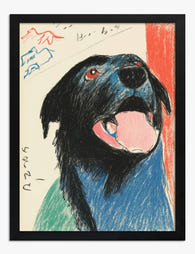
Realistic labrador portraits: when detail matters
Realistic portraits, whether painted in oil, watercolour, or rendered in photographic prints, are the most emotionally direct option. Done well, they capture something specific: the slightly worried expression, the wet nose, the way a chocolate lab's eyes go almost amber in soft light.
These work best when you genuinely want the art to feel like a portrait of the labrador, not a labrador. They suit traditional and transitional interiors: panelled walls, leather chairs, deeper paint colours like Hague Blue or Card Room Green. In a stark all-white minimalist room, a hyper-realistic dog portrait can feel jarring, almost taxidermy-like.
A few honest things to know. Realistic portraits demand quality printing. The whole point is the detail in the fur, the catchlight in the eye, the subtle gradients in the coat. On cheap paper or with poor ink, these get muddy fast. Look for giclée printing on thick matte paper, which holds detail without the glare you get from gloss. The matte finish also makes the art look more like a painting and less like a poster.
Size matters more here than with any other style. A small realistic portrait above a large sofa looks like a postage stamp. We'd go 50x70cm minimum for above-sofa placement, and 70x100cm if you've got the wall for it.
Illustrative and modern labrador prints: lighter, more playful
Illustrative prints are the broadest category and the most forgiving. Think gouache, flat colour, contemporary watercolour, slightly stylised proportions. They're the labrador art ideas that work in 80% of homes because they read as art first and dog art second.
This is the right pick if your home leans contemporary, Scandinavian, mid-century, or anywhere you'd describe the vibe as "considered but not precious." Illustrative prints also work brilliantly in kids' rooms and family kitchens, where a hyper-realistic portrait might feel too serious.
Look for illustration with a clear point of view: a confident colour palette, a defined style, a sense that an actual human made decisions. The mark of generic print-on-demand work is when it could be any breed with the colours swapped. The good stuff has personality, an actual perspective on what makes a labrador a labrador.
If you want to browse the broader category, our labrador art prints collection is grouped roughly by style so you can scan the difference between a moody portrait and a bright illustration without clicking through 200 products.
Minimalist labrador art: less is genuinely more
Minimalist labrador art, single-line drawings, simple silhouettes, abstract shape studies, is the most underrated category. It's also the easiest to integrate into a non-dog-themed home.
A black lab silhouette in a thin oak frame doesn't announce itself. It's a quiet, slightly graphic piece that happens to reference your dog. Hang it in a hallway between two abstract prints and nobody walks in thinking "ah, dog house." They just see good art.
This style suits modern, monochrome, and Japandi interiors particularly well. It also works in small spaces where a busier print would feel claustrophobic. A 30x40cm line drawing in a downstairs loo or above a console table is one of those small decorating moves that quietly elevates the whole space.
The trade-off is that minimalist art lives or dies by execution. There's nowhere to hide. Bad linework looks bad immediately. Good linework, with confident weight changes and considered negative space, looks expensive even when it isn't.

Vintage and retro labrador poster styles
Vintage poster styles, faded travel posters, old hunting prints, mid-century advertising aesthetics, are having a moment, and labradors suit them brilliantly. There's a long history of sporting and country art featuring labs, which gives this style a genuine reference point rather than just being "made to look old."
Retro pet food adverts, 1950s-style illustrated posters, and faux-vintage country club prints all work in the right rooms. Where they shine: kitchens, snugs, downstairs bathrooms, boot rooms, anywhere with a slightly relaxed, lived-in feel. Where they don't: glassy modern apartments and ultra-minimalist spaces, where the busyness reads as clutter.
Honest caveat: there's a lot of bad faux-vintage labrador art out there. The tell is when the "ageing" looks like a Photoshop filter rather than considered design. Good vintage-style art uses limited colour palettes, proper typography, and compositional restraint. It looks like it could've actually been printed in 1958.
These look particularly strong as a wall art set, three matching prints in a row above a kitchen bench or down a hallway. The repetition leans into the poster aesthetic.
How to mix labrador prints into a gallery wall without it looking like a shrine
The shrine problem is real. Three labrador portraits in a row, framed identically, lit from above, and you've crossed from "dog lover" into territory you didn't mean to enter. Here's how to avoid it.
Rule one: one labrador per gallery wall, maximum two. A gallery wall with five lab prints is no longer a gallery wall. It's a memorial. One strong labrador piece anchored among landscapes, abstracts, and typography reads as personal. Five reads as obsessive.
Rule two: vary the subject matter aggressively. If your lab print is a tight portrait, surround it with wide landscapes, still life, or graphic work. The contrast in subject matter is what makes a gallery wall feel curated rather than themed.
Rule three: don't match the frames to the dog. A common mistake is choosing a frame colour that matches the lab's coat, chocolate frame for a chocolate lab, black for a black lab. It looks too coordinated. Pick frames based on your room, not your dog.
Rule four: the "is this too much" test. Stand in the doorway and look at the wall. If a stranger walked in, would they describe the room by mentioning your dog within the first sentence? If yes, pull back. Good decorating reveals personality slowly, not at the door.
If you're building a mixed gallery wall, our dog art prints collection has options that aren't obviously breed-specific, useful for filling out a wall without doubling down on the labrador theme.
Room-by-room ideas: hallway, living room, home office, and kitchen
Hallway
Hallways are narrow, which means scale and viewing distance matter. You're rarely standing more than a metre back, so detail-heavy realistic portraits get wasted here. Better picks: a single statement piece (50x70cm or 60x80cm), or a row of three smaller prints in matching frames.
Vintage posters and minimalist line art are the strongest hallway choices. They work as people walk past at speed. Avoid hanging anything precious at child or dog tail height. Aim for centre-of-image at roughly 145cm from the floor.
Living room
The living room is where realistic portraits earn their money. You're sitting back, the lighting is usually softer, and there's space for size. Above the sofa, the rule of thumb is the art should be 60-75% of the sofa's width. A 200cm sofa wants a piece roughly 120-150cm wide, which is canvas territory.
For living room wall art, one strong central labrador piece almost always beats two smaller ones flanking the TV. If you want browse-and-think energy, illustrative prints work too. Just resist the urge to fill every wall with dogs.
Home office
The home office is the one room where we'd actively encourage a labrador print. You stare at it on Zoom calls, it lowers the cortisol, and it makes the space feel like yours rather than a corner of the spare room. Pick something on the calmer end: a quiet illustration or a single portrait, not a high-energy action shot.
A4 or A3 sizes (roughly 30x40cm or 40x50cm) work above a desk. Anything bigger fights with your monitor.
Kitchen
Kitchens are humid, which means canvas often outperforms paper here. The poly-cotton canvas with mirrored edge wrapping handles temperature swings without warping. Vintage poster styles and bright illustrative prints suit kitchens because the rooms themselves are usually busy and warm.
Avoid hanging anything directly above a hob or kettle, even with UV-protective glazing. Steam is steam. A side wall, breakfast nook, or above a banquette is the sweet spot.

A note on bathrooms
Yes, the cheeky "labrador on the loo" prints exist, and yes, they have a place. A small, well-printed humorous piece in a downstairs cloakroom is genuinely charming. The same print at 70x100cm in a main living space is a different story. Keep the joke proportional to the room.
Choosing between yellow, black, and chocolate lab art
Match the art to your room first, your dog second. Yellow lab art has warm cream and honey tones that sit beautifully against warm neutrals, oatmeal, sand, soft greys, and natural oak. Black lab art reads almost graphic, which makes it perfect for monochrome and modern interiors, especially in line drawings or high-contrast portraits. Chocolate lab art has the richest palette, warm browns, amber eyes, and tends to suit deeper, more traditional rooms with greens, navies, and tan leather.
If your dog is yellow but your room is moody and dark, don't force a yellow lab print just for accuracy. A black-and-white photographic print of a yellow lab will sit better than a bright cheerful illustration that fights the room.
Frame, canvas, or unframed: when to choose what
Framed prints are the most polished option and the right call for living rooms, hallways, and anywhere the art is the focal point. Solid wood frames, UV-protective acrylic glazing (which won't shatter and won't fade your print in direct sunlight), and proper fitting matter more than people realise. The biggest failure in this category is frames that arrive separately from the print, or that warp within a year. Worth checking your art arrives ready-hung, properly fitted, in one box.
Canvas prints are lighter, work in humid rooms like kitchens, and suit larger sizes (up to 100x150cm) without the visual weight of a heavy frame. The mirrored edge wrap means none of the image gets cropped at the sides. Canvas is the right call for big statement pieces and for anywhere a glass-fronted frame would feel too formal.
Unframed prints are the cheapest option and look great when you've got your own framer or a specific frame in mind. Just know that DIY framing tends to cost more than buying framed in the first place once you factor in mounting and glazing.
Our current favourites from the collection
If you want a starting point rather than 200 thumbnails, here's where we'd point you:
- For a statement living room piece: a large illustrative portrait at 70x100cm, framed in natural oak. It reads as art first, lab second.
- For a hallway: a set of three vintage-style poster prints, 30x40cm, framed in black. Tight, coordinated, gallery-feel without being precious.
- For a home office: a single line drawing at 40x50cm. Quiet, modern, calming on calls.
- For a kitchen: a canvas print of a bright watercolour illustration. Forgiving in humidity, warm in feel.
- For a downstairs loo: something with a sense of humour at 30x40cm, framed.
Pick the style that fits your home, get the size right, and resist the urge to hang five of them. One great labrador print is worth more than a wall of okay ones.


Produits Fab présentés dans cet article
-

Affiche portrait de labrador joyeux
Translation missing: fr.products.product.sale_price À partir de £11.95£19.95 -

Toile portrait de labrador joueur
Translation missing: fr.products.product.sale_price À partir de £44.95£74.95 -

Toile labrador noir sur fond fleuri Morris
Translation missing: fr.products.product.sale_price À partir de £44.95£74.95 -

Affiche labrador doré de profil
Translation missing: fr.products.product.sale_price À partir de £13.99£19.99 -
Affiche portrait de labrador noir espiègle
Translation missing: fr.products.product.sale_price À partir de £11.95£19.95 -

Affiche labrador fidèle aux tons beiges et blancs
Translation missing: fr.products.product.sale_price À partir de £13.99£19.99 -

Affiche labradoodle doré à l’aquarelle
Translation missing: fr.products.product.sale_price À partir de £13.99£19.99 -

Toile portrait ludique d'un labrador noir
Translation missing: fr.products.product.sale_price À partir de £44.95£74.95 -

Toile portrait de labradoodle effet aquarelle
Translation missing: fr.products.product.sale_price À partir de £55.99£79.99 -

Toile portrait de labrador noir joueur
Translation missing: fr.products.product.sale_price À partir de £44.95£74.95 -

Affiche portrait de labrador noir espiègle
Translation missing: fr.products.product.sale_price À partir de £11.95£19.95 -

Toile portrait de labradoodle doré
Translation missing: fr.products.product.sale_price À partir de £55.99£79.99


Plus de The Frame

The Complete Guide to Arranging Botanical Print...
Botanical prints are forgiving. They share a colour family, a subject, and a sensibility, which makes them one of the easiest categories to group on a wall. The trick isn't...

Why Do Book Themed Gallery Walls Always Look So...
Book themed walls fail for predictable reasons: too literal, too matchy, too symmetrical. The good news is the fix is just as predictable. This is how to build a literary...

Cottage Prints and Country House Art: How to St...
Cottage prints carry a particular kind of warmth: weathered stone, climbing roses, smoke from a chimney on a grey afternoon. The worry is always the same. Will they make your...