How to Build a Cat Gallery Wall That Actually Looks Good
The exact formula for celebrating your love of cats without your living room looking like a feline shrine.

A cat gallery wall can absolutely look curated, grown-up, and design-led. The trick is treating it like any other gallery wall, then applying a specific ratio of themed to non-themed pieces so the cats feel like a thread running through the wall, not the entire wall itself. Below is the formula, the spacing, and the layout templates that make it work.
Why a themed gallery wall works (and when it becomes too much)
Themed walls work because they give a viewer a story. A wall of unrelated prints reads as decoration. A wall with a clear thread, in this case cats, reads as personality. That repetition of subject matter is what makes a space feel intentional rather than assembled from whatever was on sale.
The problem is when the theme stops being a thread and becomes the whole rope. Eight cat prints in eight different styles will not look like a curated collection. It will look like a tribute. The line between charming and overwhelming sits at roughly 60% themed content, and we will get to that in a moment.
The other failure mode is going too literal. Realistic cat portraits at every size, in every frame, is the visual equivalent of shouting. Mixing illustrative cat prints with abstract shapes, line drawings, and botanicals lets the cats land properly because they have somewhere quieter to sit alongside.

The 3-5 print formula: how many cat prints you actually need
For most walls, you need between 5 and 7 prints total, with 2 to 3 of those being cat-specific. That is the working range. Fewer than 5 and the wall feels under-cooked. More than 7 and the spacing has to get tight enough that it starts to feel cluttered, especially on a typical UK living room wall.
The number of cat prints inside that total is the key decision. Two cat prints in a five-piece arrangement gives you 40% themed content, which reads as tasteful and personal. Three cat prints in a seven-piece wall gives you 43%, still well within the comfort zone. Push past 60% and the wall tips into theme-park territory.
A few combinations that work in practice:
- Five-piece wall: 2 cat prints, 2 abstracts, 1 botanical
- Six-piece wall: 2 cat prints, 2 abstracts, 1 botanical, 1 typographic or line drawing
- Seven-piece wall: 3 cat prints, 2 abstracts, 2 botanicals
Odd total numbers (5 or 7) tend to feel more dynamic than even numbers because the eye does not split them into matching halves. If you do go even, build asymmetry into the layout to compensate.
Mixing cat illustration prints with abstracts and botanicals for balance
The cats are the loud guests at the party. Abstracts and botanicals are the people who keep the conversation going. You want both.
Abstracts work because they introduce shape and colour without competing for the same attention as figurative work. A muted terracotta arch, a soft beige geometric, or a black-and-cream brushstroke piece all sit beautifully next to a stylised cat illustration without trying to outshine it. Browse abstract art prints and pick pieces that share at least one colour with your cat prints. That single repeated colour is what binds the whole wall together.
Botanicals do a different job. Where abstracts add rhythm, botanicals add softness. A pressed fern, a single eucalyptus stem, or a vintage botanical illustration introduces an organic note that stops the wall feeling graphic-heavy. They also tend to come in greens, sages, and warm neutrals, which flatter most cat illustrations naturally.
The colour palette rule is simple: pick three colours and make sure each appears in at least two prints across the wall. If your hero cat print has charcoal, ochre, and cream, then your abstracts and botanicals need to echo at least two of those tones. This is the single biggest reason themed walls fail. The styles look fine in isolation, but no shared palette means no cohesion.
For the cat pieces themselves, the animal art collection is a good starting point if you want to see illustrative styles laid out together, and the gifts for cat lovers collection leans into more characterful pieces if you want a bit more personality.
Size combinations that work: a layout template you can copy
Here is a layout you can lift directly. It works on walls between 1.8 and 2.5 metres wide, which covers most living rooms, hallways, and behind-sofa positions.
The five-piece off-centre layout:
- 1 large anchor print at 60x80cm, positioned slightly off-centre toward the left
- 1 medium print at 40x50cm, positioned diagonally up and right from the anchor
- 1 medium print at 40x50cm, below and right of the anchor
- 1 small print at 30x40cm, top right
- 1 small print at 30x40cm, bottom left, balancing the anchor
The anchor is your statement piece. This is where your strongest cat print goes, the one you would happily hang on its own. Everything else builds around it.
The principle behind the placement is visual weight. Your largest piece anchors one quadrant of the wall. Your second-largest piece sits diagonally from it to balance the weight. Smaller pieces fill the remaining space, with at least one small piece placed on the opposite side of the anchor to stop the whole composition leaning.
For spacing, leave 5 to 8cm between every frame. Less than 5cm and the frames feel cramped. More than 8cm and the wall reads as separate prints rather than a single composition. Keep the gap consistent across the whole arrangement, including diagonals.
The centre point of the entire arrangement (not any individual print, but the visual middle of the whole group) should sit at roughly 145 to 150cm from the floor. That is gallery height, calibrated for standing eye level. Above a sofa or console, drop it so the bottom edge of the lowest print sits 15 to 25cm above the furniture.

Keeping frames consistent for a cohesive look
If you take one rule from this article, take this one. Limit yourself to a maximum of three frame styles, and ideally stick to two.
The combinations that consistently work:
- All black frames. Crisp, modern, slightly editorial. Works in almost any room.
- All natural oak frames. Warmer, softer, leans Scandinavian. Best in rooms with a lot of wood or warm neutrals.
- Black plus natural oak, split roughly 60/40. The most flexible option. Use the dominant colour for your largest pieces and the secondary for accent prints.
What does not work is mixing four or five frame finishes hoping it will look "eclectic." It does not. It looks like you couldn't decide.
We make our frames from solid FSC-certified wood, not MDF or veneer, which matters because cheaper frames warp over time and that warping is what makes a gallery wall start to look uneven six months in. The acrylic glaze (rather than glass) is also UV-protective, which is worth knowing if your wall gets any direct sunlight. Cat prints fading from sage green to mustard within a year is a real risk with low-quality framing.
If you want to simplify the decision entirely, look at pre-curated wall art sets where the framing and palette are already coordinated, then add one or two cat-specific pieces to personalise it.
Room-by-room placement: stairways, above desks, and living room feature walls
Living room feature walls are the most common home for a cat gallery wall and the most forgiving. Hang above the sofa, console, or sideboard, with the bottom of the lowest frame 15 to 25cm above the furniture. Five to seven pieces works best here because you have the horizontal space.
Above a desk is where smaller arrangements shine. Three to five prints, weighted toward smaller sizes (30x40cm and 40x50cm), with one slightly larger anchor. Keep the bottom edge about 25 to 30cm above the desk surface so monitors and lamps don't crash into the frames. This is also where more characterful or playful cat prints can live, since a workspace is a more personal zone.
Stairways demand a different approach. The wall is on a slope, so your gallery has to slope with it. Follow the line of the staircase, keeping the same vertical distance between each print and the stair below it. A staircase gallery can take more prints (7 to 9) because the eye travels them sequentially rather than taking them in all at once. This is also the only context where a longer, more cat-heavy arrangement starts to feel right, because viewers see two or three prints at a time, not the whole wall.
Bedrooms are worth a brief mention. Above the bed, drop the cat percentage further (closer to 30%) and lean into calmer abstracts and botanicals. You want to fall asleep looking at a curated wall, not nine pairs of eyes.

Common gallery wall mistakes and how to avoid them
Hanging before laying out on the floor. Always do a dry run. Lay every print on the floor in the arrangement, photograph it from directly above, and adjust before a single nail goes in the wall. Better still, cut paper templates to the exact frame sizes, tape them to the wall, and live with them for 24 hours.
Using all the same size. A wall of identical 40x50cm prints in identical frames looks like a hotel corridor. You need at least one significantly larger anchor piece (60x80cm minimum) to create hierarchy.
Spacing too wide. More than 8cm between frames and the prints stop reading as a group. They become individual prints that happen to be on the same wall.
Hanging too high. The most common error in British homes. Gallery centre at 145-150cm from the floor, not 170cm. When in doubt, lower.
Too many colours, no repetition. Three colours, each appearing in at least two prints. Anything more and the wall fragments visually.
One frame style per print. This is the kitsch trap. Coordinate the frames; let the prints inside vary.
Over-indexing on cat content. If more than 60% of the prints are cat-specific, the wall stops being a gallery and becomes a theme. Pull one or two cat prints, replace with abstracts or botanicals, and the whole wall steps up a level.
How our prints arrive ready to hang so your layout stays precise
Gallery walls fail more often at the framing stage than the curation stage. Frames shipped separately from prints almost always arrive with the print not properly seated, the mount slightly off, or the backing not flush. By the time you've fitted everything yourself, your careful layout is already compromised by frames that don't sit flat against the wall.
Our framed cat art prints ship pre-fitted in one box. The print is mounted, the frame is sealed, the fixtures are already attached to the back, and nothing needs to be assembled. That matters for gallery walls specifically because every frame in your arrangement sits at exactly the same depth from the wall, so the whole composition reads flat and uniform from across the room.
The prints themselves are giclée-printed on thick matte paper, which means no glare from overhead lighting, and the colour holds up over years rather than months. If you are mixing cat illustrations from different artists across your wall, that consistent print quality is what stops the wall looking like a collage of different sources.
We offer a 99-day returns window, which is worth knowing because gallery walls often need adjustment after they are up. If a piece doesn't sit right in the arrangement once it is on the wall, swapping it out is straightforward.

Final thought
The mistake most people make with cat wall art ideas is treating the theme as the goal. The theme is the thread. The goal is a wall that looks good first and happens to have cats on it second. Stick to the 60/40 ratio, limit your frames to two finishes, repeat your colours across at least two prints each, and lay everything out on the floor before you commit. Do that, and your gallery wall will look like something a designer put together, not something assembled at the end of a long evening on the internet.

Produits Fab présentés dans cet article
-

Toile chats curieux à la porte rose
Translation missing: fr.products.product.sale_price À partir de £49.95£74.95 -

Affiche chats et bouquet fleuri
Translation missing: fr.products.product.sale_price À partir de £11.95£19.95 -

Toile chat noir au café gourmand
Translation missing: fr.products.product.sale_price À partir de £49.95£74.95 -

Affiche trio de chats dans un bouquet fleuri
Translation missing: fr.products.product.sale_price À partir de £11.95£19.95 -

Affiche scène conviviale au café à chats
Translation missing: fr.products.product.sale_price À partir de £11.95£19.95 -

Affiche pièce forte pour amoureux des chats
Translation missing: fr.products.product.sale_price À partir de £11.95£19.95 -
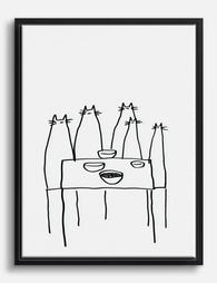
Toile chats à table, dessin noir et blanc
Translation missing: fr.products.product.sale_price À partir de £49.95£74.95 -

Affiche chat et élégance florale
Translation missing: fr.products.product.sale_price À partir de £11.95£19.95 -

Affiche groupe de chats aux tons pastel
Translation missing: fr.products.product.sale_price À partir de £11.95£19.95 -

Affiche chat brun minimaliste
Translation missing: fr.products.product.sale_price À partir de £11.95£19.95 -

Affiche chats espiègles
Translation missing: fr.products.product.sale_price À partir de £11.95£19.95 -

Affiche chats au jardin secret, inspiration Klimt
Translation missing: fr.products.product.sale_price À partir de £11.95£19.95 -

Toile chat noir et blanc dans une pièce bleue
Translation missing: fr.products.product.sale_price À partir de £49.95£74.95 -

Affiche chats multicolores empilés
Translation missing: fr.products.product.sale_price À partir de £11.95£19.95 -
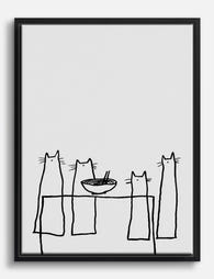
Toile chats réunis à table en noir et blanc
Translation missing: fr.products.product.sale_price À partir de £49.95£74.95 -
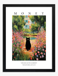
Affiche jardin impressionniste avec chat noir
Translation missing: fr.products.product.sale_price À partir de £11.95£19.95 -
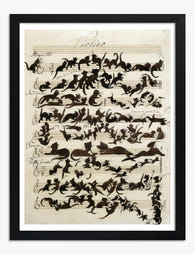
Affiche chats musiciens
Translation missing: fr.products.product.sale_price À partir de £11.95£19.95 -

Affiche chat noir et fleurs éclatantes
Translation missing: fr.products.product.sale_price À partir de £11.95£19.95 -

Affiche chat noir sur canapé vert menthe
Translation missing: fr.products.product.sale_price À partir de £11.95£19.95


Plus de The Frame

Urban Jungle Interiors: Using Wall Art Instead ...
The urban jungle look is having a moment that refuses to end. But most of the people pinning those plant-drenched living rooms will never own 47 monsteras, and that's fine....

Room by Room: How to Hang William Morris Floral...
You've fallen for Morris. The question now is which floral goes where, at what size, in what frame. This guide skips the Arts and Crafts lecture and gets straight to...

Jungle Bedroom Ideas for Adults: Grown-Up Ways ...
Jungle bedrooms have a reputation problem. Search the term and you'll find nursery mood boards, cartoon monkeys, and bright kelly green walls that would keep anyone awake. The grown-up version...