How to Style Frida Kahlo Art Prints: Room-by-Room Inspiration
A practical room-by-room guide to displaying Kahlo's work, with sizes, frames and colour pairings that actually work.

You've decided on Kahlo. Now comes the harder part: choosing which works, what size, what frame, and where to hang them so the result feels considered rather than chaotic. This guide walks through every room with specific recommendations.
Why Kahlo's colour palette is a secret weapon for interior styling
Most art coordination problems come down to colour. You buy a print, hold it up against your sofa, and something feels off. Kahlo's palette quietly solves this because the colours she returned to again and again, cobalt blue, terracotta red, citron yellow, deep emerald, fuchsia pink, are the same colours that anchor most warm, lived-in interiors.
Casa Azul cobalt sits somewhere around #2A4B8D. Her terracottas live in the #B8472A range. The vibrant greens she used for foliage and dresses tend toward #4A7C3A. If you sample paint or textile colours from a Kahlo print and match them to a cushion, a rug, or a pot of trailing pothos, the room reads as intentional rather than coincidental.
This is the practical advantage of Frida Kahlo prints over more muted contemporary work: the colours give you something to coordinate with. Pull one shade out of the print and repeat it once or twice in soft furnishings. That's the entire trick.

Living room: making a single Kahlo print the focal point
In a living room, one large Kahlo print almost always beats three small ones. Her self-portraits in particular were composed to hold a viewer's gaze, and at scale they do exactly that.
For a standard sofa wall (around 2.4 to 3 metres wide), go for 70x100cm. The print should sit at roughly two thirds the width of the sofa, centred about 20cm above the back cushions. Anything smaller and it looks marooned. Anything bigger and you risk overwhelming the seating below it.
Which works suit a living room
Choose pieces with horizontal energy or strong central composition. Self-portraits with foliage backgrounds work beautifully because the greenery softens the directness of the gaze, which matters when you're spending hours in the room. The botanical and still-life pieces (parrots, fruit, flowers) are also excellent because they bring colour without the intensity of eye contact.
Frame strategy
For modern living rooms with clean lines, a slim black frame keeps the focus on the artwork. For warmer, more layered spaces, a natural oak frame echoes Kahlo's connection to organic materials. Avoid ornate gold here unless your living room is genuinely maximalist; in a contemporary space it reads as costume rather than considered.
A Frida Kahlo framed print arriving ready to hang with the print properly fitted matters more than people realise. Living room walls are usually the most visible in the home, and a frame with a warped mount or a print sitting unevenly behind glass will undermine the whole composition.
Bedroom: choosing the right mood (introspective vs. celebratory)
Bedrooms are the room where Kahlo selection matters most, because you wake up and fall asleep with the work. The choice between introspective and celebratory pieces shapes how the room feels at 7am versus 11pm.
The introspective route
If you want the bedroom to feel like a retreat, choose works with quieter compositions. The Broken Column, The Two Fridas, and the more contemplative self-portraits create stillness. These pieces work best at 50x70cm, framed simply in dark walnut or matte black, hung above the bed or on the wall opposite so it's the first thing you see.
Pair with deep, saturated wall colours: a dusty terracotta, a soft moss, or a charcoal blue. Avoid white walls with introspective Kahlos. The contrast becomes too sharp and the work loses its meditative quality.
The celebratory route
For a bedroom that energises, lean into Viva la Vida, the parrot paintings, and the floral still lifes. These belong at 60x80cm, framed in natural ash or unframed if you want a softer edge. They sit happily above a chest of drawers or in a pair flanking a window.
A 30x40cm print on a bedside wall is also worth considering. It creates an intimate moment without competing with the bed as the room's focal point. Browse the wider bedroom art collection if you want to see how Kahlo's work sits alongside other moods.

Home office or studio: prints that inspire without distracting
The office is where most people get Kahlo wrong. They pick the most arresting self-portrait they can find, hang it directly in their eyeline, and then wonder why they can't concentrate. Direct eye contact at scale is wonderful in a living room and exhausting at a desk.
What to choose
Go for the still lifes, the botanical studies, and the works where Kahlo's gaze is averted or partially obscured. Sun and Life, the watermelon paintings, and the floral compositions all work. They carry her colour and energy without demanding your attention.
Size and placement
For a home office, 40x50cm or 50x70cm is the sweet spot. Hang the print on the wall behind your desk (visible to anyone on a video call) or to the side, never directly in front of where your eyes rest when you look up from the screen. The latter creates low-level visual fatigue you won't consciously notice but will feel by 4pm.
Frame strategy
Black frames pull the print into the working architecture of the room. Natural wood frames soften it. If your office is in a corner of another room, a wood frame helps the art feel residential rather than corporate.
For creative studios, the rules loosen. A studio can take more, larger, and more chromatically intense Kahlos because you want stimulation. A 70x100cm Viva la Vida above a work table is exactly right.
Hallway and entryway: first impressions with bold art
Hallways are perfect for Kahlo because they reward bold choices. You walk through them rather than sit in them, so the intensity that might be too much in a living room becomes welcome punctuation.
Single statement piece
In a narrow hallway, a single 50x70cm self-portrait at the far end draws the eye and gives the corridor purpose. Centre it at average eye level (around 145 to 150cm to the centre of the print) and consider a small picture light above to bring out the colour at night.
Pair compositions
In a wider entryway, two prints of the same size hung side by side with around 8cm between them work better than one large piece. Choose two works that share a palette but differ in subject: a self-portrait paired with a botanical, for example.
For more options on what suits a transitional space, the hallway art collection is worth a look.
Frame strategy
Hallways take warmer frames well. Natural oak, dark walnut, or even a thin gold (the genuinely thin kind, not the ornate baroque kind) all suit Kahlo here. The light in hallways tends to be poorer than in living spaces, and a warmer frame compensates.
A note on glare: Kahlo's deeper colours can show reflections badly under a single overhead bulb. Prints with UV-protective acrylic glaze handle this better than glass, with less reflection and no risk of breakage in a high-traffic area where bags and coats swing past.

Frame and size guide: which combinations work best
A practical reference for the choices you'll actually face.
By room
- Living room focal wall: 70x100cm, slim black or natural oak frame
- Living room secondary wall: 50x70cm, matching frame to focal piece
- Bedroom above bed: 50x70cm or 60x80cm, walnut or matte black
- Bedroom side wall: 30x40cm, same frame as above
- Home office: 40x50cm or 50x70cm, black or natural wood
- Hallway end wall: 50x70cm, oak or thin gold
- Entryway pair: two at 40x50cm, matching frames
- Stairwell gallery: mixed sizes from 21x30cm to 50x70cm
By aesthetic
- Modern minimalist: thin black frames, generous white border, single prints rather than clusters
- Bohemian or eclectic: natural wood frames in oak or ash, mix of framed and unframed canvas, layered with textiles
- Maximalist: ornate gold or dark walnut, gallery walls of five or more, paired with patterned wallpaper
- Scandinavian: light ash or oiled oak, prints with botanical or still-life subjects, restrained wall colour
Common mistakes to avoid
Oversized self-portraits in small rooms feel oppressive rather than dramatic. Mixing five different frame finishes on one wall makes the art compete with itself. Hanging Kahlo prints at standard 'gallery height' (which assumes adult eye level standing) above a sofa where you'll be sitting puts the art too high. Drop it to about 20cm above the sofa back instead.
Building a Kahlo-inspired gallery wall without it feeling cluttered
Gallery walls go wrong when there's no rule holding them together. With Kahlo, you have two natural rules to choose from: all Kahlo, or Kahlo plus one supporting style.
The all-Kahlo wall
This works in larger rooms with simpler furnishings. Five to seven prints maximum. Mix sizes (one 50x70cm anchor, two 30x40cm mid-sizes, two to four 21x30cm smaller pieces). Keep frames identical: all black, or all natural oak, no mixing. Spacing should be consistent at 5 to 8cm between frames. Closer than 5cm and they read as one mass; further than 8cm and the wall fragments.
Lay the whole composition out on the floor first. Photograph it. Adjust until it feels balanced (heavier or larger pieces toward the bottom and centre, smaller pieces radiating outward). Then transfer to the wall.
The Kahlo plus one wall
Here Kahlo provides the colour and emotion, and you pair her with one supporting style: vintage botanical illustrations, abstract Mexican folk art, or black and white photography of architecture or plants. The trick is that everything else stays subordinate. Two thirds of the wall should be Kahlo; one third everything else.
Avoid mixing Kahlo with other figurative portrait work. Two strong faces on the same wall fight for attention and neither wins. The supporting pieces should be quieter than she is.
How many is too many
More than seven Kahlo prints in one room and the work loses its power. Each piece becomes wallpaper. If you love her work enough to want more, distribute across rooms. A bedroom Kahlo, a hallway Kahlo, an office Kahlo, all in coordinating frames, builds a thread through the home that reads as personal taste rather than monomania.
For pre-curated combinations, the wall art sets collection is a useful starting point if you want the gallery effect without doing the curation yourself.

A few final notes on lighting and rotation
Kahlo's colours come alive under warm lighting (2700K to 3000K). Cool white light flattens the terracottas and dulls the cobalts. If you have one room with cool overhead lighting and another with warm lamps, hang the Kahlos in the warm room.
Consider seasonal rotation if you have more than one piece. The Broken Column and the more contemplative works suit autumn and winter, when shorter days favour introspection. Viva la Vida and the floral pieces belong to spring and summer. Swapping a single print twice a year refreshes the room more than buying new furniture ever will.
Start with one piece in the room you spend most time in. Live with it for a fortnight before adding more. Kahlo rewards patience, and a single well-placed print will tell you exactly what the next one should be.

Produits Fab présentés dans cet article
-

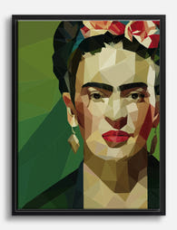
Affiche Frida Kahlo portrait géométrique
Translation missing: fr.products.product.sale_price À partir de £13.99£19.99 -

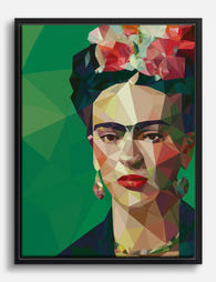
Affiche portrait géométrique de Frida Kahlo
Translation missing: fr.products.product.sale_price À partir de £13.99£19.99 -

Affiche Frida Kahlo portrait géométrique
Translation missing: fr.products.product.sale_price À partir de £13.99£19.99 -

Affiche portrait géométrique inspiré de Frida Kahlo
Translation missing: fr.products.product.sale_price À partir de £13.99£19.99 -

Toile portrait géométrique de Frida Kahlo
Translation missing: fr.products.product.sale_price À partir de £55.99£79.99 -

Affiche Frida Kahlo portrait géométrique
Translation missing: fr.products.product.sale_price À partir de £13.99£19.99 -

Affiche Frida Kahlo, portrait géométrique
Translation missing: fr.products.product.sale_price À partir de £13.99£19.99 -

Affiche portrait géométrique de Frida Kahlo
Translation missing: fr.products.product.sale_price À partir de £13.99£19.99 -

Toile portrait géométrique inspiré par Frida Kahlo
Translation missing: fr.products.product.sale_price À partir de £55.99£79.99 -

Affiche Frida Kahlo muse florale
Translation missing: fr.products.product.sale_price À partir de £11.95£19.95 -

Toile portrait floral inspirée de Frida Kahlo
Translation missing: fr.products.product.sale_price À partir de £44.95£74.95 -
Toile Frida Kahlo portrait géométrique
Translation missing: fr.products.product.sale_price À partir de £55.99£79.99 -

Affiche portrait géométrique de Frida Kahlo
Translation missing: fr.products.product.sale_price À partir de £13.99£19.99 -

Toile Frida Kahlo muse géométrique
Translation missing: fr.products.product.sale_price À partir de £55.99£79.99 -

Affiche muse florale de Frida Kahlo
Translation missing: fr.products.product.sale_price À partir de £11.95£19.95 -
Toile Frida Kahlo portrait géométrique coloré
Translation missing: fr.products.product.sale_price À partir de £55.99£79.99 -

Toile portrait audacieux de Frida Kahlo
Translation missing: fr.products.product.sale_price À partir de £44.95£74.95 -

Affiche Frida Kahlo muse florale
Translation missing: fr.products.product.sale_price À partir de £11.95£19.95 -

Toile Frida Kahlo portrait géométrique moderne
Translation missing: fr.products.product.sale_price À partir de £55.99£79.99 -

Toile portrait géométrique de Frida Kahlo
Translation missing: fr.products.product.sale_price À partir de £55.99£79.99


Plus de The Frame

Black Picture Frames: Why They Always Work and ...
Black frames outsell every other colour by a wide margin, and most articles will tell you it's because they're "versatile." That's lazy. The real reason is design psychology, and once...

How to Build a Tropical Bird Gallery Wall That ...
Tropical bird prints are some of the most rewarding gallery wall subjects you can choose, and also some of the easiest to get wrong. The colours are loud, the species...

How to Build a Gallery Wall Around Flamingo Pri...
Flamingo prints are having a moment. The trouble is, most people buy one, hang it alone, and then freeze when it comes to building anything around it. This guide solves...