Minimalist Beach Decor Ideas That Actually Work (No Seashells Required)
A grown-up guide to coastal style that swaps driftwood signs and rope details for considered art and quiet rooms.

Coastal style has a branding problem. Somewhere between holiday cottages and gift shops, it picked up a reputation for being twee, themed, and slightly past it. The good news is you can have the calm, salt-air feeling of the sea in your home without a single rope detail, and the work mostly happens on your walls.
The problem with most beach decor (and why it dates so fast)
Traditional beach decor is theatrical. Seashells in glass jars, oar-shaped wall hooks, "Gone to the Beach" signs in distressed white wood, anchors on cushions, starfish on everything. It announces itself the moment you walk in, and it ages badly because it's costume rather than design.
The deeper issue is that literal references stop working the second the trend shifts. A driftwood letter spelling out HOME was charming in 2014 and embarrassing by 2019. Anything that depends on a single visual gag (rope, anchor, lighthouse, "BEACH" in chunky font) has a short shelf life because there's nowhere for the eye to go after the joke lands.
Coastal minimalism takes the opposite approach. Instead of referencing the beach, it evokes it. Soft horizons, washed-out blues, the negative space of an empty shoreline, the texture of sand or linen. You feel the sea without being told about it, which is why it holds up year after year.
The other thing worth saying plainly: nautical and coastal are not the same. Nautical is sailors, knots, navy stripes, brass. Coastal is the experience of being near water. If you want longevity, go coastal and skip nautical entirely.

Start with art: choosing one anchor print instead of five small ones
The single biggest mistake people make with coastal art prints is buying small. A 30x40cm print floating above a three-seater sofa looks like a postage stamp on an envelope. The wall reads as empty and the print reads as an afterthought.
One large anchor print does more work than five small ones. It commands the room, gives the eye a clear place to rest, and lets the rest of the space stay quiet. This is the foundational move of coastal minimalism: one strong piece, plenty of breathing room around it.
How big is big enough?
A reliable rule for art above furniture: the print should be roughly two-thirds the width of the sofa, console, or bed it sits above. Above a standard 200cm sofa, that means a print around 130-140cm wide. Above a 160cm sideboard, you want something around 100-110cm.
If a single print at that size feels too expensive or too committed, a diptych (two prints hung close together as one unit) reads as one anchor piece, not two small ones. Treat the gap between them as part of the composition, not a wall in its own right.
What makes a print "minimalist enough"?
A quick litmus test while you're shopping: can you describe the image in five words or fewer? "Pale horizon, grey sea, sky." "Single rock, white water." "Empty beach, soft fog." If it takes a paragraph to explain what's in the picture, it's probably too busy for a coastal minimalist scheme.
The other test is colour. Simple coastal prints tend to live in a narrow band of muted tones: chalk white, bone, oat, sand, sage, pale slate, soft navy. If a print uses more than three distinct colours, or has any saturated brights, it'll fight the rest of the room.
Placement basics
Hang the centre of the print at roughly 145-150cm from the floor (gallery standard). Above furniture, leave around 15-25cm of breathing room between the top of the sofa and the bottom of the frame. Closer than 15cm and the print looks like it's sitting on the cushions. Further than 30cm and it floats off, disconnected.
The gallery wall approach for coastal minimalists (the 3-5-7 rule adapted)
If you're set on a gallery wall rather than a single anchor print, the traditional 3-5-7 rule (always work in odd numbers, with three, five, or seven pieces) needs a coastal-minimalist adjustment. Most gallery walls fail because they're too varied. Coastal walls fail twice as hard, because variety reads as clutter the moment the palette gets noisy.
The rules that actually work
Stick to one palette. Every print should feel like it was photographed or painted on the same overcast morning. If one piece has a hot orange sunset and another has cool grey fog, they don't belong together no matter how nice they are individually.
Match your frames. This is non-negotiable for minimalist coastal. Either all natural oak, all white, or all black. Mixed frame finishes work for maximalist gallery walls but they pull a coastal scheme apart.
Use one dominant piece. Even with three or five prints, one should be noticeably larger and act as the visual anchor. Equal-sized grids work but feel formal. An asymmetric arrangement around one big piece feels more relaxed, which is the whole point.
Be ruthless with spacing. Keep gaps between frames consistent at around 5-7cm. Tighter gaps make a multi-piece arrangement read as one composition rather than scattered pictures.
A three-piece arrangement is the easiest to get right: one larger landscape-orientation print on the left, two smaller portrait-orientation prints stacked on the right. Five-piece arrangements need more planning. Seven is usually too many for a minimalist scheme unless you're working with a very long wall.
If you'd rather skip the planning entirely, pre-curated wall art sets are designed to hang together as a coherent group, which removes most of the failure points.

Furniture and textiles that support the art without competing
Coastal minimalism falls apart when the room around the art is too busy. The wall pieces are doing the heavy lifting, so everything else needs to step back.
Soft, undyed textiles. Linen in oat, bone, or pale grey. Cotton throws in stonewashed white. Wool rugs in undyed naturals. Avoid anything with a strong pattern, especially stripes, which read as nautical and undo the work the art is doing.
Pale wood, matt finishes. Oak, ash, lime-washed pine. Stay away from glossy lacquer, dark walnut, and anything orange-toned. The aim is bleached driftwood without literally using driftwood.
One natural texture per zone. A jute rug, a linen sofa, a ceramic lamp, a wool throw. Layer textures, not patterns. This is what gives coastal minimalism its quiet richness without tipping into theme-park beach house.
Plants, not props. A single olive tree in a clay pot does more for a coastal feeling than any amount of shells in jars. Olive, eucalyptus, dried pampas, beach grasses in tall vases. Anything green and slightly wild.
The thing to resist is the urge to add. Minimalist coastal works because of restraint. Every time you put something on a surface, ask whether the room felt better without it.
Rooms that need coastal art the most (and where to avoid it)
Rooms that benefit most
Bedrooms. This is where coastal art earns its keep. The associations (calm, water, soft horizons) genuinely help with how a bedroom feels. A large minimalist seascape above the headboard is one of the highest-impact single decisions you can make in a home.
Bathrooms. Counterintuitively, bathrooms benefit hugely from coastal art, but only if you've solved the moisture issue. Canvas prints handle humid rooms better than paper-based prints behind glass, where moisture can sometimes get trapped. A canvas above the bath, in a steamy room, reads beautifully.
Living rooms with limited natural light. Coastal palettes are pale by nature, which bounces light around a darker room and makes it feel airier. A north-facing lounge gains noticeably from a large pale horizon piece on the main wall.
Hallways and entryways. Long, narrow walls work brilliantly for panoramic seascapes. The horizontal stretch of a coastline echoes the proportions of the wall.
Rooms where it usually doesn't land
Kitchens. Coastal art in a working kitchen tends to compete with appliances, tiles, and the general visual noise of the space. If you have a separate dining area, that's where the art belongs.
Home offices that need focus. Soft horizons are restful, which is the opposite of what some people need at a desk. If your work requires concentration, a more graphic minimalist piece tends to serve you better than a calming seascape.
Rooms with strong existing themes. If your living room is already mid-century modern with bold colour, or industrial with exposed brick and metal, dropping a pale seascape into the middle won't read as coastal, it'll read as confused. Coastal minimalism wants a quiet base to sit on.
The small flat question
City dwellers in 50-square-metre rentals often assume coastal style won't work without sea views and white floorboards. It works fine. The trick is going harder on restraint, since smaller spaces punish clutter more aggressively. One properly-sized anchor print, a linen sofa cover, an oat-coloured rug, one plant. That's a complete coastal scheme in a London flat.

Before and after: a blank living room wall transformed with a single minimalist sea print
Picture a typical rented lounge. Magnolia walls, mid-grey sofa from the previous tenant, an IKEA Kallax against the wall holding books, a floor lamp, no rug. The big wall behind the sofa is completely empty. The room reads as unfinished, slightly sad, vaguely transitional.
Most people fix this by buying three small prints, hanging them in a row above the sofa, and standing back disappointed. The prints are too small, too low, too separate. Nothing has changed.
The single-print approach: one minimalist sea print at 70x100cm, framed in natural oak with UV-protective acrylic glaze, hung centred above the sofa with around 20cm of clearance from the cushions. The image: a pale horizon, two-thirds sky, one-third sea, almost no detail.
What changes immediately:
- The wall stops feeling empty. The eye has somewhere to land.
- The grey of the sofa stops looking sad and starts reading as soft, because it's now part of a considered palette.
- The room feels taller, because a tall portrait or large landscape orientation print pulls the eye up.
- Everything else in the room (the Kallax, the lamp, the lack of rug) starts looking deliberate rather than accidental.
You haven't bought new furniture, repainted, or done anything structural. You've spent under £200 and the room reads as designed. This is why we keep coming back to the anchor print principle. It's the highest-leverage decision in a coastal minimalist scheme.
A note on the framing question that comes up constantly. The reason a lot of people end up with disappointing wall art isn't the print itself, it's that the print arrives flat-packed, the frame ships separately, the print doesn't sit properly inside it, and within six months the paper has warped or developed bubbles behind the glass. Properly fitted framed prints that arrive as one finished object, ready to hang, solve almost all of this. Solid wood frames don't warp the way MDF does. Acrylic glazing is lighter than glass, doesn't shatter, and blocks UV so the print doesn't fade in a sunny room.
Where to go from here: building a cohesive look across multiple rooms
Once you've nailed the anchor print in the main room, the temptation is to keep buying. Resist this for a week and look at the rest of the house first.
Cohesion across rooms doesn't mean every room has a seascape. It means the visual language stays consistent. If your lounge has a soft, foggy horizon in muted blues, your bedroom can have an empty beach in warm sand tones and they'll read as part of the same home. They're speaking the same language.
A useful approach: pick three to five minimalist art prints that share a palette and a mood, then assign one to each main room. Bedroom gets the calmest. Lounge gets the most striking. Hallway gets the most horizontal. Bathroom gets whichever piece works best at smaller scale (canvas is often the better call here).
Frame finish should stay consistent across the home. If you've gone natural oak in the lounge, stay natural oak in the bedroom. Mixed frame finishes between rooms are fine if the rooms are visually separated, but if you can see one frame from another (as in open-plan living), match them.
Buy slightly bigger than feels comfortable. Almost everyone underestimates the size they need, and almost no one regrets going larger. If you're hovering between two sizes online, the bigger one is nearly always right.
The whole point of coastal minimalism is that it gets out of its own way. You're not trying to make a statement, you're trying to make a calm room. The art does the heavy lifting. Everything else can be quiet.


Produits Fab présentés dans cet article
-

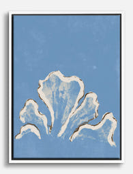
Affiche étude de coquillage côtier
Translation missing: fr.products.product.sale_price À partir de £11.95£19.95 -

Affiche planche de surf minimaliste beige
Translation missing: fr.products.product.sale_price À partir de £11.95£19.95 -

Affiche coquillage bord de mer
Translation missing: fr.products.product.sale_price À partir de £11.95£19.95 -

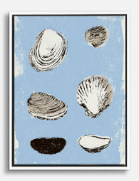
Affiche coquillages sur fond bleu
Translation missing: fr.products.product.sale_price À partir de £11.95£19.95 -

Affiche coquillages sur fond bleu
Translation missing: fr.products.product.sale_price À partir de £11.95£19.95 -

Toile collection de coquillages marins
Translation missing: fr.products.product.sale_price À partir de £49.95£74.95 -
Toile coquillages bleus bord de mer
Translation missing: fr.products.product.sale_price À partir de £49.95£74.95 -

Toile planche de surf minimaliste bord de mer
Translation missing: fr.products.product.sale_price À partir de £49.95£74.95 -

Affiche abstraite minimaliste sable doux
Translation missing: fr.products.product.sale_price À partir de £11.95£19.95 -

Toile vagues apaisantes bord de mer
Translation missing: fr.products.product.sale_price À partir de £49.95£74.95 -

Affiche bord de mer brumeux et apaisant
Translation missing: fr.products.product.sale_price À partir de £11.95£19.95 -

Toile sérénité marine
Translation missing: fr.products.product.sale_price À partir de £49.95£74.95 -
Toile étude de coquillages marins
Translation missing: fr.products.product.sale_price À partir de £49.95£74.95 -

Affiche havre en bord de mer
Translation missing: fr.products.product.sale_price À partir de £11.95£19.95


Plus de The Frame

From Dutch Masters to Modern Minimalism: The Ke...
Search "types of flower bouquet art" and you'll get wedding centrepieces, posy guides, and cascading bridal arrangements. Useful if you're getting married. Useless if you're trying to choose what goes...

Every Flower in William Morris's World: A Guide...
William Morris designed roughly 50 wallpapers and around 30 chintzes across his career, and almost every single one features a plant. If you've ever stood in front of a Morris...

What Colours Go With Bouquet Prints? Pairings I...
You've found a bouquet print you love. Now you need to know if it will actually work above your sofa, opposite that mustard armchair, next to the curtains you spent...