How to Build a Pet Gallery Wall That Looks Intentional (Not Chaotic)
The difference between a curated pet gallery wall and a chaotic shrine comes down to measurements, frame discipline, and one key principle.

Pet art has a reputation problem. Done badly, it tips into kitsch faster than almost any other category, and the more pieces you add, the worse it gets. Done well, a gallery wall of dogs, cats, hares or horses can be one of the most personal and well-composed walls in your home.
Why a gallery wall works better than a single pet print in some spaces
A single large pet print works beautifully above a sofa or bed. But in narrow hallways, on stair walls, above sideboards, or in any space with awkward proportions, one print often looks marooned. Gallery walls fill these spaces in a way single pieces can't.
There's also a compositional argument. If you genuinely love pet art and want to celebrate it across multiple animals or styles, trying to cram that into one print leads to busy, overworked imagery. A gallery wall lets each piece breathe while contributing to a larger story.
The trade-off: gallery walls demand more planning. A single print is forgiving. A gallery wall punishes laziness, and that's exactly why most pet-themed ones fail.

The golden rule: match the style, not the subject
This is the single most important principle, and it's where almost every pet gallery wall goes wrong. Homeowners pick prints based on what the prints show (my labrador, my tabby, the neighbour's beagle) rather than how they're rendered.
The result looks like a zoo gift shop. A photographic dog portrait next to a watercolour cat next to a cartoon hare next to a vintage horse illustration. Four different visual languages shouting at each other.
Match the style instead. Pick one of the following and stay in it:
- Botanical or vintage scientific illustration. Muted, ink-and-watercolour, often on cream backgrounds.
- Modern minimalist line art. Single weight lines, lots of white space, often monochrome.
- Painterly portraits. Loose brushwork, oil or gouache feel, rich colour.
- Photographic. Black and white or consistent colour grading.
- Folk or graphic. Bold flat colour, simplified shapes, illustrative.
Once you've chosen a style, you can mix dogs, cats, foxes, birds and rabbits freely. The visual grammar holds them together. Browse a focused collection like pet art prints and pick six or eight pieces in a single style before you even think about layout.
Recommended size combinations for 3, 5, and 7 print layouts
Sizing is where the practical guidance usually disappears. Here are combinations that actually work, using standard print sizes Fab offers.
3-print layouts
For above a two-seater sofa or a 120cm sideboard:
- Horizontal row: three prints at 30x40cm, spaced 5cm apart. Total width roughly 100cm.
- Anchor and pair: one 50x70cm centrepiece flanked by two 30x40cm pieces. Total width roughly 130cm.
5-print layouts
For above a three-seater sofa, a console table, or a king bed:
- Symmetrical cluster: one 50x70cm in the middle, two 30x40cm above it (one each side), two 30x40cm below it. Total footprint roughly 110cm wide by 140cm tall.
- Horizontal salon: mix of three 30x40cm and two 21x30cm, arranged in a loose horizontal band. Total span roughly 160cm.
7-print layouts
For larger walls, stair walls, or feature walls:
- Grid: seven prints at 30x40cm in a 4-3 staggered grid. Total footprint roughly 130x90cm.
- Anchored salon: one 70x100cm anchor, plus two 50x70cm and four 30x40cm pieces arranged around it. Total footprint roughly 200x140cm.
The principle behind these numbers: your gallery wall should cover roughly two-thirds to three-quarters of the furniture width below it, and 60 to 75 percent of the available wall space. Smaller than that, it floats. Bigger than that, it suffocates.
Choosing a frame finish and sticking with it
Frame consistency is the lazy person's design hack, and it's brilliant. If your prints vary in subject and even slightly in style, identical frames pull everything into a unified composition.
Three approaches that work:
- All-black frames. Sharpest, most contemporary. Works in modern, Scandi, and industrial spaces.
- All-natural oak. Warmer and quieter. Works in mid-century, country, and Japandi interiors.
- All-white frames. Lightest visual weight. Works in cottage, coastal, and minimalist rooms.
If you genuinely want variety, allow yourself a maximum of two finishes (say, oak and black) and distribute them evenly across the wall so neither dominates. Three finishes is the absolute upper limit and usually a mistake.
A practical note on quality. The most common gallery wall failure isn't layout, it's the frames themselves. Cheap frames warp, the prints buckle inside them, and after six months on a sunny wall the whole thing looks tired. Solid wood frames with UV-protective glazing keep prints flat and colours accurate for years. If you're investing in eight pieces, this matters. Fab's framed art prints ship with the print already fitted, properly tensioned, ready to hang.

Layout templates with actual measurements
Stop eyeballing it. Every successful gallery wall starts on the floor or with paper templates on the wall.
The grid layout
Best for: modern interiors, minimalist rooms, anyone who wants to impose visible order on varied subjects.
Take six prints at 30x40cm. Lay them out in two rows of three. Spacing between each frame: 5cm horizontally and 5cm vertically. Total footprint: roughly 100cm wide by 85cm tall.
The grid is unforgiving but rewards you with a calm, gallery-like result. It's especially good for pet themed wall art because the rigid structure counteracts any sentimental softness in the subject matter.
The symmetrical cluster
Best for: above sofas and beds, traditional and transitional interiors.
One 50x70cm anchor in the centre. Two 30x40cm pieces directly above the anchor's top corners, separated by 5cm of vertical space and 5cm between them. Two 30x40cm pieces directly below in the same arrangement. Result: a tall, symmetrical diamond-ish shape roughly 110cm wide by 140cm tall.
The salon hang
Best for: hallways, stair walls, eclectic spaces, anyone with seven or more pieces.
Salon hangs look spontaneous but aren't. Start with your largest piece slightly off-centre. Build outwards in a loose cloud, keeping the gaps between frames consistent at 5 to 7cm. The outer edge of the arrangement should suggest a soft rectangle or oval, not a starfish.
Frame spacing: the universal rule
Whatever layout you choose, the professional standard is 5 to 7cm between frames. Closer than 5cm and the wall feels cramped. Wider than 7cm and the pieces stop reading as a single composition. Stick within that range and you'll be fine.
Centre line: 145 to 150cm from the floor
The centre of your gallery wall, not the centre of the top print, should sit roughly 145 to 150cm from the floor. This is standard gallery hanging height, calibrated to average eye level. If you're hanging above a sofa or sideboard, the bottom of the lowest frame should sit 15 to 20cm above the furniture.
Mixing dogs and cats (and other animals) without visual chaos
Now the part everyone struggles with. You have a labrador you adopted, two cats, a beloved hare print from a holiday, and a heron piece you bought on impulse. How do you make this work?
Apply the 60-30-10 colour rule
Borrowed from interior design, but it works perfectly here. Across all your prints combined: 60 percent should share a dominant base colour (typically the background), 30 percent a secondary colour, and 10 percent an accent.
In practice, this means choosing prints that share a tonal world. If most of your pieces have warm cream backgrounds with charcoal subjects and the occasional rust accent, every animal you add should fit that palette. A bright cobalt-and-pink print will detonate the whole arrangement.
Distribute subjects, don't cluster them
Don't put all the dogs on one side and all the cats on the other. The eye reads that as two separate walls. Alternate species across the layout so the arrangement reads as one collection.
Vary scale and orientation, but keep it balanced
If every print is the same size and orientation, you have a grid (which is fine, see above). If you're going for a salon hang, mix portrait and landscape orientations and at least three different sizes. But balance them: a large piece on the upper left needs visual weight on the lower right, whether that's another large piece or a tight cluster of smaller ones.
Limit the cast
Six to nine pieces is plenty. Beyond that, even a beautifully styled wall starts to feel like a collection rather than a composition. If you have more pet art than fits, rotate seasonally rather than cramming it all up.
For inspiration on building cohesive sets, browse wall art sets that have already been curated to work together, then add one or two complementary pieces from broader animal art prints to personalise.

How to hang everything level on the first attempt
The paper template method is non-negotiable. Skip it and you will end up with a wall full of holes in the wrong places.
Step one: lay out on the floor. Arrange your frames on the floor below the wall they'll hang on. Photograph the layout from directly above. Keep adjusting until you're happy. Do not skip this step. What looks good in your head almost never matches what looks good once you've laid it out.
Step two: cut paper templates. Cut a piece of brown paper or newspaper to the exact size of each frame. Mark on each template where the hanging fixture sits on the back of the actual frame (measure from the top edge).
Step three: tape templates to the wall. Use low-tack painter's tape. Position your first template so its centre sits at 145 to 150cm from the floor, or 15 to 20cm above your furniture. Use a spirit level. Then position the others around it, maintaining your 5 to 7cm spacing. Step back across the room and look. Adjust freely. This is the moment to make changes.
Step four: mark and hang. Push a pencil or nail through the marked hanging point on each template, into the wall. Remove the templates. Hammer in your fixings on the marks. Hang the frames.
Frames that arrive ready to hang with fixtures already attached make this dramatically faster. You're not assembling, you're not fitting prints into frames, you're not levelling internal mounts. You're just putting picture on hook.
Common gallery wall mistakes and how to avoid them
Hanging too high. The biggest mistake by far. People hang gallery walls at standing eye level, which is too high when you're sitting on the sofa beneath. Centre at 145 to 150cm, not at your nose.
Inconsistent gaps. A wall with 4cm here and 9cm there reads as careless. Use a small piece of card cut to your chosen gap width as a spacer when you're hanging.
Mixing too many styles. Match the style, not the subject. If you forget every other rule, remember this one.
Going too small for the wall. A cluster of 21x30cm prints lost in the middle of a 4-metre wall looks apologetic. Scale up, or add more pieces.
Forgetting about light. Direct sunlight fades cheap prints within months. UV-protective glazing matters, especially in south-facing rooms. This is one of the few places where buying well genuinely pays off long-term.
Getting emotional about the layout. Yes, the print of your first dog is sentimental. No, that doesn't mean it has to go in the centre. Compositional balance comes first. Sentiment is preserved by including the piece, not by giving it the throne.

A final thought before you start
Build your wall once, properly, and you won't touch it for years. Spend an afternoon laying out templates. Pick prints in one style. Pick one or two frame finishes. Measure twice. The difference between a gallery wall that looks like a designer did it and one that looks like a school project is almost entirely planning, not taste.
Pet art deserves better than the gift-shop reputation it usually gets. Treat it with the same compositional discipline you'd apply to any other art on your walls, and it will repay you with one of the most personal rooms in the house.

Produits Fab présentés dans cet article
-

Affiche portrait de chien minimaliste
Translation missing: fr.products.product.sale_price À partir de £13.99£19.99 -

Toile chiens élégants
Translation missing: fr.products.product.sale_price À partir de £44.95£74.95 -

Affiche chien paisible de dos
Translation missing: fr.products.product.sale_price À partir de £13.99£19.99 -

Toile portrait de chien au regard fidèle
Translation missing: fr.products.product.sale_price À partir de £55.99£79.99 -

Toile chats curieux à la porte rose
Translation missing: fr.products.product.sale_price À partir de £44.95£74.95 -

Affiche chien paisible
Translation missing: fr.products.product.sale_price À partir de £13.99£19.99 -

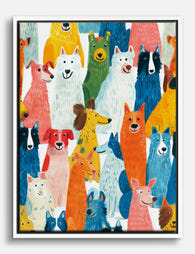
Affiche chiens multicolores
Translation missing: fr.products.product.sale_price À partir de £13.99£19.99 -
Toile parade de chiens joueurs
Translation missing: fr.products.product.sale_price À partir de £55.99£79.99 -

Toile chien au regard fidèle
Translation missing: fr.products.product.sale_price À partir de £55.99£79.99 -

Toile chiens joueurs en tons pastel
Translation missing: fr.products.product.sale_price À partir de £44.95£74.95 -

Affiche chiot à l'aquarelle, regard en arrière
Translation missing: fr.products.product.sale_price À partir de £13.99£19.99 -

Toile portrait de chien apaisant
Translation missing: fr.products.product.sale_price À partir de £55.99£79.99 -

Affiche chiens sur une pile de livres
Translation missing: fr.products.product.sale_price À partir de £11.95£19.95 -

Toile chien noir élégant dans pièce colorée rose et bleu
Translation missing: fr.products.product.sale_price À partir de £44.95£74.95 -

Toile après-midi au café des animaux
Translation missing: fr.products.product.sale_price À partir de £55.99£79.99 -

Toile chiot sur lit à rayures bleues et blanches
Translation missing: fr.products.product.sale_price À partir de £55.99£79.99 -

Toile chiens attachants
Translation missing: fr.products.product.sale_price À partir de £44.95£74.95 -
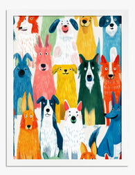
Affiche parade de chiots colorés
Translation missing: fr.products.product.sale_price À partir de £13.99£19.99 -

Toile chien et chat noir complices
Translation missing: fr.products.product.sale_price À partir de £44.95£74.95


Plus de The Frame

Botanical Prints vs Floral Prints: Which Style ...
Most online stores use "botanical" and "floral" as if they mean the same thing. They don't. The difference shapes the mood of a room, the furniture it pairs with, and...

Pink Gallery Wall Ideas: 7 Looks from Soft and ...
Pink is having a long moment, and a gallery wall is the most flexible way to commit to it without painting your walls. The trouble is that "pink gallery wall"...

How to Decorate Your Living Room with Vintage A...
Vintage art is having a moment, and most people are still hesitating because they worry their lounge will end up looking like a tea room. It won't, if you follow...