Road Themed Gallery Walls: How to Build One That Feels Curated, Not Cluttered
A subject-first approach to building a road and travel gallery wall that tells one story instead of shouting seven.

Most gallery wall guides will tell you how to space frames and which nail to use. Almost none will tell you what actually pairs with a winding mountain road or a desert highway shot at golden hour. That's the part shoppers get stuck on, so that's where we'll start.
Start with your anchor: choosing the right road print as a centrepiece
Every road themed gallery wall needs a hero. One print that's larger, more dramatic, and more saturated than anything else on the wall. Without a clear anchor, you end up with five equally weighted images competing for attention, which is the visual equivalent of everyone in a room talking at once.
Your hero should be at least 50x70cm, ideally 70x100cm if your wall can take it. Smaller than that and it stops feeling like a centrepiece and starts feeling like just another piece in the grid. We'd recommend browsing road art prints with strong directional lines: a vanishing point that pulls the eye in, a long curve that leads through the frame, or a high-contrast horizon.
Composition matters more than subject matter at this stage. A misty forest road with low contrast can absolutely work as a hero, but only if it has enough drama in its tonal range or scale to hold the wall on its own. If it feels like a quiet supporting piece, it is one.
A practical test: imagine the print at 70x100cm in the middle of an empty wall. If it would look powerful on its own, it's hero material. If it would look lonely, you've chosen a supporting piece by mistake.

Supporting subjects that pair well with roads
This is where most gallery walls go wrong. People pick five road images thinking the theme requires repetition, and end up with a wall that reads as a single, exhausting motif. Roads as a theme work best when the supporting cast expands the story rather than echoes it.
Mountains and dramatic terrain
Mountains are the most natural pairing because they share visual DNA with most road photography: depth, scale, atmosphere, and a sense of journey. A winding alpine road as your hero, supported by two mountain art prints showing peaks at dawn or dusk, immediately reads as a cohesive travel narrative.
The trick is matching tonal mood, not subject matter exactly. If your road print is shot in cool blue early morning light, your mountains should live in a similar palette. A warm sunset road next to icy blue mountains feels disjointed unless you're deliberately working with contrast as a concept.
Skies, horizons and minimalist landscapes
Open skies and minimalist horizons act as visual breathing room. A dramatic winding road carries a lot of visual weight, so pairing it with a quiet, airy horizon line gives the eye somewhere to rest. Think foggy lakes, pale dunes, or a single horizon line splitting earth from sky.
These work brilliantly as the smallest pieces in your gallery. They calm the wall down without competing with your hero.
Forests and texture pieces
Forest interiors and detailed nature shots add texture and intimacy. They pull the gallery away from pure landscape and into something more layered. A close-up of pine canopy, a misty woodland clearing, or even an aerial of a forest road tying back to the theme all work well as secondary pieces.
The wider landscape art prints collection is the place to mine for these supporting subjects. Look for images that share light quality with your hero, even if the subject is different.
What to avoid
Avoid mixing weather moods aggressively. A stormy desert highway and a bright sunny forest in the same gallery feel like they were ripped from two different magazines. Avoid five winding road images in a row, even if you love them all. And avoid pairing heavily saturated roads with similarly saturated supporting prints. One piece should sing; the others should harmonise.
Size combinations that work
Theory is fine, but most people want a layout they can actually copy. Here are the two combinations we keep coming back to.
The 3-piece layout (good for narrow walls, above sofas under 2m)
- 1x hero road print at 70x100cm (vertical or horizontal)
- 2x supporting prints at 30x40cm
Hang the hero centred. Place the two supporting prints stacked vertically to one side, with their combined height roughly matching the hero's height. This is asymmetric on purpose. Symmetrical 3-piece layouts can feel formal in a way that suits some interiors but kills the journey feeling roads need.
If you want symmetry, place a 50x70cm hero centrally with one 30x40cm print on each side, all aligned along their horizontal centres. Cleaner, calmer, slightly more traditional.
The 5-piece layout (for walls 2.5m and wider)
- 1x hero road print at 70x100cm horizontal (centred)
- 2x mid-size supporting prints at 40x50cm (flanking the hero)
- 2x small detail or minimalist prints at 21x30cm (placed above or below the mid-size pair)
The hero anchors the middle. The mid-size pair extends the horizontal line. The two smaller pieces add variation and prevent the layout feeling like a strict grid. We'd typically place the smallest prints diagonally opposite each other, top-left and bottom-right, to create gentle visual movement.
If you'd rather skip the maths, pre-curated wall art sets handle the size pairing for you, and you can swap in your hero road print as the anchor.
Orientation mixing
One vertical road print pairs better with horizontal supporting landscapes than with more verticals. Mixing orientations creates rhythm. A wall of all vertical prints feels stiff and columnar. A wall of all horizontals feels flat. The sweet spot is roughly a 60/40 split, with your hero's orientation being the dominant one.

Spacing and alignment: the measurements that matter
Spacing is the single most overlooked detail in gallery walls. Get it right and the wall reads as one composition. Get it wrong and it reads as several prints that happen to share a wall.
The 5 to 8cm rule
Keep 5 to 8cm of negative space between every print. That's roughly two to three inches. Closer than 5cm and the prints visually merge, which kills the rhythm. Wider than 8cm and they stop talking to each other and start looking like isolated decisions.
Use the same spacing throughout the entire gallery. Inconsistent gaps are the fastest way to make a wall look amateur. If your top row has 6cm between frames, your bottom row needs 6cm too.
Alignment lines
Every gallery wall should have at least one invisible alignment line. The most common is a horizontal centre line running through the middle of the hero print, with supporting prints aligned to it either by their centres, their tops, or their bottoms.
Pick one alignment principle per wall and stick to it. Mixing alignment logic mid-wall is what makes a gallery look chaotic.
Hanging height
The centre of your gallery wall, treated as a single composition, should sit at roughly 145 to 150cm from the floor. That's standard gallery eye height. Above a sofa or sideboard, leave 15 to 20cm between the top of the furniture and the bottom of your lowest frame. Closer than that and the art looks like it's resting on the furniture. Further away and it floats untethered.
Frame consistency vs deliberate mixing
Here's where we have a strong opinion: thematic gallery walls need more frame consistency than eclectic personal collections, not less.
When the subject matter tells a unified story (roads, travel, landscape), mixing frame styles fights against that cohesion. The eye reads frames as part of the visual information. Three different frame finishes turn one story into three. For a road themed gallery, we'd recommend a single frame colour throughout, or a maximum of two finishes used deliberately (for example, all black frames for the perimeter prints with a natural oak frame for the hero).
Black frames sharpen the contrast and lean contemporary. Natural oak frames feel warmer and work beautifully with golden-hour or desert road imagery. White frames disappear into the wall and let the imagery dominate, which suits minimalist interiors.
Whatever you choose, the frame profile (the depth and width of the moulding) should match across the gallery even more strictly than the colour. A thin black frame next to a chunky black frame looks like a mistake even to people who can't articulate why.
A note on frame quality
The reason this matters more for thematic galleries is that you'll notice every flaw. Warped frames, prints that aren't sitting flat, glare across the surface, all of it gets amplified when prints sit close together. We use solid FSC-certified wood and UV-protective acrylic glaze rather than glass, which means no reflections bouncing off your hero print and no fading even if the wall catches direct sun. Worth knowing if your gallery wall lives somewhere bright.

How to lay it all out on the floor before you commit to the wall
Never hang anything until you've laid it out flat. This is the step that separates galleries that work from galleries that get rearranged six times.
Step 1: Measure your wall
Note the wall's full width and height. Subtract any furniture sitting beneath it. The usable area is what you're designing into. As a rough rule, your gallery should fill about two-thirds of the wall width above a piece of furniture, and never extend wider than the furniture itself.
Step 2: Tape an outline on the floor
Use masking tape on the floor to mark out the exact dimensions of your usable wall space. This becomes your canvas. Lay your prints inside this taped rectangle in the arrangement you're considering.
Step 3: Arrange, photograph, rearrange
Move the prints around. Try the hero in the centre. Try it offset. Try the small prints stacked, then spread. After each version, take a photo from directly above. Photos flatten the arrangement and let you see the composition the way it'll read on the wall, which is something your brain can't do when you're standing over it.
Step 4: Lock the spacing
Once you've chosen a layout, measure the gaps between every print and adjust until they're all consistent (your 5 to 8cm). Photograph the final version. This becomes your reference image when you're hanging.
Step 5: Cut paper templates
Cut paper rectangles to the exact size of each print. Tape them to the wall using your photographed layout as reference. Live with the paper templates for at least a day. If anything feels off, you'll know before you've put a single hole in the plaster.
Common gallery wall mistakes and how to avoid them
Choosing all similar compositions
Five winding road photographs is not a gallery, it's a repetition. Vary your compositions. Mix close-up details with wide vistas. Mix bold leading lines with quiet horizons.
Ignoring scale variation
A wall of five prints all at 40x50cm reads as a grid, not a gallery. You need a clear hierarchy: one largest, two medium, two small (or one largest and two small for a 3-piece). Equal sizing kills the sense of curation.
Clashing weather moods
We mentioned this earlier but it's worth repeating because it's the most common road gallery mistake. A stormy mountain pass and a sunny coastal road do not belong on the same wall. Pick a mood, stay with it.
Buying everything at once
You don't need to commit to the full gallery on day one. Start with your hero. Live with it for a few weeks. Add the supporting pieces gradually as you find images that genuinely belong. Galleries built over months almost always look better than galleries assembled in a single afternoon, because each addition gets considered against what's already there.
Hanging too high
Eye-level for a gallery means the centre of the entire arrangement, not the centre of any single print. Most people instinctively hang things 10 to 15cm too high. Trust the 145 to 150cm centre line.

Final thought
Build the gallery around one strong road print and let everything else serve it. Match your moods, keep your spacing consistent, commit to one frame finish, and lay everything out on the floor before you touch the wall. If you do those five things, you'll end up with a gallery that looks like it was put together by someone who knew exactly what they were doing. Which, by then, you will be.

Produits Fab présentés dans cet article
-

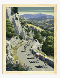
Affiche cyclistes sur route de campagne sinueuse
Translation missing: fr.products.product.sale_price À partir de £11.95£19.95 -

Toile esprit road trip pittoresque
Translation missing: fr.products.product.sale_price À partir de £44.95£74.95 -

Affiche cyclistes sur route de montagne
Translation missing: fr.products.product.sale_price À partir de £11.95£19.95 -

Affiche road trip pittoresque
Translation missing: fr.products.product.sale_price À partir de £11.95£19.95 -

Affiche peloton de cyclistes sur route vallonnée
Translation missing: fr.products.product.sale_price À partir de £11.95£19.95 -

Affiche cyclistes sur route de montagne
Translation missing: fr.products.product.sale_price À partir de £11.95£19.95 -

Affiche cyclistes sur route des canyons rouges
Translation missing: fr.products.product.sale_price À partir de £11.95£19.95 -

Toile cyclistes sur les routes de campagne
Translation missing: fr.products.product.sale_price À partir de £44.95£74.95 -
Affiche cyclistes sur route de montagne
Translation missing: fr.products.product.sale_price À partir de £11.95£19.95 -

Toile vélo, esprit du Tour de France
Translation missing: fr.products.product.sale_price À partir de £44.95£74.95 -

Toile cyclistes sur route panoramique
Translation missing: fr.products.product.sale_price À partir de £44.95£74.95 -

Toile cyclistes sur route de montagne
Translation missing: fr.products.product.sale_price À partir de £44.95£74.95 -

Toile échappée de cyclistes dans la campagne vallonnée
Translation missing: fr.products.product.sale_price À partir de £44.95£74.95 -

Affiche van vintage vert sur route forestière
Translation missing: fr.products.product.sale_price À partir de £11.95£19.95 -

Affiche vélo dans les montagnes dorées
Translation missing: fr.products.product.sale_price À partir de £11.95£19.95 -

Affiche ambiance rétro des bords de route
Translation missing: fr.products.product.sale_price À partir de £11.95£19.95 -

Affiche vélo, cyclistes sur route de montagne
Translation missing: fr.products.product.sale_price À partir de £11.95£19.95 -

Affiche balade à vélo le long de la rivière
Translation missing: fr.products.product.sale_price À partir de £11.95£19.95 -

Toile cyclistes sur col de montagne ensoleillé
Translation missing: fr.products.product.sale_price À partir de £44.95£74.95 -

Affiche route du désert, esprit aventure jaune rétro
Translation missing: fr.products.product.sale_price À partir de £11.95£19.95


Plus de The Frame

How to Build a Blossom Gallery Wall That Actual...
Most blossom gallery walls fail for the same reason: they're a collection of pretty things rather than a composition. The fix is planning, not taste. This guide gives you the...

How to Build a Winter Sports Gallery Wall That ...
Most winter sports gallery walls fail for the same reason: people buy four prints they like, hang them roughly equidistant, and call it done. A gallery wall that looks intentional...

How to Style Matisse Portrait Prints in Every R...
You've fallen for a Matisse face. Now you're staring at a wall, second-guessing the size, the frame, the room, the lot. This is the practical guide that takes you from...