Room by Room: How to Style Klimt Gold Pattern Wall Art in Your Home
Practical placement, sizing, and pairing advice for getting Klimt's gold patterns to actually work in your rooms.

Klimt's ornamental work is gorgeous and intimidating in equal measure. Buyers fall in love with the gold leaf swirls and Byzantine geometry, then freeze when it comes to actually hanging the thing. This guide takes you room by room with specific sizes, frame choices, and colour pairings so you get it right first time.
Living Room: Making a Klimt Pattern Print the Focal Point
The living room is where a Klimt pattern print earns its keep. Above the sofa is the obvious spot, and the rule we'd actually follow is this: the artwork should span roughly two-thirds the width of the sofa beneath it. For a standard three-seater (around 200cm wide), that means a single piece at 100x150cm or a pair of 60x80cm prints hung side by side with about 5cm between them.
If your ceilings are tall (2.7m or above), go bigger. A 100x70cm print can look stranded on a high wall, while a 100x150cm canvas anchors the space properly. The bottom of the frame should sit roughly 20-25cm above the back of the sofa, no higher. Most people hang art too high, which makes the room feel disjointed and the artwork feel like it's floating away.
For pattern-heavy Klimt works like the Tree of Life or the gold-and-silver fragments from the Stoclet Frieze, give the surrounding wall some breathing room. These prints reward negative space. If you've got a busy gallery wall already, a Klimt pattern print will fight with everything else. Better to let it stand alone and pull the eye.
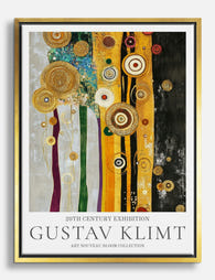
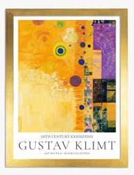
Browse the full Gustav Klimt abstract pattern collection if you're still deciding which composition suits your wall.

Bedroom: Warm Gold Tones and the Right Scale for Above the Bed
Bedrooms are where Klimt's warmth really pays off. The gold tones throw a soft, ambient warmth across the room that flatters bedding and skin tones alike, which is why these prints look so good in soft morning and evening light.
Above the bed, the same two-thirds rule applies. For a king size bed (150cm wide), aim for a print around 100cm wide. For a super king (180cm), go to 120cm or a pair of 50x70cm prints. Keep the bottom of the frame 15-20cm above the headboard so the composition reads as one piece with the bed, not two stacked objects.
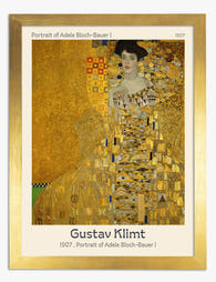
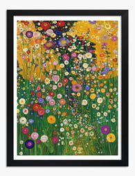
We'd steer you toward Klimt's more abstract or decorative works here over the portraits. A full-on Adele Bloch-Bauer staring across the bed at 3am is a vibe, but not necessarily the one you want. The Tree of Life, the floral motifs, and the geometric pattern studies all work better for sleep spaces. They reward a long, slow look without the intensity of a direct gaze.
Pair with linen bedding in oat, putty, or warm white. Avoid pure cool greys: they fight the gold. If you're pairing with dark navy or forest green bedding, the gold pops beautifully and you get that jewel-box bedroom feel.
Hallway and Entryway: Using Klimt's Detail to Reward a Closer Look
Hallways are narrow, which means people see your art from about 60cm away. This is where Klimt absolutely shines. The fine detail in his pattern work, the tiny squares of gold, the swirling line work, all of it rewards close inspection in a way that big abstract paintings simply can't.
For a narrow hallway, choose a portrait-orientation print at 50x70cm or 70x100cm and hang it at eye level (centre of the print at about 145-150cm from the floor). One strong piece beats three weak ones in a tight space.
In an entryway with more room, consider a vertical pair or a trio of Klimt decorative art prints running along one wall, 10cm apart. This works particularly well if you've got a console table or bench beneath them.
The other advantage here: hallways are usually lower-traffic display zones where you can be bolder. If you've been worried that a Klimt print is "too much" for your main rooms, an entryway is a low-stakes place to commit. Guests get an immediate sense of taste and confidence the moment they walk in.
One practical note. Hallways often get harsh overhead lighting, which can cause glare on glass-framed prints. Our framed prints use a UV-protective acrylic glaze instead of glass, which cuts glare significantly and also protects the inks from any direct sunlight you might get through a front door pane.

Dining Room: Pattern Prints That Elevate an Evening
The dining room is the most underrated room for Klimt. The gold tones come alive under candlelight and warm pendant lighting, and the ornamental detail gives dinner guests something to actually look at when conversation lulls.
Above a dining sideboard, go horizontal. A 100x70cm landscape print works beautifully. Above the table itself, only hang art if your pendant light is positioned away from the wall (not directly over the centre). Otherwise the pendant and the art compete.
For dining specifically, the more opulent Klimt works become an asset rather than a liability. The Stoclet Frieze fragments, the heavily patterned backgrounds from his Golden Phase, all of these feel right at home with a set table and a bottle of wine.
We'd pair with a wall colour that grounds the print rather than competes. Deep terracotta, aubergine, or a smoky teal all work. White walls are fine too, but if you want the full jewel-box dining room experience, commit to a darker shade.
If you're building a wider scheme around gold tones, our gold art prints collection is a useful place to see how different artists handle metallic palettes, which helps clarify why Klimt's approach is so distinctive.
Home Office: Why Ornamental Detail Beats Generic Motivation Posters
Most home office art is dreadful. Motivational quotes in sans-serif. Abstract shapes in muted pastels that look like a stock photo of "productivity." You can do better.
Klimt's pattern work is genuinely good office art for a specific reason: it gives your eyes something rich to land on between tasks. Looking up from a screen at an ornate, detailed composition gives your brain a micro-reset in a way that a flat colour print or a quote can't.
For office walls, size depends on where you sit. If the art is behind you on Zoom calls (the most-seen spot), aim for 70x100cm minimum. It needs to read clearly on a webcam. If it's on your peripheral wall, you can go smaller, 50x70cm works well.
Place it so you can actually see it from your desk chair. The wall directly opposite your seated eye line is ideal. Hang the centre at 140-145cm if you're sitting, which is lower than you'd hang for a standing room.
Pattern work over portraits here. You don't want a face watching you work. Stick to the abstract and decorative compositions.

Frame and Size Recommendations for Each Room
Let's be specific about what goes where.
Frame colour by room
Living room: Black or natural oak. Both work. Black gives a graphic, modern edge that pulls Klimt firmly into the 21st century. Natural oak softens the gold and feels warmer. Avoid gold frames here. Doubling down on the gold makes it feel costume-y, like a hotel lobby in 1998.
Bedroom: Natural oak or white. White frames make Klimt feel lighter and more contemporary, which works in calm sleep spaces. Oak adds warmth.
Hallway: Black. The contrast helps the print pop in lower-light conditions and adds graphic punch in a narrow space.
Dining room: This is the only room where we'd seriously consider an ornate or darker frame. A deep walnut or a thin black profile both work. Still no gold frames.
Home office: Black, always. It frames the work like a museum piece without overwhelming a working space.
Size by room (quick reference)
- Living room sofa wall: 100x150cm single, or pair of 60x80cm
- Bedroom above bed: 100x70cm landscape or 70x100cm portrait
- Hallway: 50x70cm or 70x100cm
- Dining room sideboard: 100x70cm landscape
- Home office (visible on camera): 70x100cm minimum
Canvas or framed print?
Framed art prints look more polished and feel more like proper artwork. They're heavier, and you need a wall that can take a fixing. Our framed prints arrive ready to hang with the fixtures already attached and the print properly fitted behind UV-protective acrylic, so you avoid the warping and bubbling issues that come with prints and frames sold separately.
Canvas prints are lighter, work better in humid rooms (bathrooms aside, which we wouldn't recommend for any art), and have a softer, more textural feel. For Klimt specifically, we lean slightly toward framed prints because the fine detail and gold tones benefit from the crispness of matte paper and the polish of a frame. But canvas at XL sizes (up to 100x150cm) is fantastic for a living room focal wall where you want presence without weight.
Colour Palettes That Complement Klimt's Gold and Geometric Motifs
The "Klimt pairs with gold" advice is technically true and practically useless. Here are specific palettes that actually work.
The Warm Earth palette
Walls in a soft terracotta or warm putty (think Farrow & Ball's Setting Plaster or similar warm pinks). Linen sofa in oat. Walnut furniture. Brass lamps. Aged leather. This palette amplifies the warmth of Klimt's gold without competing.
The Deep Jewel palette
Walls in a deep teal, forest green, or aubergine. Velvet textiles. Brass or matte black hardware. Dark oak floors. This is the dramatic option, and it makes Klimt's gold tones look like they're glowing from within.
The Contemporary Contrast palette
Walls in crisp white or soft warm white. Pale oak or beech furniture. Black linear accents. Cream bouclé or natural linen. This pulls Klimt firmly into a modern context and is the best route if you've been worried about the work feeling "too museum."
What to avoid
Cool greys, pure icy blues, and very cold whites all fight the gold tones. Heavily patterned wallpaper underneath a Klimt pattern print is a recipe for visual noise. And we'd avoid pairing Klimt directly with other heavily ornamental art in a gallery wall. If you're mixing, balance the Klimt with simpler line drawings, photography, or flat-colour abstract work to let the pattern breathe.
For a focal wall in a main living space, browse our living room art prints for pieces that pair well as supporting players alongside a Klimt centrepiece.

A few final practical notes
Hang lower than you think. The middle of the artwork should sit at roughly 145-150cm from the floor in standing spaces, and lower in seated rooms. Most people hang art 10-15cm too high.
Lighting matters. A small picture light or an adjustable wall spot transforms how gold tones read in the evening. Skip the harsh overhead spotlight directly on the print.
If you're nervous about commitment, start with a single 50x70cm framed Klimt style pattern print in a hallway or office. Live with it for a fortnight. You'll either fall harder and go bigger in the main rooms, or you'll know it's not for you. Either way, you'll know with confidence.
Klimt's pattern work isn't difficult to live with. It's just been styled badly for so long that people assume it has to look like a hotel. Give it space, the right frame, and a wall colour that supports rather than competes, and it will do the rest.

Produits Fab présentés dans cet article
-
Toile harmonie dorée de Klimt
Translation missing: fr.products.product.sale_price À partir de £44.95£74.95 -

Affiche l’étreinte dorée de Gustav Klimt
Translation missing: fr.products.product.sale_price À partir de £11.95£19.95 -

Affiche l’étreinte dorée de Gustav Klimt
Translation missing: fr.products.product.sale_price À partir de £11.95£19.95 -

Toile allée dorée au jardin de Gustav Klimt
Translation missing: fr.products.product.sale_price À partir de £44.95£74.95 -

Affiche harmonie dorée de Klimt
Translation missing: fr.products.product.sale_price À partir de £11.95£19.95 -

Affiche symphonie de fleurs sauvages de Gustav Klimt
Translation missing: fr.products.product.sale_price À partir de £11.95£19.95 -

Affiche forêt dorée de Gustav Klimt
Translation missing: fr.products.product.sale_price À partir de £11.95£19.95 -
Affiche Adele Bloch-Bauer par Gustav Klimt
Translation missing: fr.products.product.sale_price À partir de £11.95£19.95 -
 Feuille d'or
Affiche L'accomplissement à la feuille d'or de Gustav Klimt
Translation missing: fr.products.product.sale_price À partir de £19.95£32.95 -
Affiche élégance abstraite de Klimt
Translation missing: fr.products.product.sale_price À partir de £11.95£19.95 -

Toile harmonie dorée de Gustav Klimt
Translation missing: fr.products.product.sale_price À partir de £44.95£74.95 -

Affiche symphonie florale de Klimt
Translation missing: fr.products.product.sale_price À partir de £11.95£19.95 -

Affiche florale de Klimt
Translation missing: fr.products.product.sale_price À partir de £11.95£19.95 -
Affiche jardin sauvage de Klimt
Translation missing: fr.products.product.sale_price À partir de £11.95£19.95 -

Affiche forêt dorée de Klimt
Translation missing: fr.products.product.sale_price À partir de £11.95£19.95 -
 Feuille d'or
Affiche forêt ensoleillée, détails en feuille d’or, inspirée par Klimt
Translation missing: fr.products.product.sale_price À partir de £19.95£32.95 -

Affiche jardin fleuri de Gustav Klimt
Translation missing: fr.products.product.sale_price À partir de £11.95£19.95 -

Toile l'étreinte dorée de Klimt
Translation missing: fr.products.product.sale_price À partir de £44.95£74.95 -

Affiche jardin fleuri de Gustav Klimt
Translation missing: fr.products.product.sale_price À partir de £11.95£19.95


Plus de The Frame

7 Rules for Decorating Your Bedroom with Vintag...
Most bedroom art advice tells you to "create cohesion" without explaining how. This is the opposite: seven specific rules with measurements, numbers, and clear stopping points, written for anyone with...

Why Vase Prints Belong in Your Kitchen (and How...
Kitchens get the worst of it. They're the hardest-working room in the house and somehow end up with the least considered walls. A vase print fixes that faster than almost...

Realism vs Impressionism in Garden Art: Which S...
Two paintings of the same peony can give a room entirely different energy. One feels precise and grounded, the other dreamy and atmospheric. This guide is about choosing between them,...