
 Commandez aujourd'hui, livré le
 Tulip Art for Bedrooms: The Best Colours, Sizes, and Placement
The petals are the easy part. Getting the size, palette, and placement right is where most bedrooms go wrong.


Tulips are one of the few florals that feel equally at home in a minimalist bedroom and a maximalist one. Their soft, sculptural forms and huge colour range mean you can find a print that calms the room down or gives it a single confident focal point. This guide covers exactly how to choose, size, and hang one.
Why tulips work so well in bedrooms
Bedrooms need art that softens the space without shouting. Tulips do this better than most florals because their silhouette is simple and rounded, without the busy detail of peonies or the sharp lines of birds of paradise. Your eye lands on them and then relaxes.
There's also something about the way tulips are painted or photographed that suits sleep spaces. They tend to be shown in muted, natural light with a lot of negative space around them, which reads as calm rather than stimulating. Compare that to a jungle print or a bold graphic, and the difference in how the room feels is immediate.
Colour psychology backs this up. Designers broadly agree that soft botanicals in muted palettes lower the visual noise of a room, which is exactly what you want in the last space you look at before sleep and the first one you see in the morning.

The best tulip colour palettes for restful spaces
Not every tulip print belongs in a bedroom. Bright pillar-box reds, hot corals, and saturated yellows work beautifully in a hallway or kitchen but they carry too much energy for a room designed to wind you down.
The palettes that consistently work in bedrooms:
Soft pinks and blush tones. These are the safest starting point if your bedroom leans neutral, warm white, or cream. They add colour without imposing a temperature on the room. Our pink art prints collection has a strong range of tulip pieces in dusty and blush tones.
Whites and creams on a soft ground. White tulips against a taupe, oatmeal, or pale grey background give you the botanical shape without any colour commitment. Ideal if your bedding already does the heavy lifting colour-wise.
Sage green and muted olive. Green is the most restful colour for the eye, and sage in particular has become a bedroom staple because it pairs with almost any wood tone. Green tulip stems and leaves on a soft ground work brilliantly here.
Dusty lilacs and mauves. More interesting than pink, more calming than purple. These sit somewhere between botanical and painterly and work well in older properties with cooler natural light.
Palettes we'd avoid: anything with pure black backgrounds (too heavy above a bed), high-contrast graphic tulip prints in primary colours, and saturated warm reds. Save those for the botanical art prints you hang in the lounge.
Print size guide: above the bed, beside the mirror, narrow walls
Size is where most bedrooms go wrong. A print that looked huge in the shop feels apologetic once it's hanging above a king bed. The rule most interior designers work to is that art above a bed should span roughly two-thirds to three-quarters of the headboard width. Anything smaller and it floats. Anything larger and it starts to overwhelm.
Here's how that translates to real dimensions.
Above the bed
- Single bed (90cm wide): aim for a print around 50 to 60cm wide. A 50x70cm portrait or 60x40cm landscape works well.
- Double bed (135cm wide): target 90 to 100cm of art width. A single 70x100cm landscape hits this, or two 50x70cm portraits hung side by side.
- King bed (150cm wide): you want 100 to 115cm of art. A single 100x70cm landscape is the cleanest option. For a bolder look, go to 100x150cm canvas.
- Super king (180cm wide): 120 to 135cm of art. Either a pair of 70x100cm prints spaced 5 to 10cm apart, or a triptych of 40x50cm pieces.
Hang the bottom edge 15 to 20cm above the headboard, or 25 to 30cm above the mattress if you don't have a headboard. The centre of the artwork should sit around 145 to 155cm from the floor.
Beside the mirror or wardrobe
Narrow wall space next to a full-length mirror or a tall wardrobe calls for a vertical print. A 30x40cm or 50x70cm portrait works best here, hung with its centre roughly aligned with the mirror's centre or slightly higher.
Narrow walls, alcoves, and between windows
Vertical tulip prints, ideally single-stem compositions, are made for these spaces. A 40x50cm print in an alcove creates a small moment. Between two windows, a 50x70cm portrait framed in oak or walnut acts as a visual anchor.

Framed vs unframed: which finish suits bedroom interiors
Bedrooms tend to have softer lighting than living spaces, which affects how art reads on the wall. Framed prints look more considered here. The frame draws a boundary around the image and gives it weight, which matters when the print is competing with a large piece of furniture (the bed) directly below it.
That said, canvas prints have a specific advantage in bedrooms. They're lighter than framed prints, which is worth thinking about if you're hanging above a bed and worrying about the fixing. They also have a soft matte texture that catches morning light beautifully without any hard reflections.
Our take: for tulip prints, a slim solid wood frame in oak, walnut, or black almost always looks better than unframed paper. The frame gives the botanical subject a bit of formality that stops it from feeling like a poster. We use FSC-certified solid wood rather than MDF or veneer, and the acrylic glaze is UV-protective, which matters more in bedrooms than people realise (more on that below).
If your bedroom is very minimal, or you're going for a Scandinavian, pared-back feel, canvas prints hung unframed give you that quieter finish. The mirrored edge wrap means the tulip image isn't cropped at the sides, which some canvas printers get wrong.
How to pair a tulip print with your existing bedding and textiles
The bedding is doing more work in the room than you think. It's the largest soft surface in the space, and any art hung above it has to have a conversation with it, not fight it.
The rule we use: pick one accent colour from your bedding, throws, or curtains and echo it in the tulip print. If your duvet is white with a dusty pink piped edge, a print with soft pink tulips ties the room together immediately. If you have a sage green throw, sage stems in the print pull the eye up the wall.
Undertones matter more than exact colour matches. Warm off-white bedding sits better with warm-toned tulip prints (blush, peach, cream). Cool grey or crisp white bedding pairs better with cooler pinks, lilacs, and true whites. Getting the undertone wrong is what makes a room feel slightly off without you being able to say why.
A trick that works: pick the print first, then buy one small textile (a cushion, a throw) that picks up its main colour. It's easier to add one item to a room than to reverse-engineer a whole colour scheme.
Lighting considerations: matte paper, glare, and UV protection
Bedroom lighting is different from any other room. You have bedside lamps that throw light at low angles, often directly across the wall above the bed. You have morning sun coming through curtains at varying intensities. And you have overhead lighting that's usually dimmer than in a lounge or kitchen.
Glossy print finishes and shiny glass framing catch all of this and turn it into distracting hotspots. This is why we print on thick matte paper rather than a gloss or satin finish. There's no reflection off the surface, and the tulip colours read as natural rather than punchy.
The other thing worth flagging is UV protection. Bedrooms often have the largest windows in the house, and if your bed is opposite the window, your art is getting hit with direct sunlight for hours. Cheap prints fade fast in these conditions, especially in the pinks and reds, which are the first colours to shift.
Our framed prints use a UV-protective acrylic glaze rather than glass. Two benefits: it protects the print from fading (the inks themselves are museum quality and rated to last hundreds of years even in direct sun), and it's much lighter than glass, which is safer above a bed.

Three bedroom layouts with tulip prints
Concrete examples are more useful than principles. Here are three layouts we've seen work.
Layout 1: The soft neutral king bedroom
Bed: 150cm king with a linen headboard in oatmeal.
Walls: warm off-white.
Bedding: white duvet with a subtle waffle texture, a dusty pink throw folded at the foot.
Print recommendation: a single 100x70cm landscape tulip print in soft blush and cream tones, framed in natural oak. Hang with the bottom edge 18cm above the headboard. Centre lands around 150cm from the floor.
This layout works because the print does one job: it introduces the pink from the throw at eye level, tying the whole scheme together. No gallery wall complications, no competing shapes.
Layout 2: The sage and walnut double bedroom
Bed: 135cm double with a walnut wooden headboard.
Walls: soft sage green.
Bedding: cream linen duvet, a mustard velvet cushion.
Print recommendation: a pair of 50x70cm portrait tulip prints in white and sage tones, framed in walnut to match the headboard. Hang side by side with 8cm between them, bottom edges 15cm above the headboard.
The pair reads as a single composition and echoes the walnut without repeating it too literally. The white tulips lift the sage wall rather than disappearing into it.
Layout 3: The minimal small bedroom with no headboard
Bed: 90cm single, no headboard, pushed against a taupe wall.
Walls: taupe.
Bedding: white cotton with a black grid pattern.
Print recommendation: a single 50x70cm portrait canvas of a single dark stem tulip against a pale ground, hung unframed. Centre the print above the pillow, bottom edge 30cm above the mattress.
Without a headboard, the art becomes the visual anchor. Going unframed and slightly minimal in composition keeps the whole wall feeling calm and intentional.

A note on gallery walls and seasonal swaps
A gallery wall above a bed can work, but keep it to three to five pieces maximum and treat one tulip print as the anchor. More than that and the wall starts to feel busy in a room that should feel calm.
If you like the idea of rotating art seasonally (fresh tulips in spring, darker botanicals in autumn), hang everything from the same picture hook position and keep frame sizes consistent. You can swap prints in minutes without touching the wall.
For more ideas on building a scheme across the whole room, our bedroom wall art collection is organised by mood rather than subject, which is often more useful when you're starting from scratch.
The short version
Pick a muted palette (blush, sage, white, dusty lilac). Size the print to two-thirds of your headboard width. Hang it 15 to 20cm above the headboard, with the centre around 150cm from the floor. Choose a framed print with matte paper and UV-protective glazing if your bedroom gets direct sun. Echo one accent colour from your bedding, and stop there.
The bedrooms that get this right aren't the ones with the most art. They're the ones where a single well-sized, well-chosen tulip print does more work than three mediocre ones ever could.

Produits Fab présentés dans cet article
-

Affiche bouquet de tulipes roses
Prix promotionnel À partir de £11.95£19.95 -

Affiche duo de tulipes roses
Prix promotionnel À partir de £11.95£19.95 -

Affiche damier noir et blanc avec fleur graphique surréaliste
Prix promotionnel À partir de £11.95£19.95 -
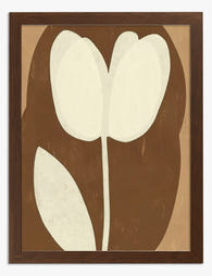
Affiche tulipe élégante aux tons neutres
Prix promotionnel À partir de £11.95£19.95 -

Affiche bouquet joyeux de tulipes
Prix promotionnel À partir de £11.95£19.95 -

Affiche tulipes blanches, souffle de printemps
Prix promotionnel À partir de £11.95£19.95 -

Affiche duo de tulipes roses
Prix promotionnel À partir de £11.95£19.95 -

Affiche tulipe solitaire abstraite
Prix promotionnel À partir de £11.95£19.95 -

Toile tulipes roses et vase à rayures
Prix promotionnel À partir de £49.95£74.95 -

Affiche bouquet de tulipes roses
Prix promotionnel À partir de £11.95£19.95 -

Toile bouquet de tulipes ensoleillé
Prix promotionnel À partir de £49.95£74.95 -

Toile rêverie de tulipes roses
Prix promotionnel À partir de £49.95£74.95 -

Affiche botanique abstraite bleue
Prix promotionnel À partir de £11.95£19.95 -

Toile fleur sur damier noir et blanc
Prix promotionnel À partir de £49.95£74.95 -

Affiche tulipes blanches sur une table à carreaux
Prix promotionnel À partir de £11.95£19.95 -

Affiche tulipes blanches
Prix promotionnel À partir de £11.95£19.95 -

Affiche tulipes corail et maisons des canaux d'Amsterdam
Prix promotionnel À partir de £11.95£19.95 -

Affiche bouquet de tulipes roses, jaunes et corail
Prix promotionnel À partir de £11.95£19.95 -

Affiche tulipe minimaliste
Prix promotionnel À partir de £11.95£19.95 -

Affiche duo de tulipes roses poudrées, bordure florale bleue
Prix promotionnel À partir de £11.95£19.95


Plus de The Frame

William Morris Animal Designs: The Complete Sto...
Animals in William Morris's original work: what he actually designed William Morris designed a surprising number of animals, but not the ones most people assume. His original wallpapers, textiles and...

Why Vintage Fish Prints Work in Modern Homes Wh...
Vintage fish prints have quietly become one of the most useful things you can put on a wall. Not because they're trendy, but because their scientific origins make them work...

Every Bird in William Morris's Designs: The Sto...
Why birds obsessed William Morris more than any other motif Morris designed acanthus leaves, willow boughs, strawberries, tulips and pomegranates, but he kept coming back to birds. Between the 1870s...