Why Floral Prints Work Better in Bedrooms Than You Think
A clear-eyed guide to choosing florals that feel modern, not like the guest room at a country B&B.

Floral prints carry baggage. Mention them in the context of a bedroom and most people picture chintz curtains, brass headboards, and a potpourri bowl on the dresser. That reputation is unfair, and this guide is about why.
The fear is specific: you want soft, organic imagery above your bed but you don't want to wake up in a holiday cottage. The good news is the difference between dated and contemporary florals comes down to a handful of decisions you can make in five minutes.
Why bedrooms and floral prints are a natural pairing
Bedrooms are the one room in your home designed for stillness. You're horizontal for a third of your time in there, and the visual cues you absorb (last thing at night, first thing in the morning) shape your mood more than the art in any other room.
Florals do something abstract prints and geometric work can't. They reference the natural world without being literal landscapes, which means they soften a space without demanding attention. A good botanical print sits in your peripheral vision and slows your nervous system down. That's exactly what you want above a headboard.
The trick is choosing florals that read as art first and flowers second. When the composition, palette, and framing feel considered, the subject matter stops being the headline.

Choosing the right colour palette for your bedroom's mood
This is where most people go wrong. They pick florals based on the flowers (peonies, roses, wildflowers) instead of the palette, and end up with a print that fights the room.
Start with the undertones already in your bedroom. If your walls are warm white, your bedding cream, and your floors oak, you're in warm-undertone territory. Florals in terracotta, ochre, dusty pink, and burnt sienna will sit naturally. Cool spaces (grey walls, white bedding, ash floors) want florals in sage, slate blue, lavender, and ink black.
Mixing temperatures is what makes a room feel like a furniture showroom. Get this one decision right and almost any floral print will work.
Saturation matters more than colour
A muted dusty pink and a bright fuchsia are technically the same colour. They will not have the same effect on your sleep. For bedrooms, drop the saturation. Anything you'd describe as "vivid" or "punchy" belongs in a hallway or a kitchen.
This isn't about being safe. A dark, moody floral with deep oxblood and near-black foliage on a charcoal background is dramatic, but it's also low saturation. That's what makes it restful instead of stimulating.
How bedroom light changes everything
Bedrooms get used at the two extremes of the day: bright morning light and warm lamp light. Florals are more sensitive to this than abstract or geometric prints because flowers have such strong cultural colour associations.
A pink peony print that looks fresh in morning daylight can look saccharine under a 2700K bedside bulb. Test by holding sample swatches up in both conditions before you commit. If you only have lamps in the room (north-facing bedroom, blackout blinds), lean cooler and slightly more saturated. Warm artificial light will pull everything pink anyway.
Size and placement: above the bed, beside the window, or opposite the door
Bedroom art has three viable positions, and the rules for each are different.
Above the bed
This is the most common placement and the one people botch most often. The width of your art should be roughly two-thirds the width of your headboard or bed. A 150cm wide bed wants a single piece around 100cm wide, or a pair that together span the same.
Hang the bottom of the frame 10 to 15cm above the headboard. Any higher and the art floats untethered, any lower and it looks like it's been shoved into a gap. If you don't have a headboard, treat the pillows as your reference line instead.
For a king-size bed, a single 70x100cm framed print or a 100x150cm canvas works beautifully. Browse floral designs at those scales rather than trying to make a small A3 print do the work of something three times its size.
Beside the window
A tall, portrait-orientation floral hung next to a window plays off the natural light coming in. This is one of the most underused placements in bedrooms. It echoes the outside without competing with the view.
Opposite the door
The wall you see when you walk in is the wall that defines the room. If your bed is positioned so the headboard wall isn't visible from the doorway, hang your statement floral opposite the door instead. This is the strongest visual position in the room.

Modern florals vs vintage botanicals: which suits your bedroom style
The B&B test is simple. Look at a print and ask: does this feel like something a contemporary artist made, or does it feel like something photocopied from a 1990s gardening manual?
The dated look has tells. Realistic, almost photographic flowers on plain cream backgrounds. Tight botanical sketches with handwritten Latin names underneath, presented as a matching set of four. Soft-focus watercolours in nursery pastels. None of these are inherently bad, but they're all working from the same visual vocabulary, and that vocabulary reads as guest-room generic.
Contemporary florals do at least one of these things: they push scale (a single oversized bloom that fills the frame), they abstract the subject (loose brushwork, blocks of colour, near-graphic compositions), they use unexpected palettes (oxblood and rust instead of pink and green), or they treat the background as part of the composition rather than empty space.
When vintage botanicals still work
A genuinely vintage botanical illustration (the kind with detailed linework and aged paper texture) can look brilliant in the right bedroom. The key is committing to it as part of a layered, collected look rather than buying a matching set of four.
A single antique-style botanical above a vintage iron bed, paired with a worn rug and lived-in textiles, reads as personal and considered. The same print in a flat-pack bedroom with new bedding reads as showroom. Have a look through vintage prints if this is the direction you're heading.
Florals in minimalist bedrooms
Yes, florals work in minimalist bedrooms. The rule is simple: choose graphic, almost-abstract florals with a restricted palette (often two or three colours including the background) and frame them cleanly in black or natural oak. One large piece, lots of negative space around it, no other patterns in the room.
Single statement piece vs a pair: when to use each approach
A single statement piece is almost always the more confident choice. One large print above the bed, properly scaled, does more work than two medium prints trying to balance each other.
Go for a pair when you have a wide wall and a low headboard, or when you genuinely want symmetry (which can be calming in a busy room). Two portrait-orientation florals of the same dimensions, hung with 10 to 15cm between them, treated as one composition.
Avoid the gallery wall above the bed. It's visually noisy directly above the place you go to switch off, and the eye keeps trying to organise it instead of resting. Save gallery walls for the wall opposite the bed if you must, or for hallways.
Pairing florals with existing pattern
If your bedding has a pattern (stripes, geometric, embroidery), your floral print needs to be either much more saturated or much more graphic to hold its own. Two equally busy patterns at equal intensity will fight.
Striped bedding plus a loose, painterly floral is one of the easiest combinations to pull off. Geometric bedding wants a more abstract, graphic floral. Plain bedding gives you total freedom.

Frame finishes that work best in bedrooms (and why matte glazing matters here)
Frame choice does more for the dated-versus-modern question than the print itself.
A heavy, ornate gold frame instantly pushes any floral toward traditional. A thin black frame pulls the same print toward contemporary. A natural oak frame sits in the middle and works in most bedrooms, particularly Scandi and Japandi spaces. White frames are quietly powerful in all-white minimal bedrooms and almost nowhere else.
Our frames are solid FSC-certified wood with proper mitred corners. The thinness of the profile matters more than people realise: a 2cm wide frame around a botanical print reads completely differently from a 5cm wide frame around the same image.
Why matte glazing matters specifically in bedrooms
Bedrooms have a viewing condition no other room has: you look at the art while lying down, often with a bedside lamp on. Standard glass framing reflects every light source in the room straight back at you.
Our framed prints use a UV-protective acrylic glaze that's both lighter than glass (safer above a bed) and effectively non-reflective. You can read in bed with a lamp on and the print above your head still reads as a print, not as a mirror showing your ceiling.
The acrylic also blocks UV, so morning sun through the window won't fade the colours over years. Inks last centuries even in direct sunlight, which matters if your bed faces an east or south-facing window.
Five floral bedroom schemes that actually work right now
Pick whichever is closest to your existing room and use it as a template.
1. Scandi minimal
White walls, oak furniture, white or oatmeal linen bedding. One large graphic floral (think single oversized bloom or loose ink-style botanical) in a thin oak or black frame, 70x100cm, above the bed. No other art in the room. One ceramic vase with a single stem on the nightstand.
2. Warm maximalist
Deep painted walls (terracotta, oxblood, forest green), velvet headboard, layered textiles. A dark, moody floral with oxblood and near-black tones in a thin black frame, or a pair of botanical studies framed in oak. The richness of the wall does most of the work.
3. Japandi calm
Beige and cream palette, low platform bed, natural materials. A single ink-style floral (peony, magnolia, plum blossom) on cream or off-white background, framed in light oak. Restrained, asymmetrical placement, often slightly off-centre above the bed.
4. Modern romantic
Soft pink-greige walls, brass accents, cream bedding. A loose, painterly floral in dusty pinks and warm whites, framed in matte black to stop it tipping into twee. One large piece, not a matching set. Browse bedroom art for ideas in this register.
5. Botanical study
Sage or warm white walls, mixed wood tones, linen bedding. A pair of detailed botanical prints framed in natural oak, hung above the bed or flanking a window. This is the closest to traditional but stays modern through restraint: two prints, not four, and clean frames.

A few things to do before you buy
Take a photo of your bedroom from the doorway, then another lying on your bed looking up at the headboard wall. Both angles matter, and the print that looks best from one position isn't always the best from the other.
Measure your headboard width and multiply by 0.66. That's your target print width.
Hold up a piece of paper or cardboard cut to size on the wall, both in morning light and with your bedside lamp on. If it feels right at both ends of the day, you've got the right scale and probably the right palette too.
Then trust the choice. The reason most bedroom florals look dated isn't the flowers, it's the hesitation. A confidently chosen, well-framed floral print is one of the most quietly transformative things you can hang above a bed.

Produits Fab présentés dans cet article
-

Affiche damier noir et blanc avec fleur graphique surréaliste
Translation missing: fr.products.product.sale_price À partir de £13.99£19.99 -

Toile florale violette style héritage
Translation missing: fr.products.product.sale_price À partir de £44.95£74.95 -
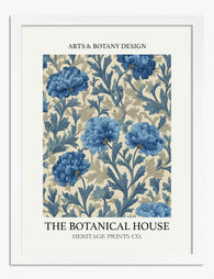
Affiche florale bleue esprit héritage
Translation missing: fr.products.product.sale_price À partir de £11.95£19.95 -

Affiche fleurs de jardin vintage
Translation missing: fr.products.product.sale_price À partir de £11.95£19.95 -

Affiche fleurs scandinaves audacieuses
Translation missing: fr.products.product.sale_price À partir de £13.99£19.99 -

Affiche fleurs scandinaves modernes
Translation missing: fr.products.product.sale_price À partir de £13.99£19.99 -

Affiche chambre inspirée de Matisse, vue sur les montagnes
Translation missing: fr.products.product.sale_price À partir de £11.95£19.95 -

Affiche fleurs bleues esprit héritage
Translation missing: fr.products.product.sale_price À partir de £11.95£19.95 -

Affiche papillons envoûtants de Klimt
Translation missing: fr.products.product.sale_price À partir de £11.95£19.95 -

Affiche harmonie florale en bleu
Translation missing: fr.products.product.sale_price À partir de £11.95£19.95 -

Affiche bouquet abstrait sur fond rose poudré
Translation missing: fr.products.product.sale_price À partir de £13.99£19.99 -

Toile florale vibrante orange et violet
Translation missing: fr.products.product.sale_price À partir de £44.95£74.95 -

Affiche botanique violette vintage
Translation missing: fr.products.product.sale_price À partir de £11.95£19.95 -

Toile femme au manteau fleuri et sac rouge
Translation missing: fr.products.product.sale_price À partir de £44.95£74.95 -

Affiche chat chic au manteau fleuri
Translation missing: fr.products.product.sale_price À partir de £11.95£19.95 -

Affiche femme au manteau fleuri
Translation missing: fr.products.product.sale_price À partir de £11.95£19.95 -

Affiche florale de Klimt
Translation missing: fr.products.product.sale_price À partir de £11.95£19.95 -

Affiche fleurs scandinaves audacieuses
Translation missing: fr.products.product.sale_price À partir de £13.99£19.99 -

Affiche florale vibrante
Translation missing: fr.products.product.sale_price À partir de £11.95£19.95 -

Affiche rêve floral de Klimt
Translation missing: fr.products.product.sale_price À partir de £11.95£19.95


Plus de The Frame

Stop Hanging Flower Art in the Lounge: A Room-b...
Flower art has a reputation problem, and it's almost entirely about scale. A tiny rose print in a fussy frame above the sofa will always read as dated, no matter...

Flower Print Ideas for Your Living Room: Sizes,...
You have an eight-foot sofa, a ten-foot wall above it, and absolutely no idea what to put there. This guide is a decision tree, not a mood board. By the...

The Best Flower Prints for Bedrooms (And Exactl...
Bedrooms are the hardest room to get art right. The wall above the bed is huge, the lighting is low, and the space needs to feel restful rather than busy....