
 Commandez aujourd'hui, livré le
 Why Kitchen Wall Art Fails (And How to Get It Right)
A proper guide to kitchen wall art, from steam-safe placement to sizing for narrow walls and cabinet-dense spaces.


Most kitchen art fails for one of three reasons: it's hung in the wrong place, it's the wrong size, or nobody thought about what the steam would do to it. This guide fixes all three. By the end you'll know exactly where art can go in your kitchen, what to hang there, and how to make it last.
Why kitchens are the most underrated room for art
You spend more waking hours in the kitchen than almost any other room, yet most people decorate it last and worst. The default is a clock, a chalkboard, and maybe a sign that says "But first, coffee." That's not decoration. That's resignation.
Kitchens are actually brilliant rooms for art. They have hard surfaces, repetitive geometry (cabinet doors, tiles, appliances), and a lot of utilitarian objects competing for attention. A well-chosen print cuts through all of that and gives the eye somewhere to land. It's the difference between a kitchen that functions and a kitchen you actually want to be in.
The reason it goes wrong is that kitchen walls are weird. They're broken up by cabinets, windows, extractors, and splashbacks. You rarely get the big uninterrupted wall you'd find in a lounge. So the rules are different, and most generic art advice doesn't apply.

The four wall zones in a kitchen (and what to hang in each)
Think of your kitchen as four distinct zones. Each one has different lighting, different proximity to heat and steam, and different sightlines. Treat them separately.
Zone 1: The dining or breakfast wall
This is the easiest zone and where most of your investment should go. It's away from the hob, usually well-lit, and people sit looking at it. Treat it like a small lounge wall. A single statement piece at 60x80cm or 70x100cm works beautifully here, or a pair hung side by side above a banquette.
This is the zone where you can hang anything you'd hang anywhere else in the house. Botanical prints, abstract work, landscapes, portraits. Don't feel obligated to choose something "kitcheny."
Zone 2: The gap between worktop and upper cabinets
If you have a section of wall where the upper cabinets stop (next to a fridge, above an open shelf, beside a window), this is prime real estate. The proportions are usually narrow and tall, around 40 to 50cm wide and 60 to 80cm tall. Vertical prints in portrait orientation are made for this space.
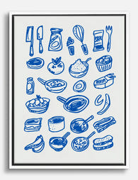
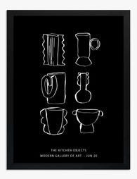
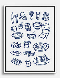
Smaller kitchenware art prints work especially well here because the subject matter echoes the function of the room without shouting about it.
Zone 3: Above the range or beside the extractor
The tricky one. Directly above the hob is a no-go for anything paper-based, full stop. But the wall beside an extractor hood, or the section above a range cooker that sits under a chimney breast, is fair game if you're sensible about height.
Aim for at least 70cm of clearance above the hob surface. Choose something with a wipeable frame and a sealed face. We'll come back to materials in a moment.
Zone 4: The awkward bits
Behind a door, above a doorway, in the run between two windows, on the side of a tall cabinet. These are the spaces most people ignore. A single small print (30x40cm or 40x50cm) in one of these spots adds personality without needing to commit to a full wall.
Matching art style to your kitchen aesthetic
The biggest mistake in kitchen art is choosing something that looks good in isolation but fights with the room. Here's how to match style to what you've actually got.
Modern and minimal kitchens
Handleless cabinets, integrated appliances, a lot of white or stone grey. The kitchen is already doing the work visually, so the art needs to be calm. Abstract line work, monochrome photography, single-subject still lifes on neutral backgrounds. Avoid anything fussy or overly literal.
A large piece (70x100cm or bigger) on the dining wall in a slim black or natural oak frame anchors the whole room. Don't be tempted to fill every wall. One strong piece is more modern than five medium ones.
Traditional and Shaker kitchens
In-frame cabinets, brass or aged-bronze handles, painted woodwork in deep colours like dark green or navy. This kitchen wants warmth and history. Vintage art prints, botanical illustrations, antique-style food plates, and classical still lifes all earn their place here.
Framed prints with a proper mount and a wooden frame look right. Canvas can feel too casual against the formality of a Shaker kitchen.
Farmhouse and country kitchens
Open shelving, butcher block, painted timber, maybe a Belfast sink. This is the natural home for food and drink art prints, produce illustrations, and rustic landscapes. Warm tones beat cool tones every time.
This is also the only kitchen style where multiple smaller pieces can outperform a single large one. A cluster of four 30x40cm framed prints above a dresser feels collected rather than coordinated.
Eclectic and colourful kitchens
You've got a pink island, a peacock-blue larder, terracotta floors. The art needs to either match the energy or provide a deliberate pause. Bold graphic prints, vintage travel posters, food market scenes, anything with confidence.
The risk here is visual chaos. Pick one wall to be the art wall and leave the others alone.

Dealing with steam, grease, and sunlight
Kitchens are harder on art than any other room. Steam rises, grease drifts further than you'd think, and south-facing kitchen windows pump out UV all day. Here's what actually matters.
Steam and humidity
Cheap framed prints fail in kitchens because the paper warps and the frame swells. The fix is solid wood frames (not MDF or veneer, which absorb moisture and delaminate), proper mounting that allows the paper to breathe, and a glaze that seals the front. Our framed prints use solid FSC-certified wood and a UV-protective acrylic glaze rather than glass, which means no condensation issues and no risk of shattering if a frame ever takes a knock.
Hang art at least a metre away from a kettle or steamer if you can. If you can't, framed is non-negotiable.
Grease and airborne oils
This one surprises people. Cooking releases a fine film of oil that travels much further than steam does. Unprotected paper prints, including anything just stuck up with tape, will eventually yellow and attract dust that sticks.
A sealed frame solves this. The acrylic glaze can be wiped down with a soft damp cloth, which you can't do safely with an unframed print. If you love the unframed look, keep it out of the cooking zone entirely and reserve it for the dining wall.
Sunlight
Direct sun fades cheap inks within a year. Museum-grade giclée printing with proper pigment inks lasts for hundreds of years even in direct sunlight, and a UV-protective glaze adds another layer of defence. If your kitchen gets strong afternoon sun, this matters more than anything else on this list.
Canvas in the kitchen
Canvas prints are lighter than framed prints and don't have a glazed surface, which makes them a sensible choice for slightly more humid spots. The poly-cotton canvas is more forgiving than paper. The trade-off is that you can't wipe a canvas the way you can wipe a glazed frame, so keep canvas away from the active cooking zone. Dining walls, breakfast nooks, and the wall opposite the hob are all good homes for canvas.
Size guide: the right print dimensions for common kitchen wall spaces
Generic sizing advice (medium, large, statement) is useless. Here are real numbers for real walls.
Above a two-seater breakfast nook or small dining table: 60x80cm portrait, or 80x60cm landscape. Centre it so the bottom edge sits 20 to 25cm above the table.
Above a four-to-six seater dining table: 70x100cm landscape as a single piece, or two 50x70cm prints hung 10cm apart. The combined width should be roughly two-thirds the width of the table.
Narrow wall between cabinets and worktop (the awkward vertical strip): 30x40cm or 40x50cm portrait. Anything bigger looks crammed.
Above a fridge or tall larder: 50x70cm landscape. Leave at least 15cm of breathing room above the appliance.
The blank wall opposite the hob: This is usually the largest uninterrupted wall in the kitchen. Go big. 100x70cm framed, or 100x150cm on canvas if you want presence.
A run of three prints above a sideboard or dresser: Three 40x50cm prints spaced 8 to 10cm apart. Total width should sit comfortably within the width of the furniture below.

Three kitchen art arrangements that actually work
Arrangement 1: The single anchor
```
┌─────────────┐
│ │
│ 70x100cm │
│ FRAMED │
│ │
└─────────────┘
─────────────────────────
░░░░ sideboard / table ░░░░
```
One large framed print, centred on the wall above a piece of furniture. Bottom edge 20cm above the surface. This is the most underused arrangement in kitchens because people default to multiples. A single confident piece almost always looks more considered.
Arrangement 2: The vertical pair
```
┌─────┐ ┌─────┐
│ │ │ │
│40x50│ │40x50│
│ │ │ │
└─────┘ └─────┘
┌─────┐ ┌─────┐
│ │ │ │
│40x50│ │40x50│
│ │ │ │
└─────┘ └─────┘
```
Two stacks of two prints, hung either side of a window or doorway. Each column is treated as a single unit. Keep 5 to 8cm between the prints within a column and match the overall column height to whatever feature sits between them.
Arrangement 3: The narrow gallery
```
┌────┐ ┌──────┐ ┌────┐
│30x40│ │50x40 │ │30x40│
└────┘ └──────┘ └────┘
┌──────┐ ┌────┐
│50x40 │ │30x40│
└──────┘ └────┘
```
Five prints arranged in a loose cluster, anchored along a central horizontal line. Mix portrait and landscape. Mix sizes within a small range (don't combine a 30x40 with a 70x100). This works above a long sideboard or along a corridor-style kitchen.
The rule that makes gallery walls work: lay everything out on the floor first, photograph it from above, and only start hammering when you're happy with the photo. Don't trust your eye on a vertical wall until you've trusted it on a horizontal floor.
Quick wins: how one well-chosen print transforms a kitchen
If you've read this far and want to do the smallest possible thing that has the biggest possible effect, here it is.
Pick the wall in your kitchen that you look at most often. Not the most photographed wall, the most looked at. Usually that's the wall opposite where you stand to make coffee or the wall behind the dining table.
Hang one framed print on it. 60x80cm or 70x100cm. Something you'd be happy to look at every morning for the next five years. Botanical art prints are the safest bet because they bring life into a room full of hard surfaces without committing to a specific style, but trust your own taste over any rule of thumb.
Get the height right. Centre of the image at 145 to 150cm from the floor for a standing sightline, or 10 to 15cm above the back of a chair if it's above a dining table. Too high is the most common mistake. When in doubt, drop it 5cm.

That one print will do more for your kitchen than a month of Pinterest scrolling. Once it's up, you'll start noticing the other walls and the other zones, and you can build from there. Slowly. Kitchens reward patience and punish the urge to fill every gap at once.
Hang one thing. Live with it for a fortnight. Then decide what's next.

Produits Fab présentés dans cet article
-

Affiche ustensiles et ingrédients de cuisine ludiques
Translation missing: fr.products.product.sale_price À partir de £11.95£19.95 -
Toile ustensiles et ingrédients de cuisine bleus
Translation missing: fr.products.product.sale_price À partir de £44.95£74.95 -

Affiche règles de cuisine noir et blanc
Translation missing: fr.products.product.sale_price À partir de £11.95£19.95 -

Toile indispensables de cuisine bleus
Translation missing: fr.products.product.sale_price À partir de £44.95£74.95 -

Toile indispensables de cuisine dessinés à la main
Translation missing: fr.products.product.sale_price À partir de £44.95£74.95 -

Affiche ustensiles du quotidien, cuisine moderne lavande et prune
Translation missing: fr.products.product.sale_price À partir de £11.95£19.95 -
Affiche ustensiles de cuisine au trait noir et blanc
Translation missing: fr.products.product.sale_price À partir de £11.95£19.95 -

Affiche croquis d’ustensiles de cuisine en bleu vif
Translation missing: fr.products.product.sale_price À partir de £11.95£19.95 -
Toile ustensiles et ingrédients de cuisine bleus
Translation missing: fr.products.product.sale_price À partir de £44.95£74.95 -

Toile oasis moderne pour la cuisine
Translation missing: fr.products.product.sale_price À partir de £44.95£74.95 -

Toile cuisine au trait ludique
Translation missing: fr.products.product.sale_price À partir de £44.95£74.95 -

Toile cuisine moderne aux lignes graphiques
Translation missing: fr.products.product.sale_price À partir de £44.95£74.95 -

Affiche ustensiles de cuisine modernes
Translation missing: fr.products.product.sale_price À partir de £11.95£19.95 -

Affiche cuisine dessin au trait bleu profond
Translation missing: fr.products.product.sale_price À partir de £11.95£19.95 -
Affiche fenêtre sur Paris pour la cuisine
Translation missing: fr.products.product.sale_price À partir de £11.95£19.95 -

Toile ingrédients de cuisine illustrés
Translation missing: fr.products.product.sale_price À partir de £44.95£74.95 -

Toile cuisine colorée avec vue sur la ville
Translation missing: fr.products.product.sale_price À partir de £44.95£74.95 -

Toile ustensiles de cuisine modernes
Translation missing: fr.products.product.sale_price À partir de £44.95£74.95 -
Toile citation cœur de la maison
Translation missing: fr.products.product.sale_price À partir de £44.95£74.95


Plus de The Frame

William Morris Bird Prints: Which Ones to Choos...
If you've started searching for Morris birds, you've probably already hit the wall: there are at least five distinct designs, they look nothing like each other, and most shops sell...

The Best William Morris Prints for Your Bedroom...
Morris designs have a reputation for being busy, which makes a lot of people nervous about putting them in a bedroom. That nervousness is fair, because some of his patterns...

Strawberry Thief, Acanthus, and Beyond: The Wil...
If you've ever searched for William Morris prints, you've met Strawberry Thief within about ten seconds. It's the pattern everyone knows, the one museums put on tote bags, the one...