William Morris's Most Famous Designs, Ranked: From Strawberry Thief to Willow Bough
A guide to Morris's most iconic patterns and how to choose the one that actually suits your walls.

Morris created over 50 patterns across his career, but most people can name four or five. This guide goes deeper, explaining what makes each design distinctive, how his printing techniques shaped their look, and crucially, which one belongs in your home. Think of it as a design personality test for your walls.
Strawberry Thief: why it became the definitive Morris design
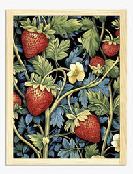
Designed in 1883, Strawberry Thief was inspired by the song thrushes Morris caught raiding the strawberry beds at Kelmscott Manor, his country house in Oxfordshire. Rather than chase them off, he immortalised them. That gentle irreverence is part of why the design endures. It is a pattern about quiet pleasure, about giving in to nature rather than fighting it.
Technically, it was Morris's most ambitious indigo-discharge print to date. The process involved dyeing the cloth deep indigo, then bleaching out the pattern in stages and overprinting other colours by hand. Each length took around three days to produce and required a separate woodblock for every shade. The result is the layered, almost three-dimensional richness you see in the finished design. Cheaper printing methods cannot replicate that depth, which is why the original prints still feel alive.
Visually, Strawberry Thief works because it balances density with movement. The thrushes give your eye somewhere to land. The strawberries and foliage do the heavy lifting in the background without ever feeling chaotic. It suits almost any room, which is rare for a pattern this busy. Pair it with painted panelling, a sage or clay wall, or let it sing against plain white. A william morris strawberry thief print at 50x70cm above a sideboard is the safe and excellent choice. Go bigger if you have the wall.

Pimpernel: the sophisticated choice for darker, moodier rooms
If Strawberry Thief is the crowd-pleaser, Pimpernel (1876) is the design Morris kept for himself. He hung it in his own dining room at Kelmscott House in Hammersmith, where he ate most evenings of his adult life. That biographical detail matters because Pimpernel is a darker, more architectural pattern, and it is meant to be lived with at close range.
The design uses heavier blooms, deeper foliage and a more pronounced vertical rhythm than his earlier florals. Morris printed it in olive, plum, soft gold and inky blue, colours pulled from his vegetable dye palette of madder, weld and indigo. The constraint of natural dyes is part of what gives Morris's work its signature warmth. Modern synthetic colours can technically reproduce any shade, but the slightly muted, slightly uneven quality of plant-based pigments is what reads as "Morris" to the eye.
A william morris pimpernel print earns its keep in a room with character: dark walls, low light, panelled walls, a fireplace. It struggles in bright minimalist spaces because it needs shadow to feel right. If your dining room or study leans moody (think Farrow & Ball Hague Blue, Studio Green, or Railings), Pimpernel is the pattern to reach for. At 70x100cm framed in dark oak, it becomes the focal point of the room without trying.
The trade-off: Pimpernel is not subtle. If you already have patterned curtains, a busy rug or strong upholstery, it will fight them. Give it space.
Willow Bough: understated elegance for minimalist spaces
Willow Bough (1887) is the Morris design for people who think they do not like Morris. There are no birds, no fruit, no narrative. Just willow leaves on slender branches, repeating in a soft, breathing rhythm. Morris designed it after spending afternoons watching willows along the Thames near Kelmscott Manor.
The design uses far fewer blocks than Strawberry Thief or Pimpernel, typically printed in a single green on a cream ground. That simplicity is the point. Willow Bough is about pattern as texture rather than pattern as event. Hang it in a pale room and it behaves almost like a wallpaper, softening the wall without competing with anything else on it.
This is the design that suits modern interiors best. Scandi-leaning lounges, plaster-pink bedrooms, white-walled hallways with pale oak floors. It also works beautifully in small spaces where a busier pattern would overwhelm. A 30x40cm framed Willow Bough above a bedside table, or a pair flanking a doorway, gives you the Morris signature without the maximalist commitment.
If you love botanical art but want restraint, this is your pattern. Browse more options in our nature art prints collection if you want to see how it sits alongside other quiet botanicals.

Bird & Pomegranate: the overlooked favourite
Bird & Pomegranate (sometimes called Bird and Pomegranate, designed in 1926 from earlier Morris motifs and produced by Morris & Co. after his death) deserves more attention than it gets. It pulls together two of Morris's lifelong obsessions: songbirds and the pomegranate as a symbol of abundance. The result is a pattern with a slightly Gothic, slightly tapestry-like quality that feels both ancient and current.
What sets it apart from Strawberry Thief is the formality. Where Strawberry Thief feels observed, Bird & Pomegranate feels composed. The birds are mirrored in pairs. The fruit is stylised rather than naturalistic. It belongs to the older tradition of medieval embroidery that Morris loved, particularly the Cluny tapestries he studied obsessively.
Use it where you want a sense of occasion. A dining room, a hallway, a generous bedroom wall. It pairs especially well with deep terracotta, burnt umber, or a soft ochre, and looks remarkable framed in walnut. If you find Strawberry Thief slightly overexposed (it is on every tea towel in the country), Bird & Pomegranate gives you the same emotional register with more visual rarity. Our bird art prints collection has more in this vein if mirrored, symbolic compositions appeal.
Lesser-known Morris designs that deserve wall space
Beyond the famous five, Morris produced dozens of designs that almost never make the listicles. A few are genuinely brilliant.
Snakeshead (1876)
Named for the fritillary flower with its drooping, chequered bell, Snakeshead is one of Morris's strangest and most beautiful patterns. The repeat is small and tight, and the colour palette leans dusty pink and old gold. It works astonishingly well in a small bedroom or a powder room where you want intimacy and detail at close range. Most people walk past it for the bigger names. Their loss.
Compton (1896)
One of Morris's last designs, Compton is a sprawling, large-repeat pattern of tulips, sunflowers and acanthus leaves. It was designed for wallpaper rather than fabric, which is why it has such generous breathing room. As a print, blown up to 70x100cm, Compton has serious presence. It suits tall walls and rooms with high ceilings where smaller-scale patterns get lost.
Cray (1884)
Named after the river Cray in Kent, this is Morris's most technically demanding printed textile, requiring 34 separate woodblocks. The repeat is enormous, nearly a metre tall, with bold sweeping curves of foliage. As a single framed print it has a dramatic, almost wallpaper-like quality. Choose Cray if you want one statement piece that does the work of three.
Lodden (1884)
A pattern of meandering tulips and pinks that feels lighter and more rhythmic than Pimpernel. It is the underrated middle ground between Willow Bough's restraint and Strawberry Thief's density. Excellent in a sitting room with mid-tone walls.

How Morris's printing techniques shaped the look of each design
Understanding Morris's printing methods explains why his designs feel the way they do, and why some patterns suit certain rooms better than others.
Morris was an obsessive. He rejected the synthetic aniline dyes that were becoming standard in late Victorian textiles and revived medieval vegetable dye recipes instead. Indigo for blue, madder root for red, weld for yellow. These dyes have a depth and slight variation that synthetic colours simply do not have. They also age beautifully, fading in soft, painterly ways rather than going flat.
Each design was hand-printed using carved pearwood blocks, one per colour. A simple pattern like Willow Bough might use four or five blocks. Strawberry Thief used many more, layered with the indigo-discharge technique that allowed Morris to introduce red and yellow into a blue-grounded design (a chemical impossibility with conventional dyeing). Cray, as mentioned, used 34. The number of blocks directly correlates with the visual depth of the pattern. More blocks means more layers, more shadow, more sense of a real plant rather than a flat motif.
This matters when choosing a print because giclée reproductions on thick matte paper preserve those layers. Cheap poster prints flatten Morris's work into something that looks like a graphic. The original depth, the slight unevenness of the hand-blocked colour, the way one pigment sits on top of another, that is the thing you are paying for and the thing your eye registers across the room. UV-protective acrylic glaze on a framed print also keeps those colours true for decades, which matters with a designer whose entire palette was built on the slow integrity of natural dyes.
It also explains the room-matching logic. Pimpernel feels heavier than Willow Bough because it literally has more layers of pigment. Strawberry Thief feels alive because the indigo-discharge process leaves micro-variations that machine printing cannot replicate. When Fab prints these designs, the high-resolution reproduction captures that texture. The print arrives properly fitted in the frame, fixtures attached, ready to hang, which sounds basic but is exactly where most framed art goes wrong.
Which design suits your room: a quick decision guide
Here is the framework. Work down the list.
Start with your walls. Dark walls (Hague Blue, Studio Green, deep plum, terracotta) want Pimpernel, Bird & Pomegranate, Cray or Compton. The pattern needs to assert itself against the depth of the wall colour. Pale walls (off-white, plaster pink, pale sage, soft grey) want Willow Bough, Snakeshead, Lodden or Strawberry Thief. These designs read clearly without needing shadow to give them weight.
Then your room's mood. Formal rooms (dining room, study, entrance hall) suit symmetrical, composed designs: Bird & Pomegranate, Pimpernel, Compton. Relaxed rooms (bedrooms, sitting rooms, kitchens) suit observed, naturalistic designs: Strawberry Thief, Willow Bough, Lodden.
Then the scale of your wall. Large walls above a sofa or fireplace can take a 70x100cm print of a large-repeat design like Cray or Compton. Smaller walls, alcoves and bedside positions want small-repeat designs like Snakeshead or Willow Bough at 30x40cm or 50x70cm. Putting a small-repeat design at huge scale tends to look strange. Putting a large-repeat design too small loses the rhythm of the pattern entirely.
Then your existing pattern load. If you already have a patterned rug, patterned curtains and patterned upholstery, choose Willow Bough. If your room is mostly plain (solid sofa, plain rug, painted walls), Strawberry Thief or Pimpernel will give you the layer of pattern the room is missing.
Framed or unframed? Framed prints behind UV-protective acrylic give Morris's work the formal context it was historically displayed in (the V&A frames everything for a reason). Unframed canvas suits looser, more relaxed rooms, particularly with the smoother large-scale designs. Solid wood frames in oak or walnut feel right for almost every Morris design. Black frames work for Pimpernel and Cray. Avoid thin metal frames, which fight the warmth of his palette.

If you are still torn, default to Strawberry Thief at 50x70cm framed in oak. It is the one Morris design that has never looked wrong in any room we have tested it in, and it is famous for a reason. Once it is on your wall, the rest of your Morris journey gets much easier.

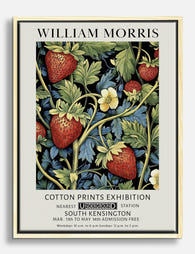
Produits Fab présentés dans cet article
-

Affiche William Morris Strawberry Thief
Translation missing: fr.products.product.sale_price À partir de £11.95£19.95 -

Affiche Strawberry Thief de William Morris
Translation missing: fr.products.product.sale_price À partir de £11.95£19.95 -

Affiche le voleur de fraises de William Morris
Translation missing: fr.products.product.sale_price À partir de £11.95£19.95 -

Toile le voleur de fraises de William Morris
Translation missing: fr.products.product.sale_price À partir de £49.95£74.95 -

Toile William Morris le voleur de fraises
Translation missing: fr.products.product.sale_price À partir de £49.95£74.95 -

Toile William Morris voleur de fraises
Translation missing: fr.products.product.sale_price À partir de £49.95£74.95 -

Affiche botanique vintage aux fraises, inspiration William Morris
Translation missing: fr.products.product.sale_price À partir de £11.95£19.95 -

Affiche Strawberry Fields de William Morris
Translation missing: fr.products.product.sale_price À partir de £11.95£19.95 -

Affiche motif Fruit de William Morris
Translation missing: fr.products.product.sale_price À partir de £11.95£19.95 -
Affiche fraises vintage inspirée de William Morris
Translation missing: fr.products.product.sale_price À partir de £11.95£19.95 -

Toile oiseau et fraises style William Morris
Translation missing: fr.products.product.sale_price À partir de £49.95£74.95 -
Toile William Morris fraises et feuillage
Translation missing: fr.products.product.sale_price À partir de £49.95£74.95 -

Toile botanique fraises et feuillage de William Morris
Translation missing: fr.products.product.sale_price À partir de £49.95£74.95 -

Hoji Garden Willow — Morris Art Print
Translation missing: fr.products.product.sale_price À partir de £11.95£19.95 -

Affiche oiseaux de William Morris
Translation missing: fr.products.product.sale_price À partir de £11.95£19.95 -

Affiche William Morris jardin fruitier
Translation missing: fr.products.product.sale_price À partir de £11.95£19.95 -

Affiche motif botanique style William Morris
Translation missing: fr.products.product.sale_price À partir de £11.95£19.95 -

Affiche Willow de William Morris
Translation missing: fr.products.product.sale_price À partir de £11.95£19.95 -

Affiche oiseau et baies, style William Morris
Translation missing: fr.products.product.sale_price À partir de £11.95£19.95 -

Affiche oiseau et fraises de William Morris
Translation missing: fr.products.product.sale_price À partir de £11.95£19.95


Plus de The Frame

Every Flower in William Morris's World: A Guide...
William Morris designed roughly 50 wallpapers and around 30 chintzes across his career, and almost every single one features a plant. If you've ever stood in front of a Morris...

What Colours Go With Bouquet Prints? Pairings I...
You've found a bouquet print you love. Now you need to know if it will actually work above your sofa, opposite that mustard armchair, next to the curtains you spent...

Boho Sun Wall Art: How to Nail the Look Without...
Boho sun art has a reputation problem. Done badly, it screams student halls and macramé overload. Done well, it's one of the warmest, most grounding aesthetics you can put on...