The Arts and Crafts Movement's Love Affair With Plants: A Visual Guide
How a group of Victorian rebels turned weeds, willows and wild roses into the original case for nature indoors.

Nature as rebellion: why Arts and Crafts designers rejected industrial imagery
By the 1860s, British design was drowning in factory output. Mass-produced wallpapers featured stiff geometric repeats, garish chemical dyes and decorative motifs lifted from machinery catalogues. The Arts and Crafts movement looked at all of this and decided to grow something else.
William Morris and his circle treated plants as a moral position, not just a pretty one. Choosing a willow bough over a Greek key, or a thistle over a fleur-de-lys, was a deliberate rejection of what industry had done to craft, to workers, and to the English landscape. The garden became the antidote to the factory.
What's striking is how unsentimental their nature was. Morris loved scrubby hedgerows, common weeds, brambles and rough native species. He wasn't interested in hothouse exotics or the manicured Victorian bedding schemes that dominated formal gardens. The phrase often used about his approach is "weeds over prettiness," and it's accurate. A bindweed had as much dignity as a rose.
This is why arts and crafts movement plants still feel modern. The designers were drawing what grew naturally, often ignored, on the edges of paths and ponds. They were arguing that ordinary nature was already enough, that you didn't need to improve it, only to look properly.

Morris, May Morris, and the Kelmscott garden as a design studio
In 1871 Morris took on the lease of Kelmscott Manor, a grey limestone house in Oxfordshire surrounded by water meadows. The garden there did most of the design work for him. He sketched the willows along the Thames, the strawberries his daughters picked, the roses climbing the porch, and turned them directly into pattern.
The famous origin story belongs to "Strawberry Thief." Morris watched thrushes raiding the strawberry beds at Kelmscott, ostensibly a gardener's nightmare, and instead of shooing them off he turned the scene into one of the most reproduced textiles of the nineteenth century. The pattern is, essentially, a record of birds eating his lunch.
His daughter May Morris is often left out of this story, which is unfair. She trained at the Royal College of Art, took over Morris & Co's embroidery department at twenty three, and designed wallpapers including "Honeysuckle" that are routinely attributed to her father. Her botanical eye was arguably sharper than his, more interested in the structure of leaves and the geometry of stems.
Beyond the immediate family, the movement's plant obsession spread through Charles Voysey's bird-and-tulip wallpapers, Walter Crane's almost storybook gardens, and Lindsay Butterfield's pattern designs for Liberty. They didn't all draw the same way, but they shared the same sources: real gardens, walked through repeatedly, in all weathers.
Morris also collected sixteenth century herbals, the illustrated plant manuals that combined botany, medicine and folklore. Those medieval and Renaissance pages, with their flat backgrounds and stylised but accurate plants, taught him how to balance imagination, order and beauty. His patterns are essentially herbals turned into wallpaper.
Key plants of the Arts and Crafts movement and where you'll recognise them
Once you know the cast of characters, you start spotting them everywhere. Here are the plants that show up again and again across William Morris nature prints and the wider movement.
Acanthus
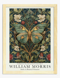
Big, sculptural, deeply lobed leaves, usually rendered in twisting, overlapping curves. Morris's "Acanthus" wallpaper from 1875 is the maximum statement, all weight and movement. If a pattern looks like Mediterranean foliage drawn by someone who'd never been to the Mediterranean, it's probably acanthus.
Willow
Long, narrow leaves on slender stems, usually drawn in soft greens and silvery greys. "Willow Bough" is Morris's most domestic pattern, calmer than acanthus, and probably the safest entry point if you've never lived with a Morris print before.
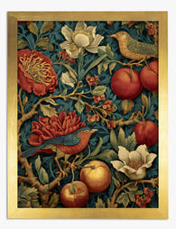
Strawberry
Small white flowers, red fruit, trefoil leaves. Almost always paired with birds in Morris's work, sometimes rabbits. The colour palette tends to be deeper, indigo grounds with madder red fruit and cream highlights.
Honeysuckle
Trumpet-shaped flowers in clusters, paired leaves, rambling stems. Often credited to William, often actually May. The pattern has a looser rhythm than the larger leaf designs and reads as more feminine without being twee.
Pimpernel
Small five-petalled flowers and dense foliage, named after the scarlet pimpernel weed. Morris used it in his own dining room at Kelmscott House. It's one of the rare patterns that actually looks like a tapestry of meadow plants rather than a stylised arrangement.
Jasmine and rose
Climbers, both of them. Roses tend to be the wild dog rose rather than the formal hybrid tea, with five open petals and visible stamens. Jasmine appears in tighter, starrier clusters. Together they signal the cottage garden side of the movement.
Thistle, fritillary, marigold
The supporting cast. Thistles especially fit Morris's "weeds over prettiness" instinct, all spike and texture. Fritillaries with their nodding chequered heads were a Kelmscott meadow speciality. Marigolds bring the warm yellows and oranges that balance the deep greens elsewhere in the palette.

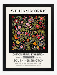
From wallpaper to wall art: how these patterns work as framed prints
Morris designed for repeat. Wallpapers and textiles are meant to tile endlessly, with no obvious start or finish. That sounds like it would translate awkwardly to a single framed picture, but in practice the opposite is true.
A well-cropped section of a Morris pattern works on a wall because the eye reads it as a window into a larger world. You're seeing one square metre of an imagined garden, and your brain happily extends it. This is why arts and crafts botanical prints often feel more immersive than standalone botanical illustrations, which tend to float their subject on white.
Scale matters more than people realise. A 30x40cm print of "Willow Bough" reads as quiet decoration. The same image at 70x100cm becomes architecture, doing the work of a feature wall without committing you to wallpapering anything. We'd push most people up a size when they're choosing a Morris print, especially if it's going above a sofa or bed.
Colour matters too. The original Morris palette was constrained by what natural dyes could do: indigo blues, madder reds, weld yellows, woad greens. These muted, slightly dusty colours are precisely what makes the patterns sit comfortably in a modern room. Bright florals fight with everything. Morris greens and blues calm a space down.
One practical note. Botanical patterns reward close looking, so the surface of the print itself matters. Museum-grade matte paper holds the fine line work and the layered colour without the glare you'd get from a glossy finish. UV-protective glazing also stops the indigos and reds shifting over time, which is the slow killer of any cheap print hung opposite a sunny window.
Biophilic design and the modern echo of Arts and Crafts thinking
Biophilic design is the current term for an idea Morris would have recognised immediately: that humans are healthier, calmer and more creative when surrounded by signs of the natural world. The contemporary version is backed by environmental psychology research, much of it pointing to lower stress and improved focus when interiors include plants, natural materials, and views or representations of nature.
The interesting bit is the overlap. Morris's argument was philosophical and political. He thought industrial capitalism was alienating people from craft, from each other, and from the seasons. Today's biophilic argument is more often framed as wellness, productivity or sustainability. Different language, similar conclusion: we need nature in the rooms where we live and work.
Real plants are wonderful. They're also demanding, seasonal, allergenic for some people, and impossible in low-light bathrooms or rented flats with no windowsills. This is where nature art prints become genuinely useful rather than decorative. A large botanical print delivers the visual cues, the leaf shapes, the green palette, the sense of growth, without the watering can.
There's also the question of what kind of nature you want indoors. Tropical foliage prints, all monstera and palm, give you a holiday mood. Victorian botanical art history, by contrast, gives you something rooted in your own latitude: hedgerow plants, garden flowers, native birds. For most British homes, the second feels less like a postcard and more like belonging.

Choosing Arts and Crafts botanical prints for your home
The prints reward thought, but they're not difficult to live with once you've made a few decisions. Here's how we'd approach it.
Start with the room's existing palette
If your walls and furniture are warm, oat, terracotta, brown, oak, look for prints with the madder reds, marigolds and deeper indigos. "Strawberry Thief" and "Pimpernel" sit beautifully here. If your scheme is cooler, sage, off-white, grey, navy, the willow and acanthus designs in their green and blue colourways work harder. Don't try to introduce a Morris print as a clashing accent. The patterns are too detailed to act as a pop of colour.
Match scale to wall, not to furniture
A common mistake is sizing the print to the sofa. Size it to the empty wall above the sofa. As a rough rule, the print should fill roughly two thirds of the width of the furniture below it. For a standard three-seater, that's usually a 70x100cm framed piece, or larger if you're going unframed canvas.
Frame or no frame
Morris patterns historically lived behind glass, or rather, on walls as wallpaper, so framing them in a slim oak or black frame feels honest to the source. We'd avoid ornate gilt frames, which fight the pattern, and very wide modern white frames, which dilute it. A narrow solid wood frame with a small white border lets the design do the work.
Canvas works for the larger leaf patterns, particularly acanthus, where the texture of the weave adds to the tapestry feel. For the finer designs like honeysuckle or jasmine, the detail genuinely benefits from flat paper rather than canvas weave.
Single statement or gallery wall
A single large Morris print is calmer and more architectural. A gallery wall of three or four smaller botanical prints, mixing Morris with other William Morris art prints or Victorian botanical illustrations, gives you more of a curated, herbal-collection feel. Both work. Pick based on whether you want the room to settle or to chatter.
Don't crowd the pattern
Morris designs are dense. They need breathing room. A bare wall, simple furniture below, and one or two ceramic objects nearby will let the print speak. A wall already busy with shelves, photos and a clock will turn the print into visual noise. If in doubt, take something else off the wall before adding the Morris.

A final thought
Morris's gamble was that ordinary plants, drawn carefully, would still feel meaningful a hundred and fifty years later. He was right. The reason these patterns keep returning isn't nostalgia, it's that they answer a question we're still asking: how do you live indoors without forgetting the world outside.
Pick the plant that already grows somewhere you love. Hang it big enough to see properly. Then live with it for a season before deciding what to do next.

Prodotti Fab presentati in questo blog
-

Poster foglie botaniche William Morris
Translation missing: it.products.product.sale_price A partire da CHF 16.00CHF 22.00 -

Poster vaso botanico William Morris
Translation missing: it.products.product.sale_price A partire da CHF 16.00CHF 22.00 -

Poster vaso botanico ispirato a William Morris
Translation missing: it.products.product.sale_price A partire da CHF 16.00CHF 22.00 -

Poster botanico con uccelli ispirato a William Morris
Translation missing: it.products.product.sale_price A partire da CHF 16.00CHF 22.00 -

Poster motivo botanico ispirato a William Morris
Translation missing: it.products.product.sale_price A partire da CHF 16.00CHF 22.00 -

Poster fioritura botanica di William Morris
Translation missing: it.products.product.sale_price A partire da CHF 16.00CHF 22.00 -
Poster botanico con farfalla ispirato a William Morris
Translation missing: it.products.product.sale_price A partire da CHF 16.00CHF 22.00 -

Tela con farfalla botanica ispirata a William Morris
Translation missing: it.products.product.sale_price A partire da CHF 61.00CHF 87.00 -

Poster botanico Vine di William Morris
Translation missing: it.products.product.sale_price A partire da CHF 16.00CHF 22.00 -

Poster botanico in stile William Morris
Translation missing: it.products.product.sale_price A partire da CHF 16.00CHF 22.00 -

Tela botanica romantica in stile William Morris
Translation missing: it.products.product.sale_price A partire da CHF 61.00CHF 87.00 -

Tela vaso botanico ispirata a William Morris
Translation missing: it.products.product.sale_price A partire da CHF 61.00CHF 87.00 -
Poster floreale in stile William Morris
Translation missing: it.products.product.sale_price A partire da CHF 16.00CHF 22.00 -

Poster botanico autunnale in stile William Morris
Translation missing: it.products.product.sale_price A partire da CHF 16.00CHF 22.00 -

Poster fiori botanici di William Morris
Translation missing: it.products.product.sale_price A partire da CHF 16.00CHF 22.00 -

Poster paesaggio botanico in stile William Morris
Translation missing: it.products.product.sale_price A partire da CHF 16.00CHF 22.00 -

Tela vaso botanico in stile William Morris
Translation missing: it.products.product.sale_price A partire da CHF 61.00CHF 87.00 -
Poster botanico con fiori e uccelli in stile William Morris
Translation missing: it.products.product.sale_price A partire da CHF 16.00CHF 22.00 -

Poster floreale ispirato a William Morris
Translation missing: it.products.product.sale_price A partire da CHF 16.00CHF 22.00 -

Poster foglie botaniche in stile William Morris
Translation missing: it.products.product.sale_price A partire da CHF 16.00CHF 22.00


Di più da The Frame

How to Choose Scandinavian Prints for Your Livi...
You've measured the wall, you know you want Scandinavian prints, and now you're stuck. How big? How many? Which frames? This guide gives you the maths, the layouts, and the...

How to Style Feminine Wall Art Without Overdoin...
You love the soft palettes, the figurative line drawings, the abstract florals. You also don't want your living room to read like a teenager's mood board. This guide is for...

How to Arrange Wall Art Sets: Layouts That Actu...
You've got the prints. You've got a hammer. You're staring at a blank wall trying to remember what that interiors article said about eye level. This guide skips the inspiration...