How to Decorate with William Morris Prints: Room-by-Room Styling Ideas
A practical, room-by-room system for hanging Morris florals at the right size, right height, and right frame.

Most advice on decorating with Morris is about wallpaper. This guide is about prints, framed and canvas, hung on actual walls. Below you'll find specific sizes, hanging heights, frame choices, and pairings, room by room.
Why William Morris prints work in almost any room (and the one room they don't)
Morris's designs have aged unusually well because they're built on natural forms (acanthus, willow, strawberries, birds) rendered with a flatness that reads as almost graphic. That flatness is what lets them slot into modern interiors without looking like a National Trust gift shop. The patterns are dense, but the colour palettes are earthy and restrained, which means they hold a wall without fighting the rest of the room.
They suit living rooms, bedrooms, hallways, dining rooms, studies, and even bathrooms with decent ventilation. The one room we'd avoid: a small, steam-heavy ensuite with no window. Humidity is the enemy of paper, and even with UV-protective acrylic glaze on a framed print, repeated condensation cycles aren't doing you any favours. If you must have Morris in a damp room, go canvas, which copes with humidity far better than paper.
The other quiet truth: Morris prints reward being looked at closely. Cheap reproductions flatten the detail and turn the linework muddy. The whole point of a print like Strawberry Thief or Pimpernel is the precision of the engraving, so print quality matters more here than with most art.

Living room: sizing, placement, and the sofa-wall sweet spot
The sofa wall is where most people put Morris, and it's the right instinct. The trick is size. Your art should be roughly two-thirds the width of the sofa beneath it. For a standard three-seater (about 220cm), that means a print around 140-150cm wide, or two prints that together span that width with a 5-10cm gap between them.
Single statement: a 70x100cm framed print is the smallest size we'd hang above a three-seater, and even that benefits from being portrait-oriented to feel substantial. If you have the wall, go to 100x150cm in canvas. Anything smaller floats lonely above the cushions.
Hang the centre of the artwork around 145-150cm from the floor, or roughly 20-25cm above the top of the sofa back. Higher than that and it disconnects from the furniture. Lower and people knock it with their heads.
For the pattern itself, Morris's bolder designs (Acanthus, Honeysuckle, Strawberry Thief in the indigo colourway) work best in living rooms because they hold their own against sofas, rugs, and the visual noise of daily life. Save the softer florals for quieter rooms. Browse the full range in our William Morris floral art prints collection if you want to see the patterns side by side.
What about above a fireplace?
If your fireplace has a mantel, treat the mantel like the top of a sofa: artwork sized to roughly two-thirds the mantel width, hung 15-20cm above. If there's no mantel, the same rule as the sofa wall applies, with the addition that you'll want a slightly smaller print to leave breathing room around it. Morris patterns are dense, and they need space to be read.
Bedroom: creating calm with Morris's softer florals
Bedrooms are where Morris really sings, but only if you choose the right patterns. Skip the high-contrast indigos and go for the softer palettes: Willow Bough in sage, Pimpernel in muted ochre, Honeysuckle in dusty pinks and creams. These are decorative floral art prints that read as restful rather than busy.
Above the bed, follow the same two-thirds rule: artwork roughly two-thirds the width of the headboard. For a king-size bed (150cm wide), aim for 100cm of artwork. This is often best as a single landscape print, like a 100x70cm framed piece, or as two portrait prints (50x70cm each) hung side by side with a small gap.
Hang the centre 15-20cm above the headboard, not the standard 145cm rule used elsewhere. Bedroom art lives in relationship to the bed, not the floor.
If you're nervous about florals feeling fussy, lean into the more botanical, less floral end of Morris's catalogue. Willow Bough is essentially a leaf print, and reads as botanical rather than romantic. It pairs beautifully with linen bedding in oatmeal, off-white, or a pale clay. Our botanical art prints collection has more in this register if you want to see how leafier designs sit alongside Morris's florals.

Hallways and entryways: making a first impression with bold patterns
Hallways are the most under-used wall space in most homes, and Morris prints are made for them. The pattern density that can feel heavy in a small bedroom becomes a feature in a narrow hallway: it gives the eye somewhere to land and makes the space feel intentional rather than transitional.
Go bigger than feels comfortable. Hallways trick you into hanging small art because the space is narrow, but the wall is usually long, and small prints get lost. A 50x70cm framed print is the minimum we'd hang in an entryway. If you have the wall length, three prints in a row at 40x50cm each, hung with 8-10cm between them, works beautifully.
Eye level is slightly different in hallways because you're standing, not sitting. Hang the centre of the artwork at 155-160cm from the floor, slightly higher than living room placement. This accounts for the standing sightline.
Bold colourways belong here. The deep indigo Strawberry Thief, the rich greens and reds of Acanthus, the dramatic blacks of some of the later designs, all of these earn their place in a hallway because you're walking past, not sitting with them for hours.
Colour pairing cheat sheet: wall colours that make Morris prints sing
Forget "pull out the accent colour." That's how rooms end up matchy. Instead, pair Morris prints with wall colours that ground the pattern rather than competing with it.
For Morris greens (Willow Bough, Acanthus): Walls in warm off-whites (think Farrow & Ball School House White, or any clean cream with a yellow undertone). Also strong: a deep terracotta or clay paint, which makes greens look more vivid.
For Morris indigos and blues (Strawberry Thief, Brer Rabbit): Walls in soft warm whites or a pale putty. Avoid cool greys, which clash with Morris's slightly green-tinged blues. Deep dusty pink walls also work, surprisingly well.
For Morris reds and ochres (Pimpernel, Honeysuckle): Walls in deep forest green or a muted teal. The pattern pops against the cool wall without fighting it. Off-whites also work but feel safer.
Universal pairing: A warm off-white with a hint of yellow or pink in the undertone. This is the safest backdrop for any Morris print and the one we'd recommend if you're undecided.
What to avoid: cool clinical greys, bright pure whites, and any high-contrast feature wall. Morris prints already do the heavy lifting. The wall should support, not compete.
Framed vs. canvas: which finish suits your space
This decision matters more than people realise. Both work, but they create very different rooms.
Framed prints suit period homes, traditional interiors, and any room where you want a polished, considered finish. The crisp edge of a frame around dense Morris pattern feels finished in a way canvas doesn't. Framed prints also suit smaller rooms because the frame creates a defined edge that helps the pattern read clearly. We'd specifically recommend framed prints for bedrooms, dining rooms, and any room with quieter colour palettes. Solid FSC-certified wood frames in oak or black work universally; black can feel a touch heavy with the bolder Morris designs, so default to oak unless you're certain.
Canvas prints suit larger rooms, contemporary interiors, and walls where you want the art to feel less formal. The mirrored edge wrapping means none of the pattern gets cropped, and the matte poly-cotton finish reads softer than framed paper. Canvas also handles humidity better, which makes it the right choice for kitchens, conservatories, and any room with temperature swings. For a 100x150cm statement above a sofa, canvas often looks more at ease than a framed piece of equivalent size.
The other practical consideration: canvas is significantly lighter. If you're hanging on plasterboard with no stud, a 100x150cm canvas is a much easier mounting job than a framed print of the same size, which carries the additional weight of solid wood and acrylic glaze.

How to pair multiple Morris prints without it looking like a museum gift shop
This is where most people go wrong. Morris designed dozens of patterns, and the temptation is to collect a few favourites and hang them together. The result, more often than not, is visual chaos.
Three rules keep this from happening:
Rule 1: One hero pattern per wall. Choose your strongest, most colour-rich Morris print and let it lead. Other prints on the same wall should be quieter: simpler botanicals, line drawings, or a single-colour Morris design. Two equally bold patterns next to each other will fight.
Rule 2: Same colourway, different patterns. If you want multiple Morris prints together, keep the colour palette consistent. Three prints in the indigo and cream colourway will read as a coherent collection. Three prints in three different palettes will read as chaos.
Rule 3: Same pattern, different sizes or colours. The cleanest layered look is the same Morris design (say, Strawberry Thief) in two different colourways, or the same pattern at two different scales. This feels intentional rather than accidental.
The "one large plus two small" formula works beautifully here: a single 70x100cm framed print as the anchor, with two 30x40cm prints stacked vertically beside it. Browse the full William Morris art prints range and pick a primary piece first, then build around it.
For gallery walls specifically, we'd cap Morris prints at 40% of the total wall. The other 60% should be quieter art: line drawings, single-tone botanicals, photography, or empty mat-board space. Morris needs breathing room.
Common mistakes: wrong size, wrong height, wrong frame
Wrong size. The most common error is going too small. A 30x40cm print above a three-seater sofa looks like a postage stamp. As a general rule, if you're unsure, go one size up from what feels safe. Morris patterns lose their detail at small scales, so prints under 40x50cm should be treated as supporting pieces, not standalone statements.
Wrong height. Hanging too high is the second most common mistake. The standard "centre at 145-150cm" rule disconnects when furniture is involved. Above a sofa, measure from the top of the sofa back, not the floor. Above a bed, measure from the headboard. The art should feel attached to the furniture, not floating above it.
Wrong frame. Heavy ornate gold frames push Morris into period-drama territory. Stick to slim solid wood frames in oak, black, or white. Avoid plastic or veneered frames; the cheapness shows immediately against the quality of the print. A good frame should disappear, letting the pattern do the work.
Over-matching. If your sofa is in Strawberry Thief upholstery and you hang a Strawberry Thief print above it, the room collapses into one busy surface. Pick one major Morris element per room: the sofa, the curtains, or the wall art. Not all three.
Ignoring light. Morris's dense patterns need decent light to read. A north-facing room with a dark Acanthus print will feel oppressive. Either go for a lighter colourway or add lamps. UV-protective acrylic glaze means you can hang in direct sunlight without fading, so south-facing rooms are fair game.

A final note on getting started
If you're decorating from scratch, start with one room and one hero print. Get the size right, get the height right, and live with it for a few weeks before adding anything else. Morris rewards restraint, and most rooms only need one well-chosen floral art print to feel transformed. Build from there.

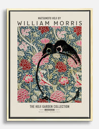
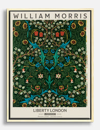
Prodotti Fab presentati in questo blog
-

Tela eleganza floreale di William Morris
Prezzo scontato A partire da CHF 63.00CHF 89.00 -

Poster floreale ispirato a William Morris
Prezzo scontato A partire da CHF 16.00CHF 23.00 -

Tela floreale di William Morris
Prezzo scontato A partire da CHF 63.00CHF 89.00 -

Tela con motivo floreale in stile William Morris
Prezzo scontato A partire da CHF 63.00CHF 89.00 -

Poster floreale ispirato a William Morris
Prezzo scontato A partire da CHF 16.00CHF 23.00 -

Poster floreale stile William Morris
Prezzo scontato A partire da CHF 16.00CHF 23.00 -

Poster con rose ispirato a William Morris
Prezzo scontato A partire da CHF 16.00CHF 23.00 -

Poster floreale ispirato a William Morris
Prezzo scontato A partire da CHF 16.00CHF 23.00 -
Tela fiori di giardino di William Morris
Prezzo scontato A partire da CHF 63.00CHF 89.00 -

Poster armonia floreale ispirato a William Morris
Prezzo scontato A partire da CHF 16.00CHF 23.00 -

Poster floreale con uccelli di William Morris
Prezzo scontato A partire da CHF 16.00CHF 23.00 -

Tela motivo floreale di William Morris
Prezzo scontato A partire da CHF 63.00CHF 89.00 -
Tela floreale in stile William Morris
Prezzo scontato A partire da CHF 63.00CHF 89.00 -

Poster eleganza floreale di William Morris
Prezzo scontato A partire da CHF 16.00CHF 23.00 -

Tela William Morris Wallflower
Prezzo scontato A partire da CHF 63.00CHF 89.00 -

Poster floreale romantico ispirato a William Morris
Prezzo scontato A partire da CHF 16.00CHF 23.00 -

Poster fiori autunnali stile William Morris
Prezzo scontato A partire da CHF 16.00CHF 23.00 -

Poster William Morris armonia floreale
Prezzo scontato A partire da CHF 16.00CHF 23.00


Di più da The Frame

You're Overthinking Art Above Your Sofa
The blank wall above your sofa isn't a maths problem. It's a mood decision, a colour decision, and a "what do I actually want to look at every evening" decision....

Our Favourite Art Prints for Bedrooms That Help...
Bedroom art is the one place in your home where a "statement piece" is usually the wrong instinct. The job here is quieter, and getting it right means unlearning most...

Vintage Rose Prints: From Botanical Illustratio...
Vintage rose prints are having a proper moment. Not the dusty, chintzy kind your nan had over the settee, but the considered, well-framed kind that anchor a modern room and...