Gold, Cats, and Gorgeous Walls: How to Style Klimt Cat Art Prints in Every Room
A room-by-room guide to making gold-patterned cat prints look intentional, elevated, and properly at home.

Klimt cat prints are having a moment, and for good reason. They combine the shimmer and pattern of Vienna Secession painting with a subject everyone already loves. The challenge is making them look like a considered design choice rather than a novelty buy, and that comes down to frame, placement, palette, and a few mistakes worth avoiding.
Why Klimt's style translates so well to wall art (and why cats make it even better)
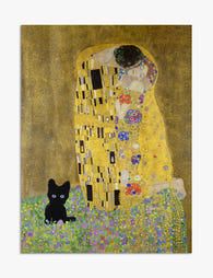
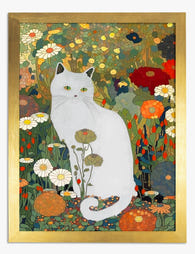
Gustav Klimt's "golden phase" work, think The Kiss and Portrait of Adele Bloch-Bauer, was practically engineered for reproduction on paper. The flat, decorative gold leaf areas, dense pattern, and bold figure-on-background composition all read beautifully at print scale. There's no muddy oil texture to lose, no subtle brushwork that only works in person. The pattern carries the piece.
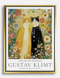
Swap the society portraits for cats and something quietly brilliant happens. The seriousness of the source material gets a wink, but the visual language stays sophisticated. You get the gold, the spirals, the eye-of-Horus motifs, the densely worked robes, just wrapped around a creature who would absolutely sit for a Klimt portrait if asked. That tension between formal style and informal subject is the whole charm of klimt style cat wall art: it's reverent and a little ridiculous at the same time.
The risk is leaning too far into the joke. Style the print like a serious piece of art nouveau and the humour takes care of itself.

Colour palettes that bring out the gold: warm neutrals, deep greens, and navy
Gold is a warm metallic, which means it sings against warm and jewel-toned backgrounds and dies against cool greys or stark white. If your walls are builder's-beige magnolia, you're already halfway there. If they're cool blue-grey, you'll need to work harder.
Warm neutrals are the easiest path. Off-white with a yellow or pink undertone, oat, mushroom, putty, warm taupe. These let the gold do the talking without competing. Add textiles in cream, camel, and rust and the whole composition reads as an expensive hotel suite rather than a student flat.
Deep greens are our favourite pairing. Sage, forest, olive, and the proper dark "smoking room" greens all flatter gold because green and gold sit beside each other in nature. Think botanical gardens, peacock feathers, moss on a brass statue. A deep green feature wall behind a Klimt cat print is one of the most reliably impressive things you can do with a brush and an afternoon.
Navy works for the same reason a navy suit with a gold tie clip works: it's the dressiest possible background. Pair navy walls with warm wood floors and brass fittings, and the print becomes the centrepiece of a room that already feels intentional.
Avoid pure cool greys, lavender, and anything millennial pink. Those palettes fight the warmth in the gold and the whole thing falls flat.
Living room placement: the 50x70cm print above a sofa or sideboard
Living room placement comes down to scale. The classic rule for art above furniture is that the artwork should be roughly two-thirds the width of the piece below it. A standard three-seater sofa is around 200cm wide, so two-thirds is 130cm. That's either one large piece (our 70x100cm in landscape works) or a 50x70cm flanked by two smaller prints.
A single 50x70cm Klimt cat print works brilliantly above a sideboard, console table, or compact two-seater. Above a full sofa on its own, 50x70cm will look stranded. If you only want one print and you have a big sofa, size up to 70x100cm.
Height matters more than people realise. Centre the artwork at roughly 145 to 152cm from the floor, which is gallery standard eye-level. Above a sofa, leave a gap of about 15 to 25cm between the top of the sofa back and the bottom of the frame. Higher than that and the print starts to feel like it's floating away from the room.
For a sideboard or console, the gap shrinks to 10 to 20cm. You want the print to feel related to the furniture below it, not hovering. Style the surface beneath with a brass or ceramic lamp, a stack of two or three books, and one sculptural object. Three points of interest, varying heights, done.

Bedroom styling: creating a warm, luxurious feel with Klimt cat prints
Bedrooms are where Klimt cat prints really earn their keep. The gold catches lamplight beautifully in the evening, and the dense pattern reads as cosy rather than busy when you're lying down looking at it.
Above the bed is the obvious placement, and the scale rule still applies: the artwork should sit around two-thirds the width of the headboard. For a standard UK double (135cm), a 70x100cm portrait print is ideal. For a king (150cm), the same size works but you can also consider two 50x70cm prints side by side with about 5cm between them.
Hang it 15 to 20cm above the headboard. Any higher and you'll regret it the first time you sit up. If you don't have a headboard, anchor the print to the bed visually by adding a wall-mounted reading light on each side at the same horizontal line.
Layer textiles in tones that pick up the print. If the cat is wrapped in a green-and-gold robe, bring in a forest green throw and one or two cream linen cushions. Avoid matching too literally. You want the print to feel like it belongs in the room, not like the room was decorated from the print outwards.
For smaller bedrooms or above a chest of drawers, a 30x40cm or 40x50cm framed print works well. Resist the urge to go any smaller. Tiny prints on big walls always look apologetic.
Frame choices that complement the art nouveau aesthetic
This is where most people go wrong. The instinct with an ornate, gold-heavy print is to reach for an ornate gold frame, and the result is usually too much. Here's how we think about it.
Thin black frames are the safest, most modern choice. They contain the print's pattern without competing, and they pull the eye to the gold inside. If you want the print to look like a piece of contemporary design rather than a museum reproduction, go black.
Natural oak or warm wood frames are our favourite pairing. The warmth of the wood echoes the warmth of the gold, and the simplicity of the profile keeps the look modern. This is the right move for warm neutral rooms, sage green rooms, and anywhere with mid-century or Scandinavian furniture.
Gold frames can work, but only if they're slim and matte, not chunky and shiny. A wide ornate gold frame around a print that's already gold-heavy creates a muddy, overworked look. If you want a vintage feel, go for a thin antique brass or aged gold profile, not the bright shiny stuff.
Whatever you choose, the frame needs to be solid and properly fitted. A thin flimsy frame around an ornate print looks like a postcard pinned up in a hurry. Our framed art prints use solid FSC-certified wood with UV-protective acrylic glaze, which matters because gold inks fade fastest in direct sunlight and the glaze prevents that. The frame and print arrive together, properly fitted, ready to hang.
One more thing: don't mix metals badly. If your room already has brass lamps and brushed gold fixtures, a gold frame can join the party. If everything else is matte black hardware, stay with black or wood for the frame. Mismatched metals are the single fastest way to make a room look like it was decorated by committee.
What to pair them with: complementary prints and décor accessories
A Klimt cat print works hardest when it has friends. The trick is choosing companions that share something (palette, era, mood) without repeating the same trick.
For a gallery wall, pair your Klimt cat with one or two other art nouveau prints, a simple botanical line drawing, and one piece of typography or abstract work. The mix of ornate and simple gives the eye somewhere to rest. Don't surround an ornate print with more ornate prints. The whole wall becomes visual static.
For pairs or trios, look at the rest of the klimt cat art prints range and choose pieces that share a dominant colour. Two or three prints in the same palette read as a series. Two or three in clashing palettes read as a mistake.
For décor accessories, bring in tactile materials: brass, aged wood, ceramic, velvet, linen. A small brass dish on the sideboard beneath the print does more work than you'd think. So does a single sculptural ceramic vase. Avoid plastic, chrome, and anything high-gloss white. Those finishes fight the warmth of the print.
Plants help too. A trailing pothos, a snake plant, or a small olive tree in a terracotta pot adds organic shape against the geometry of the pattern.

Common mistakes that make decorative cat wall art look cheap (and how to avoid them)
The difference between a Klimt cat print looking expensive and looking like a charity-shop find usually comes down to four or five preventable mistakes.
Hanging too high. The most common error, by a mile. Art belongs at eye level, around 145 to 152cm to centre, not floating two-thirds of the way up a blank wall. If you've already drilled the holes, lower them. It's worth the filler.
Choosing the wrong size. A 30x40cm print above a three-seater sofa looks like a stamp. Measure your furniture, take two-thirds of the width, and buy accordingly. When in doubt, size up.
Cheap printing on thin paper. Gold tones are unforgiving. Cheap inks render gold as flat mustard yellow, and thin paper warps inside a frame within weeks. Look for giclée printing on thick matte paper, which is what gives decorative cat wall art actual depth and presence up close.
Flimsy frames or frames shipped separately. A thin MDF frame that bows under the weight of the glaze, or a frame and print that arrive in separate boxes for you to assemble badly on the kitchen floor, will ruin even the best print. The frame should be solid wood, properly fitted at the factory, and arrive ready to hang.
Clashing décor styles. A Klimt cat print does not belong in a room full of nautical-themed cushions and slogan mugs. It also doesn't belong in a stark all-white minimalist space with no other warmth. Match the mood: layered, textured, slightly maximalist, warm.
Bad lighting. Gold needs light to do its thing. A north-facing room with no lamps will leave the print looking dull. Add a warm-toned floor lamp or wall sconce nearby (2700K bulbs, not cool white) and the gold will shimmer in the evening. Avoid pointing a spotlight directly at the acrylic glaze, which can create glare. Indirect, warm, ambient light is what you want.
A quick sophistication check before you drill
Before committing to holes in the wall, run through this: Is the print at eye level? Is it the right size for the furniture below? Does the frame complement rather than compete with the art? Are the metals in the room consistent? Is there warm light nearby? Does the print share a palette with at least one other thing in the room?
If you can say yes to all six, drill the holes. The print will look like it was always meant to be there, which is the whole point.


Prodotti Fab presentati in questo blog
-

Poster gatto ispirato a Klimt
Translation missing: it.products.product.sale_price A partire da CHF 16.00CHF 22.00 -

Poster musa felina ispirato a Klimt
Translation missing: it.products.product.sale_price A partire da CHF 16.00CHF 22.00 -

Poster gatti in giardino, ispirazione Klimt
Translation missing: it.products.product.sale_price A partire da CHF 16.00CHF 22.00 -

Tela gatto bianco in giardino di Gustav Klimt
Translation missing: it.products.product.sale_price A partire da CHF 62.00CHF 88.00 -

Tela il bacio dorato di Klimt con gatto nero
Translation missing: it.products.product.sale_price A partire da CHF 62.00CHF 88.00 -

Tela il bacio di Klimt con gatto
Translation missing: it.products.product.sale_price A partire da CHF 62.00CHF 88.00 -

Poster gatto bianco nel giardino ispirato a Gustav Klimt
Translation missing: it.products.product.sale_price A partire da CHF 16.00CHF 22.00 -

Poster gatti in abbraccio ispirato a Klimt
Translation missing: it.products.product.sale_price A partire da CHF 16.00CHF 22.00 -

Poster il bacio di Klimt con gatto
Translation missing: it.products.product.sale_price A partire da CHF 16.00CHF 22.00 -
Tela gatti fiabeschi di Klimt
Translation missing: it.products.product.sale_price A partire da CHF 62.00CHF 88.00 -
Poster il bacio di Klimt con il gatto
Translation missing: it.products.product.sale_price A partire da CHF 16.00CHF 22.00 -
 Foil dorato
Poster gatti abbracciati in lamina oro ispirato a Klimt
Translation missing: it.products.product.sale_price A partire da CHF 22.00CHF 36.00 -

Poster gatto nero tra fiori arancioni alla Klimt
Translation missing: it.products.product.sale_price A partire da CHF 16.00CHF 22.00 -

Poster gatto nero nel giardino ispirato a Gustav Klimt
Translation missing: it.products.product.sale_price A partire da CHF 16.00CHF 22.00 -
Poster Klimt gatto bianco e fiori selvatici
Translation missing: it.products.product.sale_price A partire da CHF 16.00CHF 22.00 -

Poster gatto nero alla finestra, giardino alla Klimt
Translation missing: it.products.product.sale_price A partire da CHF 16.00CHF 22.00 -

Tela gatti nel giardino, stile Klimt
Translation missing: it.products.product.sale_price A partire da CHF 62.00CHF 88.00 -

Poster il giardino incantato di Klimt
Translation missing: it.products.product.sale_price A partire da CHF 16.00CHF 22.00 -

Poster giardino incantato con gatto nero ispirato a Klimt
Translation missing: it.products.product.sale_price A partire da CHF 16.00CHF 22.00


Di più da The Frame

Kids' Room Art: Playful Without Childish
Most kids' room art falls into two camps: aggressively cute (rainbows, cartoon animals, alphabet posters) or weirdly adult (minimal black and white prints that could hang in a dentist's office)....

Nursery Art That Grows with the Room
Most nursery art gets retired by the time the cot comes down. That's a waste of money, wall space and the chance to build something genuinely meaningful. This guide is...

Office and Study: Art That Helps You Focus or A...
The art you hang in a workspace isn't neutral decoration. It either supports the kind of thinking you do at your desk, or it quietly works against it. The trick...