How to Build a Mediterranean Gallery Wall That Feels Effortless
The difference between a wall that whispers Mallorca and one that shouts beach house, decoded into a step-by-step plan.

A Mediterranean gallery wall isn't just coastal art with extra blue. It's a specific balance of sun-bleached architecture, terracotta warmth, and that particular quality of light you only get on the Balearics. Done well, it looks collected over years of travel. Done badly, it looks like a beach-themed gift shop.
What makes a Mediterranean gallery wall different from a generic one
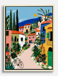
Generic coastal art leans American: driftwood frames, pale blue palettes, seashells, shiplap. It's casual, beachy, often a little nautical. Mediterranean is something else entirely. It's architectural before it's coastal. Think whitewashed villages, shuttered windows, the geometric play of shadow on a stucco wall.
The colour story is also different. Coastal stays mostly within a cool spectrum (blues, sandy beiges, soft greys). Mediterranean and balearic style interiors bring warm tones into conversation with cool ones: terracotta roofs against an azure sea, ochre earth, olive groves, the dusty pink of bougainvillea against limewashed walls.
There's also more restraint. European interiors tend to favour negative space, a smaller number of well-chosen pieces, and tighter editing. American coastal galleries often pile on; Mediterranean galleries breathe. Get this distinction right and the rest of the decisions become much easier.

Choosing your anchor piece: start big, then build outward
Every successful gallery wall has an anchor. This is your largest piece, the one that sets the tone for everything around it. For a Mediterranean wall, your anchor should almost always be a landscape or architectural piece rather than an abstract.
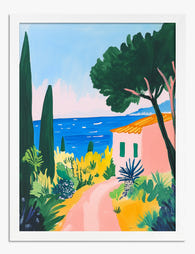
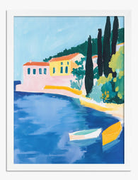
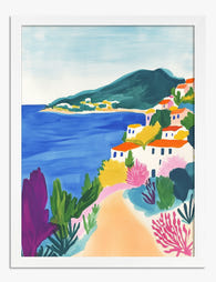
Why? Because landscapes and architecture carry the most narrative weight. A photograph of a cliff-side village in Mallorca, a painting of a cypress-lined road in Tuscany, or a wide composition of the sea meeting a stone harbour gives the eye somewhere to rest and tells the story your smaller pieces will riff on.
Size your anchor generously. Above a standard three-seat sofa (roughly 200cm wide), an anchor of 70x100cm works beautifully. Above a console or sideboard, 50x70cm is usually right. The rule of thumb is that your anchor should be roughly two-thirds the width of the furniture below it, leaving the smaller surrounding pieces to balance the rest.
Once your anchor is chosen, everything else builds outward in supporting roles. Smaller landscapes, architectural details, and abstract coastal pieces orbit around it without competing.
The best layout for 3, 5, and 7 prints
Mediterranean gallery walls tend to look most considered with odd numbers. Three is intimate, five is the sweet spot for most living rooms, seven works above larger sofas or as a feature wall in dining rooms.
For all three layouts, keep your spacing tight. 5 to 7cm between frames (roughly 2 to 3 inches) is the sweet spot. Wider spacing pushes you into casual American gallery territory. Tighter spacing reads as a single, considered composition, which is the European look you're after.
Three prints
The cleanest three-print layout is a horizontal row at the same height. Use frames of identical size (50x70cm portrait orientation works well) and align the centres. This works above a console table, headboard, or narrow sofa.
For a slightly more dynamic look, try one large landscape (70x100cm) on the left, with two smaller squares (40x40cm) stacked on the right. Align the outer edges and you get visual rhythm without chaos.
Five prints
The classic Mediterranean five-print layout is what designers sometimes call the "one big, four small" formation. Place a large anchor (70x100cm) on one side, and a 2x2 grid of smaller prints (40x50cm each) on the other. Align the top edge of the anchor with the top of the upper grid prints, and the bottom edge with the bottom grid prints.
A second strong option is the horizontal salon row: five prints of varying sizes, all aligned along a central horizontal axis (their middles, not their tops or bottoms). Mix two 50x70cm landscapes with three 30x40cm pieces and the eye reads it as one continuous frieze.
Seven prints
Seven prints is where you can introduce a proper salon-style cluster. The trick is to still have a clear anchor (a 70x100cm piece slightly off-centre) with six smaller prints arranged around it, varying sizes between 30x40cm and 50x70cm.
Lay everything out on the floor first. Photograph it from above. Adjust until the visual weight feels balanced (no heavy clusters of dark pieces in one corner, no all-blue zones on one side). Only then start measuring for the wall.
Frame finishes that suit Mediterranean tones
Frame choice does more work than most people realise. The wrong finish can drag a sophisticated Mediterranean palette towards either rustic farmhouse or beachy American coastal. There are three finishes worth considering, and each does something different.
Oak is our default recommendation. The warm honey tone of solid oak picks up the terracotta and ochre notes in Mediterranean prints and balances the cooler blues. It feels European, particularly when the oak is left natural rather than stained. Oak also softens the formality of architectural prints, which can otherwise feel cold.
Black brings graphic sophistication. If your Mediterranean prints lean heavily towards architecture, black-and-white photography, or high-contrast compositions, black frames sharpen everything. They suit interiors with a bit of edge: dark joinery, brass fixtures, tiled floors. Less villa, more Barcelona apartment.
White disappears against pale walls and lets the prints themselves carry the entire visual weight. This is the right choice if your prints are highly saturated (deep blues, strong terracottas) and you want them to read as the only colour story. White frames suit minimalist interiors and very small spaces where you don't want frame lines competing.
What to avoid: driftwood, distressed wood, or any frame finish that telegraphs "beach house." This is the single fastest way to push your wall from European Mediterranean to American coastal, and once you've gone there it's very hard to come back.
A note on consistency: pick one frame finish and stick with it across the whole gallery. Mixed frames can work in maximalist interiors, but for the effortless Mediterranean look, frame uniformity is what makes a varied set of prints feel like one collection.

Subject mixing: landscapes, architecture, and abstract coastal art
The single most useful framework for choosing prints is a simple ratio. For any Mediterranean gallery wall, aim for roughly:
- 40% landscape (sea views, hillside villages, olive groves, coastal panoramas)
- 30% architecture (whitewashed buildings, doorways, shuttered windows, terracotta rooftops)
- 30% abstract or still life (botanical studies, abstract coastal forms, ceramic vessels, fruit)
For a five-print wall, that translates to roughly two landscapes, one or two architectural pieces, and one or two abstracts. Going heavier on architecture (three out of five) starts to feel like a travel brochure. Going heavier on abstract makes the wall feel disconnected from its Mediterranean roots.
The reason this ratio works: landscapes provide narrative, architecture provides structure and graphic interest, abstracts provide breathing room and tonal connection. Drop any one category and the wall loses something.
If you're drawn to a specific place, mallorca wall art ideas are a brilliant starting point because the island gives you all three categories naturally: dramatic coastal cliffs (landscape), Palma's architecture and Deià's stone villages (architecture), and the colour palette of bougainvillea, terracotta, and Mediterranean blue ready-made for abstract translation.
Photography mixes well with painted or illustrated prints, but try to keep one or the other dominant. A wall that's half photography and half illustration can feel undecided. We'd suggest 70/30 in favour of whichever you prefer.
Colour palette discipline: keeping blues, terracottas, and whites in harmony
The Mediterranean palette has three core notes: deep azure or cobalt blue, warm terracotta and ochre, and bright architectural white. Almost every successful Mediterranean gallery wall lives within these three families, with occasional accents (olive green, dusty pink, sand).
The discipline is in the proportions. A common mistake is to load up on blues (because blues feel "Mediterranean") and end up with a wall that reads cold and one-note. Aim for roughly equal visual weight between cool tones (blues, whites) and warm tones (terracotta, ochre, sand). If you find yourself with five prints and four are predominantly blue, swap one out for something with strong terracotta or warm stone.
Whites act as the breathing space between cool and warm. Architectural prints featuring whitewashed buildings are particularly useful here because they bring both white (the walls) and warm undertones (the shadows, the stone, the terracotta roofs) into the same image.
A useful test: stand back from your laid-out prints and squint. If the wall reads as predominantly one colour, you're out of balance. A well-balanced Mediterranean wall should look, when blurred, like roughly equal patches of warm and cool with white as the connector.
This is also where the giclée print quality matters. Mediterranean palettes rely on subtle tonal shifts (the difference between sun-bleached terracotta and shaded terracotta, between deep harbour blue and pale sky blue) and these only translate if the printing is genuinely high resolution on a paper that holds colour properly. Thin papers and digital prints flatten these subtleties and you lose the Mediterranean quality entirely.
Common gallery wall mistakes and how to avoid them
A few mistakes show up over and over, and they're worth flagging because they're each fixable.
Hanging too high. The centre of your gallery wall (not the centre of the anchor, the centre of the whole composition) should sit roughly 145 to 150cm from the floor. Above a sofa, leave 15 to 20cm between the top of the sofa and the bottom of the lowest frame. Most people hang too high by about 10cm.
Mismatched frame depths. When prints arrive separately framed, frames often vary slightly in depth, which creates uneven shadows along the wall. Worse, prints can warp inside poorly fitted frames, causing visible bubbling. This is the single biggest reason cheap framed prints look cheap. Buy prints and frames that ship together properly fitted, with the print held flat, and this problem disappears.
Driftwood frames. Already mentioned, but it bears repeating. Driftwood pushes Mediterranean towards beach house. Avoid.
Too many architectural prints. Three architectural prints in a row of five starts to feel like a postcard rack. Keep architecture to one or two pieces in any five-print arrangement.
Ignoring matting. A small white mat (3 to 5cm) inside the frame adds breathing room and elevates the whole composition. For Mediterranean prints especially, where negative space is part of the aesthetic, matting helps each print feel like a considered object rather than a poster.
Cool-blue overload. Covered in the colour section, but the most common single mistake. Always include enough warm tones to balance.

Shopping the look: our top Mediterranean and Mallorca print combinations
Concrete combinations are more useful than vague advice. Here are three sets we'd genuinely recommend, each working as a complete gallery wall.
The Mallorca Five
A 70x100cm photograph of the Serra de Tramuntana coastline as your anchor. Two 40x50cm architectural prints: one of a whitewashed Palma doorway, one of terracotta rooftops. Two 40x50cm abstract or botanical pieces: an olive branch study and a terracotta-toned abstract. All in natural oak frames. This is the textbook mallorca wall art ideas starting point.
The Cliff and Sea Three
For smaller spaces or above a console: three 50x70cm portrait prints. A dramatic cliff and sea landscape, a whitewashed village scene, and an abstract in deep blues and warm whites. Tight 5cm spacing, all in oak or all in white frames depending on whether your wall colour is pale (use oak) or richly painted (use white).
The Salon Seven
For a feature wall above a generous sofa: a 70x100cm anchor landscape, two 50x70cm architectural prints, two 40x50cm abstracts, two 30x40cm botanical or still-life studies. Mix orientations. Black frames if your interior leans graphic, oak if it leans warm. This works particularly well sourced from coastal wall art inspiration with a Mediterranean filter applied.
If you'd rather not curate from scratch, pre-curated wall art sets take the guesswork out of proportions and palette balance, which is genuinely the hardest part of getting this right.

A final note on letting it breathe
The single thing that separates a Mediterranean gallery wall from a generic one is restraint. European interiors trust negative space. They trust the viewer to fill in the gaps. Resist the urge to add one more print, one more colour, one more frame finish. Hang what you've chosen, live with it for a week, and only then decide whether anything needs to change. Most of the time, it doesn't.

Prodotti Fab presentati in questo blog
-

Poster stradina costiera mediterranea
Translation missing: it.products.product.sale_price A partire da CHF 16.00CHF 22.00 -
Poster sentiero estivo mediterraneo
Translation missing: it.products.product.sale_price A partire da CHF 16.00CHF 22.00 -
Tela vicolo mediterraneo baciato dal sole
Translation missing: it.products.product.sale_price A partire da CHF 61.00CHF 87.00 -

Poster atmosfere blu mediterranee
Translation missing: it.products.product.sale_price A partire da CHF 16.00CHF 22.00 -

Poster rifugio sulla costa mediterranea
Translation missing: it.products.product.sale_price A partire da CHF 16.00CHF 22.00 -

Poster stile mediterraneo modernista
Translation missing: it.products.product.sale_price A partire da CHF 16.00CHF 22.00 -

Poster borgo mediterraneo illuminato dal sole
Translation missing: it.products.product.sale_price A partire da CHF 16.00CHF 22.00 -

Poster mediterraneo moderno con porta color ottanio e sedia arancione
Translation missing: it.products.product.sale_price A partire da CHF 16.00CHF 22.00 -

Tela panorama della costa mediterranea
Translation missing: it.products.product.sale_price A partire da CHF 61.00CHF 87.00 -

Poster sogno mediterraneo
Translation missing: it.products.product.sale_price A partire da CHF 16.00CHF 22.00 -

Poster costa del Mediterraneo dai colori vivaci
Translation missing: it.products.product.sale_price A partire da CHF 16.00CHF 22.00 -

Tela ambiente mediterraneo moderno
Translation missing: it.products.product.sale_price A partire da CHF 61.00CHF 87.00 -
Poster oasi mediterranea baciata dal sole
Translation missing: it.products.product.sale_price A partire da CHF 16.00CHF 22.00 -

Tela costa del Mediterraneo al sole
Translation missing: it.products.product.sale_price A partire da CHF 61.00CHF 87.00 -

Tela vicolo mediterraneo assolato con vista mare
Translation missing: it.products.product.sale_price A partire da CHF 61.00CHF 87.00 -

Poster sogno mediterraneo
Translation missing: it.products.product.sale_price A partire da CHF 16.00CHF 22.00 -

Tela cortile mediterraneo dal fascino senza tempo
Translation missing: it.products.product.sale_price A partire da CHF 61.00CHF 87.00 -

Tela villaggio mediterraneo sul mare
Translation missing: it.products.product.sale_price A partire da CHF 61.00CHF 87.00 -
Poster costa mediterranea dai colori vivaci
Translation missing: it.products.product.sale_price A partire da CHF 16.00CHF 22.00


Di più da The Frame

How to Create a Gallery Wall Above Your Couch T...
Most gallery walls fail for the same reasons: prints hung too high, gaps that feel random, frames that argue with each other, and a colour palette that never quite settled...

How to Build a Pet Gallery Wall That Looks Inte...
Pet art has a reputation problem. Done badly, it tips into kitsch faster than almost any other category, and the more pieces you add, the worse it gets. Done well,...

How to Create a Coastal Gallery Wall That Doesn...
You love the look on Pinterest. You've saved forty seascape prints. Then you stand in front of your wall holding a tape measure and a hammer, and your brain goes...