How to Build a Ski-Themed Gallery Wall That Actually Looks Good
A designer's playbook for arranging ski prints, vintage posters and mountain photography into a wall that feels curated, not cluttered.

Most ski-themed walls fail in the same way: too many styles competing, mismatched frames fighting each other, prints hung at random heights. A great gallery wall looks effortless because every decision was deliberate. This guide gives you the templates, measurements and rules to get there.
Gallery wall vs single statement piece: which is right for your space
A single large print is the right call when your wall has architectural drama already, a vaulted ceiling, exposed timber, a stone fireplace. You don't want to compete with the room. One 100x150cm canvas of a snow-laden ridgeline does more for a chalet living room than six smaller prints would.
A gallery wall earns its place when the wall is flat, plain, and slightly awkward. Think the long blank stretch above a sofa, a stairwell, or the wall opposite your front door in a ski apartment. Multiple prints add rhythm and give the eye somewhere to travel.
The deciding factor is usually the wall's relationship to the rest of the room. If the wall is the loudest thing in the space, go single. If it's quiet and needs a voice, go gallery.

The ideal number of prints for three common wall widths
Most ski-themed walls fall into one of three widths. Here's what we recommend for each, based on prints that actually breathe rather than crowd each other.
4ft wall (around 120cm)
This is the typical width above a console table, a small sofa, or in a narrow hallway. Stick to three prints. Either three 30x40cm prints in a horizontal row, or one 50x70cm centre print flanked by two 30x40cm. Anything more becomes fussy.
6ft wall (around 180cm)
The standard sofa wall. Five to six prints is the sweet spot. A common combination: one 70x100cm anchor print, two 50x70cm, and two or three 30x40cm. Or, if you prefer symmetry, a tight grid of six 40x50cm prints.
8ft wall (around 240cm)
A bigger canvas, in every sense. Seven to nine prints work here, anchored by at least one piece in 70x100cm or larger. Don't be tempted to fill every inch. A bit of negative space around the cluster makes the whole thing read as intentional.
The general rule: your gallery should occupy roughly two-thirds the width of the wall or the furniture beneath it. Wider feels overwhelming. Narrower looks like the prints are floating in too much air.
Mixing styles: vintage posters, action photography, and abstract mountain scenes
This is where most ski walls go wrong. People love vintage Alpine travel posters (Zermatt, Chamonix, St Moritz in chunky 1950s typography). They also love moody black-and-white action photography of skiers cutting powder. And they love clean, minimalist line drawings of mountain ranges. Then they put all three on the same wall and wonder why it feels like a charity shop.
You can absolutely mix these styles. The trick is the 60-30-10 rule, borrowed from interior design. One style dominates (60%), a second supports (30%), and a third accents (10%). So a wall with six prints might be: three vintage posters, two photography prints, one abstract mountain illustration.
The unifying thread should be colour, not subject. If your vintage posters lean warm (cream, ochre, faded red), your photography should echo those tones, sepia-toned action shots rather than icy blues. If your palette is cold and modern (charcoal, slate, white), pick monochrome photography and skip the warm-toned posters entirely.
For the colour-curious, our mountain art prints collection includes both moody photographic pieces and clean illustrative work, which makes building a coherent palette easier than hunting across multiple sources.
Vintage poster reproductions: a word
Original vintage ski posters cost thousands. High-quality giclée reproductions cost a fraction and, when printed properly on thick matte paper, look almost indistinguishable on the wall. The detail in the typography is what makes or breaks them, so cheap thin-paper prints will betray themselves. This is one area where print quality genuinely matters.
Frame consistency vs deliberate mismatch (our strong opinion)
We have a position on this and we'll defend it: for ski-themed gallery walls, choose one frame style and stick to it across every print.
Mismatched frames work in eclectic, art-collected-over-decades interiors. They do not work for themed walls. The moment you introduce a "ski theme", you're already adding a strong unifying concept to the room, and mismatched frames will fight that concept rather than support it. The eye reads chaos, not curation.
Our recommendations:
- Black frames for modern photography and minimalist illustrations. Sharp, gallery-like, lets the image do the work.
- Natural oak frames for vintage posters and warm-toned work. Echoes timber-clad chalet aesthetics without being on the nose.
- White frames for bright, airy rooms with cooler palettes. Disappears into white walls and lets colour pop.
Pick one. Use it for everything. The only deliberate mismatch we'll endorse is mixing framed and unframed canvas pieces, where the canvas acts as a textural break in an otherwise framed grouping. Even then, keep it to one canvas in a wall of five or six prints.
A practical note: framed prints are heavier and more polished, canvas is lighter and works better in humid rooms (a mudroom near a boot dryer, for instance). For most living spaces, framed wins on visual weight. For a ski apartment hallway that catches snow off jackets, canvas is the smarter call.

Layout templates you can copy
Three layouts cover roughly 90% of ski gallery walls worth building. Pick the one that suits your wall and copy the proportions exactly.
The asymmetric cluster
Best for: 6ft to 8ft walls above sofas or sideboards. Looks gathered and lived-in.
Anchor with one large print (70x100cm) positioned slightly left of centre. To its right, stack two medium prints (40x50cm) vertically with about 5cm between them. Below the anchor, place a 30x40cm print. To the far right, a final 30x40cm at the same height as the bottom of the anchor.
The total cluster should occupy roughly 180cm wide by 120cm tall. The asymmetry is the point. Don't try to balance it.
The tight grid
Best for: 4ft to 6ft walls. Calm, modern, designed-looking.
Six identical prints in 40x50cm or 50x70cm, arranged 3 across and 2 down. Spacing between each print should be exactly 5cm, both horizontally and vertically. The discipline is what makes it work, any variation in spacing will show.
For a grid, every print needs to feel like part of a series. Either six photographs from the same trip, six vintage posters from the same era, or a curated wall art set where the styling is already coordinated.
The vertical stack
Best for: narrow walls between windows, stairwell walls, or beside doorways.
Three prints stacked vertically. Either three of the same size (40x50cm works well) with 5cm between each, or a tapered stack where the largest is on top. The vertical stack is dramatically underused for ski art and works particularly well for trail map prints or full mountain-range illustrations where the subject itself has vertical drama.
Spacing, height, and hanging tips specific to grouped prints
Spacing between prints in a gallery wall should be consistent and tight. Aim for 5cm to 7cm between frames. Less than 4cm and the wall feels claustrophobic. More than 8cm and the prints stop reading as a group, they read as separate objects.
The centre of the gallery as a whole should sit at roughly 145cm from the floor. This is the museum standard for eye level for the average adult. Note that this is the centre of the entire arrangement, not the centre of any individual print.
Above a sofa or console, the bottom of the lowest print should sit 15cm to 25cm above the furniture. Closer than 15cm and it feels cramped. Further than 25cm and the prints float, disconnected from the room.
The paper template trick
Before you put a single hole in the wall, cut paper templates of every print to scale and tape them to the wall with masking tape. Live with the arrangement for 24 hours. Move things around. This single step prevents almost every regret you might have, and it's far easier than refilling holes.
When you're ready to hang, framed prints from us arrive ready to hang with fixtures already attached, which removes the usual faff of fitting hooks at home. For larger pieces (anything above 50x70cm), use two hanging points rather than one. It keeps the print level and prevents the slow tilt that affects single-point hanging over time.

Common gallery wall mistakes and how to avoid them
Mistake 1: too many subjects, not enough connection
Six different ski resorts, three different artistic styles, four different colour palettes. The eye can't find a pattern, so it reads as visual noise. Fix: pick a unifying constraint. One resort, one decade, one colour palette, or one artistic style.
Mistake 2: the wrong scale
Tiny prints on a huge wall, or oversized prints in a small alcove. Fix: measure your wall, calculate two-thirds of its width, and that's the maximum width your gallery should occupy. Then size individual prints accordingly.
Mistake 3: hanging too high
The single most common mistake in any room. People hang art at their own eye level rather than seated eye level, especially above sofas. Fix: 145cm to the centre, always.
Mistake 4: ignoring lighting
Glossy print finishes and direct sunlight are enemies. Glare washes out the image and, over years, fades the inks. This is one reason we print everything on thick matte paper with a UV-protective acrylic glaze, no glass, no glare, and no fading even in rooms with direct sun. Worth checking what you're buying elsewhere if your wall gets afternoon light.
Mistake 5: forgetting the rest of the room
A ski-themed gallery wall sits within a room, and the room has its own colours and textures. If your sofa is cognac leather and your rug is a warm Berber, an icy blue gallery wall will feel like it belongs in a different home. Pull at least one colour from the room into your art selection.
Mistake 6: confusing chalet with year-round home
A full-on vintage ski poster wall in a London flat that you visit the Alps from twice a year can read as themed in a way that feels touristy. For year-round homes, lean towards atmospheric mountain photography and abstract landscape work, the kind of pieces in our landscape art prints selection that read as "I love mountains" rather than "I went skiing once". Save the bold vintage posters for actual chalets and ski apartments, where the theme has earned its place.
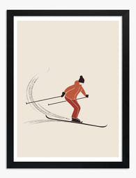
Mistake 7: ignoring the human element
Pure landscape walls can feel cold. One print featuring a figure (a skier mid-turn, a lone hiker on a ridge) adds scale and warmth to an otherwise empty mountain wall. Browse skier art prints for pieces that work as the human counterpoint to broader landscape work.

A final word on edit, edit, edit
The best ski gallery walls have fewer prints than you'd think. When in doubt, remove one. Negative space is what separates a curated wall from a busy one, and it costs you nothing.
Build the paper templates. Live with them for a day. Commit to one frame style. Pick a palette and refuse to break it. Hang at 145cm. The wall will look like you hired someone, because every decision was made on purpose.

Prodotti Fab presentati in questo blog
-

Tela gruppo di sciatori sulla neve
Translation missing: it.products.product.sale_price A partire da CHF 62.00CHF 88.00 -

Tela sciatori colorati sulla neve
Translation missing: it.products.product.sale_price A partire da CHF 62.00CHF 88.00 -

Poster sci vintage
Translation missing: it.products.product.sale_price A partire da CHF 16.00CHF 22.00 -

Poster scena di sci minimalista in bianco e nero
Translation missing: it.products.product.sale_price A partire da CHF 16.00CHF 22.00 -
Poster sciatore vintage
Translation missing: it.products.product.sale_price A partire da CHF 16.00CHF 22.00 -

Poster avventura sugli sci a colori
Translation missing: it.products.product.sale_price A partire da CHF 16.00CHF 22.00 -

Tela pista da sci al sole in bianco e nero
Translation missing: it.products.product.sale_price A partire da CHF 62.00CHF 88.00 -

Poster sciatori colorati
Translation missing: it.products.product.sale_price A partire da CHF 16.00CHF 22.00 -

Tela set da sci rosa su righe azzurre e bianche
Translation missing: it.products.product.sale_price A partire da CHF 62.00CHF 88.00 -

Poster scena di sci vintage
Translation missing: it.products.product.sale_price A partire da CHF 16.00CHF 22.00 -

Tela attrezzatura da sci retrò minimalista
Translation missing: it.products.product.sale_price A partire da CHF 62.00CHF 88.00


Di più da The Frame

Jungle Bedroom Ideas for Adults: Grown-Up Ways ...
Jungle bedrooms have a reputation problem. Search the term and you'll find nursery mood boards, cartoon monkeys, and bright kelly green walls that would keep anyone awake. The grown-up version...

The Strawberry Thief: Everything You Need to Kn...
Strawberry Thief is the William Morris design people search for by name. It's also the one most often bought badly: wrong size, wrong colourway for the room, wrong print quality...

Our Favourite Jungle Prints for Every Room: The...
Jungle prints have a reputation problem. Done badly, they tip a room into themed-restaurant territory faster than almost any other trend. Done well, they add depth, movement and a sense...