The Maximalist Gallery Wall Edit: Curated Prints That Look Intentional
The tactical rules for going big and bold on a blank wall without it sliding into chaos.

A maximalist gallery wall isn't chaos. It's a tightly curated argument made up of ten or fifteen prints, and the difference between "intentional" and "car boot sale" comes down to a handful of rules nobody explains properly. This guide gives you those rules, with real measurements and a step-by-step method so you can go big without second-guessing every decision.
Why maximalist gallery walls work (and why minimalist ones are played out)
The single framed print floating above a sofa has had its moment. It's safe, and it photographs well, but it leaves rooms feeling unfinished, like the people who live there ran out of opinions halfway through. A maximalist gallery wall does the opposite. It tells you something about taste, mood, and the willingness to commit.
The fear is that more equals messy. It doesn't. Density looks deliberate when the spacing is consistent and the frames agree with each other. Maximalism isn't going out of style either, despite the cyclical handwringing. It's the natural pushback against decade of beige interiors, and it works in flats, terraces, and tiny box rooms equally well.
The trick is treating "maximalist" as a discipline, not a free-for-all. Bold yes, random no.

Step one: pick your anchor print and build outward
Every gallery wall needs an anchor. This is the largest print, usually 50x70cm or 60x90cm, and it does most of the heavy lifting. Pick this one first, before you even think about the surrounding pieces.
Your anchor sets the mood. If it's a saturated pop art portrait in cherry red and electric blue, those two colours become the thread running through the rest of the wall. If it's a moody abstract in ochre and forest green, that's your palette now. Don't skip this step. Building a wall without an anchor is how you end up with twelve prints that don't speak to each other.
Position the anchor slightly off-centre, around one-third in from the edge of your arrangement, not dead middle. Dead middle reads as symmetrical and stiff, which is the opposite of what maximalism is doing. From there, build outward in a rough cluster. Larger prints near the anchor, smaller prints (20x30cm, 30x40cm) at the edges where they soften the outline.
A good starting place if you're stuck is the bold pop maximalist art prints collection, which is built specifically for this kind of layered, high-energy wall.
Frame consistency is your secret weapon: why one finish beats five
Most gallery wall guides will tell you to "mix and match frames for character." Ignore them. When you're hanging twelve loud, colourful prints together, mixing frame finishes is what tips the wall from curated to jumble sale.
Pick one frame finish and use it across every print. The three that work hardest:
- Black wood: sharpens the edges, makes colours pop, works in any room.
- Natural oak: warmer, softer, leans Scandinavian, brilliant with botanicals and earthier palettes.
- White: best in small rooms or against deep wall colours like navy or forest green.
The frame becomes the rhythm. Twelve different frames means twelve competing voices. One frame across the lot lets the prints themselves be the loud thing. This is the single most underrated rule in creating a maximalist gallery wall, and the one most people get wrong.
If you're worried about it feeling monotonous, don't be. The variation in the prints does all the work. Your eye reads the frames as a unifying frame around the whole composition, not as repetition.
A practical note: cheap frames warp. The print itself is fine, but a wavy frame on a busy wall is impossible to ignore. Solid wood frames hold their shape, and on a wall this dense the difference is obvious within six months.
The spacing rules that keep a busy wall feeling intentional (the 4-6cm sweet spot)
Here is the rule no one tells you: keep 4 to 6cm of wall between every frame. Not 2cm, not 10cm. Four to six.
Closer than 4cm and the prints visually merge into one chaotic blob. Wider than 6cm and the wall stops reading as a gallery wall and starts reading as a bunch of separate pictures that happen to share a postcode. The 4-6cm range is tight enough to feel deliberately dense, loose enough that each print can breathe.
Use the same spacing on every side: top, bottom, left, right. Consistency is the entire point. Your eye picks up uneven gaps instantly even if it can't articulate why a wall feels off.
For very large prints (70x100cm and up), you can stretch the spacing to 7 or 8cm because the prints themselves have more visual weight and need more room. For small prints clustered together (20x30cm and below), tighten to 4cm. The principle is the same: the gap should feel proportional to the prints around it.

How many prints you actually need based on your wall size
The most common question, and one almost no guide bothers to answer. Here's the rough maths.
Above a standard 3-seater sofa (around 200cm wide): 8 to 12 prints. The arrangement should span roughly two-thirds the width of the sofa, around 130 to 150cm wide.
Above a 180cm bed (UK king): 9 to 12 prints, similar proportions. Aim for the arrangement to sit about 15-20cm above the headboard.
A full feature wall (3m wide and up): 14 to 20 prints. This is where you can really commit. Mix sizes, including at least two anchors at 60x90cm or larger.
A narrow wall or hallway (under 1.5m wide): 5 to 8 prints, vertical stack. Smaller sizes (30x40cm, 40x50cm) work better here.
The general rule borrowed from professional stylists is that wall art above furniture should occupy roughly two-thirds the width of the piece below it. Less than half feels stranded, more than the full width feels like the art is trying to flee the sofa.
For sizing the prints themselves: one anchor at 60x90cm or 70x100cm, two or three mid-size pieces at 50x70cm, then fill in with 30x40cm and 40x50cm prints. That ratio holds up beautifully on most walls.
Mixing pop art with other styles: what pairs well and what clashes
Pop art is loud, but it's surprisingly social. It pairs better than people expect, as long as you respect a couple of boundaries.
What works with pop art:
- Vintage botanical illustrations. The contrast between scientific precision and pop colour is genuinely electric.
- Black and white photography. Acts as a visual rest between high-saturation pieces and stops the wall feeling exhausting.
- Abstract expressionism. Especially anything with bold colour blocking. Speaks the same emotional language.
- Typography prints. Especially in saturated colours that echo the pop palette.
- Mid-century modern illustration. Same era of optimism, same confidence with colour.
What clashes:
- Pastoral landscapes and traditional oil-painting reproductions. The energy is wrong. Pop is graphic and flat, traditional landscapes are atmospheric and tonal. They fight.
- Ultra-minimalist line art. Looks lonely next to pop's saturation. The contrast reads as accidental, not curated.
- Soft watercolour florals. They get steamrolled.
The colour cohesion trick: pick two or three colours from your anchor print and make sure those colours appear in at least three or four other prints across the wall. This is what unifies wildly different subjects. A botanical, a pop portrait, and a typography print can all live happily together if they share a thread of cherry red or mustard yellow.
Browse the colourful art prints collection with this in mind, picking pieces that share a palette rather than a subject.
Common gallery wall mistakes and how to avoid every one of them
Inconsistent spacing. Already covered, but it bears repeating. This is the number one tell that a wall is amateur. Measure every gap.
Hanging too high. The centre of your arrangement should sit at roughly 145-150cm from the floor, which is gallery standard eye level. Most people hang too high because they're scared of the sofa. Don't be. The arrangement should feel anchored to the furniture, not floating above it.
Wall too small for the print count. If you've crammed 14 prints into a 1.5m space, you've made wallpaper, not a gallery. Either reduce the count or move to a bigger wall.
No size variation. Twelve prints all at 40x50cm reads as a grid, not a gallery. You need at least three different sizes for visual rhythm.
Forgetting the corners. Your outer edges should have smaller prints to soften the silhouette. A wall where the outer prints are all large pieces looks blocky.
Mixing portrait and landscape badly. Use both, but balance them. If your anchor is landscape, surround it with a mix. If everything is portrait orientation, the wall starts to feel like a queue.
Glass on a sunny wall. Standard frame glass causes glare and direct sunlight will fade prints over time. UV-protective acrylic glaze, which is what we use across our framed range, prevents fading and weighs less, which matters when you're hanging fifteen of them.

Hanging it all: tools, templates, and the trick with painter's tape
Do not start drilling. The biggest hanging mistake is hanging.
Step one: lay it out on the floor. Clear a space the same dimensions as your wall. Arrange every print on the floor exactly as you want it on the wall, with the 4-6cm spacing. Photograph it from above. Adjust until it looks right. This usually takes longer than you think, and that's the point.
Step two: make paper templates. Cut a piece of brown kraft paper or newspaper to the exact size of each print. Mark on the back where the hanging fixture sits (measure from the print itself). This is so you can align the hooks precisely.
Step three: tape the templates to the wall. Use low-tack painter's tape so it doesn't pull paint when you remove it. Stick all the templates up at your planned spacing. Live with it for a day if you can. Walk past it. Look at it from the doorway, from the sofa, from across the room. Adjust.
Step four: mark and drill. Once you're committed, mark each hook position through the paper, then remove the templates. Drill, hang, and check level as you go.
Tools you'll want:
- Spirit level (or the level app on your phone, which is fine).
- Measuring tape.
- Pencil with a fine point.
- Painter's tape.
- A drill, picture hooks, and wall plugs appropriate for your wall type.
Our framed prints arrive with fixtures already attached on the back, which speeds this up considerably. The print, frame, and glaze all ship together in one box, properly fitted, so you're not assembling anything or hoping the frame fits the print.
For inspiration on how the finished thing actually looks in context, the living room wall art collection has a number of styled examples that show density done well.

A final word on going bold
Maximalism rewards commitment. The wall that almost works, with eight prints when it needed twelve, or 9cm spacing when it needed 5, will haunt you. The wall that goes all in with consistent frames, tight spacing, and a clear colour thread looks better than you imagined. Pick the anchor, pick the finish, measure twice, and trust that more is the point.

Prodotti Fab presentati in questo blog
-

Tela tavola conviviale massimalista
Translation missing: it.products.product.sale_price A partire da CHF 61.00CHF 87.00 -

Poster swing deciso in stile massimalista
Translation missing: it.products.product.sale_price A partire da CHF 16.00CHF 22.00 -

Poster tigre multicolore in stile massimalista
Translation missing: it.products.product.sale_price A partire da CHF 16.00CHF 22.00 -

Tela Bauhaus geometrica minimalista
Translation missing: it.products.product.sale_price A partire da CHF 61.00CHF 87.00 -

Poster stanza moderna dai colori pop
Translation missing: it.products.product.sale_price A partire da CHF 16.00CHF 22.00 -

Tela tigre multicolore in stile massimalista
Translation missing: it.products.product.sale_price A partire da CHF 61.00CHF 87.00 -
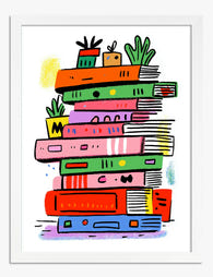
Poster pila di libri arcobaleno
Translation missing: it.products.product.sale_price A partire da CHF 16.00CHF 22.00 -

Poster fiore vivace su sfondo a scacchi
Translation missing: it.products.product.sale_price A partire da CHF 16.00CHF 22.00 -

Poster urbano minimalista a blocchi
Translation missing: it.products.product.sale_price A partire da CHF 16.00CHF 22.00 -

Poster papaya massimalista
Translation missing: it.products.product.sale_price A partire da CHF 16.00CHF 22.00 -

Poster Bauhaus minimalista nero e beige
Translation missing: it.products.product.sale_price A partire da CHF 16.00CHF 22.00 -

Tela botanica scandinava audace
Translation missing: it.products.product.sale_price A partire da CHF 61.00CHF 87.00


Di più da The Frame

Living Room Botanical Prints: The Right Way to ...
Botanical prints are one of the most forgiving categories of wall art to choose, and one of the easiest to ruin with bad framing. A warped frame, the wrong glazing,...

Why William Morris Animal Prints Work in Modern...
Morris's floral patterns get all the attention, but his animal designs are quietly the easier win. A fox or a hare gives your eye somewhere to land, which means these...

The Best Botanical Prints for Your Conservatory...
Conservatories are sun traps, and most art prints are not built for them. The same light that makes the space so lovely to sit in will cook a poorly made...