Every William Morris Botanical Design You Should Know (and Where to Hang Each One)
A buyer's guide to Morris's botanicals, from the famous to the forgotten, with confident room and size recommendations.

You know you want a Morris print. You just can't decide which one. This guide walks through his most important botanical designs, what makes each one distinctive, and which rooms and wall sizes they actually suit.
Why William Morris kept returning to plants and flowers
Morris drew nearly everything he designed from the hedgerows, gardens, and riverbanks around his homes at Red House and Kelmscott Manor. He believed pattern should feel like something growing, not something stamped, and that decoration should bring the outside in without pretending to be a literal window onto a field.
That's why his botanicals still work in modern rooms. They're stylised enough to read as graphic art, detailed enough to reward close looking, and rhythmic enough to calm down a busy wall. His william morris botanical designs sit comfortably in a 1930s semi and a new-build flat alike.
The other thing worth knowing: not every "Morris" design was drawn by Morris himself. His chief assistant John Henry Dearle designed several of the most famous patterns sold under the Morris & Co. name, including Golden Lily and Blackthorn. The house style was consistent enough that the distinction rarely matters visually, but it explains why his later catalogue feels broader than one person could plausibly draw.
The iconic botanicals: Willow Boughs, Honeysuckle, and Golden Lily
These are the three you'll recognise on sight, and each has a completely different personality.
Willow Boughs (1887)
Willow Boughs is the quiet one. Soft sage and olive leaves drift across a cream ground in a gentle, repeating curve. There's no flower, no fruit, no drama. It's the Morris pattern that works hardest in modern, pared-back interiors because the palette is so restrained that it reads almost as a textured neutral from across a room.
Hang it where you want calm. Bedrooms above the headboard, reading nooks, hallways that need softening. It's also the safest Morris design if your decor leans Scandi or mid-century, because the limited palette doesn't fight contemporary furniture.
Honeysuckle (1876)
Honeysuckle is denser and more romantic. Trailing vines, full blooms, and curling tendrils pack the surface in a palette that usually combines cream, dusty pink, deep teal, and ochre. It feels like a cottage garden in late June.
This one needs space to breathe. A large Honeysuckle print over a sofa or behind a freestanding bath has presence. A small one tends to look fussy because the eye can't settle on any individual flower.

Golden Lily (1897, Dearle)
Golden Lily is the showstopper. Tall lily stems rise through a thicket of smaller flowers in saturated golds, ochres, and deep greens, with occasional flashes of blue. It's the most maximalist of the three and the design most likely to dominate a room.
Treat it as a statement. One large framed print on an otherwise plain wall works far better than a Golden Lily gallery wall, which quickly tips into visual overload. Dining rooms, snugs, and rooms with darker paint colours suit it best.
Underrated Morris botanicals worth discovering
The famous three get all the attention, but Morris and Dearle produced dozens of patterns that deserve more love. These are the ones we keep returning to when customers ask for something less expected.
Pimpernel (1876)
Morris hung Pimpernel in his own dining room at Kelmscott House, which tells you everything. It's a dense, slightly mysterious design with large green leaves, small red-pink pimpernel flowers, and tulip-like blooms moving through a darker ground. It feels grown-up and a little bit moody.
Blackthorn (1892, Dearle)
Blackthorn is busier than almost anything Morris designed himself. White blossom, violets, daffodils, and primroses crowd a deep green background. It looks like spring exploding all at once. Beautiful in small doses, overwhelming if you cover an entire wall with it.
Wild Tulip (1884)
Often overlooked because the name doesn't have the same ring as Strawberry Thief, but visually it's one of the most balanced Morris ever produced. Stylised tulips alternate with curling acanthus leaves in a rhythm that feels almost Art Nouveau. Sage, terracotta, and warm cream dominate.
Jasmine (1872)
One of Morris's earliest patterns and one of his most delicate. A trellis of tiny white jasmine flowers winds through soft green leaves on a pale blue or cream ground. Quiet, airy, intimate. The Morris design most suited to small rooms.
Daisy (1864)
His very first wallpaper. Naive, almost childlike rows of small flowers on a plain ground. It looks nothing like the dense later patterns and is a good choice if you find most Morris designs too busy.
You'll find most of these in our wider william morris art prints collection.
Colour palettes across Morris's botanical work: greens, blues, and warm golds
Morris worked with natural dyes and limited himself to a fairly tight set of base colours. Once you start recognising the palettes, choosing a design that suits your room becomes much easier.
The greens
Sage, olive, moss, and forest green run through almost everything. Willow Boughs, Acanthus, Wild Tulip, and Larkspur all lean green-dominant. These designs calm a room down and work especially well against off-white, clay, or warm grey walls. If your existing decor includes any natural wood or linen, a green-led Morris print will slot in without negotiation.
The blues
Less common but striking when they appear. Trellis uses a soft blue ground with climbing roses. Jasmine often appears on a pale blue background. Bird and Anemone leans into deeper indigo tones. Blue Morris designs feel cooler and slightly more formal, and they work brilliantly in bathrooms and north-facing rooms where you want to lean into the cool light rather than fight it.
The warm golds and ochres
Golden Lily, Marigold, Honeysuckle, and Pimpernel pull toward yellow, ochre, and dusty pink. These warm the room considerably and look best in spaces with limited natural light: dining rooms, snugs, hallways, and any room that gets used mostly in the evening.

The practical takeaway: match the dominant colour temperature of the print to the room's natural light, not to the room's wall colour. A warm Honeysuckle in a cool, bright kitchen will feel disconnected. A cool Jasmine in a warm, low-lit lounge will feel washed out.
Which Morris botanical suits which room (with specific recommendations)
This is where most guides go vague. Here's our actual opinion, room by room.
Bedrooms
Willow Boughs is the obvious choice and the right one. The rhythm is hypnotic in a good way, the palette is restful, and it doesn't demand attention when you're trying to sleep. Jasmine is the second pick if you want something more delicate. Avoid Golden Lily and Blackthorn in bedrooms. They're too active for a room meant for winding down.
Living rooms and lounges
Strawberry Thief is the classic living room Morris because it's dynamic without tipping into chaos. The birds give the eye somewhere to land. Honeysuckle works well over a sofa if you go large. Wild Tulip is a quieter alternative if your lounge already has a lot going on furniture-wise.
Dining rooms
Pimpernel, because Morris himself made that choice. The deeper palette flatters food and candlelight, and the density of the pattern looks intentional rather than busy when viewed across a table. Golden Lily also performs well here for the same reasons.
Kitchens
Keep it lighter. Daisy, Fruit (technically not purely botanical but close enough), or a small Wild Tulip. Dense Morris patterns can feel oppressive in rooms that already contain a lot of cabinetry and hardware.
Bathrooms
Blue-based designs like Trellis or Jasmine. Canvas prints handle humid rooms better than framed paper, so if your bathroom gets steamy, a canvas Morris is the practical pick. Avoid Acanthus, which is too dense and dark for most bathrooms.
Hallways and stairwells
Tall, narrow Morris designs shine here. A 50x70cm or 70x100cm portrait-orientation Willow Boughs or Larkspur draws the eye up a staircase. Hallways are also the right place for the more delicate designs like Daisy that get lost in larger rooms.

Choosing the right size: when to go large and when to keep it intimate
Morris designed his patterns for wallpaper, which means they were intended to repeat across entire walls. When you crop a single rectangle of pattern and frame it, scale matters enormously.
Go large with dense patterns
Acanthus, Pimpernel, Blackthorn, Strawberry Thief, and Honeysuckle all need size to read properly. At 60x80cm you start to see the full repeat. At 70x100cm or 100x150cm on canvas, the pattern has room to feel like the immersive surface Morris intended. A small dense Morris print looks busy and confused because your eye can't take in a full motif.
Stay intimate with delicate patterns
Daisy, Jasmine, and the airier early designs work beautifully at 30x40cm or 50x70cm. The delicacy is the point. Blowing up a Daisy print to 100x150cm strips it of the quiet, hand-drawn quality that makes it appealing.
One statement vs. a set
We generally favour one large Morris print over a gallery wall of small ones. Morris patterns are already pattern-rich, so combining several creates visual competition. If you do want multiple, pair a Morris botanical with something quieter: a vintage botanical study, a calm landscape, or a piece of monochrome line work. Our vintage art prints collection has plenty that pair well.
For a broader sense of what works alongside Morris, our botanical art prints collection covers everything from Victorian flora studies to contemporary plant illustrations.
How our printing captures the detail Morris obsessed over
Morris was famously particular about reproduction. He revived hand block printing because mechanical printing of his era flattened the subtleties of his colour layering. Cheap modern reproductions tend to make the same mistake, with muddy greens, blown-out highlights, and dot patterns visible at close range.
We print on thick matte paper using museum-grade giclée, which holds the fine line work in patterns like Willow Boughs and the subtle tonal shifts in Pimpernel's background. The matte finish matters because Morris designs were never meant to gleam. A glossy reproduction of Honeysuckle reads as plasticky and wrong.

The framed versions use solid FSC-certified wood with a UV-protective acrylic glaze. That last detail matters more than it sounds: Morris's saturated golds and reds are exactly the colours that fade fastest in direct sunlight, and UV protection keeps a Golden Lily looking like a Golden Lily a decade from now. The frame and print ship together in one box, properly fitted, ready to hang, which removes the most common failure point in framed art: warped paper or a frame that arrives separately and never quite fits.
If you want the canvas route, our hand-stretched canvas uses mirrored edge wrapping so none of the pattern is lost around the sides. For dense Morris designs especially, this matters. Losing the edge of a Pimpernel motif to a wrap breaks the rhythm Morris built so carefully.
Where to start
If you're still undecided, start with the room, not the design. Pick the room you actually want art for, decide whether you want it to calm the space down or wake it up, and let that narrow the field. Calm and minimal: Willow Boughs or Jasmine. Warm and atmospheric: Pimpernel or Golden Lily. Lively but liveable: Strawberry Thief or Wild Tulip. Once you've chosen the design, size it generously. Morris rewards scale, and a print that feels slightly bigger than you expected on the wall is almost always the right call.

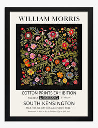
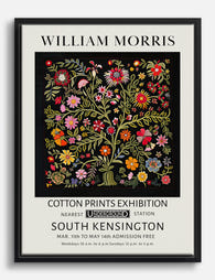
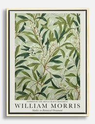
Prodotti Fab presentati in questo blog
-

Poster motivo botanico ispirato a William Morris
Translation missing: it.products.product.sale_price A partire da CHF 16.00CHF 22.00 -

Poster botanico in stile William Morris
Translation missing: it.products.product.sale_price A partire da CHF 16.00CHF 22.00 -

Tela uccelli e motivi botanici in stile William Morris
Translation missing: it.products.product.sale_price A partire da CHF 61.00CHF 87.00 -
Poster floreale in stile William Morris
Translation missing: it.products.product.sale_price A partire da CHF 16.00CHF 22.00 -

Tela fiori botanici stile William Morris
Translation missing: it.products.product.sale_price A partire da CHF 61.00CHF 87.00 -

Poster fioritura botanica di William Morris
Translation missing: it.products.product.sale_price A partire da CHF 16.00CHF 22.00 -

Poster botanico ispirato a William Morris
Translation missing: it.products.product.sale_price A partire da CHF 16.00CHF 22.00 -

Poster floreale ispirato a William Morris
Translation missing: it.products.product.sale_price A partire da CHF 16.00CHF 22.00 -

Poster floreale rosa ispirato a William Morris
Translation missing: it.products.product.sale_price A partire da CHF 16.00CHF 22.00 -

Poster farfalla con motivi botanici ispirato a William Morris
Translation missing: it.products.product.sale_price A partire da CHF 16.00CHF 22.00 -

Tela fiori botanici ispirata a William Morris
Translation missing: it.products.product.sale_price A partire da CHF 61.00CHF 87.00 -

Poster floreale blu e bianco ispirato a William Morris
Translation missing: it.products.product.sale_price A partire da CHF 16.00CHF 22.00 -

Tela botanica elegante di Morris
Translation missing: it.products.product.sale_price A partire da CHF 61.00CHF 87.00 -
Tela floreale ispirata a William Morris
Translation missing: it.products.product.sale_price A partire da CHF 61.00CHF 87.00 -
Tela foglie botaniche di William Morris
Translation missing: it.products.product.sale_price A partire da CHF 61.00CHF 87.00 -

Tela con motivo floreale in stile William Morris
Translation missing: it.products.product.sale_price A partire da CHF 61.00CHF 87.00 -

Poster botanico con uccelli, ispirato a William Morris
Translation missing: it.products.product.sale_price A partire da CHF 16.00CHF 22.00 -

Poster motivi botanici rossi in stile William Morris
Translation missing: it.products.product.sale_price A partire da CHF 16.00CHF 22.00 -

Poster botanico con uccellino in stile William Morris
Translation missing: it.products.product.sale_price A partire da CHF 16.00CHF 22.00 -

Poster vaso botanico William Morris
Translation missing: it.products.product.sale_price A partire da CHF 16.00CHF 22.00


Di più da The Frame

Art for White Walls: The Hardest Wall to Dress
Everyone tells you white walls are easy. They're not. A white wall hides nothing: every proportion mistake, every cheap frame, every clashing undertone gets magnified because there's no colour to...

Art for Pink Walls
Pink walls are the most misunderstood backdrop in interiors. People assume they're tricky, twee, or only for nurseries, when in fact pink is one of the most flattering colours you...

Art for Blue Walls: Sage, Navy, and Powder
Blue walls are one of the most rewarding paint decisions you can make, and one of the trickiest to style. Navy swallows light, powder blue can wash out, and sage...