
 Ordina oggi, consegna il
 Stars, Moons and Meadows: William Morris's Fascination with the Night Sky
How a Victorian designer's medieval obsessions and night-time wanderings shaped the celestial pattern revival on your wall in 2026.


Walk into any homeware shop today and you'll spot them: deep indigo prints scattered with stars, moons cradled in twisting foliage, all signed off as "William Morris" or "Morris-inspired". The truth behind these designs is more interesting than the labels suggest. Morris himself rarely drew an explicit night sky, yet his medieval scholarship, his nature worship and his collaborators left a celestial thread running through his entire body of work.
Morris and the natural world: the foundation of everything he designed
Morris built his career on a single conviction: that good design begins with patient, devoted observation of the living world. He wandered the meadows around Kelmscott Manor in the Cotswolds, sketched the willows along the Thames, watched thrushes raid his strawberry beds, and turned every detail into pattern. Strawberry Thief, Willow Boughs, Trellis, Pimpernel: these are not abstractions but transcriptions of things he had stood very close to.
This was a moral position as much as an aesthetic one. The Industrial Revolution was flattening English craftsmanship into machine-made sameness, and Morris saw nature as the antidote. Pattern, he argued, should remind us of the world we belong to. A wallpaper was not decoration. It was a daily, domestic encounter with growth, weather and time.
That philosophy is the key to understanding why celestial imagery sits so naturally inside the Morris universe. The night sky is simply nature seen after dark. The same hawthorn hedge, the same pond, the same Cotswold field, but lit by moon rather than sun. Once you frame it that way, the leap from meadow to firmament becomes very small indeed.

The night sky in Morris's pattern language
Morris's own catalogue contains plenty of moonlit suggestion, even where he doesn't draw the moon itself. Look at the deep midnight blues of Brother Rabbit, the inky grounds of Indian Diaper, or the way Blackthorn rises out of darkness with its blossoms glowing pale. These are nocturnal patterns. The flora is real, but the palette places you outside on a still, cold evening.
His pattern language has three habits that translate beautifully to celestial work. First, flat decorative space: he refused Victorian realism and kept everything pressed into the picture plane, which is exactly how stars and moons read best on a wall. Second, rhythmic repetition: leaves, berries, birds and (later) stars all behave like beats in a piece of music. Third, an undercurrent of motion, as if a small wind is passing through the design.
Apply those three habits to a moon and a scattering of stars among twisting stems, and you get something that feels unmistakably his, even if his hand never touched the page. That is the foundation of every modern interpretation in our William Morris collection.
Arts and Crafts meets astronomy: the Victorian context
The 1870s and 1880s were a curious moment for the English imagination. Public observatories were opening, popular astronomy books were bestsellers, and Gothic Revival architects were tucking zodiac motifs into church ceilings. Ruskin, Morris's great intellectual influence, wrote about the heavens with religious fervour and urged designers to look up as well as down.
Crucially, the Arts and Crafts movement was steeped in medievalism, and medieval art was unembarrassed about astronomical symbolism. Illuminated manuscripts personified the planets, embedded zodiac wheels in calendar pages, and used stars as a shorthand for the divine. When Morris and his circle reached back to the Middle Ages for inspiration, they reached back to that visual vocabulary too.
This is why "arts and crafts movement night sky designs" feel so coherent as a category, even though no single designer set out to invent one. The movement collectively rejected industrial realism in favour of symbolic, spiritual, decorative imagery, and the night sky was already loaded with all three qualities.
Burne-Jones and the Stars and Planets series
The most important celestial project to come out of Morris & Co. wasn't drawn by Morris at all. In 1878, his lifelong friend Edward Burne-Jones designed a stained glass series called Stars and Planets, drawing on the medieval astronomy text De Sphaera Mundi. Each panel personified a celestial body as a robed figure carrying its astronomical attribute.
Morris's role was producer, colourist and manufacturer. The firm's workshop translated Burne-Jones's drawings into glass, choosing the leading, the stains and the placement. It was a true collaboration, and it explains why so many "William Morris stars" online are really the Morris & Co. studio working with Burne-Jones. Calling those designs Morris's is shorthand at best, but the studio's fingerprints are genuinely on them.

What inspired Morris's designs, and how the night sky fits the bigger picture
Morris drew from four wells, and the night sky touches all of them.
Medieval manuscripts. Morris was an obsessive collector of illuminated books. His library catalogue records a copy of Astronomia from around 1470 to 1480, alongside herbals, bestiaries and books of hours. These manuscripts taught him that pattern, text and symbolism could share a page without competing. They also gave him a steady diet of stylised suns, moons and stars rendered in lapis blue and burnished gold.
Direct nature observation. The garden at Kelmscott was his daily reference library, but so was the Oxfordshire sky above it. In the 1870s, rural England was still pre-electric. The Milky Way was visible from his back door, owls were audible all night, and the moon genuinely lit your walk home. That sensory environment is the unspoken backdrop to his pattern work.
Norse and Arthurian literature. Morris's epic poem The Story of Sigurd the Volsung treats the sun and moon as active mythological characters. His translations of Icelandic sagas are full of star-omens and night journeys. The same imagination that produced those stanzas produced his designs: there is no firewall between Morris the poet and Morris the pattern-maker.
The dignity of craft. Above all, Morris believed handmade work carried a spiritual charge that machines could not replicate. Celestial imagery, with its associations of awe, mystery and the sacred, sits very comfortably inside that worldview.
This is the real meaning of william morris astronomy inspiration: not that he produced a star chart, but that his entire creative life was shaped by sources in which the night sky was central.
Why Morris's celestial prints feel modern
There is a reason these designs are everywhere in 2026. Cottagecore restored the appetite for hedgerows and embroidered linens. Dark academia added candlelight, libraries and a touch of melancholy. Both aesthetics share a longing for slowness, mystery and intellectual romance, which is precisely what Morris and his circle were already chasing in the 1880s.
The visual logic carries across cleanly. A Morris-style celestial print gives you:
- Pattern density without chaos. The repetition is calming, not busy.
- Deep, saturated grounds. Indigo, midnight, forest green and oxblood ground the room.
- A handmade quality. Linework that feels drawn rather than rendered.
- Symbolic warmth. Stars and moons carry meaning without needing explanation.
Compared to a clean botanical like Willow Boughs, a celestial Morris print feels more emotional, more atmospheric, more night-time. It pairs differently with a room. Where Strawberry Thief makes a kitchen feel like a country garden, a moon-and-foliage print makes a bedroom feel like a chapter from a novel.
If you want to widen your reference points, our broader celestial art prints collection and nature art prints collection sit either side of this aesthetic and help you see where Morris-style work fits between them.

How to choose a William Morris night sky print for your space
A few honest things to know before you buy.
Match the depth of the print to the depth of the room
Morris-style celestial designs almost always have a dark ground. They look spectacular against deep walls (think Farrow and Ball Hague Blue, Inchyra Blue, Studio Green) but they can also anchor a pale room beautifully if you commit to a larger size. What doesn't work is a small dark print floating on a large white wall. It looks marooned. Either go bigger or pick a paler-ground version.
Size by furniture, not by wall
The most reliable rule we use: your art should be roughly two-thirds the width of the furniture beneath it. Above a 180cm sofa, a 100x70cm or 70x100cm print does the work. Above a bedside table or a chest of drawers, 50x70cm sits more naturally. Above a fireplace, scale to the mantel rather than the chimney breast.
Framed or unframed
Morris-style work tends to look better framed. The pattern is detailed, the colours are saturated, and a slim black or natural oak frame gives the eye a place to rest. Our framed art prints are made with solid FSC-certified wood, no MDF or veneer, and a UV-protective acrylic glaze rather than glass. The acrylic matters more than people realise: museum-quality giclée inks already last hundreds of years, and the UV layer keeps colours true even on a sunny south-facing wall.
If you prefer the softer, more textural look of canvas, the same designs work well stretched. Canvas is lighter, copes better with humid rooms like bathrooms or kitchens, and gives the print a slightly more handmade quality. The trade-off is that fine linework reads slightly less crisply than on matte paper.
Authenticity: Morris, Morris & Co., or Morris-inspired
Worth knowing what you're actually buying. A genuine Morris design is one he drew himself, like Strawberry Thief or Pimpernel. A Morris & Co. design might be by Burne-Jones, May Morris or another studio collaborator working under the firm's direction. A Morris-inspired design is a contemporary artist working in his visual language. All three are legitimate, but the price and the provenance differ. We label our prints honestly so you know which is which.
Our favourite Morris night sky prints and the rooms they suit best
A few combinations we keep coming back to.
Bedrooms. This is the natural home for celestial prints. A 70x100cm framed moon-and-foliage design above the headboard, ideally on a deep painted wall, gives a bedroom genuine atmosphere. Pair with linen bedding in oatmeal or sage and a single warm bedside lamp. Avoid hanging anything too busy on the opposite wall; let the celestial piece be the room's quiet centre.
Reading corners and home libraries. Stack two smaller prints, 40x50cm or 50x70cm, vertically beside a wingback chair or a tall bookcase. A sun motif above a moon motif is a nice rhythm. Brass picture lights, if you can stretch to them, make the gold tones in the print sing after dark.
Hallways and stair walls. A long vertical Morris-style print works hard in a narrow space. Choose a design with strong rising stems and you'll draw the eye upward, which makes a tight hallway feel taller. Frame in natural oak to soften the darkness of the print.
Lounges. Go large, or go in a pair. A single 100x150cm canvas behind a sofa makes a serious statement, especially in a room with otherwise restrained colour. If the room is symmetrical, two matching 60x80cm framed prints either side of a fireplace or window read as architecture rather than decoration.
Bathrooms. Counter-intuitive but rewarding. A canvas Morris-style print in a windowless bathroom, paired with a deep green or oxblood wall, transforms the space into something like a Victorian dressing room. Canvas handles the humidity better than paper here.
You can browse the curated edit at our William Morris night sky collection, which groups the strongest celestial designs together by palette and scale.

Where to take it from here
If you only remember one thing, make it this: Morris's celestial work isn't a side project, it's the logical extension of everything he believed about pattern, nature and the medieval imagination. Choose a print whose ground colour you'd happily paint a wall in, scale it to the furniture beneath it, and frame it properly. Get those three things right and a Morris night sky print will outlast every passing trend that brought you to it.

Prodotti Fab presentati in questo blog
-
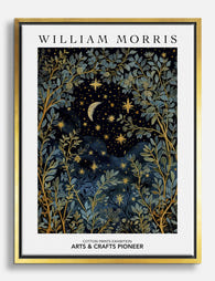
Tela cielo notturno di William Morris
Translation missing: it.products.product.sale_price A partire da CHF 61.00CHF 87.00 -

Poster William Morris paesaggio notturno
Translation missing: it.products.product.sale_price A partire da CHF 16.00CHF 22.00 -

Poster notte al chiaro di luna di William Morris
Translation missing: it.products.product.sale_price A partire da CHF 16.00CHF 22.00 -

Poster sogni celesti di William Morris
Translation missing: it.products.product.sale_price A partire da CHF 16.00CHF 22.00 -
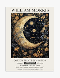
Poster luna e stelle in stile William Morris
Translation missing: it.products.product.sale_price A partire da CHF 16.00CHF 22.00 -

Tela luna celestiale in stile William Morris
Translation missing: it.products.product.sale_price A partire da CHF 61.00CHF 87.00 -
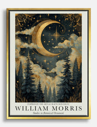
Tela notte al chiaro di luna in stile William Morris
Translation missing: it.products.product.sale_price A partire da CHF 61.00CHF 87.00 -

Poster botanico al chiaro di luna ispirato a William Morris
Translation missing: it.products.product.sale_price A partire da CHF 16.00CHF 22.00 -

Tela notte al chiaro di luna di William Morris
Translation missing: it.products.product.sale_price A partire da CHF 61.00CHF 87.00


Di più da The Frame

Why William Morris Prints Look Brilliant in Mod...
William Morris has been quietly miscategorised for decades. His patterns get filed under "country cottage" or "Arts and Crafts revival" and rarely escape, which is a shame because his tree...

Why Arts and Crafts Nature Prints Are the Antid...
The minimalism hangover: why bare walls stopped feeling calming For about a decade, the aspirational interior was a white box with one boucle chair in it. That look has officially...

Botanical Petal Art: Why Close-Up Prints Feel M...
Full florals have had a long run, and they're not going anywhere. But if you've noticed that the botanical art appearing in design magazines, boutique hotel lobbies, and the better-styled...