Art for Blue Walls: Sage, Navy, and Powder
Navy, sage, and powder behave like three different colours. Here's how to pick art that flatters each one.

Blue walls are one of the most rewarding paint decisions you can make, and one of the trickiest to style. Navy swallows light, powder blue can wash out, and sage blue sits in a strange middle space that confuses most decorating advice. This guide treats all three as distinct problems with distinct solutions.
First, work out which blue you actually have
Before you buy a single print, get clear on what's on your walls. Most "blue walls go with" advice fails because it assumes all blues behave the same. They don't.
Navy is deep, saturated, and absorbs light. Hold a sheet of white paper against the wall: if the wall reads almost black in shadow and richly indigo in sunlight, you have navy. Think Hague Blue, Stiffkey Blue, or Railings.
Powder blue is pale, cool, and sits close to white on the colour wheel. In low light it can look almost grey. Test it the same way: against white paper, powder blue will look distinctly blue but soft, never dramatic. Think Borrowed Light, Parma Gray's lighter cousins, or anything described as "duck egg adjacent."
Sage blue is the one people get wrong. It's a muted, grey-green-blue, sometimes called "smoke blue" or "blue-grey." Hold a true grey swatch next to it and you'll see a green undertone. Hold a green swatch next to it and you'll see blue. It behaves more like a neutral than a colour, which changes everything about how art reads on it.
Once you know which shade you're working with, the art choices fall into place.

Art for navy walls
Navy is the easiest blue to style and the easiest to get wrong. It reads as a neutral in interiors terms, which means almost any palette will work, but the contrast level you choose makes or breaks the result.
The contrast rule
On navy walls, anything mid-toned disappears. A dusty pink print, a muted olive landscape, a grey abstract: they all sink into the wall and look murky. Navy needs either high contrast (cream, white, pale ochre, blush) or genuinely rich, saturated colour (burnt orange, deep emerald, mustard).
The mistake most people make is choosing art that's "in the same family" as their walls. A moody blue print on a navy wall looks like a smudge from across the room. Push away from the wall colour, not towards it.
Gold and brass, done properly
Yes, gold works on navy. But there's a difference between gold that looks elegant and gold that looks like a hotel lobby. The trick is to use brass tones in the artwork itself (a still life with brass objects, an art deco print with warm metallic ink, a botanical illustration with gilded accents) rather than relying entirely on a gold frame to do the work.
If you do go for a gold frame, pick brushed or antique brass over high-polish gold. High-polish reads cheap against deep navy because it bounces too much light. Brushed brass holds its own.
What actually works
Cream and ivory prints look incredible on navy. Botanical illustrations with white backgrounds, classic figure drawings, vintage maps, and architectural prints all give you that crisp gallery-wall feeling. For something with more colour, lean into terracotta, rust, mustard, and warm pinks. The warmth pulls navy out of feeling cold or formal.
Coastal art on navy can feel obvious, almost on-the-nose. If you love the look, balance it with something unexpected (an abstract, a portrait) so the room doesn't tip into theme territory. Browse abstract art prints for pieces that bring colour and movement without leaning nautical.
Frame choice on navy
Black frames disappear into navy walls, which is sometimes what you want (the art floats) and sometimes flattens the whole composition. White frames create the strongest contrast and work brilliantly for graphic or minimalist prints. Natural oak warms navy up and is the most forgiving option if you're nervous about getting it wrong.
Art for sage blue walls
Sage blue is the most flexible of the three and the most often misunderstood. Because of its green undertone, it sits comfortably next to organic, earthy palettes that would look fussy on true blue walls.
Lean into the natural undertone
Sage blue loves botanical prints, landscape photography, and anything with organic forms. Terracotta, rust, and warm ochre are the standout pairings, much more so than on navy. The green undertone in sage blue picks up reddish-orange tones and makes them sing.
Black-and-white photography also works beautifully on sage blue, particularly landscape and architectural shots. The wall's softness keeps high-contrast work from feeling stark.

What to avoid
Anything in the same blue-grey-green family will get lost. A sage green print on sage blue walls is a recipe for visual mush. Equally, pure cool blues fight with the green undertone. If you want blue in the artwork, pick a warmer blue (think ultramarine or cobalt) rather than another muted shade.
Bright, saturated jewel tones can also feel out of step with sage blue's quietness. The wall is asking for something equally considered.
Frame choice on sage blue
Natural wood frames (oak, ash, walnut) are made for sage blue. They share the same earthy, slightly muted quality and pull the whole composition together. Black frames create elegant definition without feeling harsh. Avoid white frames here unless the art itself is very minimal: white can look clinical against sage blue's softness.
A framed botanical or landscape print on sage blue is one of those combinations that looks effortlessly considered. The botanical art prints collection is a good starting point if you want to lean into that natural, organic feel.
Art for powder blue walls
Powder blue is the trickiest of the three. It's pale enough that low-contrast art vanishes, but it's also a colour with personality (unlike pure white), which means art needs to acknowledge it.
The visibility problem
Pale art on powder blue walls is a common disaster. A delicate watercolour, a soft pastel abstract, a pale beige photograph: they all dissolve into the wall. Powder blue needs art with definition, even if the overall palette is soft.
The fix is to look for prints with a clear focal point, strong line work, or at least one area of saturated colour or deep tone. The art doesn't have to be loud, it just has to hold its shape.
Palettes that flatter powder blue
White and cream feel obvious but actually need careful handling. Pure white art on powder blue walls can feel sterile, like a dentist's surgery. Warm whites, creams, and bone tones are much better. Pair them with warm wood tones in the room and the whole scheme softens.
Navy and powder blue together is a classic, slightly preppy combination that works if you don't overdo it. A navy-heavy print on a powder blue wall creates the contrast that powder blue craves without breaking the colour story.
For something more unexpected, try blush pink, warm coral, or soft burgundy. Powder blue and warm pinks are an underrated combination that feels modern rather than nursery-ish, provided the pink leans toward terracotta rather than bubblegum.
Art styles that suit powder blue
Airy abstracts work well, particularly those with bold gestural marks or clear compositional structure. Line drawings and minimalist figure studies look elegant. Architectural photography, particularly with strong geometry, gives powder blue the structure it needs.
Coastal art is the obvious choice and often the wrong one. Powder blue walls plus pale beach scenes equals a room that looks washed out from across the hall. If you want coastal, go for something with strong horizon lines and saturated colour, not soft seascapes.
Frame choice on powder blue
Black frames are your friend on powder blue. They create the definition the wall lacks and make the art feel intentional. Dark walnut works similarly. White frames blend into powder blue and should usually be avoided unless the art itself is high-contrast.

Lighting changes everything
How a room is lit transforms how art reads on blue walls, and this gets ignored in most styling advice.
Navy walls in low light can feel oppressive. Choose art with luminous or warm tones to lift the space. Avoid art with large dark areas: the print and wall will merge into a single dark mass after sunset.
Sage blue in natural light shifts noticeably through the day. In morning light it looks more green, in evening light more grey-blue. Test any art at multiple times of day if you can. The reliable rule: pick art that works in the lighting condition you use the room most.
Powder blue in artificial light can turn flat and slightly grey, particularly under warm yellow bulbs. If your room is mostly used in the evening, lean into art that brings its own warmth (terracotta, ochre, warm wood frames) rather than relying on the walls to feel inviting.
The UV-protective acrylic glaze on framed prints means you don't have to worry about positioning art away from sunny windows, which gives you more flexibility on south-facing walls where light is strongest.
Gallery walls on coloured backgrounds
Gallery walls behave differently on coloured walls than on white. On white, frames provide the structure. On blue walls, the wall itself is doing visual work, which means your gallery wall needs to be more disciplined.
Keep frames consistent. A mix of frame colours that would look eclectic on white walls looks chaotic on navy or sage. Pick one frame finish and stick to it across the whole arrangement.
Tighten the spacing. Frames hung 5-7cm apart read as a single composition, which is what you want when the wall is competing for attention. Wide spacing (10cm+) makes the wall dominate and the art feel scattered.
Consider visual weight across the whole arrangement. On a coloured wall, a few darker or higher-contrast pieces anchor the composition. If everything is pale and delicate, the wall takes over.
For dramatic walls like deep navy, a single oversized framed print often beats a gallery wall. A 70x100cm print framed in oak or brushed brass creates a moment. Multiple smaller pieces can feel busy against an already-rich background. Have a look at large art prints if you're considering a single statement piece.
Canvas or framed: what works on blue
The question of canvas versus framed print matters more on blue walls than on neutrals.
Framed prints with matte paper and a proper frame look polished and considered, which suits deeper walls like navy. The matte finish has no glare, so colours read true even in bright rooms. A framed print on navy looks intentional in a way that an unframed canvas sometimes doesn't.
Canvas prints have a softer, more casual quality. They work brilliantly on sage blue, where the matte canvas texture echoes the wall's organic feel. Canvas is also lighter and a sensible choice for humid rooms (bathrooms, kitchens) where moisture might warp framed pieces over time.
On powder blue, framed prints almost always win. The crisp edges of a frame give powder blue the definition it needs. Canvas can feel too soft against an already-soft wall.

Mistakes to avoid on any blue wall
Matching too closely. Blue art on blue walls almost never works. You're aiming for harmony, not camouflage.
Going too small. A 30x40cm print on a statement blue wall looks lost. Size up. On feature walls, 60x80cm is a sensible minimum, 70x100cm or larger for above a sofa or bed.
Ignoring undertones. Sage blue with cool-toned art looks off. Navy with muddy mid-tones looks dull. Powder blue with pale art disappears. Always check that the temperature of the art (warm or cool) is doing something deliberate against the wall.
Forgetting the rest of the room. Art doesn't exist in isolation. The colours in your furniture, rug, and curtains should connect to the art, not just the wall. If your sofa is mustard and your rug is terracotta, your art should reference at least one of those.
What to do next
Stand in your room at the time of day you use it most. Look at the wall. Decide what's missing: warmth, contrast, structure, or colour. Then choose art that delivers exactly that, in a size that holds the wall.
Blue walls aren't difficult to decorate. They just punish lazy choices. Get specific about the shade, specific about the palette, and specific about the contrast level, and the rest takes care of itself.

Prodotti Fab presentati in questo blog
-

Poster astratto d'impatto verde salvia, nero e bianco crema
Translation missing: it.products.product.sale_price A partire da €16,95€23,95 -

Poster sfumature di blu e bianco
Translation missing: it.products.product.sale_price A partire da €16,95€23,95 -

Poster albero blu effetto acquerello
Translation missing: it.products.product.sale_price A partire da €16,95€23,95 -

Tela astratta verde salvia con tratti neri e bianco crema
Translation missing: it.products.product.sale_price A partire da €64,95€92,95 -

Poster Sky Blue di Kandinsky
Translation missing: it.products.product.sale_price A partire da €16,95€23,95 -

Poster minimalista curva blu intenso
Translation missing: it.products.product.sale_price A partire da €16,95€23,95 -

Poster ritratto astratto in blu intenso
Translation missing: it.products.product.sale_price A partire da €16,95€23,95 -

Poster nuvola su cielo blu
Translation missing: it.products.product.sale_price A partire da €16,95€23,95 -

Poster linee intrecciate blu
Translation missing: it.products.product.sale_price A partire da €16,95€23,95 -

Poster cavallo blu lunare con motivi botanici dorati
Translation missing: it.products.product.sale_price A partire da €16,95€23,95 -

Tela sfumature di blu e bianco
Translation missing: it.products.product.sale_price A partire da €64,95€92,95 -
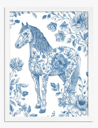
Poster cavallo elegante tra fiori blu
Translation missing: it.products.product.sale_price A partire da €16,95€23,95 -
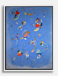
Tela Sky Blue di Kandinsky
Translation missing: it.products.product.sale_price A partire da €64,95€92,95 -

Tela sogno in rosa cipria
Translation missing: it.products.product.sale_price A partire da €64,95€92,95 -

Poster nuvola nel cielo azzurro
Translation missing: it.products.product.sale_price A partire da €16,95€23,95 -

Poster botanico blu intenso dal fascino d'epoca
Translation missing: it.products.product.sale_price A partire da €16,95€23,95 -

Poster La finestra blu di Henri Matisse
Translation missing: it.products.product.sale_price A partire da €16,95€23,95 -

Poster Sky Blue di Kandinsky
Translation missing: it.products.product.sale_price A partire da €16,95€23,95 -
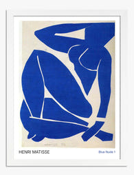
Poster nudo blu di Henri Matisse
Translation missing: it.products.product.sale_price A partire da €16,95€23,95 -

Poster chioma serena di foglie blu
Translation missing: it.products.product.sale_price A partire da €16,95€23,95


Di più da The Frame

Art for Pink Walls
Pink walls are the most misunderstood backdrop in interiors. People assume they're tricky, twee, or only for nurseries, when in fact pink is one of the most flattering colours you...

Art for Dark Walls: Going Bolder or Quieter
Dark walls are not a problem to solve. They are an opportunity that most people approach with one tired piece of advice: just add contrast. The truth is there are...

Art for Cool Neutral Walls: Greys and Off-Whites
Cool neutrals aren't a design problem to solve. They're a deliberate, considered backdrop that deserves art chosen with the same care that went into picking the paint. Most advice treats...