
 Ordina oggi, consegna il
 Arts and Crafts Botanical Art: Why Morris's Leaf Patterns Outlasted Every Trend
While trend-led wall art ages out in two seasons, Morris's leaf designs have stayed in style for 140 years.


Trends in wall art now turn over faster than ever. A pattern goes viral in spring, floods every feed by summer, and looks dated by Christmas. Morris's leaf designs, drawn in the 1880s, are still hanging in homes that have been redecorated half a dozen times around them.
That staying power isn't an accident. It's the result of a design philosophy built specifically to resist disposability, and it explains why William Morris leaf prints keep finding new audiences with every generation.
The Arts and Crafts promise: beauty through nature, not machines
The Arts and Crafts movement was, at its core, a backlash. Victorian Britain was knee-deep in mass-produced ornament: cheap factory wallpaper, machine-stamped tin, gilt furniture that fell apart in five years. Morris and his contemporaries looked at all of it and decided the solution was honest materials, skilled hands, and patterns drawn directly from the natural world.
Morris said the famous line that still gets quoted in every interior design book: have nothing in your house that you do not know to be useful, or believe to be beautiful. What's less often quoted is the philosophy underneath it. He believed beauty in the home should come from observation of nature, not from imitation of nature. A leaf wasn't a thing to copy photographically. It was a thing to study, understand, and translate into pattern.
That distinction matters. Arts and crafts movement botanical art isn't trying to fool you into thinking there's a real fern on your wall. It's giving you the rhythm, structure, and life of a plant, distilled into something flatter, more graphic, and infinitely more wallpaper-able than a photograph ever could be.

Why botanical art from the 1880s looks perfect in a 2024 home
There's a specific reason Morris feels right in contemporary interiors, and it's not just nostalgia. The dominant design moods of the last few years (warm minimalism, quiet luxury, the British country house revival, biophilic design) all share the same underlying brief: bring nature in, slow things down, choose objects that look made rather than manufactured.
Morris was solving for that brief 140 years ago. His patterns are essentially the original biophilic design. They take leaves, vines, fruit and birds and arrange them into something rhythmic enough to calm a busy room and detailed enough to reward a long second look.
Compare that to a typical modern botanical print: a single pressed leaf on a white background, photographed at high resolution, printed flat. It's clean, it's pretty, it works in a hallway. But it's also forgettable, and it doesn't do much for a wall beyond filling it. A Morris pattern fills a wall the way a piece of music fills a room. There's structure, repetition, and depth.
This is why you'll see Morris turning up in spaces that have nothing to do with cottagecore: minimalist new builds, mid-century lounges, even industrial flats with concrete floors. The patterns are confident enough to hold their own against modern furniture, and quiet enough not to fight it.
Morris vs modern botanical prints: what makes his leaf designs different
If you put a Morris leaf print next to a contemporary botanical illustration, the differences are immediate. Worth understanding what you're actually looking at.
Stylisation, not photorealism
Modern botanical prints tend toward photorealistic accuracy: every vein on the leaf, every shadow, every imperfection. William morris leaf designs do the opposite. The leaves are simplified into shapes, the veins become rhythmic lines, the colour fields are flat. It's closer to a Japanese woodblock than to a botanical encyclopedia, which is exactly what Morris was looking at when he developed his style.
Geometric order underneath the chaos
A Morris pattern looks at first like a tangle of leaves and stems. Look longer and you see the underlying grid: every motif sits on a hidden geometric framework, usually a diagonal lattice or a turnover repeat. This is why his patterns feel calming rather than chaotic. Your brain registers the order before it consciously notices it.
Flatness as a feature
Morris designed for textile and wallpaper, not for framed display. That meant flat colour, no shading, no fake dimensionality. Modern botanical prints often try to look three-dimensional, with watercolour washes and hyper-detailed shadows. The flatness of a Morris print is what makes it sit so well in a contemporary room: it reads as graphic art, not as a fussy Victorian illustration.
Density
Morris filled the page. There's no negative space in Willow Bough, no resting white margin in Acanthus. That density is what makes a single Morris print feel like a whole feature wall, even at 50x70cm.

The colours that last: how Morris's palette maps to today's interiors
Morris's colours come from natural dyes: indigo, madder, weld, walnut. He famously brought back vegetable dyeing when the Victorian world was getting drunk on aniline chemicals that produced eye-searing magentas and acid greens. The palette he ended up with was earthy, slightly muted, and remarkably modern.
Run down the dominant colours of his leaf and botanical work:
- Sage and olive greens that read as soft and grounded rather than bright
- Indigo and ink blues, deep but never navy
- Madder reds and terracotta, warm and earthy
- Mustard and ochre yellows, drawn from weld and walnut
- Soft cream and bone backgrounds, never stark white
If that list sounds familiar, it's because it's almost identical to the palette dominating interior design for the last three or four years. Earthy greens have been everywhere from kitchen cabinetry to sofas. Warm terracottas and ochres are the defining tones of the quiet luxury moment. Deep indigo has replaced the cool greys of the 2010s. Morris's palette is the palette right now.
This is also why Morris works in such different spaces. Drop a Willow Bough print into a sage-painted lounge and the print disappears into the room as part of a tonal scheme. Hang the same print on a clean white wall in a minimalist flat and the colours pop forward as the room's only real warmth. The palette is broad enough to be styled multiple ways without ever feeling out of place.
For a wider sense of how this earthy, plant-based colour language reads across different artists and eras, the botanical art prints collection is a good place to compare.
Vintage feel, museum-grade quality: why reproduction matters
Here's the catch with Morris: the market is flooded with bad versions. Search his name online and you'll find low-resolution scans printed on flimsy paper, AI-generated approximations that get the patterns subtly wrong, and frames that arrive separately from the print and warp within a year.
A good reproduction matters more with Morris than with almost any other artist, because his work depends on details that cheap printing destroys.
What to look for
Paper weight and finish. Morris's flat colour fields show every flaw in cheap paper. Thin, glossy stock makes the colours look plasticky and the pattern look pixelated. A heavy matte paper, the kind you'd see in a museum frame, lets the ink sit properly and gives you that subtle, slightly soft quality that Morris's original work had on textile.
Colour fidelity. The natural-dye palette is hard to print well. Mass-market prints often shift the greens too cool or the reds too orange, and the whole pattern starts to look synthetic. Giclée printing using archival inks is what gets the colours right and keeps them right for decades, not months.
Print resolution. Morris's patterns are full of fine line work. Stems, veins, the tiny dots that fill background spaces. Anything under museum-grade resolution loses these and the pattern flattens into something muddier than Morris ever intended.
Frame construction. This is where most Morris reproductions fall apart, literally. Frames made from MDF or veneer warp, especially in humid rooms. Frames that ship separately from the print arrive with everything loose and rattling, and you spend an evening trying to fit a print into a frame it wasn't measured for.
The Fab approach is to print on thick matte paper using museum-grade giclée, frame in solid FSC-certified wood, fit the print properly at our end, and ship the whole thing in one box ready to hang. The acrylic glaze is UV-protective, which matters for Morris specifically because those natural-pigment colours are exactly the kind that fade in sunlight if they're not protected.
If you want to see how reproduction quality changes the way an old design reads on a wall, the broader vintage art prints collection is worth a look. The difference between a print that respects the original and one that just copies it is immediate.

Three ways to style Arts and Crafts leaf prints in a contemporary room
Morris gets typecast as cottage-core, but the patterns are far more flexible than that reputation suggests. Three approaches that work particularly well in current interiors.
1. Morris in a minimalist room
The instinct is to keep Morris out of clean, pared-back spaces because the patterns feel busy. The opposite is true: a single large Morris print in a minimalist room becomes the entire visual centre of the space. One framed Acanthus or Willow Bough at 70x100cm above a low sofa, plain walls, no other art, gives a room everything it needs.
Stick to one print, go large, and let the density of the pattern do the work. Pair with raw oak, off-white linen, and matte black hardware. The flatness of Morris's style works beautifully here because it doesn't fight the architectural cleanness of the room.
2. Morris in an eclectic maximalist room
The other extreme: layer Morris into a room already full of texture, colour and pattern. The reason it works is that Morris patterns have that hidden geometric order underneath the visual richness. They anchor a busy room rather than adding to the chaos.
Try a Morris leaf print over a velvet sofa in burnt orange, surrounded by mismatched cushions, a vintage rug, and a mantelpiece full of objects. The print pulls all the colours together because the palette includes most of them already. A gallery wall mixing Morris with abstract modern prints, line drawings, and small ceramics also works exceptionally well, and exploits the contrast between his stylised patterns and looser contemporary pieces.
3. Morris in a mid-century or industrial space
This is the surprising one. Morris and mid-century modern share more than people realise: both prize honest materials, simple silhouettes, and an emphasis on craft. Hang a framed Morris leaf print above a teak sideboard with brass legs and the combination feels considered, not contradictory.
In a more industrial space (exposed brick, concrete floors, black metal shelving), Morris brings the warmth and softness the architecture is missing. Frame in solid wood with a deep moulding to match the structural elements, and let the print be the only soft thing in the room.
Across all three, the patterns worth knowing beyond the famous ones are Acanthus (large-scale, sculptural leaves, brilliant as a single statement piece), Fruit/Pomegranate (denser, warmer, works in dining rooms), and Larkspur (more delicate, good in bedrooms). The full William Morris art prints range goes well past Strawberry Thief.

The case for buying once
The honest economics of trend-led wall art: a print bought because it's having a moment usually has a useful life of two to three years before it starts to feel dated. Replace a few of those across a home over a decade and you've spent more, sent more to landfill, and ended up with walls that have never quite settled.
A Morris print bought now will look exactly as good in 2034 as it does today, for the same reason it looks as good now as it did in 1884. The design isn't tied to a moment. It's tied to leaves, which haven't gone out of fashion in a few hundred million years.
If you're going to put something on your wall, put something there that isn't trying to keep up.

Prodotti Fab presentati in questo blog
-

Poster foglie botaniche William Morris
Translation missing: it.products.product.sale_price A partire da €16,95€23,95 -

Poster motivo botanico ispirato a William Morris
Translation missing: it.products.product.sale_price A partire da €16,95€23,95 -

Poster foglie botaniche in stile William Morris
Translation missing: it.products.product.sale_price A partire da €16,95€23,95 -

Poster vaso botanico William Morris
Translation missing: it.products.product.sale_price A partire da €16,95€23,95 -

Poster botanico a foglie verdi stile William Morris
Translation missing: it.products.product.sale_price A partire da €16,95€23,95 -

Tela foglie botaniche ispirata a William Morris
Translation missing: it.products.product.sale_price A partire da €65,95€92,95 -

Poster vaso botanico ispirato a William Morris
Translation missing: it.products.product.sale_price A partire da €16,95€23,95 -

Poster botanico verde di Morris
Translation missing: it.products.product.sale_price A partire da €16,95€23,95 -

Poster botanico in stile William Morris
Translation missing: it.products.product.sale_price A partire da €16,95€23,95 -
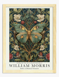
Poster botanico con farfalla ispirato a William Morris
Translation missing: it.products.product.sale_price A partire da €16,95€23,95 -

Poster botanico con uccelli ispirato a William Morris
Translation missing: it.products.product.sale_price A partire da €16,95€23,95 -

Poster botanico ispirato a William Morris
Translation missing: it.products.product.sale_price A partire da €16,95€23,95 -
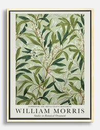
Tela foglie botaniche di William Morris
Translation missing: it.products.product.sale_price A partire da €65,95€92,95 -

Poster botanico autunnale in stile William Morris
Translation missing: it.products.product.sale_price A partire da €16,95€23,95 -
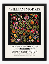
Poster floreale in stile William Morris
Translation missing: it.products.product.sale_price A partire da €16,95€23,95 -

Poster botanico verde Morris, fascino vintage
Translation missing: it.products.product.sale_price A partire da €16,95€23,95 -

Poster fioritura botanica di William Morris
Translation missing: it.products.product.sale_price A partire da €16,95€23,95 -

Poster floreale ispirato a William Morris
Translation missing: it.products.product.sale_price A partire da €16,95€23,95 -

Tela con farfalla botanica ispirata a William Morris
Translation missing: it.products.product.sale_price A partire da €65,95€92,95 -

Poster farfalla con motivi botanici ispirato a William Morris
Translation missing: it.products.product.sale_price A partire da €16,95€23,95


Di più da The Frame

Why William Morris Prints Look Brilliant in Mod...
William Morris has been quietly miscategorised for decades. His patterns get filed under "country cottage" or "Arts and Crafts revival" and rarely escape, which is a shame because his tree...

Why Arts and Crafts Nature Prints Are the Antid...
The minimalism hangover: why bare walls stopped feeling calming For about a decade, the aspirational interior was a white box with one boucle chair in it. That look has officially...

Botanical Petal Art: Why Close-Up Prints Feel M...
Full florals have had a long run, and they're not going anywhere. But if you've noticed that the botanical art appearing in design magazines, boutique hotel lobbies, and the better-styled...