Klimt's Sunflower: Why This Quiet Painting Outshines Van Gogh's on Your Wall
Van Gogh gets the fame, but Klimt's lone sunflower is the one that actually belongs on your wall.

Mention sunflowers in art and almost everyone pictures the same thing: Van Gogh, yellow vase, yellow wall, yellow flowers. Klimt's Sunflower (1907) is the quieter cousin, and for most modern interiors it's the smarter choice. Here's why, and how to hang it properly.
Two artists, two sunflowers, two very different vibes
Van Gogh's sunflowers are cut, arranged, and sat in a vase against a bright wall. They're a still life, painted in thick, almost agitated brushstrokes, the whole canvas vibrating with yellow on yellow. Klimt's Sunflower is something else entirely: a single, towering plant rooted in a dark cottage garden, leaves spilling outward, the flower itself hovering near the top like a small sun against deep green foliage.
One is a bouquet on a table. The other is a living thing in a landscape. That distinction matters when you start thinking about which one belongs on your wall.
Van Gogh's compositions read warm, busy, and cheerful in a slightly frantic way. They suit cottage kitchens, farmhouse dining rooms, and interiors that already lean rustic and yellow-friendly. Klimt's painting reads cooler, more meditative, almost solemn. It carries the same Golden Phase sensibility as The Kiss, just without the literal gold leaf. There's a stillness to it that works in bedrooms, lounges, hallways, and rooms where you actually want to slow down.
If your home leans modern, Scandi, dark-walled, art-nouveau influenced, or just generally calm, this is your sunflower.

What makes Klimt's Sunflower composition so distinctive
The first thing to notice is that it's vertical. Klimt built the painting around a tall, triangular silhouette, narrow at the base where the stem emerges from a tangle of leaves and flowers, widening as the plant rises, then crowned by the bloom itself. The shape echoes a figure in a long dress, which is not an accident.
Art historians widely connect this painting to Emilie Flöge, Klimt's lifelong companion and the woman often described as the great love of his life. Flöge ran a fashion house in Vienna and designed loose, flowing reform dresses. Klimt called her his "love-struck fairy" in letters, and the leaves of this sunflower fan out in a way that genuinely recalls the silhouettes of her gowns. The painting is, in a quiet way, a portrait.
That gives the work an emotional register Van Gogh's bouquets don't have. There's a beautiful-yet-lonely quality to it, a single flower standing in its own light. It's romantic and a touch melancholic at the same time, which is exactly why it works in spaces meant for rest rather than activity.
Compositionally, the vertical triangle is also a gift for modern walls. It slots neatly between two windows, above a console table, beside a doorway, or in any narrow stretch of wall where a horizontal still life would feel awkward. You can find more of his nature studies in our Klimt plants and flowers collection, and they share this same upright, garden-rooted sensibility.
The colour breakdown: deep greens, golds, and how they play with room tones
The palette is what really sets this painting apart from Van Gogh's, and it's where the case for modern interiors becomes obvious.
The background. A dense, dark forest green made up of countless smaller leaves and flowers. This is the part most reproductions struggle with, because if the printing flattens those greens into a single block, you lose the entire painting. Done well, it reads as depth and shadow.
The leaves. Blue-green and sage, layered with cooler grey-greens lower down. These are the tones that make Klimt's Sunflower so easy to live with. They're the same greens that appear in trending paint colours right now: dusty sage, deep olive, forest green, eucalyptus.
The flower itself. Warm yellow at the petals, deepening to a dark brown-black centre, with occasional touches of ochre and gold catching the light. It's not the screaming chrome yellow of Van Gogh. It's softer, almost dusty, closer to old gold.
The accents. Tiny scatterings of red, white, and pink wildflowers around the base, almost hidden until you look closely. These are the details that justify investing in a print with proper detail resolution.
Put this palette against a warm white wall and it looks elegant. Put it against a sage green or deep teal wall and it looks like the painting has finally come home. Against a soft terracotta or clay wall, the yellow centre lifts and glows. The only walls it genuinely fights with are bright cool blues and saturated pinks. Everything else, it gets along with.
Best rooms and wall colours for a Klimt Sunflower print
This isn't a kitchen painting. Van Gogh's bouquets are kitchen paintings. Klimt's Sunflower wants somewhere quieter.
Bedrooms
Our top recommendation. The vertical composition works beautifully above a bed or to one side of it, and the cool greens with that single warm bloom create exactly the kind of calm-with-warmth feeling you want in a room for sleeping. Pair with linen bedding in oatmeal, sage, or rust. Avoid bright white duvet covers, which compete with the painting's quiet contrast.
Lounges and reading corners
If you have a darker wall colour, this painting will sing on it. Deep green, charcoal, navy, plum, even a properly dark forest. The dark background of the painting means it doesn't need a light wall to pop. It's one of the rare prints that genuinely looks better on a moody wall than on white.
Hallways and stairwells
The vertical format is tailor-made for hallway walls, which tend to be tall and narrow. A single large Klimt Sunflower at the end of a corridor draws the eye and gives a long hallway a destination.
Dining rooms
Yes, but with a caveat. This works in dining rooms with darker, more formal palettes (think bottle green walls, brass fittings, wooden table) rather than bright airy ones. If your dining room is white and breezy, you'll want something else from our floral art prints collection with a lighter ground.

Wall colours that work especially well
- Sage green (Farrow & Ball Card Room Green territory)
- Deep forest or bottle green
- Warm off-white and bone
- Clay, terracotta, and dusty pink
- Charcoal and near-black
- Soft mushroom and taupe
Wall colours to avoid
- Bright primary blue
- Saturated cool pinks
- Glossy magnolia and yellow-leaning creams (they fight the painting's own yellows)
Sizing advice: why going bigger works for this particular painting
Most people buy art too small. With Klimt's Sunflower specifically, the temptation is even worse, because the composition reads as a "single object" and people instinctively size it like a portrait. Don't.
This is a landscape painting that happens to be shaped like a portrait. The flower needs space to feel like it's growing, not floating. Go bigger than your instinct tells you.
Rough guide based on the wall
- Above a single bed or sofa under 2 metres wide: 50x70cm minimum, 60x80cm ideal.
- Above a king bed, large sofa, or sideboard: 70x100cm. This is the size that genuinely does the painting justice.
- End of a hallway or as a feature in a tall room with high ceilings: 70x100cm framed, or push to a canvas at 100x150cm if you want a real statement piece.
- In a small alcove or beside a doorway: 40x50cm or 50x70cm. Anything smaller and you lose the detail in the dark green background.
For art prints we offer up to 70x100cm, and for canvas you can go up to 100x150cm. If you have a tall wall and want this painting to actually take it over, a canvas at the largest size is genuinely jaw-dropping. The mirrored edge wrapping on our canvases means none of the painting gets cropped at the sides, which matters when the composition is this carefully balanced.
A note on viewing distance: this is a detail-rich painting. Up close, you can see the individual smaller flowers in the background, the texture of the leaves, the variation in the yellow petals. A larger print rewards that closer inspection, which is why we'd push you up a size rather than down.
Framed vs unframed: our recommendation for this print
We think this painting deserves a frame. Here's why.
Klimt was a formal painter working in a Vienna gallery tradition. His paintings were made to sit inside ornate frames, often gilded ones. A frame isn't decoration with this work, it's part of the visual language. An unframed print of Klimt's Sunflower, especially as a paper print pinned to a wall, undersells the painting.
That said, you don't need anything elaborate. Our recommendations:
Natural oak. Our default suggestion. The pale warm wood picks up the gold tones in the flower without competing, and it stops the dark background from feeling heavy. Works in almost every interior style.
Black. The other strong option, especially on a sage or pale wall. A slim black frame gives the painting a contemporary, almost graphic quality and makes the colours read as more saturated. Avoid chunky black frames, they overpower the composition.
Walnut or darker wood. Beautiful in traditional, moody, or art-nouveau-influenced rooms. Pairs especially well if you have other walnut furniture nearby.
White frames. We'd avoid these. They flatten the painting and make the dark green background look like a hole in the wall.

Why framing quality actually matters here
The biggest failure with art prints, and the thing that ruins more Klimt reproductions than anything else, is bad framing. Warped frames, glass that catches every overhead light, prints fitted skew inside their mounts, components shipped separately so you're left assembling things on the kitchen floor.
Our framed prints arrive in one box, properly fitted, ready to hang. We use solid FSC-certified wood (no MDF, no veneers) and UV-protective acrylic glaze instead of glass. The acrylic matters specifically for this painting because the dark green background is exactly the kind of low-light area where glass glare ruins everything. Acrylic stays glare-free, and the UV protection means the yellows won't fade even if your wall gets afternoon sun.
The print itself is museum-grade giclée on thick matte paper. Matte is non-negotiable for Klimt. The original painting has texture and depth, and a glossy reproduction makes it look like a poster. Matte preserves the sense that you're looking at a painted surface.
Canvas as an alternative
If you want to skip the frame entirely and you're going large, canvas is a genuinely good option for this painting. The poly-cotton canvas with its smooth matte finish handles Klimt's painterly surface well, and the hand-stretched solid wood frame underneath gives it presence without the formality of a moulded frame. We'd recommend canvas specifically if you're going to the 100x150cm XL size, or if the room has any humidity (kitchens, bathrooms adjacent to bedrooms) where canvas tends to hold up better than framed paper.

A quick word on what you're actually buying
Reproductions of Klimt always lose something. The original used real metallic pigments and was built up in layers you can see in person at the Belvedere in Vienna. No print can replicate that exactly. What a good print can do is preserve the colour relationships, the composition, the detail in the background flowers, and the matte painterly quality of the surface.
What to look for in any Klimt sunflower print, ours or anyone else's:
- Matte paper or canvas, never glossy
- Detail visible in the dark green background (small flowers, leaf shapes)
- Yellows that read as warm gold, not lemon
- A frame that complements rather than competes
- UV protection if the print is going anywhere near a window
If you're drawn to more of his work, his broader Klimt collection covers the gold-leaf portraits and landscapes, while specifically Klimt-or-otherwise sunflower prints sit alongside other floral options if you want to mix styles.
Final thought
Van Gogh's sunflowers are extroverts. They want a bright kitchen, a yellow tablecloth, sunshine pouring through a window. Klimt's Sunflower is an introvert. It wants a quiet wall, a soft light, a room where you spend time slowly. Buy the painting that matches how you actually live in your home, not the one you've seen on a fridge magnet a thousand times. Size it up, frame it properly, and hang it somewhere you'll look at it every day. That's the whole job.

Prodotti Fab presentati in questo blog
-

Tela girasoli di Gustav Klimt
Translation missing: it.products.product.sale_price A partire da €64,95€92,95 -

Poster girasoli di Gustav Klimt
Translation missing: it.products.product.sale_price A partire da €16,95€23,95 -

Poster giardino di girasoli di Gustav Klimt
Translation missing: it.products.product.sale_price A partire da €16,95€23,95 -

Poster girasole di Gustav Klimt
Translation missing: it.products.product.sale_price A partire da €16,95€23,95 -

Tela girasole di Gustav Klimt
Translation missing: it.products.product.sale_price A partire da €64,95€92,95 -

Tela giardino di campagna con girasoli di Gustav Klimt
Translation missing: it.products.product.sale_price A partire da €64,95€92,95 -

Poster orto con girasole di Van Gogh
Translation missing: it.products.product.sale_price A partire da €16,95€23,95 -

Poster i girasoli di Vincent van Gogh
Translation missing: it.products.product.sale_price A partire da €16,95€23,95 -

Tela girasole nell'orto di Van Gogh
Translation missing: it.products.product.sale_price A partire da €64,95€92,95 -

Poster giardino di campagna con girasoli di Klimt
Translation missing: it.products.product.sale_price A partire da €16,95€23,95 -

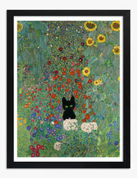
Poster gatto nero stile Klimt tra girasoli
Translation missing: it.products.product.sale_price A partire da €16,95€23,95 -

Tela vaso di girasoli di Van Gogh
Translation missing: it.products.product.sale_price A partire da €64,95€92,95 -
Poster giardino di campagna con girasoli di Klimt
Translation missing: it.products.product.sale_price A partire da €16,95€23,95 -

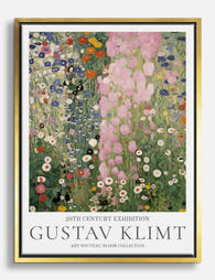
Poster giardino fiorito di Gustav Klimt
Translation missing: it.products.product.sale_price A partire da €16,95€23,95 -

Poster giardino fiorito di Gustav Klimt
Translation missing: it.products.product.sale_price A partire da €16,95€23,95 -

Poster sinfonia di fiori selvatici di Gustav Klimt
Translation missing: it.products.product.sale_price A partire da €16,95€23,95 -

Tela giardino fiorito in stile Klimt
Translation missing: it.products.product.sale_price A partire da €64,95€92,95 -
Tela sinfonia floreale di Gustav Klimt
Translation missing: it.products.product.sale_price A partire da €64,95€92,95 -

Poster giardino fiorito di Klimt
Translation missing: it.products.product.sale_price A partire da €16,95€23,95 -

Poster girasoli luminosi di Van Gogh
Translation missing: it.products.product.sale_price A partire da €16,95€23,95


Di più da The Frame

Why William Morris Prints Look Brilliant in Mod...
William Morris has been quietly miscategorised for decades. His patterns get filed under "country cottage" or "Arts and Crafts revival" and rarely escape, which is a shame because his tree...

Why Arts and Crafts Nature Prints Are the Antid...
The minimalism hangover: why bare walls stopped feeling calming For about a decade, the aspirational interior was a white box with one boucle chair in it. That look has officially...

Botanical Petal Art: Why Close-Up Prints Feel M...
Full florals have had a long run, and they're not going anywhere. But if you've noticed that the botanical art appearing in design magazines, boutique hotel lobbies, and the better-styled...