Above the Bed: 7 Modern Art Arrangements That Actually Look Intentional
Seven layout blueprints with exact dimensions, so you can stop scrolling and start hanging.

Most advice on what to hang above your bed falls into two camps: 47 random Pinterest ideas, or a single rule about two-thirds widths that leaves you no closer to actually buying anything. This guide gives you seven specific layouts with real measurements, so you know exactly what size to order and where the nail goes.
Why above the bed is the most important art wall in your home
The wall above your headboard is the only piece of art you see twice a day, every day, in your most unguarded moments. It's the last thing you look at before sleep and the first thing you see when you open the eyes. That's a different job from a hallway print or a kitchen poster, and it deserves a different level of thought.
It's also the most visually demanding wall in the house. The bed is the largest object in the room, and a blank wall above it makes the whole space feel unfinished, like a sentence with no full stop. Get it right and the room reads as designed. Get it wrong and nothing else in the room can save it.
One quick caveat before we start: if you have a tall upholstered headboard (above 130cm), a four-poster, or dramatic wall sconces flanking the bed, you may not need art above it at all. The headboard is doing the visual work. For everyone else, here are the seven arrangements worth considering.

Layout 1: the single centred statement print
This is the cleanest, most foolproof option, and it's the one we recommend for nine out of ten bedrooms. One large print, centred over the bed (not the headboard, the bed itself), pulled tight to the right size.
The right size is roughly two-thirds to three-quarters the width of your bed. For a UK king (150cm wide), that means art between 100cm and 115cm wide. For a double (135cm), aim for 90cm to 100cm. For a super king (180cm), you're looking at 120cm to 135cm wide, which usually means a horizontal canvas at the upper end of available sizes.
For vertical statement prints, a 70x100cm framed print works beautifully above a double bed. Above a king, you'll want to go horizontal: a 100x70cm print, or step up to a 100x150cm canvas if you want real presence. Smaller than that and the art looks marooned, floating in too much wall.
Subject-wise, abstract works hardest here. A single figurative piece (a portrait, a landscape with a clear horizon) carries narrative weight that can feel busy in a sleep space. Browse abstract art prints if you want one large piece to do all the work.
Layout 2: the symmetric pair
Two prints, identical sizes, hung side by side with a small gap between them. This works especially well above a king or super king where a single print would need to be impractically large.
The geometry: each print should be 40-50% the width of the bed, with 5-8cm between them, and the whole arrangement centred over the bed. For a king (150cm), two 60x80cm portrait prints with 7cm between them gives you a total span of 127cm, which sits at the right two-thirds proportion. For a super king, scale up to two 70x100cm prints.
Both prints need to be the same size and the same frame. Mixing frame styles in a symmetric pair undermines the whole point. We'd suggest a black or natural oak frame, kept simple, so the eye reads them as a single unit. The two prints don't need to be by the same artist, but they should feel like they belong together: shared palette, similar weight, complementary subjects (two botanicals, two abstracts in the same colour family, two architectural studies).
The pair format also forgives slightly low headboards better than a single print, because the visual mass spreads horizontally rather than concentrating in one block.
Layout 3: the horizontal triptych or set of three
Three prints in a row is the most under-used arrangement in modern bedrooms, and it's often the strongest. The horizontal format mirrors the horizontal line of the bed, anchoring the composition rather than fighting it.
For a queen or king, three 40x50cm prints with 5cm gaps between them gives you a 130cm total span. Three 50x70cm prints with 6cm gaps stretch to 162cm, which suits a super king beautifully. The trick is to keep the gaps small and consistent. A triptych with 15cm gaps reads as three separate prints. A triptych with 5cm gaps reads as one long composition.
True triptychs (one image split across three panels) are dramatic but commit you to a specific subject. A "set of three" approach, where each print stands alone but they share a palette and style, gives you more flexibility. Our wall art sets are designed with this in mind, with prints that are made to be hung as groups.
Hang the centre print first, exactly centred over the bed, then add the outer two. Use the top edges as your alignment line, not the bottoms.

Layout 4: the off-centre lean
This is the most modern of the seven layouts, and the one that breaks the rules most usefully. Instead of centring the art, you offset it: one large print pushed to the left or right of the bed, often paired with a smaller piece, a sconce, or a tall plant on the opposite side.
It works because it acknowledges that bedrooms aren't symmetrical in real life. You probably have a bedside table on one side that's different from the other. The lamp on the left is taller than the one on the right. An off-centre arrangement leans into that asymmetry rather than pretending it doesn't exist.
The execution: hang a 70x100cm portrait print roughly above one bedside table, with its inner edge aligning loosely with the inner edge of the table. Balance the other side with a 30x40cm print, a wall sconce, or nothing at all if the bedside lamp has enough presence.
This layout is best for low-profile beds (think a low platform bed, or a headboard under 90cm tall) and rooms with a deliberately modern feel. It looks wrong in a traditional space, where symmetry is part of the language. Pair it with modern art for bedroom selections that lean graphic or minimalist.
How high to hang art above a headboard (exact measurements)
The number you want is 15-25cm between the top of your headboard and the bottom of your frame. Most generic guides give a single figure (often 6 inches, or 15cm). The truth is that range exists for a reason.
Use the lower end (15cm) when:
- Your ceiling is standard height (2.4m) and your headboard is tall (over 110cm)
- You're hanging a tall vertical print and want to keep the centre of the art at eye level when standing
- You're going for a tight, anchored look
Use the upper end (20-25cm) when:
- You have high ceilings (2.7m or above)
- Your headboard is low (under 90cm) and you need the art to "fill" some of the gap
- You're hanging a horizontal piece or a triptych that needs breathing room above
If you have no headboard at all, measure from the top of your pillows when the bed is made: the bottom of your art should sit 35-40cm above pillow height. That keeps the art from looking like it's floating randomly on the wall.
The eye-level rule (centre of art at 145-150cm from the floor) is for gallery walls and standalone walls. Above a bed, the bed dictates the geometry, not the floor.
Layout 5, 6 and 7: gallery walls, the salon hang, and the leaning shelf
Three more arrangements worth knowing, briefly.
Layout 5: the structured gallery wall
Six to nine prints arranged in a tight grid above the bed. Treat the entire grouping as a single rectangle: its outer edges should follow the same two-thirds rule as a single print. Keep gaps between prints to 5-7cm and don't exceed nine pieces or it starts to feel chaotic above a sleep space. Use identical frames in the same colour. Mixed frames belong on a living room wall, not above a bed.
Layout 6: the salon hang
A looser, asymmetric cluster of mixed sizes and orientations. Best for confident decorators with eclectic taste. Anchor it with one large piece (50x70cm or larger), then build outwards with smaller prints in the 20x30cm to 30x40cm range. Keep the colour palette consistent even if the subjects vary.
Layout 7: the leaning shelf
A single floating shelf or picture ledge above the bed, with two or three prints leaned against the wall rather than hung. This works brilliantly in rentals, in rooms where you change your mind often, and above low platform beds. Use a shelf 5-10cm shorter than your bed width, hung 25-30cm above the headboard. Lean larger prints behind smaller ones for depth.

Colour and subject: what works and what keeps you awake
This is the part most articles skip, and it matters more above the bed than anywhere else in the house. You're looking at this art in a slow, semi-conscious state, twice a day. Subject matter affects mood in ways it doesn't in a hallway you walk through in three seconds.
What works:
- Soft abstracts in muted palettes (sage, terracotta, dusty rose, warm grey)
- Botanical studies and pressed-flower compositions
- Landscapes with soft horizons (mist, dunes, calm sea)
- Architectural details with strong negative space
- Black and white photography with quiet subjects
What keeps you awake (often without you noticing):
- High-contrast graphic prints with aggressive colour blocking
- Direct-gaze portraits, particularly large ones (your brain reads them as company)
- Busy, detailed scenes that reward looking (your eye keeps trying to read them in the dark)
- Pure red or electric blue as dominant colours
- Surrealist or unsettling imagery, however beautifully composed
Saturation matters more than hue. A muted teal abstract is calming; a saturated cobalt one is stimulating. If you're between two prints, pick the one with lower contrast. You can always add visual energy elsewhere in the room. Browse our bedroom wall art selection, which is curated specifically with this in mind.
Framing tips for above-bed art (why quality matters here most)
Frame quality matters above the bed more than anywhere else in the house, for two reasons. First, you see this art at close range, twice daily, in good light. Cheap frames look fine in a hallway and obvious in a bedroom. Second, the bedroom is usually the calmest, most considered room in your home. A flimsy frame breaks that mood instantly.
Three things to look for:
Solid wood, not MDF or veneer. MDF frames warp at the corners over time, especially in bedrooms with any humidity (en-suites, radiators near walls). Solid wood frames hold their shape for decades. All Fab framed prints use solid FSC-certified wood for this reason.
Acrylic glaze, not glass. Glass is heavy, breakable, and reflective. Above a bed it's also a safety question: a heavy glass frame coming off the wall is not what you want a foot above your head. Acrylic is lighter, shatter-resistant, and with the right UV coating it actually protects the print from fading better than standard glass.
Frame and print fitted together properly. The most common failure in shop-bought art is frames that ship separately from prints, leaving you to assemble them yourself, often with the print sitting loose, bubbling against the glaze, or off-centre in the frame. Look for art that arrives ready to hang with the print already fitted, the fixtures attached, and no warping or gaps.
One practical tip on hardware: anything over 5kg needs a proper wall anchor, not adhesive strips. For plasterboard, use a toggle bolt rated for the weight. For masonry, a standard rawl plug works. Your frame supplier should tell you the weight; if they don't, that's a flag.
A final word on intentionality
The difference between a bedroom that looks designed and one that looks decorated is rarely about what you bought. It's about whether the proportions make sense. A modest print at the right size, hung at the right height, in the right frame, will always beat an expensive piece hung badly.
Pick one of the seven layouts. Measure your bed, do the maths, and order to size. Hang it 15-25cm above your headboard, centred on the bed, not the wall. That's the entire job.


Prodotti Fab presentati in questo blog
-

Tela letto moderno dall’alto arancione e blu
Translation missing: it.products.product.sale_price A partire da €64,95€92,95 -

Poster Above Me Now, ritratto classico con tocco contemporaneo
Translation missing: it.products.product.sale_price A partire da €16,95€23,95 -

Tela natura morta con vaso moderno in toni neutri
Translation missing: it.products.product.sale_price A partire da €64,95€92,95 -

Poster letto minimalista arancione e blu
Translation missing: it.products.product.sale_price A partire da €16,95€23,95 -
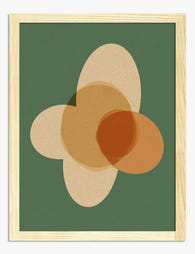
Poster forme moderne nei toni della terra
Translation missing: it.products.product.sale_price A partire da €16,95€23,95 -

Poster ritratto moderno espressivo
Translation missing: it.products.product.sale_price A partire da €16,95€23,95 -

Poster geometrico Bauhaus
Translation missing: it.products.product.sale_price A partire da €16,95€23,95 -

Poster astratto alba boho moderna
Translation missing: it.products.product.sale_price A partire da €16,95€23,95 -

Poster volto astratto blu a linea continua
Translation missing: it.products.product.sale_price A partire da €16,95€23,95 -

Tela astratta volto e foglie in toni terracotta
Translation missing: it.products.product.sale_price A partire da €64,95€92,95 -

Poster mezzaluna minimalista
Translation missing: it.products.product.sale_price A partire da €16,95€23,95 -

Tela geometrica in stile Bauhaus
Translation missing: it.products.product.sale_price A partire da €64,95€92,95 -

Poster geometrico moderno in stile Bauhaus
Translation missing: it.products.product.sale_price A partire da €16,95€23,95 -

Poster forme organiche in toni neutri caldi su verde profondo
Translation missing: it.products.product.sale_price A partire da €16,95€23,95 -

Poster letto a righe moderno con cuscino arancione
Translation missing: it.products.product.sale_price A partire da €16,95€23,95 -

Tela fiore bianco su pavimento a scacchi bianco e nero
Translation missing: it.products.product.sale_price A partire da €64,95€92,95 -

Tela Bauhaus geometrica minimalista
Translation missing: it.products.product.sale_price A partire da €64,95€92,95 -

Poster geometrico in stile Bauhaus
Translation missing: it.products.product.sale_price A partire da €16,95€23,95


Di più da The Frame

Transform Any Room with a Cohesive Pink Gallery...
Pink is one of the trickiest colours to gallery-wall well. Get it wrong and the whole thing reads juvenile or chaotic, like a teenager's mood board. Get it right and...

What Interior Designers Know About Hanging Art ...
You've found the print. You've cleared the wall. Now you're standing on the sofa with a hammer, trying to remember if your friend said "eye level" or "60 inches" or...

What Interior Designers Know About Styling Mati...
Most gallery wall advice assumes you're starting with nothing. This guide assumes you already own one Matisse landscape print, or you're about to, and you want everything you hang next...