From Audubon to Abstract: Popular Bird Art Styles and How to Use Them at Home
A field guide to the four major styles of bird art, and how to know which one belongs on your walls.

Birds have been on our walls longer than wallpaper has existed. The category covers everything from scientifically precise Victorian illustrations to single-line modern silhouettes, and knowing the difference is the difference between art that looks intentional and art that looks like it came with the room.
This guide breaks bird art into four distinct styles, explains where each comes from, and tells you which interiors they actually suit.
A brief history of bird art (and why it's never gone out of style)
Bird imagery in art predates the written word. Cave paintings at Lascaux include them. Egyptian tombs are full of falcons and ibises. Medieval bestiaries treated birds as moral allegories long before anyone painted them for beauty alone.
The shift toward bird art as we recognise it now happened in the 17th and 18th centuries, when European naturalists started documenting species with scientific accuracy. By the time John James Audubon published The Birds of America in the 1830s, bird illustration had become both a scientific discipline and a decorative art form. It has remained both ever since.
The reason bird art endures is simple. Birds give you nature, movement, and colour in a single image, without the heaviness of a landscape or the formality of a portrait. They suit almost any room because they reference the outside world without dictating a specific place or season.

Ornithological illustration: the Audubon tradition and its lasting appeal
Ornithological illustration is the most recognisable style in the category. Think life-sized birds rendered in fine detail, usually posed on a branch or in mid-action, with clear scientific labelling and a plain or lightly washed background. The birds are the subject. Nothing else competes.
Audubon set the template, but he was not alone. Louis Agassiz Fuertes, Archibald Thorburn, and John Gould all produced extensive bodies of work in the same tradition, often more refined than Audubon's in technique. What they share is a commitment to anatomical accuracy combined with genuine artistic composition. These are not diagrams. They are portraits.
Visual hallmarks
- Fine, detailed linework showing individual feathers
- Naturalistic but not photorealistic colouring
- Plain or muted backgrounds, often cream or pale grey
- Latin and common names printed below the image
- Birds in characteristic poses (perched, calling, hunting)
Where it works at home
Ornithological prints suit traditional interiors almost by default. Studies, libraries, hallways with panelled walls, dining rooms with deeper paint colours. They sit naturally alongside antique furniture, brass lamps, and Persian rugs.
They also work surprisingly well in very modern, pared-back rooms, where the historical detail provides a single point of richness against clean lines. The trick is committing to the contrast. A lone Audubon plate in a white frame on a white wall in a minimalist room can look brilliant. The same print in a busy farmhouse kitchen looks lost.
For these prints, framing matters more than for any other style. A warped frame or an off-centre mount ruins the whole effect because the originals were so carefully composed. Our framed bird art prints ship ready to hang with the print properly fitted in solid FSC wood, so the geometry actually holds up.
Vintage botanical bird prints: where birds meet flowers
Botanical bird prints sit at the intersection of two collecting traditions. In the 18th and 19th centuries, botanical illustration and ornithological illustration were often produced by the same publishers, sometimes by the same artists. The crossover style places birds within flowering branches, fruiting trees, or full plant studies, giving you flora and fauna in one composition.
Pierre-Joseph Redouté is the most famous botanical illustrator, though he focused on flowers. The bird-and-botanical combination was perfected by artists like Mark Catesby (whose 1731 Natural History of Carolina predates Audubon) and later by countless Victorian printmakers producing decorative plates for middle-class drawing rooms.
Visual hallmarks
- Birds shown smaller, integrated into a plant composition
- Rich detail in both the bird and the surrounding foliage
- Warmer colour palettes: ochres, soft greens, dusty pinks
- Aged paper tones or cream backgrounds
- Often comes in series or pairs
Where it works at home
Botanical bird prints are the most flexible style in the category. They suit country cottages, English-style sitting rooms, and modern interiors with a softer, lived-in feel. They work particularly well in bedrooms because the plant element softens the composition, and in bathrooms with good ventilation where the warm tones balance cool tile.
They also pair beautifully with pure botanical work. A trio of plates, two flowers and one bird, makes a more interesting wall than three of the same. Browse the botanical art prints collection if you want to mix the two.
A note on humidity: framed prints with UV-protective acrylic glaze hold up better in bathrooms and kitchens than glass-fronted alternatives, which can collect condensation and cause foxing on the paper inside.

Japanese and East Asian bird art: delicate lines and bold simplicity
Japanese bird art belongs to a tradition called kachō-e, literally "bird-and-flower pictures." It developed in China during the Song dynasty and was adapted in Japan from the 15th century onward, reaching its decorative peak in the Edo period with the great ukiyo-e printmakers.
Hokusai and Hiroshige are the names most people know, but Ohara Koson (also known as Shoson) is arguably the master of the form. His early 20th century woodblock prints of herons, sparrows, and kingfishers are some of the most copied bird images in existence, and for good reason. They are extraordinarily refined.
Visual hallmarks
- Asymmetric composition with significant empty space
- Confident, economical linework
- Flat colour areas rather than gradient shading
- Birds often in motion or interacting with a single branch or flower
- Subtle, sometimes muted palettes (indigo, ink black, ochre, soft red)
The aesthetic principle behind this style is ma, the meaningful use of empty space. Where European illustration fills the frame with information, Japanese bird art uses negative space as a compositional element. The empty area is doing as much work as the painted one.
Where it works at home
This style is built for modern interiors. Scandinavian, Japandi, minimalist, mid-century, all of these benefit from the discipline of kachō-e. The empty space in the composition extends visually into the room, which is why a single large Japanese print often does more work than a cluster of busier images.
It also suits meditation spaces, yoga rooms, and any interior that uses natural materials like linen, oak, and stone. Avoid hanging kachō-e alongside heavily ornamented European art. The two traditions cancel each other out.
For larger walls, consider a canvas print in this style. The matte finish and lack of glaze suits the woodblock aesthetic, and the mirrored edge wrapping means none of the original composition gets lost around the sides. Our traditional Japanese art prints cover the major masters in both formats.
Modern and abstract bird prints: why less detail can mean more impact
Modern bird art covers everything from mid-century graphic illustration (Charley Harper's work being the obvious reference) to contemporary minimalist line drawings, geometric interpretations, and fully abstract compositions where the bird is suggested rather than depicted.
The shift toward abstraction in bird art follows the broader 20th century move in visual art. Once photography could capture birds with perfect accuracy, illustration was freed from the obligation to do so. Artists started using birds as design elements, mood pieces, or symbols, rather than as scientific subjects.
Visual hallmarks
- Reduced or stylised forms
- Strong use of colour blocks or pure monochrome
- Simplified silhouettes
- Geometric or organic abstraction
- High contrast and graphic clarity
The reason "less detail can mean more impact" works as a principle is that the eye fills in what the artist leaves out. A single curved line that suggests a heron in flight forces the viewer to engage. A photorealistic heron asks nothing of the viewer at all. Both have their place, but the abstract version creates a different kind of presence in a room.
Where it works at home
Modern and abstract bird prints suit contemporary interiors, open-plan spaces, kitchens, home offices, and children's rooms (where simplified imagery is genuinely easier to live with than detailed Victorian illustration).
They scale up well, which matters. A small abstract print on a large wall looks accidental. The same print at 70x100cm or larger on canvas looks deliberate and commanding. If you have a big empty wall above a sofa or bed, modern bird art is usually the easiest style to make work, because abstraction reads from across the room in a way that fine detail does not.

How to match bird art style to your interior design
Some quick translations between style and setting.
Traditional, classic, or country: Ornithological illustration and vintage botanical prints. Frame in dark wood or warm gold. Hang at standard gallery height (centre of image at 145-150cm from the floor).
Scandinavian, Japandi, or minimalist: Japanese kachō-e or simple modern line work. Frame in light oak or thin black. Use generous wall space around the piece. Resist the urge to cluster.
Modern, contemporary, or mid-century: Graphic modern bird prints, often in bold colour. Frame in black or leave canvas unframed for a softer look. Scale up.
Farmhouse, cottage, or eclectic: Botanical bird prints in pairs or trios. Mix sizes. Warm wood frames or distressed finishes.
Bohemian or layered: Mix styles deliberately. A Victorian plate next to a Japanese print can work if the colours connect. Avoid mixing more than three styles in one room.
Colour vs. monochrome
If your room is already colourful, lean toward monochrome bird art. Black-and-white ornithological etchings or pure line drawings will calm a busy space. If your room is neutral, colour-rich prints give you a focal point without redecorating. This is a more useful question than "do I like colour or not," because the answer depends on the room more than your personal taste.
Scale and composition
Audubon worked at life size. That tradition has practical consequences. Large bird prints feel correct because they reference the original intention. A 30x40cm Audubon plate looks slightly off because it is shrunk from its natural scale. If you want ornithological work, go larger. 50x70cm minimum, ideally 70x100cm.
Japanese prints can work small because the original woodblocks were often modest in size. Modern abstract work scales however you want, but bigger usually reads better.
Our favourite prints from each style
Rather than naming individual prints (taste is too personal), here is how we would choose within each style.
For ornithological: Look for prints where the bird is clearly the subject, the background is uncluttered, and the original detail has survived the reproduction. Avoid heavily filtered or "aged" versions that obscure the linework. The vintage art prints collection covers the major Victorian and Edwardian illustrators with reproductions that preserve the original detail rather than smothering it in fake patina.
For botanical bird prints: Choose pairs or trios from the same series rather than mixing artists. The visual consistency matters more than variety.
For Japanese: Start with Ohara Koson if you are new to the style. His compositions are accessible and consistently strong. Move to Hiroshige and Hokusai once your eye is in.
For modern and abstract: Buy the largest size your wall can carry. Modern bird art rewards scale more than any other category.

A final practical point. Bird art tends to live in a home for a long time, often moving between rooms as you redecorate. Choosing a style that genuinely matches how you live, rather than one that suits your current sofa, is the difference between art that follows you for decades and art that gets quietly relegated to the spare room within a year.

Prodotti Fab presentati in questo blog
-

Poster uccelli d’America di Audubon
Prezzo scontato A partire da €16,95€23,95 -

Poster uccelli del bosco di Audubon
Prezzo scontato A partire da €16,95€23,95 -

Tela uccelli d'America di Audubon
Prezzo scontato A partire da €65,95€93,95 -

Poster dalla collezione di uccelli canori di Audubon
Prezzo scontato A partire da €16,95€23,95 -

Poster uccelli canori di Audubon
Prezzo scontato A partire da €16,95€23,95 -

Poster uccello tropicale bianco di Audubon
Prezzo scontato A partire da €16,95€23,95 -

Poster con uccelli canori ispirato ad Audubon
Prezzo scontato A partire da €16,95€23,95 -

Poster uccello beffeggiatore e tordo di Audubon
Prezzo scontato A partire da €16,95€23,95 -

Tela collezione uccelli di Audubon
Prezzo scontato A partire da €65,95€93,95 -

Tela uccelli del bosco di Audubon
Prezzo scontato A partire da €65,95€93,95 -
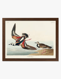
Poster voltapietre di Audubon
Prezzo scontato A partire da €16,95€23,95 -

Poster ghiandaie azzurre e gazze di Audubon
Prezzo scontato A partire da €16,95€23,95 -

Poster ibis lucente di Audubon
Prezzo scontato A partire da €16,95€23,95 -

Poster mimo poliglotta di Audubon
Prezzo scontato A partire da €16,95€23,95 -

Poster disegno di uccello nero di Hokusai
Prezzo scontato A partire da €16,95€23,95 -

Poster orioli del frutteto di Audubon
Prezzo scontato A partire da €16,95€23,95 -

Poster germano reale di John James Audubon
Prezzo scontato A partire da €16,95€23,95 -

Tela uccelli canori di Audubon
Prezzo scontato A partire da €65,95€93,95 -

Poster picchio dal becco d'avorio di Audubon
Prezzo scontato A partire da €16,95€23,95 -

Poster studio di gazza di Audubon
Prezzo scontato A partire da €16,95€23,95


Di più da The Frame

The Best Water Lily Prints for Every Room (And ...
Water lily art has a rare quality: it slots into almost any room without asking the rest of the decor to change around it. The tricky part is knowing which...

The Best Wall Art for Plant Lovers (That Doesn'...
You already have too many plants. You know it, your partner knows it, the fiddle leaf fig blocking the window knows it. But your walls are still bare, and there's...

Are Botanical Prints Still in Style? The Trend ...
Botanical prints have been declared "over" roughly every three years since 2015, and yet they keep hanging on more walls than ever. The truth is they're not a trend at...