Vintage Butterfly Prints: From Victorian Cabinets to Modern Walls
How to channel three centuries of naturalist illustration without your living room feeling like a Victorian parlour.

Butterfly illustration has a longer, stranger history than most decor trends. What began as serious scientific record-keeping became Victorian obsession, then Art Nouveau decoration, and now sits on the walls of design-forward homes that look nothing like a 19th-century study. Here's how to understand what you're actually looking at, and how to make it work in a contemporary space.
A brief history of butterfly illustration
The story really starts with Maria Sibylla Merian, a German-born naturalist working in the late 1600s. Her 1705 book on Surinamese insects was radical for one reason: she illustrated butterflies through their full metamorphosis, alongside the specific plants they fed on. Before Merian, illustrators painted dead specimens on blank backgrounds. After her, butterflies came with context — caterpillars, chrysalises, host leaves — and her compositions still feel alive three centuries later.
Through the 1700s and 1800s, naturalists like Dru Drury, Jean Baptiste Boisduval, and Charles Dessalines D'Orbigny produced hand-coloured lithographic plates with extraordinary scientific precision. These were reference works, not decoration. Specimens were arranged in grids, labelled in Latin, and rendered with the kind of patient accuracy that came from working with actual pinned butterflies under magnification.
Then came E.A. Séguy in the 1920s, who broke the rules entirely. Working in the Art Nouveau and Art Deco traditions, Séguy used pochoir (a labour-intensive stencil printing process) to produce butterfly plates that prioritised pattern, colour, and decorative arrangement over scientific accuracy. His work is why some "vintage" butterfly prints feel ornamental and graphic, while others feel like museum specimens. Both traditions are vintage. They just come from different impulses.

What makes a butterfly print feel 'vintage' vs. 'modern'
The visual markers are surprisingly specific, and once you know them, you can spot the difference in seconds.
Vintage signals: muted, slightly desaturated colour (the result of natural pigments fading on aged paper), visible paper texture or foxing, hand-lettered Latin nomenclature, specimens arranged in symmetrical grids or scientific plates, sepia or cream backgrounds rather than pure white, and the small imperfections of hand-colouring where pigment sits slightly outside the line.
Modern signals: high-contrast colour, clean white or solid coloured backgrounds, sans-serif type (or no labelling at all), asymmetric or single-specimen compositions, and the crisp, uniform line quality of digital illustration.
Plenty of contemporary prints borrow the vintage vocabulary — aged paper effects, Latin labels, plate-style layouts — and that's fine, as long as you know what you're buying. A well-made reproduction of a Merian or Séguy plate, printed on quality paper with archival inks, can sit alongside a 200-year-old original and hold its own visually. A cheap print with a fake "antique" border will look exactly like what it is.
If you're browsing our vintage art prints collection, look for the genuine markers: muted palettes, scientific arrangement, and that slightly off-white background that suggests age rather than mimics it.
Botanical butterfly prints: when flora meets fauna
This is Merian's legacy, and it's the most decoratively useful tradition for modern homes. A pure scientific specimen plate (rows of pinned butterflies on cream paper) reads as serious, almost clinical. Beautiful, but it commits hard to a particular mood.
Botanical butterfly prints, by contrast, pair the insect with its host plant — a Swallowtail on fennel, a Monarch on milkweed, a Painted Lady on thistle. The composition gains movement, narrative, and a softer overall shape. The plant gives your eye somewhere to rest. The butterfly becomes a character rather than a specimen.
For most contemporary interiors, this hybrid tradition is the easier sell. It bridges the worlds of insect illustration and botanical art, which means it slots naturally into a wall mixed with leaf prints, pressed flowers, or other botanical art prints. It also softens the "natural history museum" feeling that pure specimen plates can carry into a domestic room.
If you're drawn to the scientific look but worried it'll feel cold, botanical butterflies are the answer. They keep the heritage and craft, but they breathe.
Pairing vintage butterfly prints with contemporary furniture
The biggest mistake people make with vintage botanical and entomological prints is matching them to vintage furniture. A mahogany sideboard, a chintz armchair, a Persian rug, and a Victorian butterfly plate above the mantel: you've just built a stage set, not a home.
The trick is tension. Vintage art looks best against contemporary surfaces, and contemporary furniture looks more interesting with a piece of genuine visual heritage nearby.
Combinations that work:
- A large framed butterfly plate (60x80cm or bigger) above a low, simple linen sofa in oatmeal or stone. The scientific precision of the print plays against the soft, modern silhouette.
- A gallery wall of smaller butterfly prints (30x40cm, arranged in a tight grid) above a pale oak console or a lucite side table. The transparency of acrylic or glass furniture lets the prints do the talking.
- A single Séguy-style Art Nouveau plate above a mid-century walnut desk. The decorative geometry of 1920s pochoir work picks up the curves of mid-century design beautifully.
- Botanical butterfly prints in a kitchen, hung in a row above open shelving with white ceramics and brass fixtures. The natural subject matter belongs near plants and food.
What to avoid: heavy ornate frames, dark wood furniture in the same room as a dark wood frame, and the temptation to lean into "cottage" with floral wallpaper and lace. The whole point of these prints in a modern home is the contrast.

Colour palettes that complement aged illustration styles
Vintage butterfly prints have a particular tonal range you need to design around. The backgrounds tend to be cream, ivory, or warm off-white. The pigments lean towards earthy reds, mustardy yellows, sage greens, and powder blues, all softened by age. There's almost no pure black or true white in a genuine vintage plate.
This means certain wall colours and palettes flatter them and others fight them.
Palettes that work:
- Warm neutrals: soft white walls (think Farrow & Ball Wevet, or any chalky off-white with a yellow undertone), oatmeal linens, natural oak. The print's cream background dissolves into the wall and the colours pop gently.
- Sage and stone: muted green walls with cream and pale wood. Sage in particular picks up the green tones in botanical illustrations and the leaf elements in Merian's work.
- Deep, moody backdrops: a dark green, charcoal, or inky blue wall makes a single vintage butterfly print glow like a specimen in a darkened gallery. This is the most dramatic option, and it works best with one large piece rather than a cluster.
- Terracotta and clay: warm earthy walls flatter the reddish and ochre pigments common in 19th-century plates.
Palettes to avoid: bright cool whites (they make cream paper look yellow and dingy), high-contrast monochrome schemes, and anything in the cool blue-grey family that fights the inherent warmth of aged paper.
Framing vintage-style art: why material quality matters more than you think
This is where most reproductions fall apart, and where the difference between "looks like an antique" and "looks like a poster" really lives.
A vintage-style illustration depends on subtle tonal information: the warm cream of the paper, the slight variation in hand-laid pigment, the texture that suggests age. If you print this on cheap glossy paper, the cream goes plasticky, the colours flatten, and the glare from any light source kills the detail you paid for. Glossy finishes are the enemy of vintage aesthetics.
Matte paper, ideally a heavy giclée stock, is non-negotiable. Our butterflies art prints are printed on thick matte paper using museum-grade giclée techniques, which is the closest a modern reproduction gets to the look and feel of an original plate. No glare, no plastic sheen, and detail you can examine from 30cm away without losing anything.
Frame choices that flatter vintage illustration:
- Natural oak or ash: the most versatile, works in almost any room. The warmth of the wood echoes the warm paper.
- Black wood (matte, not gloss): sharp, gallery-feeling, particularly good for Séguy-style decorative plates.
- Walnut: rich and traditional without tipping into ornate. Good for larger statement pieces.
- White wood: clean and contemporary, lets the print itself carry all the visual weight.
What to avoid: ornate gilt frames (too on-the-nose, instantly ages a room), thin metallic frames (they fight the organic feel of the illustration), and any frame with carved detail.
A note on materials. The single biggest failure in framed prints is poor construction: warped MDF frames, prints shipped separately from the frame and fitted badly at home, bubbling under cheap glass. Solid wood frames hold their shape. UV-protective acrylic glaze (rather than glass) protects the print from fading even in a sunny room, which matters because vintage-style prints often end up in living rooms and bedrooms with significant natural light. Our framed prints arrive in a single box, properly fitted, with fixtures attached.
If your print warps, your frame splits, or your "vintage" art fades in two summers, none of the styling advice in this article matters.

Scale, arrangement, and where to hang them
Two strategies, both legitimate, depending on what you want the room to do.
The single statement piece. One large framed butterfly print (anything from 50x70cm upwards) hung as the dominant artwork on a wall. This works in entryways, above sofas, above headboards, and in dining rooms. It demands a print with enough internal complexity to hold attention at scale, so a botanical composition or a multi-specimen plate works better than a single small butterfly enlarged.
The collected wall. A grid or salon-style arrangement of smaller prints (30x40cm or 40x50cm), echoing the way Victorian collectors displayed their specimens. Hang them tight (5-7cm gaps), use matching frames, and keep the arrangement geometric. This is the more historically authentic option and looks particularly strong in hallways, stairwells, and bathrooms where you want density and rhythm.
Rooms that work especially well: bedrooms (the soft, contemplative quality suits a restful space), bathrooms (natural subject matter, especially botanical, feels right near water and plants), home offices (scientific illustration suggests focus and curiosity), and hallways (gallery-style hanging rewards a closer look as people pass).
Rooms to think twice about: high-humidity kitchens directly above hobs, and any space with extreme temperature swings. Canvas handles humidity better than paper if you're worried about a particular room.
Mixing old and new on the same wall
You don't have to commit fully to one era. Some of the most interesting walls we see pair a vintage-style butterfly plate with a piece of contemporary abstract art, or a modern line drawing, or a piece of photography. The shared element is usually colour or scale, not subject matter.
A 19th-century-style butterfly grid alongside a contemporary minimalist print in matching tones reads as deliberate curation. Two pieces from the same era can feel like a costume.
If you're building a wall that mixes traditions, browse our broader nature art prints for contemporary pieces that share the palette and spirit of vintage botanical work without copying it.

Bringing it together
The reason vintage butterfly prints have survived three centuries of changing taste is that they sit at an unusual intersection: scientific seriousness, decorative beauty, and a quiet reminder of the natural world. They carry weight without being heavy.
The mistake is treating them as period decoration. They're not. Treat them as artwork first, with their own internal logic and visual demands, and pair them with the cleanest, simplest contemporary surfaces you have. Choose matte paper, solid wood frames, and warm wall colours. Hang them where you'll actually look at them. The Victorians collected butterflies in glass cases to study them up close, and the best vintage-style prints still reward that kind of attention.

Prodotti Fab presentati in questo blog
-

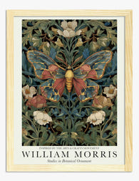
Poster farfalla e fiori di William Morris
Translation missing: it.products.product.sale_price A partire da €16,95€23,95 -

Tela parata di farfalle vintage
Translation missing: it.products.product.sale_price A partire da €64,95€92,95 -

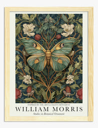
Poster farfalle in stile William Morris
Translation missing: it.products.product.sale_price A partire da €16,95€23,95 -

Poster farfalla con motivi botanici ispirato a William Morris
Translation missing: it.products.product.sale_price A partire da €16,95€23,95 -

Poster farfalla botanica ispirata a William Morris
Translation missing: it.products.product.sale_price A partire da €16,95€23,95 -

Tela farfalla e fiori ispirata a William Morris
Translation missing: it.products.product.sale_price A partire da €64,95€92,95 -

Tela eleganza delle farfalle di William Morris
Translation missing: it.products.product.sale_price A partire da €64,95€92,95 -

Tela farfalla ispirata a William Morris
Translation missing: it.products.product.sale_price A partire da €64,95€92,95 -
Poster farfalla botanica in stile William Morris
Translation missing: it.products.product.sale_price A partire da €16,95€23,95 -

Poster farfalla elegante di William Morris
Translation missing: it.products.product.sale_price A partire da €16,95€23,95 -

Poster farfalla botanica in stile William Morris
Translation missing: it.products.product.sale_price A partire da €16,95€23,95 -

Tela botanica con farfalla bianca in stile William Morris
Translation missing: it.products.product.sale_price A partire da €64,95€92,95 -

Poster farfalla con motivo floreale ispirato a William Morris
Translation missing: it.products.product.sale_price A partire da €16,95€23,95 -

Tela farfalle e fiori di William Morris
Translation missing: it.products.product.sale_price A partire da €64,95€92,95 -

Poster botanico con farfalla di Morris
Translation missing: it.products.product.sale_price A partire da €16,95€23,95 -
Poster botanico con farfalla ispirato a William Morris
Translation missing: it.products.product.sale_price A partire da €16,95€23,95 -

Tela farfalla e fiori di William Morris
Translation missing: it.products.product.sale_price A partire da €64,95€92,95 -

Tela con farfalla ispirata a William Morris
Translation missing: it.products.product.sale_price A partire da €64,95€92,95 -

Tela farfalla con motivi floreali ispirata a William Morris
Translation missing: it.products.product.sale_price A partire da €64,95€92,95 -

Poster farfalla bianca di William Morris
Translation missing: it.products.product.sale_price A partire da €16,95€23,95


Di più da The Frame

Why William Morris Prints Look Brilliant in Mod...
William Morris has been quietly miscategorised for decades. His patterns get filed under "country cottage" or "Arts and Crafts revival" and rarely escape, which is a shame because his tree...

Why Arts and Crafts Nature Prints Are the Antid...
The minimalism hangover: why bare walls stopped feeling calming For about a decade, the aspirational interior was a white box with one boucle chair in it. That look has officially...

Botanical Petal Art: Why Close-Up Prints Feel M...
Full florals have had a long run, and they're not going anywhere. But if you've noticed that the botanical art appearing in design magazines, boutique hotel lobbies, and the better-styled...