
 Ordina oggi, consegna il
 9 Vintage House Decor Ideas That Start With What's on Your Walls
A design-from-the-walls-outward approach to vintage decorating that works in rentals, small spaces, and modern homes.


Most vintage decor advice starts with the wrong thing. It tells you to hunt flea markets, install crown moulding, or refinish a dresser before you've decided what the room is actually trying to say. Your walls should decide that first, and a well-chosen vintage house print is one of the fastest ways to set the tone.
Why your walls set the tone for the entire room
Walls are the largest uninterrupted surface in almost any room. Whatever you put on them is what your eye returns to, which means your art quietly dictates the palette, the mood, and the era your other pieces need to answer to.
Start with a rug or a sofa and you'll spend the next year trying to find art that matches. Start with the art and the rest of the room has a reference point. This is especially true for vintage schemes, where the risk of everything looking accidentally themed (or worse, like a costume) is highest.
A vintage house print gives you architecture, colour, and character in one frame. It tells you what century you're playing in, what palette to pull from, and how formal or relaxed the room should feel. Everything else becomes a decision you can make with a clear brief.

Start with a vintage house print and build outward
The trick is to treat the print as your mood board. Before you buy a cushion or a lamp, spend ten minutes looking at your chosen print and writing down what you see: dominant colours, secondary colours, the era of the architecture, the materials suggested (stone, timber, brick, render), and the feeling (grand, cosy, faded, formal).
That list becomes your shopping filter. A print of a Georgian townhouse in muted terracotta and cream suggests one direction. A watercolour of a Cornish fisherman's cottage in slate grey and white suggests another. Both are vintage. Neither wants the same sofa.
We think this works because it removes the biggest cause of vintage-decor failure: buying individual pieces you love and hoping they'll cohere. They rarely do. A single anchoring image on the wall forces every subsequent choice to have a reason.
If you're browsing for a starting point, our vintage house art prints collection is organised by architectural style, which makes it easier to pick a direction before you commit.
Pick the era before you pick the print
Victorian house prints tend toward ornate detail, deep colours, and a sense of formality. Georgian and Regency prints are more restrained, with symmetrical façades and softer palettes. Edwardian and early twentieth century cottage illustrations lean rustic, with hand-drawn lines and washed-out watercolour tones.
None of these is more vintage than the others. But they each pull your room in a distinct direction, and mixing them without thought is how you end up with the museum look you were trying to avoid.
Pairing vintage cottage prints with natural materials and warm neutrals
Cottage prints, especially watercolour or ink illustrations of thatched roofs, stone walls, and country lanes, want to be surrounded by materials that echo what's in the image. Think oak, linen, wool, unglazed ceramics, aged brass. Anything shiny, plastic, or aggressively modern will fight the print instead of supporting it.
Warm neutrals do most of the heavy lifting here. Off-white walls, oatmeal upholstery, honey-toned wood, and a rug in muted ochre or faded red will let a cottage print sit comfortably without shouting. Add one or two darker anchors (a black iron lamp, a deep green cushion) to stop the scheme going flat.
A 50x70cm framed cottage print above a low console table with a stoneware jug and a stack of hardback books is a complete vignette. You've done vintage without buying a single antique.
Textiles that echo the print without matching it
Avoid the temptation to buy a cushion in the exact colour of the roof tiles in your print. Matching too literally reads as costume. Instead, pull one secondary colour from the image and use it in an unexpected texture: a mustard velvet cushion picking up a sunlit window, a heavy linen throw echoing the pale sky.
The gallery wall approach: mixing house prints with botanical and landscape art
A single vintage house print is a statement. Three or four together, mixed with complementary subjects, becomes a proper gallery wall with narrative weight.
The pairings that consistently work are house prints with botanical art prints and landscape art prints. Botanicals add softness and organic shape against the hard lines of architecture. Landscapes provide context, as though you're seeing the countryside the house sits in.

Composition rules for a vintage gallery wall
Keep the frames in the same family, not identical. Three black wood frames of slightly different widths look considered. Three completely different frames (one gilt, one black, one raw oak) look chaotic unless you really know what you're doing.
Anchor the arrangement with the largest piece, usually the house print, either in the centre or offset to one side. Cluster smaller botanicals and landscapes around it. Aim for 5 to 8cm of consistent spacing between frames. Lay everything out on the floor first, then transfer to the wall.
For rentals, use adhesive picture strips rated for the weight of your frames. Framed prints with solid wood frames and UV-protective acrylic glaze (rather than glass) are noticeably lighter than traditional glazed frames, which makes adhesive hanging genuinely viable rather than a compromise.
Using large old fashioned house prints as a room's focal point
If you have a room with high ceilings or a long empty wall, a single large print does more than three medium ones ever will. Old house prints for the wall work particularly well at scale because the architectural detail becomes legible from across the room.
A 70x100cm framed print, or a 100x150cm canvas, above a sofa or a bed is not decoration. It's the reason the room exists. Everything else in the space should feel like it's arranged around it.
Canvas works especially well for larger vintage prints because the matte finish softens the image and gives it the quality of a painting rather than a poster. Framed prints on museum-grade matte paper look sharper and more formal, which suits Georgian or Victorian architectural subjects.
When to go framed and when to go canvas
Framed prints suit period architecture, formal rooms, and any space where the print needs to feel like a proper piece of art. The frame gives it authority.
Canvas suits cottage scenes, rustic interiors, humid rooms (bathrooms, kitchens), and any space where you want the art to feel a bit softer and less precious. It's also lighter, which matters if you're hanging XL sizes on plasterboard walls.
Colour-matching your print to existing furniture and textiles
If you're not starting from scratch (most people aren't), reverse the process. Photograph your room in natural light. Identify the three or four dominant colours already present. Then find a vintage house print that shares at least two of them.
You're not looking for an exact match. You're looking for a print that has enough tonal overlap to feel like it belongs, while introducing one or two new colours to freshen the scheme.

The three-colour rule
Every successful vintage room we've seen follows a rough three-colour rule: one dominant neutral (the walls, maybe the sofa), one warm accent (terracotta, ochre, faded red, mustard), and one grounding dark (charcoal, forest green, deep navy, black).
Your print should contain at least two of these. If it introduces a fourth colour, that becomes your excuse to buy one new cushion or a small piece of pottery in that shade, tying the whole thing together.
Three room makeovers that started with a single vintage print
The rental lounge that stopped feeling temporary
Starting point: magnolia walls, grey sofa, no real character. The tenant added a 60x80cm framed print of a Georgian townhouse in warm cream and slate blue above the sofa. From there: a jute rug (echoing the cream), two mustard linen cushions (pulling from the window glow in the print), a secondhand oak side table, and a brass floor lamp. Total spend under £400, all removable.
The magnolia walls suddenly read as period-appropriate rather than landlord-beige. Nothing was renovated. Everything came from the print.
The kitchen that got a country feel without a country kitchen
Starting point: a modern flat with white gloss cabinets. Not a candidate for exposed beams. The owner hung a trio of small vintage cottage prints in matching black frames along the empty wall above a slim console. Below: a stoneware bowl of lemons, a linen tea towel over the rail, an old-looking (but new) brass tap.
The gloss cabinets stopped being the loudest thing in the room. The eye went to the prints and the vignette below them, and read the whole space as considered rather than clinical.
The bedroom that mixed Victorian and mid-century without visual chaos
Starting point: an Ercol-style bed frame and bedside tables (1960s in feel), a Victorian house print the owner had fallen in love with. The risk: costume drama meets Mad Men.
The resolution: keep the print's frame minimal (thin black wood, no gilt), pull the palette toward the mid-century era (mustard, olive, cream), and skip anything overtly Victorian in the rest of the room. No ornate lampshades, no floral wallpaper. The print became the single Victorian note in an otherwise restrained mid-century room, and the contrast made both eras feel intentional.
Where to go from here: building a vintage-inspired home without it looking like a museum
The single biggest fear people have about vintage decor is that it will read as dated, fussy, or like they've inherited someone's grandmother's house. The solution isn't to buy less vintage. It's to leave more air around what you do buy.

Restraint is the difference between vintage and dated
Pick one vintage house print as your anchor. Add two or three supporting vintage-adjacent objects (a lamp, a rug, a ceramic). Then stop. Modern rooms with a strong vintage focal point look intentional. Rooms crammed with vintage everything look like a set.
Empty wall space around a print is not a waste. It's what makes the print feel like art rather than clutter.
Rotate seasonally rather than accumulating
Instead of adding more prints over time, consider swapping. A brighter cottage scene for spring and summer, a moodier manor house or winter landscape for autumn and winter. One or two prints in circulation keeps the room feeling looked-after without turning it into a gallery.
Our broader vintage art prints collection is worth browsing when you're thinking about rotation, since building a small library of complementary pieces is cheaper and more flexible than committing to one arrangement forever.
Vintage vs antique, and why it matters for your walls
Vintage generally means twenty to a hundred years old. Antique means over a hundred. For decor purposes the distinction matters less than the feeling: are you going for something faded and lived-in, or something formal and historic?
A high-quality reproduction print of a period house gives you the visual language of antique without the fragility, the cost, or the sense that you're going to break something. Museum-grade giclée printing on thick matte paper reads as substantial and considered from across the room, which is really all you need it to do.
Pick your print first. Let it tell you what the room wants. Then buy slowly, leave space, and resist the urge to match everything. That's the entire method.

Prodotti Fab presentati in questo blog
-
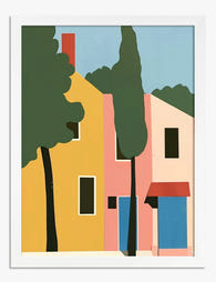
Poster geometrico dai colori vivaci
Prezzo scontato A partire da €16,95€23,95 -

Little Storybook Houses Canvas Print
Prezzo scontato A partire da €65,95€93,95 -

Poster la casa gialla di Vincent van Gogh
Prezzo scontato A partire da €16,95€23,95 -

Poster villaggio incantato di Van Gogh
Prezzo scontato A partire da €16,95€23,95 -

Little Storybook Houses Art Print
Prezzo scontato A partire da €16,95€23,95 -

Tela sogno urbano vibrante
Prezzo scontato A partire da €65,95€93,95 -

Tela eleganza vintage da tavola
Prezzo scontato A partire da €65,95€93,95 -

Poster tavola vintage
Prezzo scontato A partire da €16,95€23,95 -

Documents Décoratifs IX by Mucha Art Print
Prezzo scontato A partire da €16,95€23,95 -

Pink Houses on the Hillside Art Print
Prezzo scontato A partire da €16,95€23,95 -

Tela casette da sogno di Van Gogh
Prezzo scontato A partire da €65,95€93,95 -

Poster barca a vela al tramonto
Prezzo scontato A partire da €16,95€23,95 -

Documents Décoratifs IX by Mucha Canvas Print
Prezzo scontato A partire da €65,95€93,95 -

Tela la casa gialla di Vincent van Gogh
Prezzo scontato A partire da €65,95€93,95 -

Colourful Townhouses on the Hill Art Print
Prezzo scontato A partire da €16,95€23,95 -
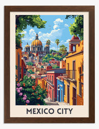
Poster Città del Messico vibrante
Prezzo scontato A partire da €16,95€23,95 -

Little Houses on the Hill Art Print
Prezzo scontato A partire da €16,95€23,95 -

Tela vasi boho con motivi botanici
Prezzo scontato A partire da €65,95€93,95 -

Poster spiaggia tropicale delle Maldive
Prezzo scontato A partire da €16,95€23,95 -
Tela con scritta 'House of Fun' azzurro cielo
Prezzo scontato A partire da €65,95€93,95


Di più da The Frame

What Art Actually Looks Good in a Kitchen (Spec...
Most kitchen art advice tells you to "choose what speaks to you." That's useless. You need a framework for elimination, specific subjects that work with the function of the room,...

Coffee Prints for the Kitchen: Exactly Where to...
Coffee art has a bad reputation, and it's mostly earned. Too many kitchens end up looking like a rustic cafe theme park, with three "But First, Coffee" signs and a...

Botanical Bedroom Ideas: How to Use Plant Print...
Botanical prints belong in bedrooms more than any other room in the house. The trick is choosing the right subjects, sizing them properly, and understanding how a printed leaf on...