Wall Art for Every Room in Your Home: What Works, What Doesn't, and Why
Forget inspiration boards — this is the practical playbook for what actually works on your walls.

Most room-by-room art guides give you mood words like "calming" for bedrooms and "energising" for kitchens, then leave you to figure out the rest. This isn't that guide. Here you'll find actual dimensions, specific format recommendations, and honest assessments of what fails and why.
Living room: the room that gets the most wall art wrong
The living room is where ambition meets reality. It's the space people care most about getting right, which is precisely why it goes wrong so often. The mistakes are predictable: art that's too small, hung too high, or chosen for a room that doesn't actually exist.
The size problem above your sofa
Here's the rule most people ignore: art above a sofa should span roughly two-thirds of the sofa's width. For a standard three-seater (around 200cm wide), that means art at least 120-130cm wide. A single 40x50cm print above a large sectional looks like an afterthought.
If you're working with a smaller budget or want a single statement piece, go big. A 70x100cm framed print works above most two-seaters. For larger sofas, consider a diptych or triptych that spans the space, or a gallery wall with pieces that collectively fill the area.
Height matters more than you think
The centre of your artwork should sit at roughly 145-150cm from the floor, which puts it at eye level for most people standing. But here's where it gets specific: when hanging above furniture, leave 15-20cm between the top of the sofa and the bottom of the frame. Any higher and the art floats awkwardly. Any lower and guests will headbutt it when they stand up.
What actually works in living rooms
Living rooms handle variety well because people spend time here actually looking at the walls. Detailed pieces reward attention. Landscapes, architectural subjects, and abstract works with depth all suit the space. For north-facing rooms (cooler light), lean toward warmer tones to compensate. South-facing rooms can handle cooler palettes without feeling clinical.
The format question: framed prints look more polished and work well in traditional or contemporary spaces. Canvas suits minimal interiors where you want the art to feel less formal. Both work fine in living rooms since humidity and steam aren't concerns here.
Browse living room art prints for pieces scaled to work above sofas and seating areas.
What doesn't work
Tiny art on large walls. Art hung at ceiling height "to draw the eye up." Matching art bought as a set that was clearly designed for a catalogue, not a real room. And gallery walls where every frame is a different colour, creating visual chaos rather than cohesion.

Bedroom: calm, romantic, or bold — choosing art that suits how you actually use the space
The bedroom advice you'll read everywhere is "keep it calming." That's not wrong, but it's not useful either. What does calming actually mean? Low contrast. Muted colour palettes. Subjects without urgency or tension. Horizons rather than verticals. Soft edges rather than hard geometry.
Above the bed: the maths
For a king-size bed (150cm wide), aim for art that's 100-120cm wide. A queen (140cm) works with 90-100cm. A double (135cm) suits 80-100cm. These aren't arbitrary numbers. They're the proportions that make art feel intentional rather than incidental.
A common mistake: hanging a portrait-oriented piece above a landscape-oriented bed. The proportions fight each other. Above beds, landscape orientation almost always works better.
What belongs in a bedroom
Soft abstracts, nature scenes with gentle palettes, botanical subjects, and figurative work that feels intimate rather than confrontational. The test: would this image feel intrusive if it were the first thing you saw at 6am? If yes, save it for the living room.
Colour temperature matters here more than anywhere. Warm whites (2700-3000K) from bedside lamps will shift how colours appear at night. Art that looks perfect in daylight can turn muddy under warm bulbs. If you're choosing between two pieces and one has a cooler undertone, test it under your actual bedroom lighting before committing.
For bedroom art prints, we recommend subjects that feel restful without being boring. Coastal scenes, soft botanicals, and minimal line art all work well.
What doesn't work
High-contrast graphic art that activates the brain when you're trying to wind down. Portraits with direct eye contact positioned where they'll stare at you while you sleep. Busy gallery walls that create visual noise. And anything so small it disappears against your headboard.
Kitchen: what survives steam, grease, and morning chaos
Kitchens are hostile environments for wall art. Steam rises from boiling pans. Grease splatters travel further than you'd think. Morning sun blasts through east-facing windows. The art you hang here needs to handle all of it.
Format first, subject second
This is the one room where format genuinely matters more than what's in the frame. Paper prints behind glass work well because the glazing protects the print from moisture and grease. Canvas can handle humidity but is harder to wipe down if grease spatters reach it. If you're hanging art near the hob, stick with framed prints with acrylic glazing, which won't shatter and can be wiped clean.
Avoid hanging art directly above the hob or within splatter range of the sink. The side walls, the area above a breakfast bar, or the wall opposite the cooking zone are all safer bets.
Size and placement
Kitchens often have awkward wall spaces: the gap between cabinets, the slice of wall beside the fridge, the area above a small dining nook. Smaller pieces (30x40cm, 40x50cm) work well here. This is one room where going modestly sized isn't a mistake. A tight cluster of three small prints often looks better than one medium piece floating in dead space.
What works in kitchens
Simple subjects that don't compete with the visual busyness of countertops, appliances, and open shelving. Line art, minimal botanicals, and graphic typography all hold their own without adding clutter. Food-related art can work but tends to look dated quickly. A lemon print felt fresh in 2019; it feels predictable now.
Kitchen art prints that work best tend to be bold enough to register amid the chaos but simple enough not to add to it.
What doesn't work
Delicate watercolours in steam zones. Unframed paper prints anywhere near the sink. Elaborate gallery walls that create more visual noise in an already busy room. And anything hung so close to the hob that you'll regret it the first time you fry bacon.
Bathroom: yes, you can hang art here — format choice matters more than subject
The question isn't whether you can hang art in a bathroom. It's whether you're choosing the right format for a room that regularly fills with steam.
The humidity question
Bathrooms cycle between humid and dry several times a day. Paper absorbs moisture, expands, then contracts as it dries. Without proper protection, this cycle causes warping, bubbling, and eventual damage. Framed prints with sealed backing and acrylic glazing handle this well. The glazing prevents moisture reaching the print, and a properly sealed frame keeps steam from entering through the back.
Canvas is also a reasonable choice for bathrooms. The poly-cotton blend handles humidity better than paper, and the stretched format doesn't trap moisture. Avoid unframed paper prints entirely.
Size for small spaces
Most bathrooms are compact, and the usable wall space is often limited to the area above the toilet, beside the mirror, or on the wall opposite the shower. Small to medium pieces work best: 21x30cm, 30x40cm, or 40x50cm. A single statement piece beats multiple small frames in a tight space.
What works
Simple, high-contrast subjects that read well in often dim bathroom lighting. Line art, botanical illustrations, and abstract pieces with clean compositions all work. The test: can you tell what it is when you're bleary-eyed at 7am? If it requires close inspection to appreciate, save it for a room where people actually linger.
Bathroom art prints designed for humid spaces tend toward bolder, simpler compositions that work at a glance.
What doesn't work
Unprotected paper prints. Detailed subjects with fine gradients that steam will eventually blur. Art hung inside the shower enclosure (just don't). And anything so precious you'll panic every time someone takes a long shower.

Hallway and entryway: first impressions in a narrow space
Hallways are the rooms people walk through rather than sit in. That changes everything about how you choose art for them.
The narrow space problem
Standard hallways are 90-100cm wide. With walls close together, art needs to be scaled down to feel proportionate. A 70x100cm piece that works above your sofa will overwhelm a narrow corridor. Stick with pieces in the 30x40cm to 50x70cm range.
Portrait orientation often works better than landscape in hallways because it echoes the vertical proportions of a person walking through. Gallery walls can work, but keep the frames consistent in colour and style to avoid visual chaos in an already confined space.
Lighting challenges
Hallways are often the darkest spaces in a home, with no windows and minimal light fixtures. Choose art with enough contrast to register in low light. Pale, low-contrast pieces will disappear. Bold lines, strong colour, and defined subjects read better when light is limited.
If your hallway has a single pendant or wall sconce, consider positioning art where the light actually falls rather than in the darkest corner.
The entryway specifically
The entryway is your home's first impression. A single confident piece works better than a cluttered arrangement. Choose something that reflects your taste without overwhelming guests before they've taken off their shoes. This isn't the place for your most challenging abstract. Save that for rooms where people have time to sit with it.
Hallway art prints that work best are bold enough to register in poor lighting but simple enough not to overwhelm tight spaces.
What doesn't work
Oversized pieces in narrow corridors. Pale, low-contrast art in poorly lit spaces. Gallery walls that span the entire length of a long hallway (pick one focal area instead). And art hung too high, which is especially tempting in corridors where there's no furniture to anchor the height.
Dining room: art that sets a mood without competing with the food
Dining rooms are performance spaces. Whether it's Tuesday pasta or a dinner party, the room needs to create atmosphere without upstaging what's on the table.
The competition problem
When food is on the table, art becomes backdrop. That's not a demotion. It's a role. Pieces with strong colour palettes and confident compositions work better than subtle, delicate works that disappear when attention is elsewhere.
Size and placement
Above a sideboard or buffet: the same two-thirds rule as sofas applies. A 120cm sideboard wants art at least 80cm wide. If you're working with a dedicated dining room, a single large statement piece (70x100cm or larger) on the main wall anchors the room.
For open-plan dining areas, consider how the art reads from the kitchen and living areas too. You want cohesion, not a jarring shift in style as you move through the space.
What works
Bold still lifes, confident abstracts, and landscapes with depth. Warm palettes feel more inviting for evening dining. Art with some formality suits the space: framed prints rather than casual canvas, especially in more traditional rooms.
Dining room art prints that work best feel intentional and confident, setting a mood without demanding constant attention.
What doesn't work
Excessively busy patterns that compete with tablescapes. Anything too small to register from across a dining table. Art hung so high it's visible only when standing. And subjects that require close inspection, since nobody's getting out of their chair mid-meal to examine your print.
Home office: productivity, calm, or inspiration — what actually works behind a webcam
The home office has a unique constraint: the wall behind your desk is now broadcast to colleagues, clients, and strangers on video calls. Art needs to work in person and on camera.
The webcam test
Most webcams have a wide-angle lens that captures more wall than you'd expect. Before hanging anything, sit at your desk, open your camera app, and check what's in frame. That's your stage set.
Art that reads well on camera tends to have clear, simple compositions and colours that don't vibrate or clash on compressed video. Avoid very fine detail (it becomes muddy), bright reds and oranges (they bloom on camera), and complex patterns (they create visual noise).
What reads as professional
Calm abstracts, landscapes, and architectural subjects all read well on calls. You want something that adds personality without becoming a distraction. "Nice art" is a good reaction. "What is that?" is not.
For in-person work, the criteria shift. Art positioned where you'll see it while thinking should suit how you want to feel while working. Some people want energising colour. Others want calming neutrals. There's no universal answer here, only what works for your brain.
Office art prints selected for workspaces balance visual interest with the professionalism required for video calls.
What doesn't work
Posters that read as college dorm. Motivational quotes (just no). Art with fine text that's illegible on camera but tantalising enough that people try to read it. Neon colours that vibrate on video. And anything positioned where it catches glare from your ring light.
Kids' room and nursery: art they won't outgrow in six months
The trap with kids' rooms is choosing art for who they are now rather than who they'll become. A room themed entirely around dinosaurs at age four will feel wrong by age seven.
The longevity approach
Choose some pieces that can grow with them and a few that are appropriately childish for now. Wall art is easier to swap out than furniture, but you don't want to replace everything annually.
For nurseries, soft palettes and gentle subjects suit the space without being overly cutesy. For older kids, involve them in choosing at least one piece. Ownership makes them more likely to keep it up as they grow.
Durability and placement
Kids touch walls. Art in kids' rooms should be hung securely, and you should expect some wear. Framed prints with acrylic glazing rather than glass are safer if anything gets knocked. Canvas works well and can handle being bumped without shattering.
Hang art above furniture where small hands can't reach it easily. The wall above a changing table, above a bed, or above a bookshelf are all sensible spots.
Size for growing rooms
Kids' furniture is scaled down, so art should be too. Smaller pieces (30x40cm, 40x50cm) work well. As children grow and furniture scales up, you can add larger pieces or upgrade what's there.
Kids' room art prints and nursery art prints that last tend toward subjects with staying power: nature, animals, abstracts, and gentle patterns rather than licensed characters or heavy themes.
What doesn't work
Art hung at adult eye level rather than kid eye level (they won't appreciate what they can't see). Glass glazing in grabbing range. Anything so precious you'll panic when juice gets spilled near it. And heavily themed collections that lock you into a specific aesthetic.

The rooms everyone forgets: stairwells, landings, and utility spaces
Some spaces genuinely benefit from art. Others don't need it. Knowing the difference saves money and effort.
Stairwells
Stairwells are challenging because viewing angles shift as you move. Art hung on a stairwell wall is seen from below, straight on, and above as you ascend or descend. Simple, bold pieces work better than detailed work that requires a fixed viewing position.
Hang art along the staircase following the angle of the stairs, with pieces stepping up the wall. This is one place where a series of smaller pieces (perhaps three 30x40cm prints ascending) often works better than one large piece.
Landings
Landings are pause points, making them excellent spots for art you want people to actually notice. If your landing has natural light, it can handle more detailed work than the stairs themselves. Size depends on wall space, but landings often offer more room than the corridors leading to them.
Utility spaces
Here's the honest truth: laundry rooms, pantries, and garage workshops don't need art. If you want to add something, go small and inexpensive. A single small print that makes you smile while folding laundry is enough. A gallery wall in the utility room is solving a problem that doesn't exist.
When art is optional
Not every wall needs something on it. If a space is purely functional, visually cluttered already, or rarely seen, skip the art. It's better to leave a wall bare than to hang something that doesn't add anything.
Pulling it together
The rules that apply everywhere: scale art to furniture, not to the wall itself. Hang at eye level unless furniture dictates otherwise. Consider the lighting conditions and adjust your colour choices accordingly. Think about format durability for challenging environments.
Beyond that, the room-specific guidance in this guide gives you concrete starting points. The living room wants scale and confidence. The bedroom wants rest. The kitchen wants durability. The bathroom wants protection. The hallway wants impact in poor light. The dining room wants atmosphere without competition. The home office wants to look good on camera. The kids' room wants longevity. And the forgotten spaces want permission to stay bare.
Start with the room you spend the most time in, get it right, then work outward. A home with one beautifully considered space beats a home where every wall has something forgettable.
Prodotti Fab presentati in questo blog
-

Poster la camera da letto di Van Gogh
Translation missing: it.products.product.sale_price A partire da €16,95€23,95 -

Poster stanza moderna illuminata dal sole
Translation missing: it.products.product.sale_price A partire da €16,95€23,95 -

Tela astratta con pennellate rosse e linee geometriche su blu notte
Translation missing: it.products.product.sale_price A partire da €64,95€92,95 -

Poster sentiero nel bosco colorato
Translation missing: it.products.product.sale_price A partire da €16,95€23,95 -

Poster pop colorato per il soggiorno
Translation missing: it.products.product.sale_price A partire da €16,95€23,95 -
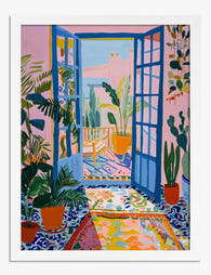
Poster veranda soleggiata in stile Matisse
Translation missing: it.products.product.sale_price A partire da €16,95€23,95 -

Poster stanza moderna illuminata dal sole
Translation missing: it.products.product.sale_price A partire da €16,95€23,95 -

Poster stanza moderna dai colori pop
Translation missing: it.products.product.sale_price A partire da €16,95€23,95 -

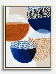
Poster astratto a blocchi di colore vivaci e armoniosi
Translation missing: it.products.product.sale_price A partire da €16,95€23,95 -

Poster soggiorno moderno colorato
Translation missing: it.products.product.sale_price A partire da €16,95€23,95 -

Tela libreria dai colori vivaci
Translation missing: it.products.product.sale_price A partire da €64,95€92,95 -
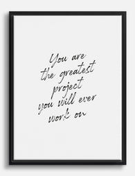
Tela con frase motivazionale 'Greatest Project'
Translation missing: it.products.product.sale_price A partire da €64,95€92,95 -

Poster paesaggio collinare colorato
Translation missing: it.products.product.sale_price A partire da €16,95€23,95 -

Tela astratta moderna geometrica nei toni caldi della terra
Translation missing: it.products.product.sale_price A partire da €64,95€92,95 -
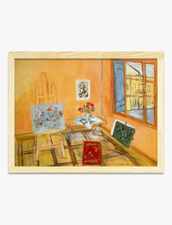
Poster interno d'atelier di Raoul Dufy
Translation missing: it.products.product.sale_price A partire da €16,95€23,95 -
Tela forme astratte eclettiche
Translation missing: it.products.product.sale_price A partire da €64,95€92,95 -

Tela geometrica boho audace
Translation missing: it.products.product.sale_price A partire da €64,95€92,95 -

Tela cuore audace in toni caldi e terrosi
Translation missing: it.products.product.sale_price A partire da €64,95€92,95 -

Poster piccoli mondi II di Kandinsky
Translation missing: it.products.product.sale_price A partire da €16,95€23,95 -

Poster camera con vista ispirato a Matisse
Translation missing: it.products.product.sale_price A partire da €16,95€23,95


Di più da The Frame

Hallway Wall Art: First Impressions That Last (...
Your hallway is the first thing guests see and the last thing you walk past every day, yet it's almost always the emptiest wall in the house. The good news:...

Bathroom Wall Art: Yes, You Can Hang Art in a B...
Yes, you can hang art in a bathroom. The internet has somehow convinced everyone this is risky business reserved for people with dehumidifiers and degrees in conservation, and that simply...

Living Room Wall Art: The Complete Guide to Get...
The living room is the hardest room in the house to get right, and the walls are the reason. You have a sofa wall, probably a TV wall, possibly a...